HGTV's Emily Henderson On How To Break The Rules And Still Have A Stunning Bathroom
Each of our bathrooms has specific design needs based on the size, shape, and floor plan. So, different design methods are necessary to maximize the functionality and decor of each space. This means we sometimes must step out of our typical boundaries and set of rules to figure out what works best for us. Interior designer Emily Henderson knows this well, as she has been exposed to the type of beauty a bathroom can exhibit when typical professional rules are broken, per Style by Emily Henderson.
We'll be taking a look at the kind of rules that were broken and exactly how they contributed to the beauty and performance of the bathroom. These rule-breaking designs are sure to help you work around the obstacles you are currently facing while also providing inspiration you wouldn't have obtained from an average design. However, you should never make a plan that will end up driving costs or causing issues, per Home Artisans of Indiana. Henderson hasn't broken these rules herself, so be sure to speak to a professional before doing anything.
Vanity discoveries
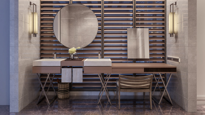
The bathroom vanity is one of the most important locations, as this is where you get ready for the day and sometimes store your personal items. Henderson's best friend introduced a double vanity against a wall where a window is present, per Style by Emily Henderson. She did this to prevent having to downgrade in size against a smaller wall. She then introduced two mirrors; one was installed normally, and the other was suspended in front of the window with a longer pole, creating a stunning visual and a great spot to get ready for the day due to the abundance of natural light. This isn't a design you see every day, but it's a great way to work around a window.
Designer William Hunter also broke at least four rules when designing a bathroom, and it turned out to be an extraordinary visual. Instead of the typical double vanity against a long wall, he chose a single vanity with a sink that was pushed off to the side, creating more counter space. He balanced out this look by introducing a stool, making the space more functional.
Open concepts
If you live in a home with limited square footage, an open floor plan is always your best friend. Henderson's friend Annie of Åsom Home created a bathroom without needing a wall, per Style by Emily Henderson. In lieu of a solid wall, Annie opted for a slatted wall between the bathroom and bedroom. Although you may not have full privacy, the room will instead glow from the natural light flowing in from the outside space.
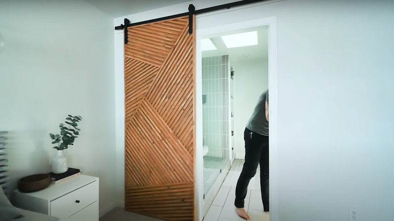
A bathroom designed by Cleo Murnane also shows how breaking the rules can be beneficial to small spaces. Against the same wall, she created a separate space for the toilet and the rest of the bathroom. Typically, the toilet is hidden at all times from the rest of the home. But in this design, a sliding door is used to hide one or the other, exposing one of the areas at all times. This is an interesting design that is visually appealing and makes the room look bigger.


