These Are The Best Outdoor Spaces Featured On Good Bones
Known as the longtime stars of one of HGTV's most popular shows, the mother/daughter team of Karen E. Laine and Mina Starsiak Hawk have been building, renovating, and rehabilitating homes in Indianapolis, Indiana for almost 20 years. With seven seasons of "Good Bones" under their belts, and a variety of other projects in the works including Hawk's own spinoff show, "Good Bones: Risky Business," the duo continues to transform countless homes and communities.
While the interior portions of their flipped homes tend to be the main focus of nearly 100 episodes of "Good Bones," their renovated exteriors and green spaces haven't received as much attention. Despite the minimal coverage of these areas, we believe their outdoor spaces speak volumes in terms of their flipping abilities and overall design style. No matter what types of changes they made to the exteriors, whether they were minimal or complete overhauls, Laine and Hawk have managed to produce charming, spacious, and functional areas that not only add value to their homes, but highlight the importance of curb appeal when it comes to real estate. So, which of their outdoor spaces from the past seven seasons have been the most impressive?
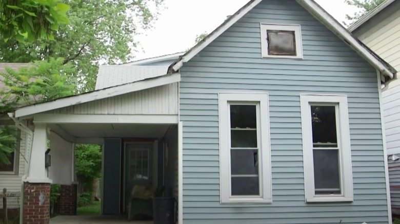
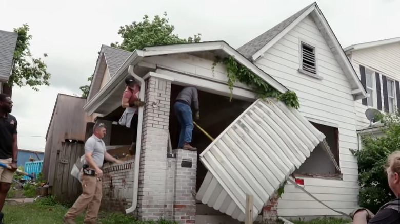
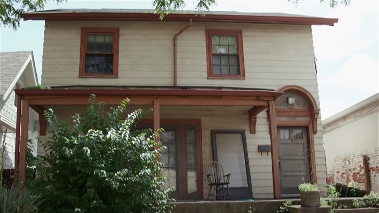
Coastal cottage before
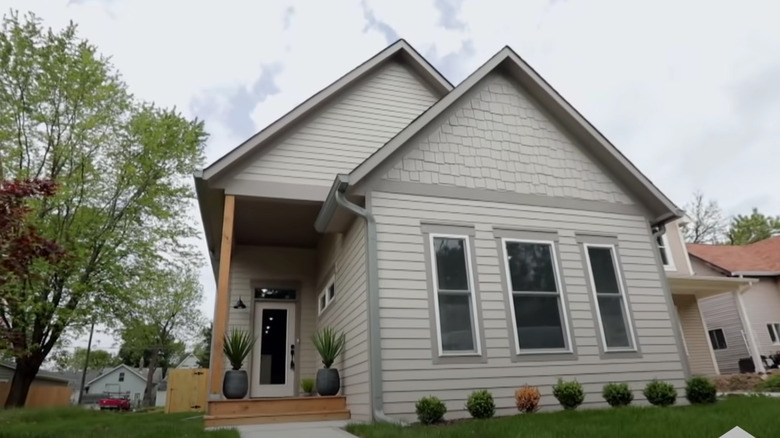
Located in one of Indianapolis' most transitional neighborhoods, this 900-square-foot cottage boasted two bedrooms and one bathroom, yet was in desperate need of some personality. The home's disjointed exterior was further highlighted by the drab siding, red brick craftsman-style columns, and a dark porch, all of which seemed to be afterthoughts of the previous owners.
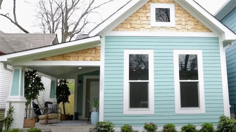
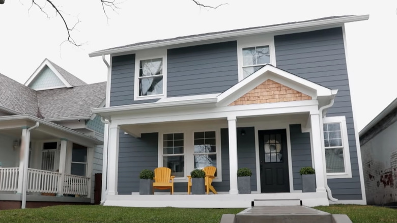
Coastal cottage after
While coastal designs aren't necessarily common in landlocked Indiana, the style helped to add some charm to this cottage. To achieve the coastal look, Laine and Hawk used Drizzle by Sherwin Williams on the siding and porch columns, then added wood shingles to the gable and porch roof. They also vaulted the porch, added lighting, and replaced the front door.
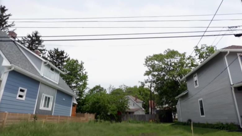
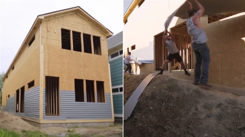
Modern farmhouse before
Purchased for $3,000 in the Bates Hendricks neighborhood, this long and narrow undeveloped lot left the design duo with only one option, building up (via Youtube). Because of this, the new build's design was similar to that of a townhome with the first floor functioning as an above ground basement and the second floor as the traditional living space.
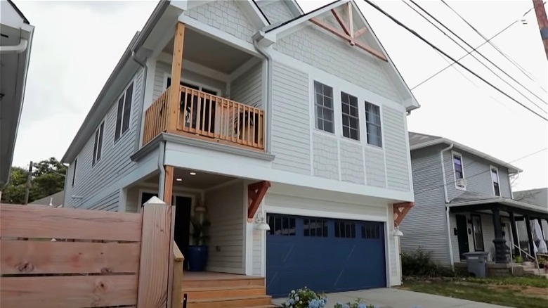
Modern farmhouse after
Built on a previously undeveloped lot, this modern farmhouse home has plenty of eye-catching exterior features, but none are more striking than the rich blue garage door. Keeping within the color scheme, the front and balcony doors match the garage. The blue hue was further referenced with the addition of porch décor and blue hydrangeas.
Quaint charmer before
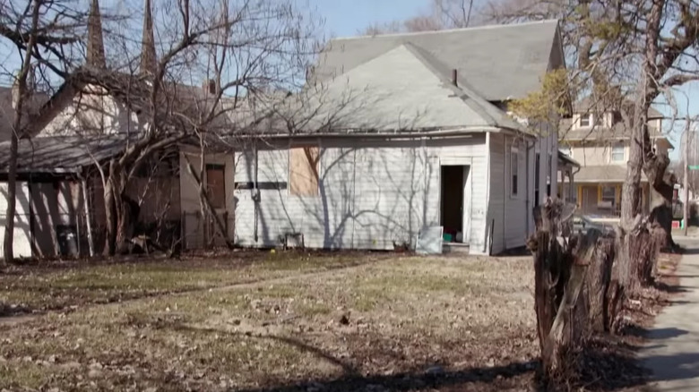
Located in the historic neighborhood of Old Southside, this home had lots of whimsy with its gingerbread detailing on the front porch. But when it came to the rest of the property, there were a number of things that needed to be refreshed and repaired, such as the damaged fence and dead trees that needed to be removed.
Quaint charmer after
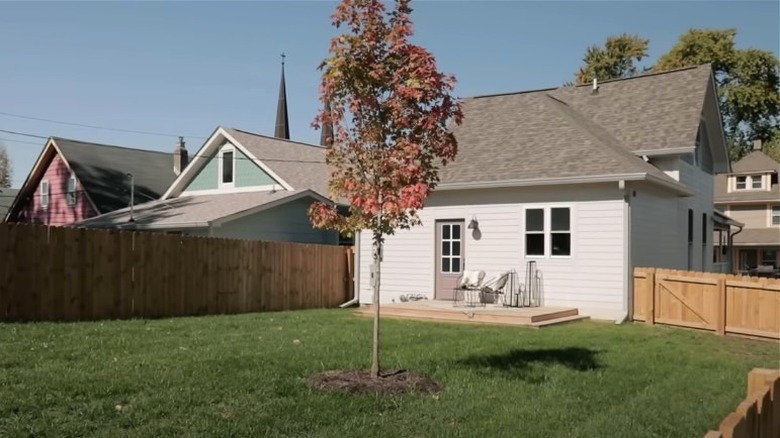
What a difference basic landscaping can make! By removing the decayed and dead trees, planting an adorable young sugar maple, and laying down sod, this backyard was completely transformed. The design duo also changed the location of the back door and added a small deck. One of the biggest upgrades is the new fence.
Tad's tiny home before
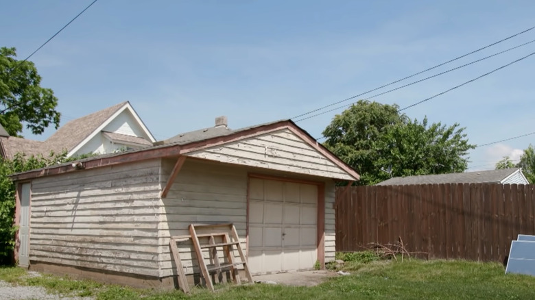
Likely one of the show's more dramatic makeovers, this little garage seemingly didn't have much potential to begin with, especially considering its small plot of land. Rather than building out like they've done before, the team opted to build up, eventually transforming it into a tiny home that maximizes the small space for Mina Hawk's brother Tad.
Tad's tiny home after
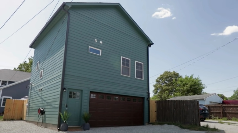
While there isn't much to the exterior design of this carriage house and garage, Laine and Hawk's use of color on this project makes a statement. Using Rocky River by Sherwin Williams, which has bluish undertones, paired with a walnut garage door, gives the home masculine vibes.
Biker bar before
This 530-square-foot home didn't have much going for it at first, and was in need of a lot of work and a splash of color. With zero bedrooms, only one bathroom, and a series of poorly built shed additions on the back, both the inside and outside of this property were in desperate need of help.
Biker bar after
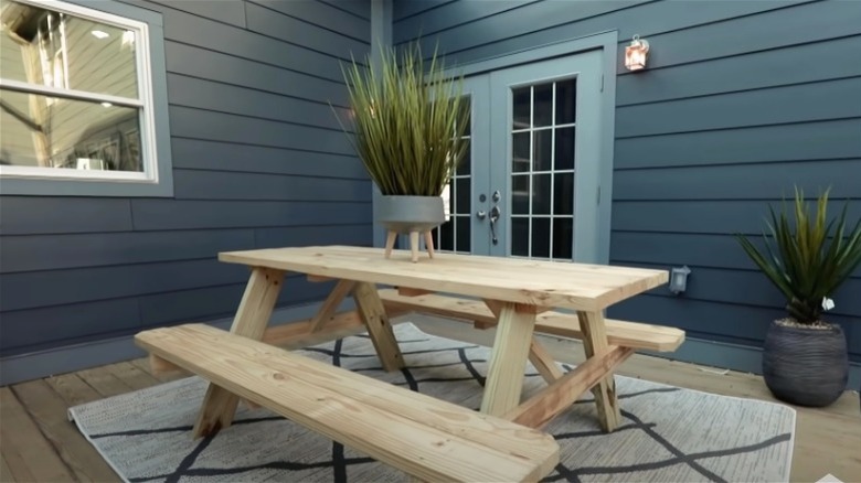
Located behind the original home and adjacent to the addition, the narrow side yard was transformed into a space that's perfect for unwinding and entertaining. Being able to see areas like this from inside the home, whether that's through a series of windows or a set of french doors, can help encourage indoor-outdoor living (via Youtube).
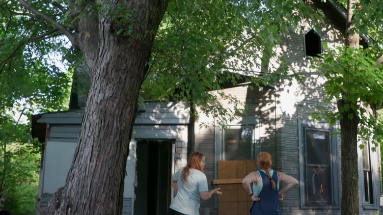
Abandoned to adorable before
Despite acquiring this home half-built and abandoned, there was no denying that the bones of this property had plenty of potential. The team tackled the renovation during the second season of "Good Bones." With a potential buyer in mind and 2,200 square feet to work with, the possibilities were endless.
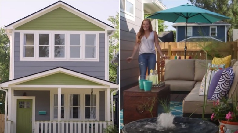
Abandoned to adorable after
While a majority of the exterior was already designed before they acquired the home, Laine and Hawk still managed to customize it by adding a front porch and more windows. They also opted for colorful siding in a variety of widths and added a lounging and dining space along with a water fountain to the side yard.
Hamptons-inspired home before
The original design of this home had lots of charm and character. However, thanks to the front door, off-centered porch, and drab color scheme, it was a bit of an eyesore. In addition to the misaligned porch and door, the mother/daughter duo also had to repaint the exterior and pour a new concrete walkway.
Hamptons-inspired home after
While they loved the original design of the porch, the duo felt it was too off-centered and moved the placement of the door during renovations. Along with the front door, they also centered the porch, changed its roofline, and added wooden shingles to the new gable roof. They also repainted the siding and trim.
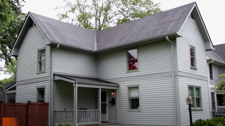
Gorgeous green before
Despite having plenty of exterior potential as it was, the young owners of this historic property enlisted the help of the Good Bones team for a major re-design. And, while the home itself proved to be a challenge to renovate due to plan restrictions, the final product definitely made a statement.
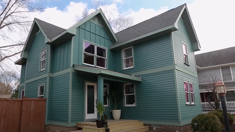
Gorgeous green after
Considering the urban aesthetic of the homeowners, the mother/daughter duo chose two rich greens from Sherwin Williams for the siding and trim. They relocated the front door, and expanded the entryway and second floor. Although they didn't do much in terms of landscaping, their addition of board and batten detailing gave the home even more dimension.
Bland to beautiful before
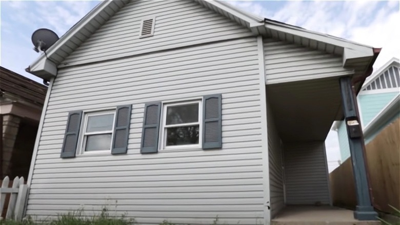
Located in an area of Bates Hendricks where Laine and Hawk had renovated other homes, this house boasted 1,300 square feet, three bedrooms, and one bathroom (via Youtube). However, the property also included a dull exterior in dire need of some character, as well as a poorly built shed addition that needed to be demolished.
Bland to beautiful after
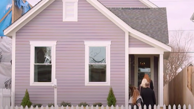
Despite keeping the home's exterior simple, the addition of the purple siding gave the property some much needed personality. Along with the color change, the designers also switched out the old fence for picket fencing to give the home a classic touch. The new windows and front door make it more inviting.
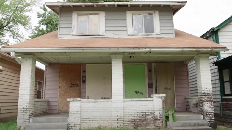
Rundown bungalow before
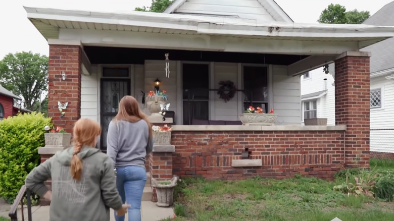
Featured in the second episode of their fifth season on HGTV, this three bedroom, one bathroom bungalow in need of rescuing became their most expensive pre-renovation purchase after they bought the home for $130,000. The exterior had some potential, however the sagging roof, red brick porch, and dingy white siding were all in need of a makeover.
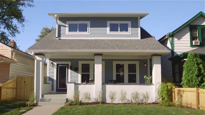
Rundown bungalow after
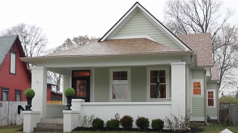
Having renovated this home for a former resident, they wanted to bring as much charm back to the bungalow as possible. That meant restoring the original features inside the home. Then, on the outside, they updated the landscaping and repainted the porch and siding in a soft green and cream, according to Two Chicks and a Hammer.
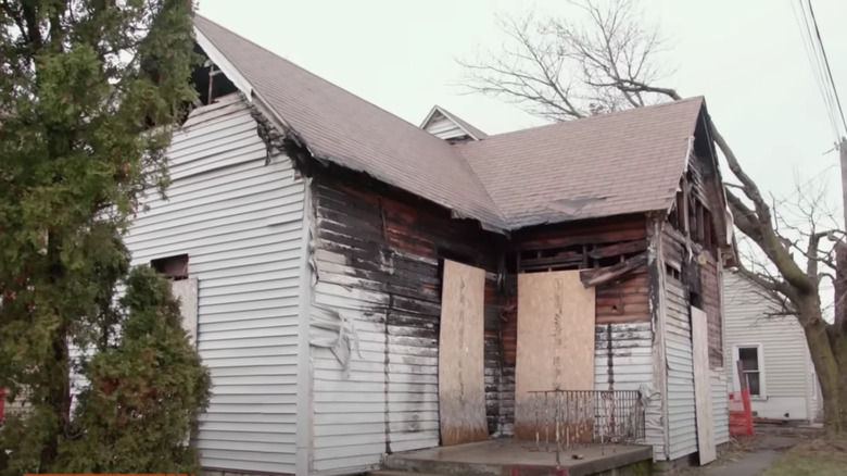
Collapsing cottage before
Purchased for $20,000, this abandoned cottage was in shambles and surrounded by overgrown foliage when they acquired it in 2020 (via Youtube). However, after demoing and preparing the home for renovations, the team found out that the cottage had collapsed in on itself, sending them back to square one and having to accommodate for new zoning laws.
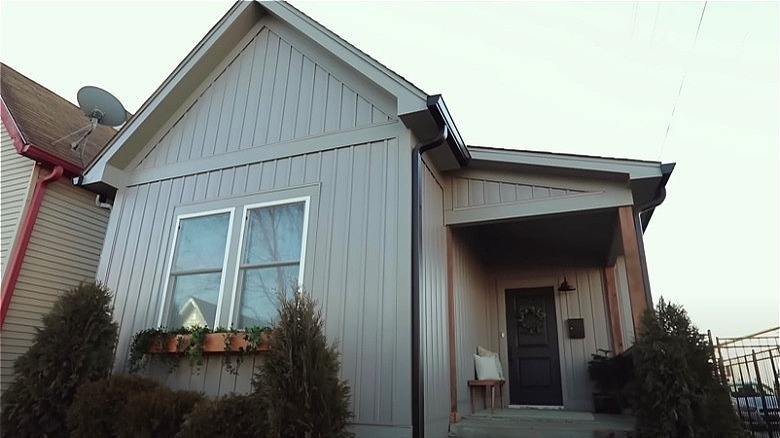
Collapsing cottage after
Despite this property's initial setbacks, they incorporated a few design features to honor the former home that once stood on the property. Due to the new zoning laws, they needed to adjust the dimensions of the home and the property's green space, but they were still able to include sizable front and backyards along with a deck.
Modern Victorian before
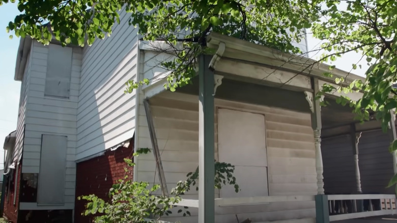
Just one of multiple properties with fire damaged that they've renovated so far, this 2,100-square-foot home included three bedrooms, one bathroom, and a charming wraparound porch. The home also had a shed addition on the back of the house which was removed during the demolition phase of the renovation to help expand the backyard.
Modern Victorian after
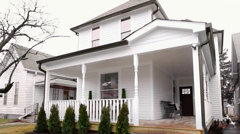
The team kept the exterior renovations simple with new windows and white siding to embrace a more modern look, and the porch stayed pretty much the same. They opted to keep the traditional posts to give the home some character and added evergreen shrubs for a pop of color throughout the year (via Youtube).
Bachelor pad before
Similar to their modern Victorian property, this 1,000-square-foot home also had significant damage from a fire. With holes in its sides and roof, there wasn't much for them to work with besides the shape of the house. In the end the duo managed to transform it into the perfect home for their property manager Cory.
Bachelor pad after
As for how Laine and Hawk updated the home's exterior, the duo replaced its siding and windows to boost the property's curb appeal. They also added fresh landscaping details and embraced a masculine yet warm feel with the addition of wooden porch posts and dark metallic touches such as the railing on the porch.
Doomed duplex before
Lacking in upkeep on both sides of the property, this partially demoed duplex was in rough shape when the Two Chicks and a Hammer co-founders acquired it. With plans to renovate the 2,300-square-foot space into a single family home, they not only had to completely redo the inside of the property, but the outside as well.
Doomed duplex after
The biggest change to the front of this home was the porch. To make the overall look cohesive, they closed off one side, removed the walkway, and replaced the front door with a set of windows. They also added fencing and removed a portion of the house's backside to install a spacious deck and a fire pit.

