How To Steal Travis Barker's Modern And Elevated Home Style
You might be wondering how dark and industrial could possibly go well with airy and soft, but Travis Barker of Blink 182 is here to show you how it's done. Yes, in the wake of his recent nuptials to Kourtney Kardashian, Architectural Digest got a recent behind-the-scenes video tour of their shared abode in Calabasas. Offering thoughtful living spaces, a soundproof recording studio, and a resort-style pool, among other features, this home does not disappoint.
Despite Barker's edgy, rockstar persona, this tour reveals a family man interested in simple, clean spaces who never forgets his roots. Part California monastery, part industrial estate, with a dash of wabi-sabi -– whoever thought a rockstar could be so eclectic! This house exudes a calmness and intrigue reflective of its owner worth examining further. Keep reading on as we break down a few ways that you can mimic this modern and elevated home style.
Black and light
Too often, homeowners associate black walls, black furniture, and black finishes with darker, moodier, and closed-off spaces. But Travis Barker subverts these expectations by featuring several sharp contrasts between black focal points and spectacularly configured natural light. In the right spaces, the color black, when contrasted with natural light, can actually make a space feel elegant and add more depth, according to Decor Tips.
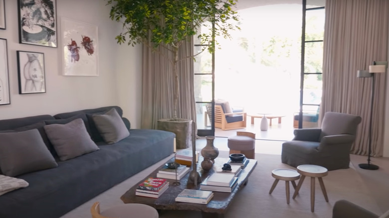
One great example of this type of contrast is featured in Travis's living room. Aside from the wall art, a majority of the pieces featured in this room could be found in any contemporary California home. From the statement plant in the corner to the minimalist side table to the warm white walls and charming coffee table pottery, what really sets this room apart is the black couch. The black couch gives it a little drama but still makes the space feel cozy and sophisticated. Barker's architect Waldo Fernandez so masterfully opened up these walls for natural light to pour into the space, thus, creating this signature contrast we will see throughout the home. So find these moments of light in your home, whether it be with a couch or a wall, and allow fresh focal points to create new dimensions in your space.
Industrial finishes
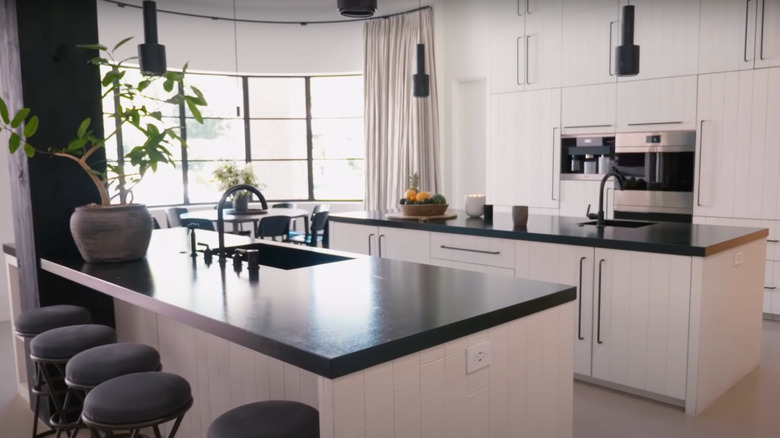
Waldo Fernandez further demonstrates this contrast with strong black finishes and exceptional natural light in the kitchen as well. In addition to playing with this palette, Fernandez also features some spectacular Alvar Aalto pendant lights for that industrial edge. These minimalist touches go wonderfully with this palette and are the kind of details you can add throughout your home to achieve this look. Beyond pendants, this could include items such as visible piping, brackets, classic factory pieces like barstools, and antique light fixtures (as noted by Decoist).
Unlike other industrial spaces, however, you will notice that Travis Barker normally goes with a black or matted finish rather than metal, rose gold, or shiny detail. So whether you are looking at the Alvar Aalto pendant lights or his cement ping pong table, there is very little sheen in the home. That is a deliberate choice. By preserving these industrial silhouettes in understated shades, the home achieves a stylish aesthetic that is calming to the eye and contributes to its overall zen sensibility.
Punk rock minimalism
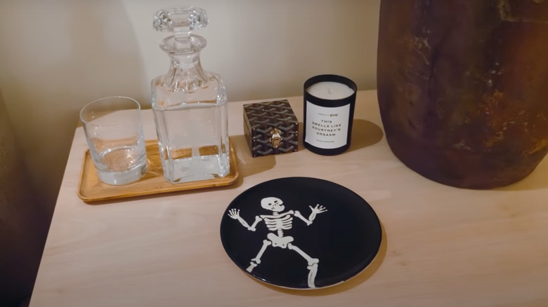
This home does a great job of conveying a calming, monastery sensibility without betraying its owner's roots. One example is this fun plate that Kourtney Kardashian painted for Travis Barker, an excellent example of punk rock minimalism. Part of the surprise of this house is what it doesn't have — there are no over-the-top metal posters or super grotesque images or gaudy finishes. Waldo Fernandez understood the assignment of sprinkling Travis's personality into the home while still retaining the objective of being relaxing and minimalist. Other examples of this include Travis and Kourtney's blood-red engagement glasses, as well as the custom lamp in the game room with the skull light switch.
In order to get these splashes of punk rock minimalism, think about your own personal connections to punk rock and how to visually incorporate those ideas. This could be in the form of skull decor, whether it be lights or candles and other beautifully creepy art from places like Etsy, but nothing too overly grotesque. Fabrik points out that, at its core, punk rock is about disrupting the status quo, so balancing this while maintaining a sense of tranquility and overall low color contrast outside of black will help ensure achieving this vibe.
Muted, warm furnishings
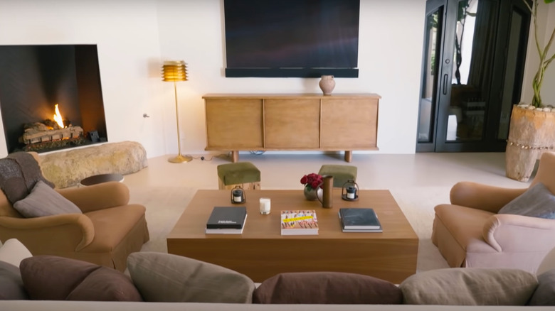
Aside from black and natural light contrast and punk rock minimalism, the third key design feature included in this home is muted, warm tones with soft materials. This is applicable to both the materials used to build the furniture as well as the color palette. A great example of this is in the formal living room, with the custom sofa in De Le Cuona linen, lounge chairs in Lee Jofa linen, along with the cocktail table and stools. Linen is soothing to the eye, and these earth tones do a great job of creating a more inviting, homey sensibility that still feels true to the house. The earth-toned accent pillows and stool tops add a pop of color, but not an overwhelming amount. And the warm woods for the dresser and the coffee table pair wonderfully with the black fireplace and black door.
When considering furniture to get this warm minimalism, Chloe Dominik recommends warm creams, beiges, and oat tones to get this effect. Geometric lines contrasted with organic shapes look great. Ultimately, it is important that the selected pieces and pillows do not have designs or patterns. These styles disrupt a zen flow in a home and draw your eye into something a bit more stimulating. Everything in this room is relatively low contrast, with colors found in nature.
With a side of wabi-sabi
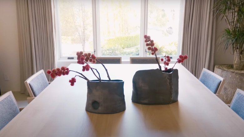
Lastly, Travis Barker and Waldo Fernandez utilized the Japanese design principles of wabi-sabi in order to achieve this monastery, soothing look. What is wabi-sabi, you might ask? It is the artistic style of embracing imperfection, age, and character (according to Japan Objects). In terms of how this translates into design, Travis's formal dining room is a great example of wabi-sabi. The flower vases are aged and cracked, with amorphous, organic shapes. They are not the traditional, uniform flower vases you might find in a typical contemporary home. The flowers are also not identical in size and configuration and are allowed to just be. There is also a statement plant in the corner, but notably, nothing on the other side — a deliberate lack of symmetry informs this aesthetic. This can also be observed in several other parts of the home.
How can you do wabi-sabi in your home? Avoid newer pieces and, instead, seek out aged, organically-shaped pieces such as stools, flower vases, and chairs that feature cracks, discoloration, and other imperfections. These pieces can add real character and an endearing quality to the space and allow for imperfection and tidiness to coexist to really zero in on that zen sensibility. If you have a plant in one corner, maybe add a sculpture on the other side and some small stools across from two chairs. Avoid symmetry, seek organic shapes, and avoid clutter.

