15 Paint Shades That Are Perfect For A Mid-Century Modern Style
Lean silhouettes, gleaming metal, stone, warm wood in furniture, and wall treatments are major traits of the mid-century design aesthetic that originated in the 1950s. It appears a resurgence of the style's popularity in the aughts continues to be unwavering, first appealing to a minimalist sensibility and later to an organic and vintage one.
Texture is a big component and a growing trend as comfort and casual luxe in our homes rise to the top of our wish lists, so gather inspiration from icons like Frank Lloyd Wright and George Nelson for compelling mid-century-informed interiors. Taking an eclectic approach — sprinkling in a few objects for maximum impact rather than carrying the look into the realm of theme — ensures the design feels current rather than on repeat.
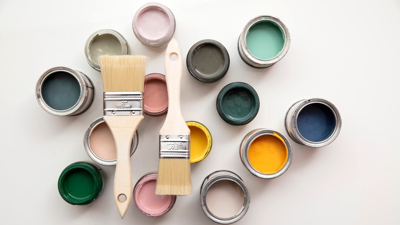
Due to the natural and man-made materials, such as plastic, lucite, and fiberglass (via MasterClass), utilized in mid-century design, there is an abundance of complementary paint colors to choose from. Shades that have a relation or affinity to nature are especially suited to bringing out its characteristics — earthy greens and taupes, gray, and subdued blues, as featured in the mid-century palette suggested by Benjamin Moore. But it's important to consider how you want your rooms to feel — effortless, jazzy, bohemian, or retro — and select colors to support that mood. Almost anything goes, as long as it's a little glamorous.
1. Medium gray
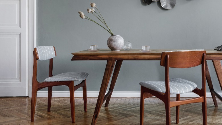
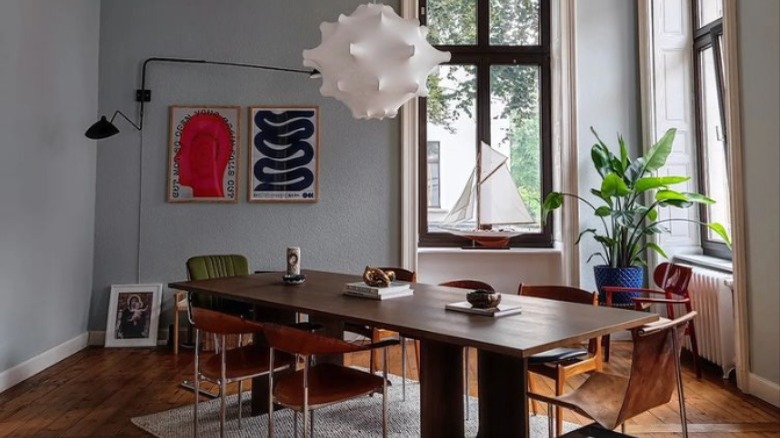
Medium gray is harmonious with the organic materials of mid-century design, particularly stone, leather, and wood. The cool tone pairs well with strong and masculine characteristics, yet it's a nice counterpoint to textural upholstery and warm wood. In addition, the medium value generally means less contrast between walls and furniture, which creates an impression of more space.
2. Greige
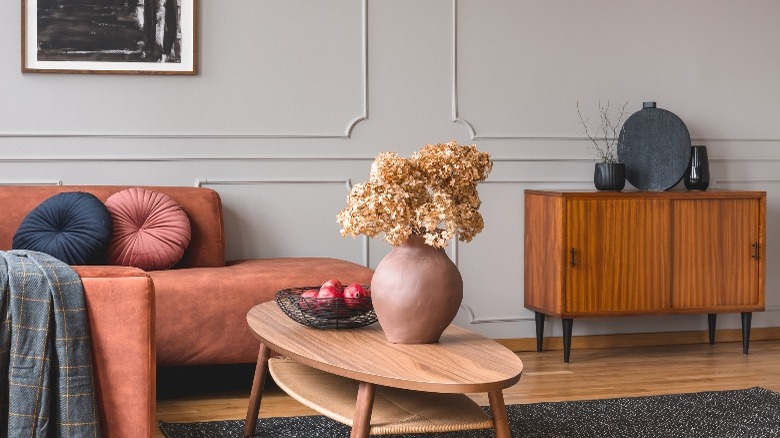
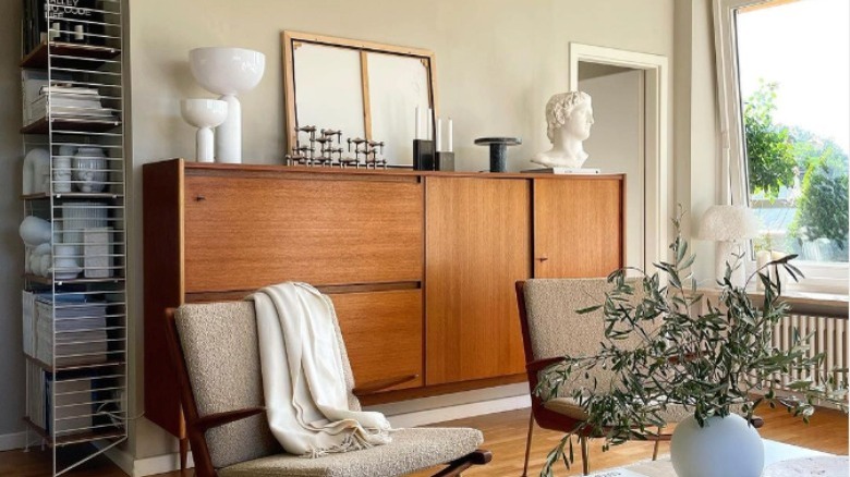
Greige — the combination of gray and beige — offers the best of both neutrals: the updated feel and trendiness of gray and the warmth of beige. In addition, the tone showcases colorful upholstery and rich woods with aplomb, providing more nuance than white while still serving as no competition to the furnishings or art.
3. Olive green
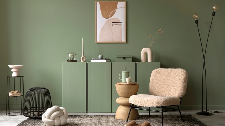
Olive and avocado are iconic shades of retro green although they now have names like matcha and green tea. But, whatever we call them, natural muted greens are grounding and soothing while being complementary to many other mid-century colors.
4. Taupe
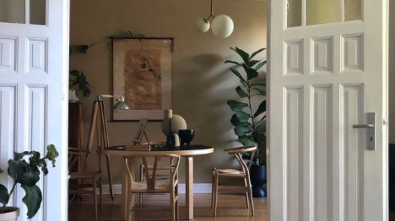
Taupe is a neutral that shifts with the light and time of day — from buff to beige to olive — and, therefore, seems to look good with almost any wood stain or color of the upholstery. Moreover, its neutrality won't read as cold because it contains warm undertones.
5. Inky blue
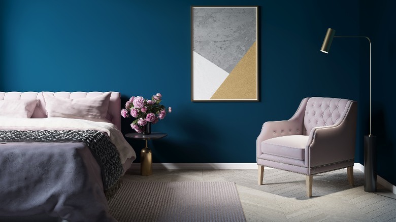
Stark, deep blue underscores the spareness of mid-century style. It's gorgeous with wood and typical upholstery colors like gray, brown, and stone. In the image above, the strong design and paint color are balanced with soft lavender and pale neutrals, while brass accents add sparkle.
6. Honey yellow
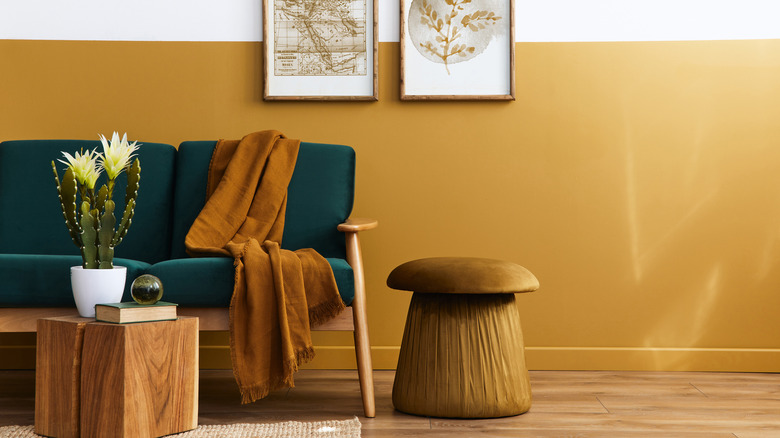
Mellow honey yellow looks beautiful with strongly colored upholstery and walnut — mid-century design's favorite wood species. The color glows, making a room feel bathed in warmth; however, this earthy shade isn't too bright to be exhausting.
7. Graphite
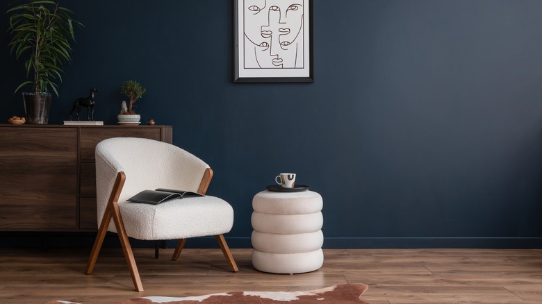
Graphite is an excellent alternative wall color for those not willing to go as deep as black paint requires. It offers almost as substantial a graphic punch as the darkness to showcase light and bright objects. Here, an ivory stool and wool boucle chair function as furniture and sculptural elements.
8. Pink
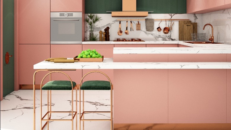
Bubblegum pink has been updated to blush in the mid-century-inspired kitchen featured here. Brass stools with emerald velvet seats add sophistication, while additional warm metallic finishes enhance the custom appearance of the design.
9. Beige
Gentleman's tweed, leather, and wood tones combine pleasantly with warm beige to create spaces that feel welcoming, layered, and classic. Add a touch of black by way of lamps or accessories to introduce an element of strength to the design.
10. Teal
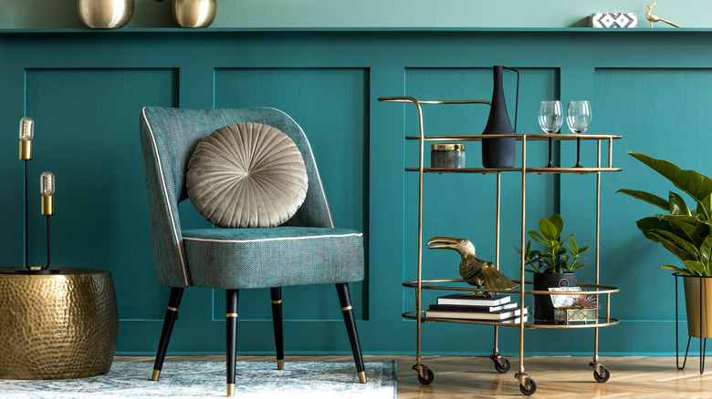
No mid-century room would be complete without a bar. Brass and glass were a popular combination of materials for accent furnishings, like a bar cart. The warm metal stands out in a space filled with cool colors, like teal, gray, and blue. And because yellow is a shared ingredient, these materials also look gorgeous with shades of brown.
11. Black
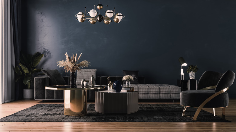
Mix black walls with mid-century pieces for dramatic flair and cocktail lounge-like vibes. Expected with very deep and gray-based tweeds and leathers, the dark shade is equally as beautiful with rich browns, burgundy, and shades of green. Finally, pair black with yellow, red, pink, or royal blue for an energy-filled pop-art space.
12. Slate blue
Slate blue walls almost disappear into the atmosphere. We're so used to seeing blue in nature that it feels familiar and comforting inside. Gray-blue reads more modern than a sweet, powdery shade, making it a great partner to mid-century décor. It can also feel cool or drab, so use it with many windows or a warmer exposure.
13. White
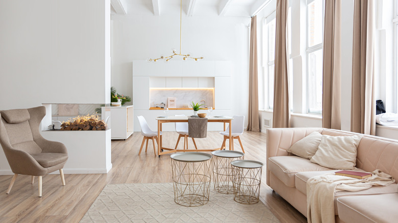
You may think white isn't a color, yet it's actually the whole spectrum of colors combined. And it's an amazing backdrop for all hues and décor styles. As a general guide, cool whites appear crisp and modern, while creamier tones align with traditional design. Regardless, white paint is usually a sure way to brighten a room.
14. Rust
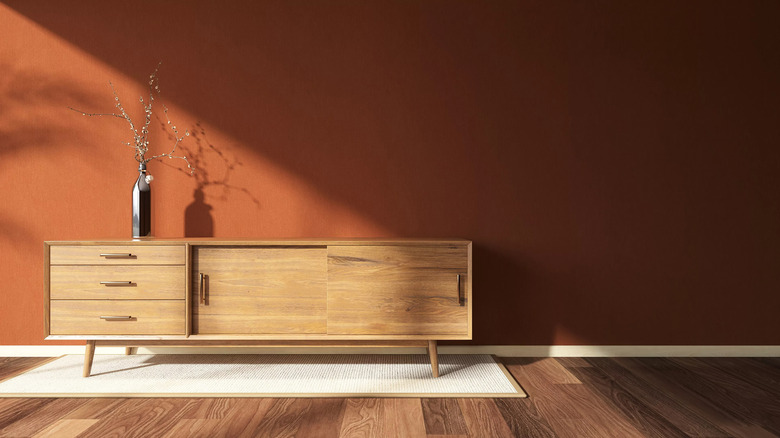
Rust, and other shades of reddish-brown, such as copper, terracotta, and clay, envelop a space with earthy warmth. They are a fantastic friend to wood tones and look contemporary with gray or ivory upholstery. For ultimate cozy chic, pair a shearling-covered mid-century chair and a classic sideboard against a rust-colored wall.
15. Pearl gray
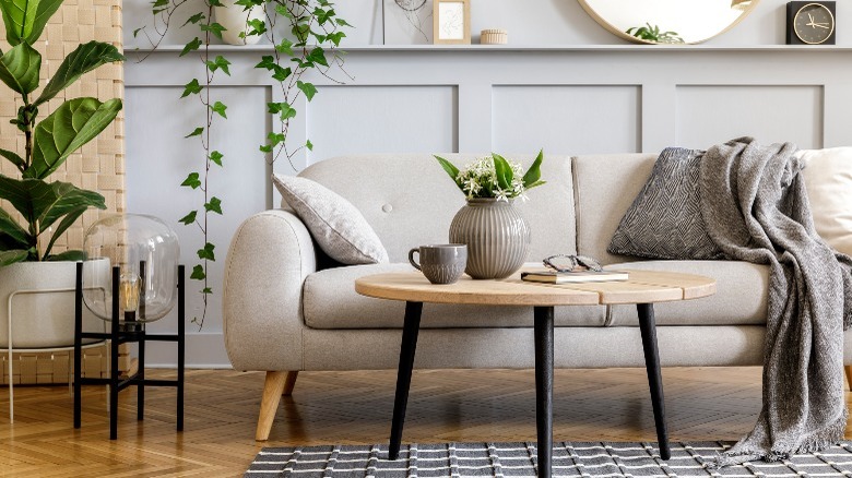
Refined pearl gray is a popular shade for modern interiors. The light neutral base allows textures and artwork to be center stage yet offers depth beyond white paint. In textiles and décor, layer tonal soft neutrals like oatmeal, bone, and oyster gray for an inviting yet updated space. A bit of black will add necessary boldness.
