David Bromstad Shows How To DIY Your Own Wall Art
With all the colors of the rainbow, you can create and design your own personalized wall art with a few simple techniques. Leave it to designer and artist David Bromstad to guide you through the carefree process of painting either a velvety watercolor concept or a more detailed geometric image to display in your desired space. Originally a Disney illustrator, Bromstad has gained years of experience as an interior designer following his breakthrough win on HGTV's "Design Star" in 2006. With several shows added to his repertoire, like "Color Splash" and "My Lottery Dream Home," the artist specializes in utilizing a plethora of delicate colors with an authentic passion.
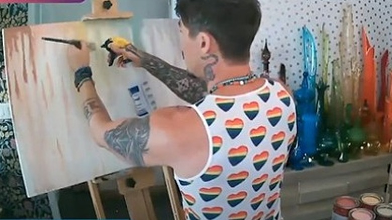
As part of the It Gets Better Project, Bromstad shared his creative talents and tips for viewers through a DIY painting tutorial. From start to finish, the design star shows his audience how to create modest abstract pictures using mainly paint brushes, water, and paint. His drip-down method lets the paint do most of the work for you, as the sprayed water presents a faint, drizzle effect within the layering of colors. Keep reading to learn more of David's tips on creating your own authentic wall art.
Layer a spectrum of pastels
To create a colorful free-flowing image that appears both abstract and alluring, artist David Bromstad takes a simple approach by applying inexpensive brushes dipped in muted tints to develop his customized creation. From light to dark, the HGTV host would suggest using a white glass plate while experimenting with your chosen palette. This allows the paint colors to significantly contrast against the white shade (via It Gets Better Project), thus making them clear and easy to remove entirely from the plate.
First, apply some water mist and a coat of white paint to prep your picture. Then apply dollops of paint from your brush onto the setting while spraying water several times throughout the process. This creates a bleeding effect down the canvas. You might also guide your brush downwards to enhance the look. To add vibrancy, you can reapply certain colors once you've completed the first one. Additionally, you can add strokes of white to enhance specific hues further. Overall, you will get a light, watercolor aesthetic from this procedure that may resemble a deft tie-dye appearance.
Create a subtle detailed image
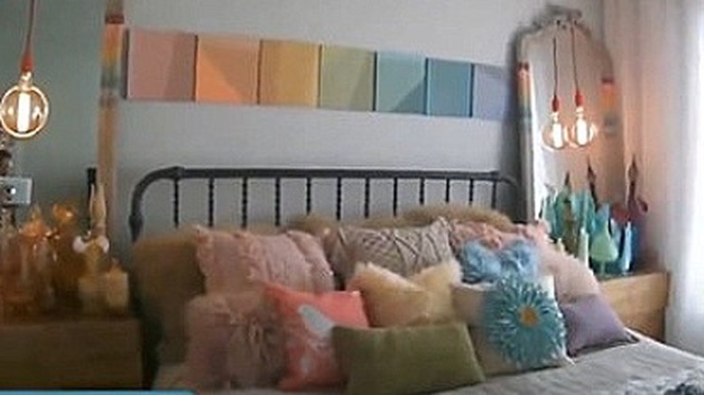
For a more meticulous method, Bromstad would incorporate a variety of pastels again, using several sectional canvas pieces to showcase more geometric and structured images. From pink to purple, the colors of the rainbow offer numerous alternative shades. When selecting your color scheme, the versatile artist is on board with grabbing as many paint swatches to choose from that appear more subdued rather than vivid, as these are often used more for accent walls, per It Gets Better Project. Many of the intense hues typically start at the top of the tier, while the softer ones can be found as you move further down.
Initially, determine which size canvas you prefer for your project. Bromstad might suggest painting your chosen colors on a 1x10 or 1x12 plywood panel, as you can get it cut to size at your local home improvement store if needed. To create triangular images within your picture, tape off the edges, then mix and apply the anticipated colors across the blank space. The result appears cheerful and balanced, as pictured in Bromstad's bedroom, elusive enough for this or any other uplifting space.


