10 Home Classroom Makeovers To Inspire Creativity
You don't have to be a teacher at a school to facilitate learning at home. You may homeschool your children, or perhaps they need a place in the house to complete their schoolwork. If either of these scenarios is the case, you may be looking for some home classroom makeover inspiration. After all, transforming your kids' learning space can help them get excited and contribute to an overall positive environment.
Any good classroom design requires three things: color, creativity, and character; styling with these three elements is sure to provide you with excellent results. To that end, Edutopia gives some more tips on designing learning spaces. For one, while the decorations should be engaging, they shouldn't take away from the students' ability to learn. Additionally, visual aids can help students, but steer clear of making the area too cluttered. Feature student artwork or schoolwork to add a personal touch.
Below are 10 home classroom transformations to inspire you and help you get started.
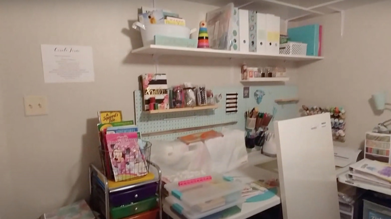
1. Before: Messy desk
Before the transformation, this home setup desperately needed to be organized. It also lacked warmth and personal touches. With just a few small changes, this corner could become the perfect place for learning.
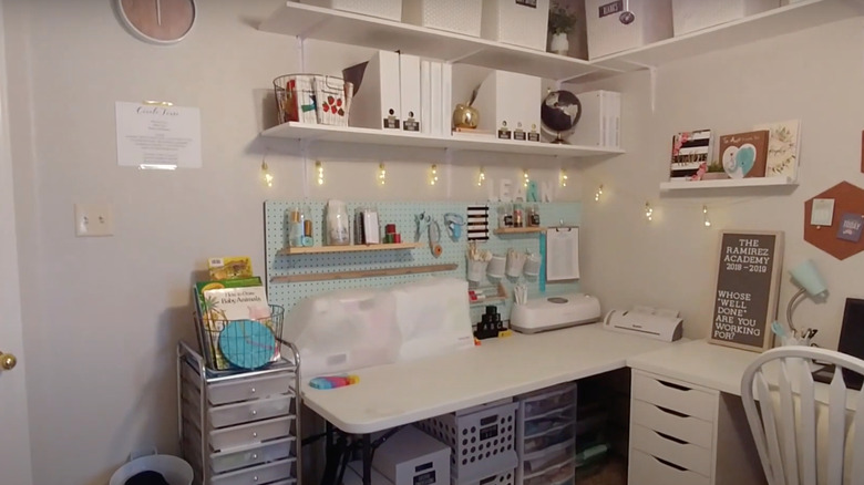
2. After: Personal and inviting
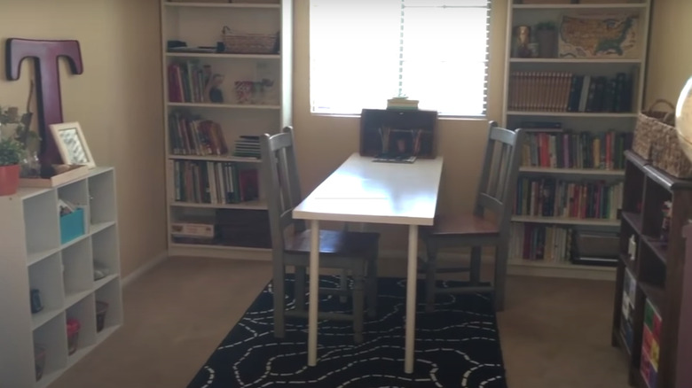
After the makeover, this room is both beautiful and functional. Gone are the piles of clutter on the desk. Also, personality has been added with the letter sign to the right, and warmth has been included with the fun string lights. This classroom would definitely get your kids excited about completing their work.
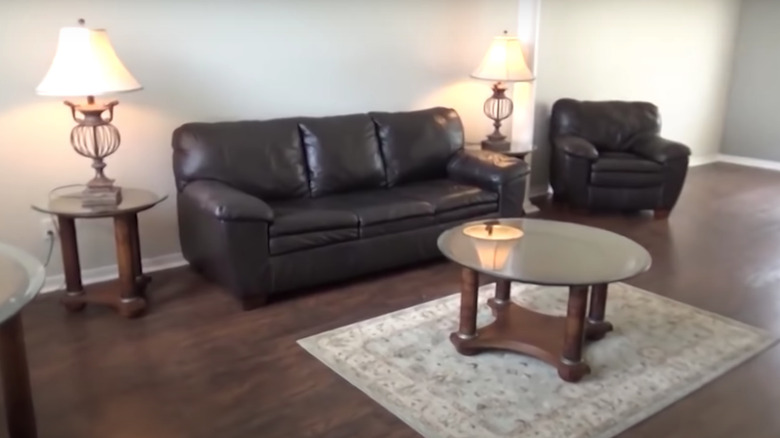
3. Before: Outdated family room
This room was an outdated family space, with boring brown leather couches and matching brown and glass furniture. It was rarely used by the family. A much better use would be for a homeschooling area.
4. After: Farmhouse touches
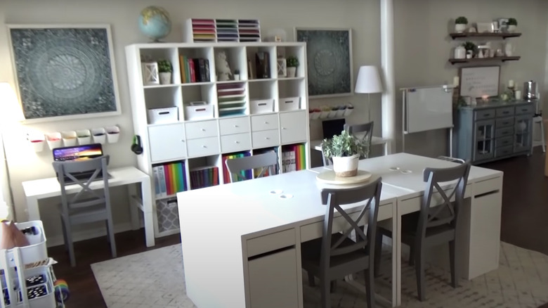
After the makeover, this room is practically unrecognizable. It looks bright and modern, and features fun farmhouse touches, as seen in the gray chairs. Every color of the rainbow has been brought in thanks to the notebooks displayed on the large white cabinet.
5. Before: Not enough storage
While there's nothing wrong with this home classroom, per se, it's not the perfect setup. As shown in the overflowing cube shelves on the back wall, there's not much space for storage.
6. After: Useful built-in shelves
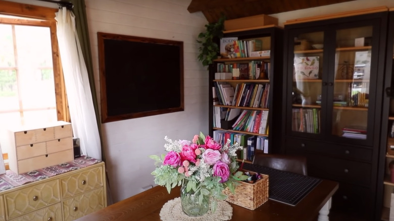
The addition of sleek, black built-in shelves adds the perfect place to store books and other school supplies. They have open shelving as well as closed drawers, which allows you to display certain items while tucking away others. This would help minimize distractions while children are learning.
7. Before: Unused cube shelves
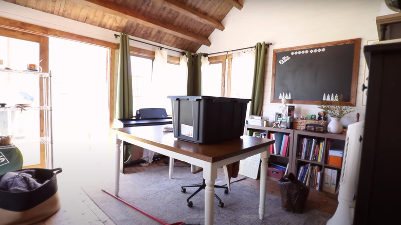
This homeschooling area has lots of cube shelves but isn't utilizing them well; nothing has been stored away properly. In addition, a large table has been placed in the center of the room, which is taking up lots of useful floor space.
8. After: Open and organized
After the transformation, every paper and small item has been put away to make the room appear more organized. The new black chairs provide a more modern feel. In addition, the large white desk has been replaced with a smaller wooden model, which has been pressed up against the wall. This allows for a more open floor plan.
9. Before: Covered in clutter
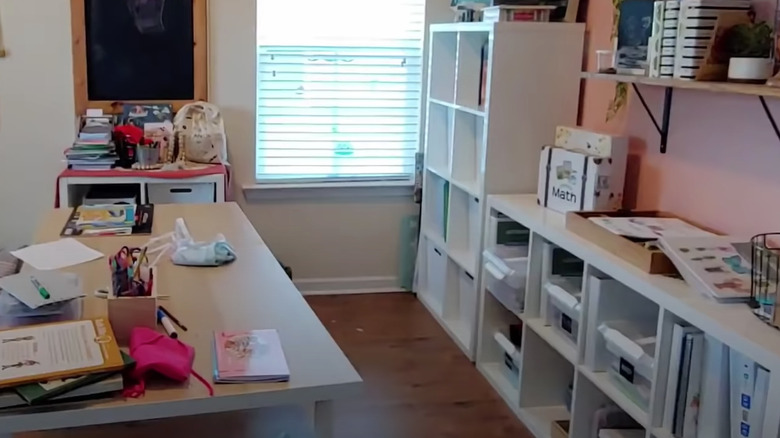
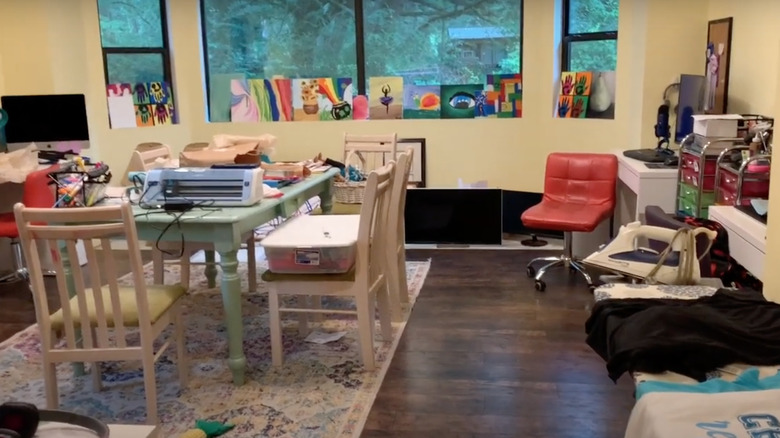
This classroom needs to be decluttered. The large table in the center of the room is covered with craft supplies. And, while displaying your children's art can provide a personal touch, nothing should be placed on windowsills as the items will block the natural light.
10. After: Clean and warm
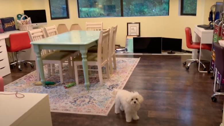
With the clutter off the table, this area looks more open. By putting items away into their rightful places, children are now able to learn with minimal distractions. The artwork has also been removed from the windows, to allow warmth to pour in on sunny days.
11. Before: Crowded setup
While organized, this home classroom looks dark and claustrophobic. The limited floor space is filled with many large pieces of furniture. There's also no room for other activities besides those completed on the table in the center -– and learning doesn't only happen while sitting at a desk.
12. After: More room for learning
After a fresh coat of paint, this room looks much brighter. In addition, because the white table has been pressed up against the wall, there is more space for other activities that don't involve sitting at a desk.
13. Before: Unused basement
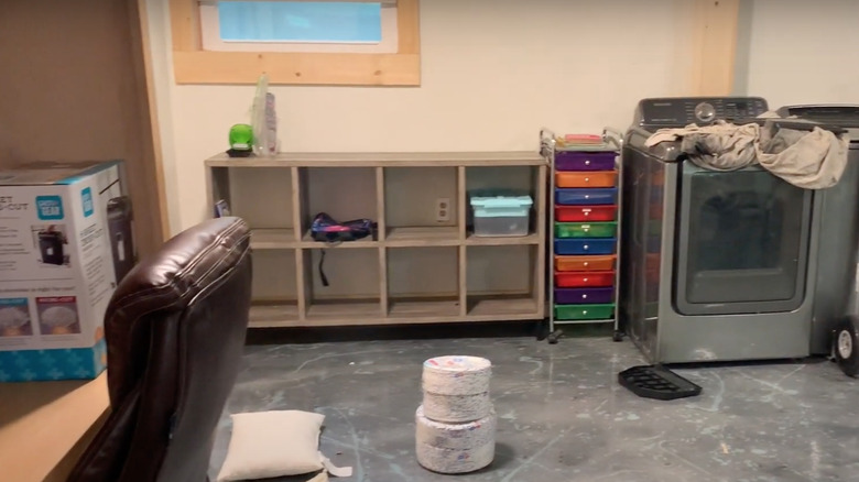
Before, this basement was practically ignored by the family. They used this corner to store extra furniture and other items, as seen on the empty shelving unit.
14. After: Classroom corner
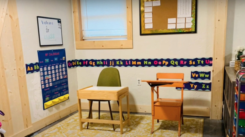
Afterwards, this corner has been given new life. The educational posters add color, while the yellow rug brings warmth. Additionally, the two desks make this classroom corner much more functional.
15. Before: Wasted wall space
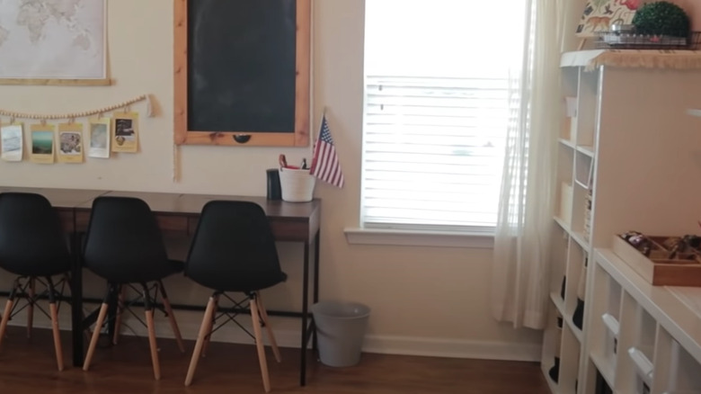
If you have a small home, you probably don't have an entire room to dedicate to learning. To fix this issue, you could combine your classroom with your family or dining room. However, you'll still need a place to store supplies. While the above setup isn't horrible, the wall isn't being used to its fullest potential.
16. After: Floating shelves for storage
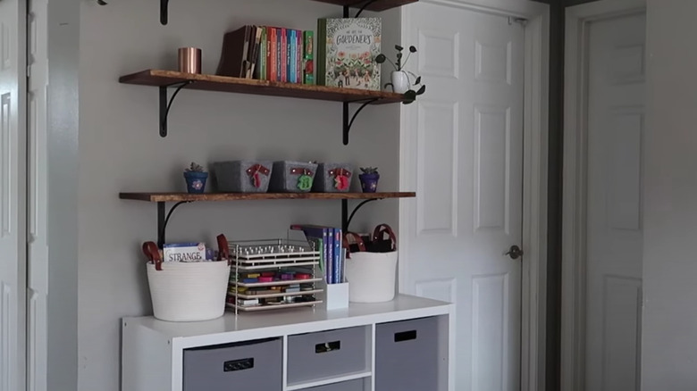
Adding floating shelves above the cube shelf provides a place to store books, décor pieces, and school supplies. This setup lets children's books to also double as artwork. It also allows school supplies to be better organized.
17. Before: Unopened boxes
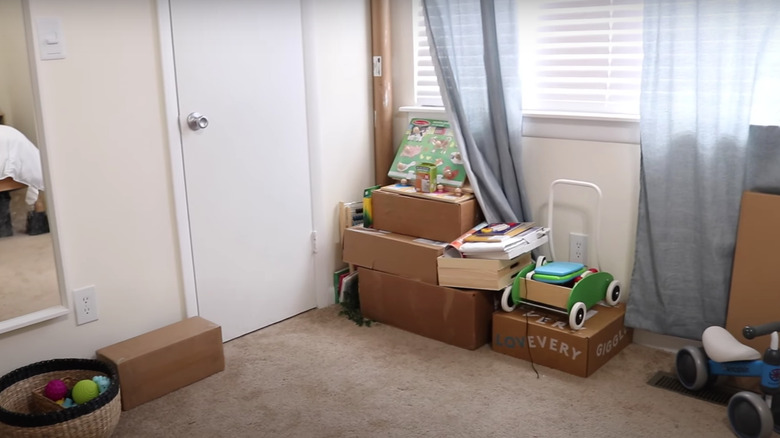
Before, this corner of the master bedroom was used to store unopened boxes and extra toys. This space clearly needed some attention.
18. After: Colorful posters
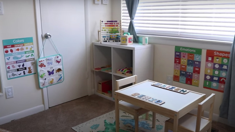
By adding colorful educational posters to the walls, this corner has been transformed into the ideal school setup. It also has adequate storage space, thanks to the white cube shelf. The colorful dinosaur rug underneath the table adds personality as well. This is so much more than a pile of boxes.
19. Before: A mostly empty room
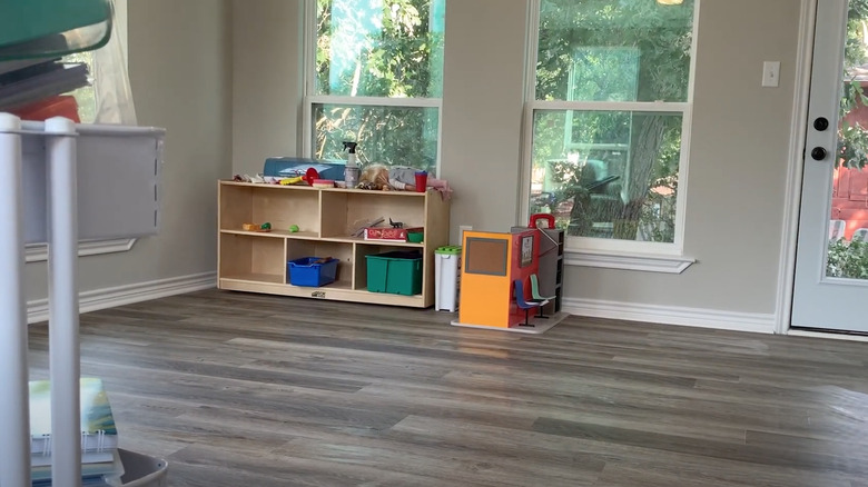
This room has lots of potential for a fantastic home classroom. It has lots of windows and plenty of unused floor space. Here, however, it was only being used to store a few toys and a mostly empty shelving unit.
20. After: Utilizing every wall
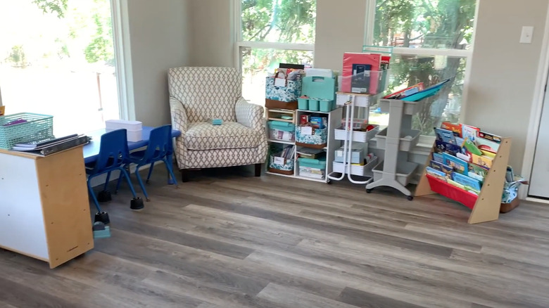
Afterwards, this large space has been reorganized to make it more functional. Every wall is utilized to store supplies or as a workspace. Color has been added through the children's book display to the right, too. Additionally, the large armchair makes this corner feel more cozy.
