Three Trends That DIY Bloggers Hate
Though DIY has really taken off in recent years thanks to social media, the concept of "do it yourself" home improvement and design projects is not entirely new — having gained mainstream traction in the 1950s and '60s, per Science Museum. During this pivotal post-war time in American history, home ownership also reached an all-time high, and people were once again able to afford things that had been rationed or considered frivolous during the war. Additionally, the passing of the Fair Labor Standards Act in 1938 (per NBC News) helped establish shorter work weeks, giving working Americans more time at home with their families and to entertain guests.
This new idea of a more family and home-oriented lifestyle gave Americans a renewed interest in the presentation of their living spaces. Finally armed with some extra cash, homeowners were now able to buy revolutionary new products such as power tools, paint, industrial glue, and plywood that were being marketed directly to the average American for the first time — and thus, the DIY craze took off.
Now, with social media apps like Pinterest and Instagram able to broadcast photos of design and decor inspiration to millions of users around the world in an instant, the world of DIY has become more mainstream than ever before, with users feeling inspired to try and replicate online design trends in their own homes. With more trends sweeping the internet, DIY bloggers and design experts are sharing which ones they hope will pass quickly.
1. Monochromatic neutrals
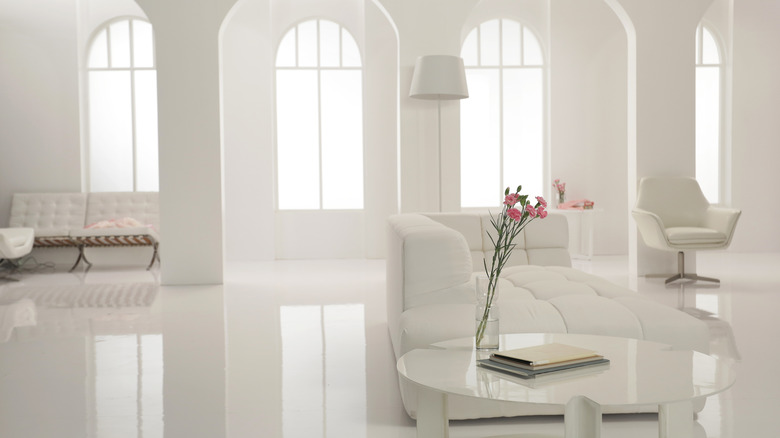
As stunning as the all-white bedroom or living room on your Pinterest board may look in photos, the simple reality is that a completely white interior is not practical in most situations. Sater Design Collection, Inc. recommends skipping this trend altogether — particularly if you have young children or pets and your home is extra prone to spills and messes.
Andra DelMonico, the lead interior designer for Trendey, also adds via Real Homes that neutral-toned rooms in monochromatic colors — particularly white — tend to feel sterile and boring instead of warm and inviting. If you feel strongly about neutrals, she recommends instead incorporating a variety of different neutral shades and working in various textures to add warmth and dimension. The differing shades and textures will help make the room more inviting (and much easier to keep clean!).
Ultimately, DIY experts agree that while all white rooms look nice for photos and social media posts, the trend is neither practical nor interesting when translated to homes that are actually lived in.
2. Messy maximalism
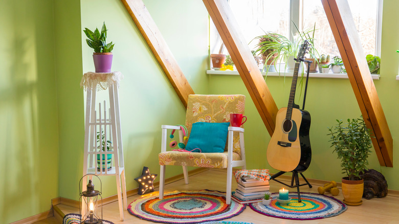
As a direct contrast to minimalism, which focuses on simplicity, clean lines, and sparse furniture and decor, maximalism is all about color, pattern, and lots of decor and furniture (per Sater Design Collection, Inc). And while a maximalist design aesthetic isn't inherently bad, Leni Calas, CEO of Ward 5 Design, tells Real Homes that a space with maximalist decor can easily look like a cluttered mess if you aren't careful about executing the design scheme in the right way.
Interior designer Beth Diana Smith tells The Washington Post that while true maximalism is about surrounding yourself with things you love and displaying it in a way that works design-wise to give your space the "wow" factor, it's entirely possible to overdo it in a way that leaves your home feeling cluttered and chaotic.
Luckily, if you are drawn to a maximalist aesthetic, there are expert-approved ways to ensure that your space remains looking Pinterest-worthy instead of like a garage sale.
Strategically and gradually layering in furniture and accessories like area rugs and wall art is crucial in making a maximalist room come together and look intentional. Smith says she includes everything she wants in a room and then starts cutting back after visualizing which proportions and aspects work together and which don't. Layering and editing your furniture and accessories in a strategic way is the best way to find the balance between "too much" and "just enough."
3. Pallet furniture
While the idea of shabby chic furniture has caught on in recent years — particularly in homes with a farmhouse or rustic design aesthetic. However, experts warn that one DIY feature commonly incorporated into these homes can actually be incredibly dangerous.
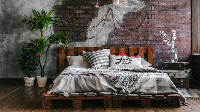
Wood pallet furniture has become incredibly popular in recent years, and homeowners are using old wood pallet shipping containers to design creative furniture and accent pieces such as headboards, bed frames, accent walls, tables, and more. And while we always love a good upcycling project, DelMonico tells Real Homes that much of the wood used to create those wood pallets has been treated with toxic chemicals, and bringing the wood into your home can expose you and your family to potentially hazardous living conditions as those chemicals can contaminate the air in your home.
EcoHome adds that discerning which wood pallets are safe to use and which are not is almost impossible and that most companies tend to hold onto and reuse the highest quality shipping pallets, making them difficult to come by. This means that many of the pallets that people find and decide to repurpose for their home projects are not of high quality and therefore run the risk of being contaminated with toxins — whether the wood itself was treated with chemicals or the pallet was used to transport them.
Delmonico suggests playing it safe and using new, untreated wood to give your home that shabby chic vibe without the health risks.


