10 Incredible Before And After Colonial House Exterior Makeovers
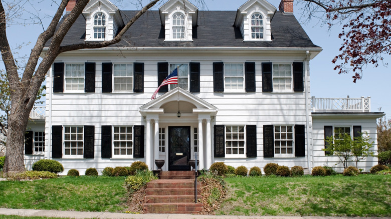
With their gable roofs and symmetrical windows, colonial houses can make quite a statement. Classic, elegant, and charming, they've become embedded in the white picket fence, American dream imagery. According to Wentworth Studio, the colonial revival began in the 1880s and lasted until around 1945. The simplicity of these homes makes them the perfect candidate for additions, alterations, and renovation. American colonial homes tend to have a symmetrical floor plan, with the front door right in the middle of the front exterior and usually flanked by large columns and tall windows.
They are impressive buildings, and flippers and renovators enjoy bringing these houses up to a modern standard. Sometimes it's a simple lick of paint to brighten and modernize; other times, it's a complete overhaul inside and out. Sometimes, they can be overgrown, and cutting back the unruly greenery can reveal stunning pillars and sash windows. This article will focus on exterior renovations with some impressive before and after photos.
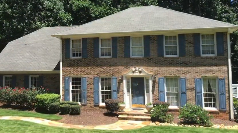
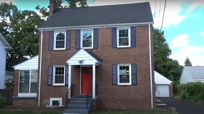
Before: Dated brickwork
This home has all the characteristics of a typical colonial house, but the brickwork makes it look dated and tired. The garden is well kept and has variety, but a more modern aesthetic would pull it all together.
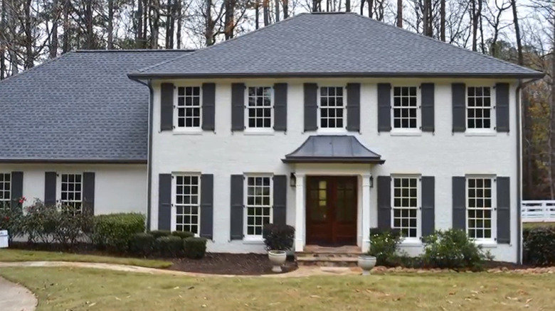
After: Bright and modern
The white walls and newly painted grey shutters bring this house up to date, while the new double front door and partial roof porch give the front entry much more presence.
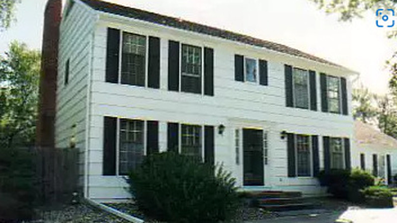
Before: Plain white
This colonial house is as plain as they come. With its dated exterior, it needs something to revive and modernize it. It's a perfect blank canvas for someone to add some personal touches.
After: Light greys and floral touches
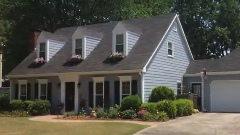
The lighter roof color and pale greys have lifted the whole exterior of this house. The floral window boxes add a splash of color, making it look loved and lived in.
Before: Boring beige
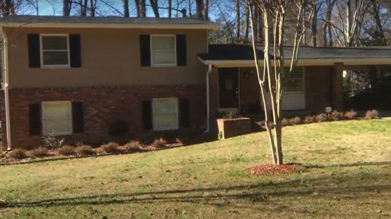
While this house has undergone some extensive renovation to change the layout and original features, the color palette leaves a lot to be desired.
After: Bright whites and pale greys
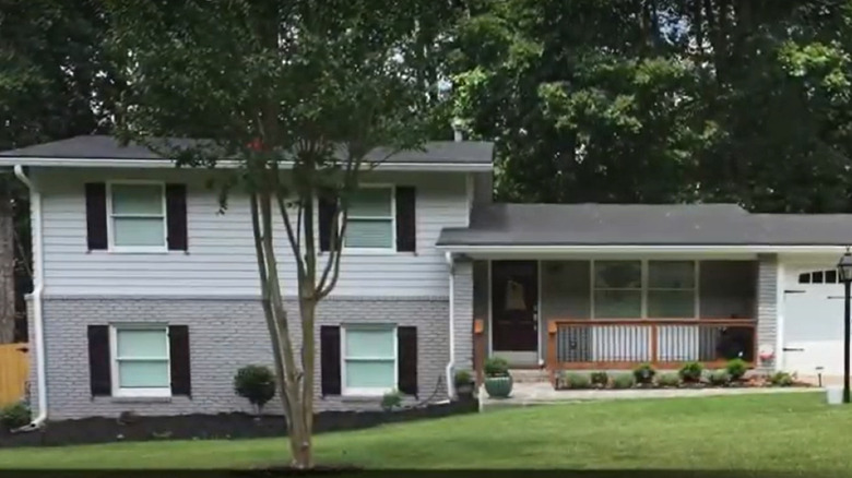
The change in this house is easy to see. Its bright white and pale grey exterior makes it almost look like a different house. The addition of the wooden handrail and fence helps to modernize it even further.
Before: Dark and overgrown
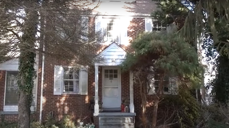
This house has so much potential, but it's spoiled by being completely crowded with trees and bushes. There are plenty of windows, but all the natural light is blocked, and the architecture is hidden.
After: Open, neat, and tidy
With all the trees and plants cleared and a new, brightly colored front door, this house has undergone a significant change. The windows can finally make use of all that natural light, and its true potential shines through.
Before: No curb appeal
While this house seems relatively modern with its bright white exterior, it lacks curb appeal or individuality. It needs a few touches of color and style to help make it stand out from the crowd.
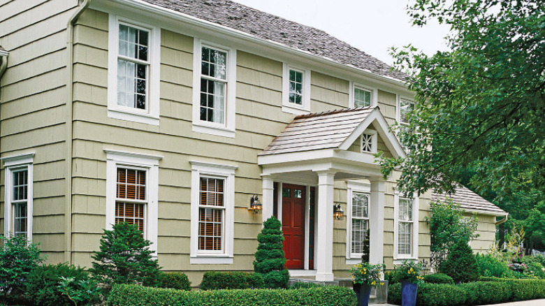
After: Dramatic changes add major curb appeal
Mission accomplished! It almost looks like a different house entirely. The addition of the porch makes a huge difference to the front's aesthetic, as does the color of the exterior. The low hedges give it a final stylish finish.
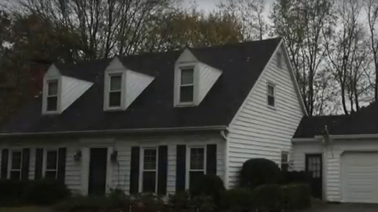
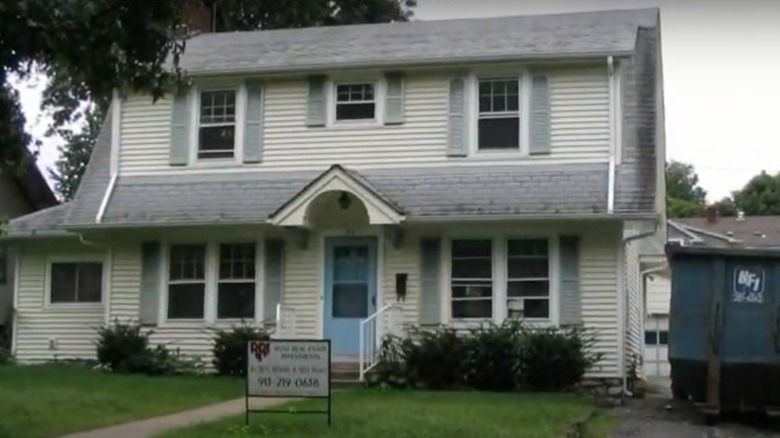
Before: Drab and lifeless
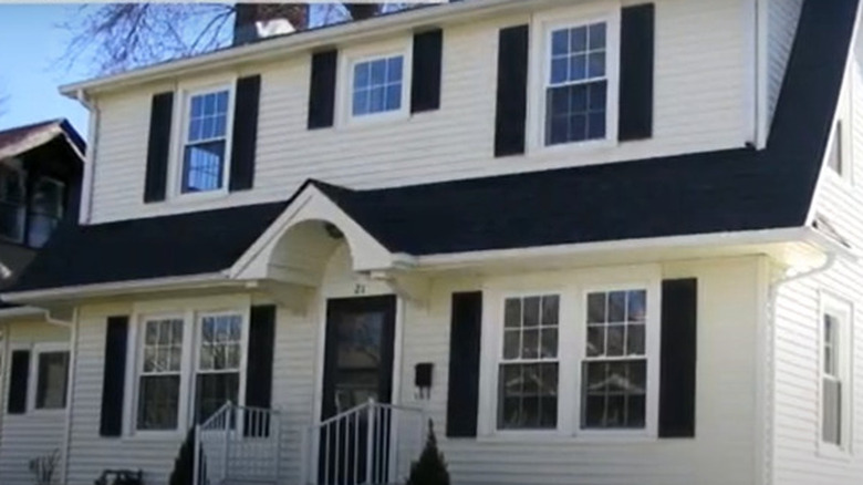
This Dutch colonial home certainly doesn't stand out from the crowd in any way. The grey and cream exterior makes it appear washed out and unloved. It needs some big changes to bring it up to date.
After: Bright white paint work
The bright white exterior, with the addition of black to the shutters and front door, adds a pleasing contrast that helps to make this house stand out in a good way.
Before: Quaint and old fashioned
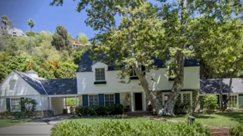
This house already has a lot going for it. The blue accents and stonework give it a sweet aesthetic, but it could benefit from drawing on traditional colonial style and brightening up in general.
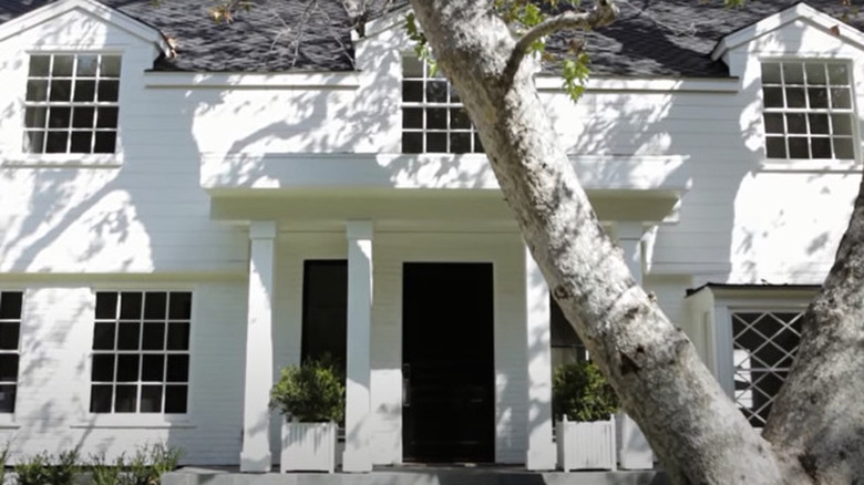
After: Dramatic entrance porch and dazzling white exterior
The addition of the extra wide porch and the dramatic pillars does wonders for this colonial house. It takes the classic colonial white siding and brickwork front and center while giving it a thoroughly modern feel.
Before: Brown and outdated
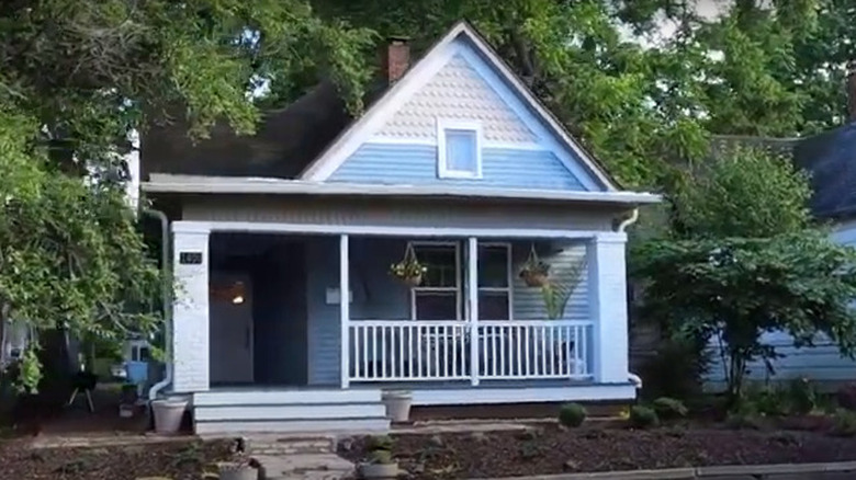
This house screams potential. The structure is quaint and charming, but the brown exterior and dull paint need brightening, and the porch area needs a complete revamping.
After: Grey blue and brightened up
Blue isn't a standard color for colonials, but it works brilliantly on this small house. Adding the fencing in the porch area brings the whole look together and gives it an authentic charm.
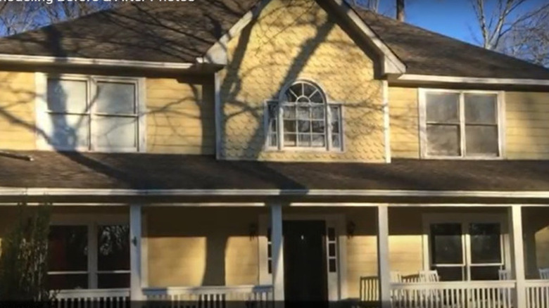
Before: Yellow siding and dull exterior
The yellow siding on the colonial house detracts from its lovely full front porch area. The symmetry is on point, and a more modern color would bring this house right up to date.
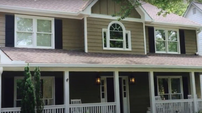
After: Modern taupe siding
The only real change here appears to be the color, but what a difference it has made to the whole exterior of this colonial house. Adding black shutters completes the transformation, making the place look homier and less bare.
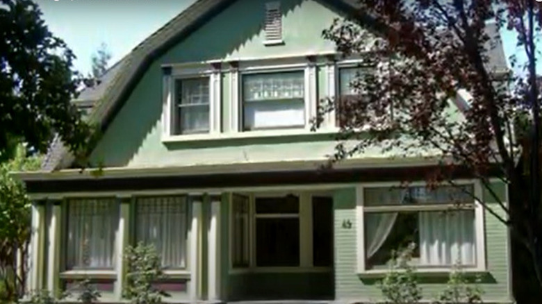
Before: Old fashioned decor and coloring
The exterior of this house is fairly uninspiring. It has undergone a renovation that has detracted from its original colonial style. The color palette is dull and lacks any of the charm or curb appeal that makes these homes so popular.
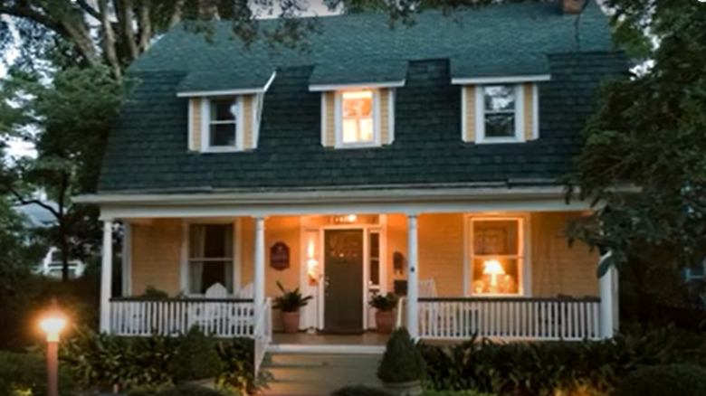
After: Symmetrical with warm aesthetic lighting
A full renovation to bring this house back to its best has considerably changed its exterior appeal. It has all of the features you'd expect from a colonial and boasts a warm, inviting feel.
