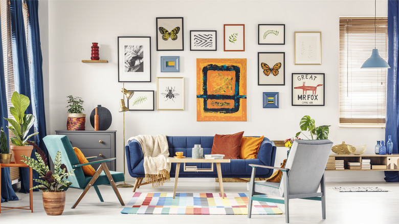
Sarah Baeumler Shares Her Tips For Creating The Perfect Gallery Wall
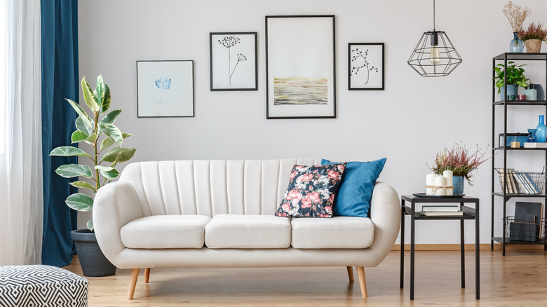
A blank wall has endless design possibilities. You could add a large painting, an accent wall color, a family portrait, or a textured décor piece to your empty wall. If you're having trouble deciding, you could always mix multiple elements together to create a gallery wall. According to Frame Bridge, when designing a gallery wall, think about the whole wall as one giant art piece. This can help you create a united design while working with multiple pieces. With this in mind, always focus on the big picture. While each individual piece is important, the larger design is of the utmost importance.
Sarah Baeumler, host of multiple HGTV home renovation shows with her husband, Bryan, has designed her fair share of gallery walls. Her many years of interior design experience has made her an expert in creating beautiful gallery walls. Whether you're wanting to create an organized grid or an eclectic design, Baeumler has five tips to help you create the perfect gallery wall.
Choose the location wisely
The first thing you'll need to do is choose the location of your gallery wall. Sarah Baeumler says that choosing a larger wall, like in a hallway or living room space, will help avoid a crowded look, per HGTV. This will give your pieces some room to breathe and be spaced out correctly. However, Family Botanic says that there's no specific place you need to choose. While larger areas will make more of a statement, smaller spaces can create an eclectic feel. Typical places to hang a gallery wall include above the living room couch, in the kitchen or the family room, down the staircase, or in the bedroom.
The space you choose for a gallery wall will help determine other factors, like the frame sizes, the color schemes, and the layout. A smaller space will use smaller frames, while a larger space can hold larger frames and a more intricate layout. Also, you'll want your gallery wall to look cohesive in your space, which means that your color scheme may be determined by the design of whatever room you choose.
Decide on a color scheme (or don't)
Sarah Baeumler says that she likes to choose a color scheme to create a more uniform gallery wall, per HGTV. Carrying a few colors throughout a wall, or matching the frames, will create more order. According to American Frame, a 'collected' look uses similar colors but different frames or art pieces. Therefore, unity can be created in many different ways.
However, mixing lots of different colors is a great choice for those who want to create a less ordered appearance. Construction 2 Style says that focusing on a theme instead of a color scheme can be helpful for those who want an eclectic look. For instance, you could only add family photos of important memories to your gallery wall. Or, you could incorporate a certain design element throughout the pieces. Whatever will create some type of unity while also allowing for diversity in the design is best.
Select the frames
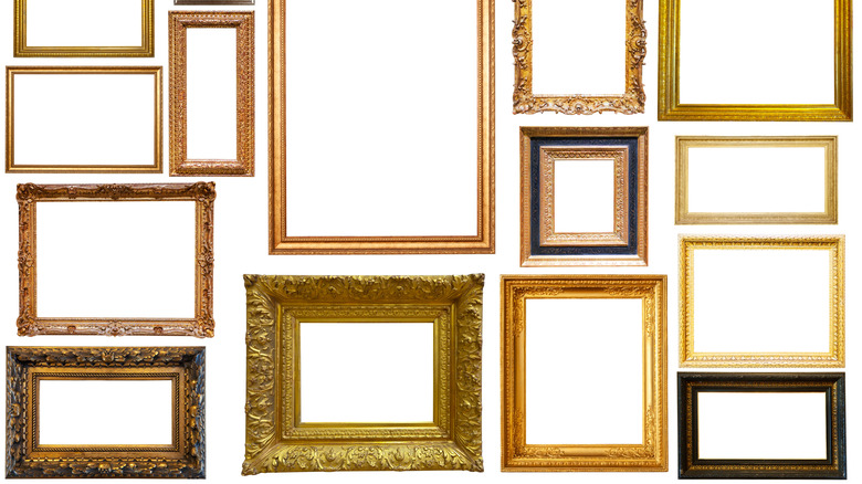
Besides the artwork itself, frames are perhaps the most important element in a gallery wall. Different shapes and colors will help create various designs. For instance, choosing all the same frames will create order, while choosing different shapes or colors will create juxtaposition. To add the most interest and variety, mix sharp edges with rounded frames.
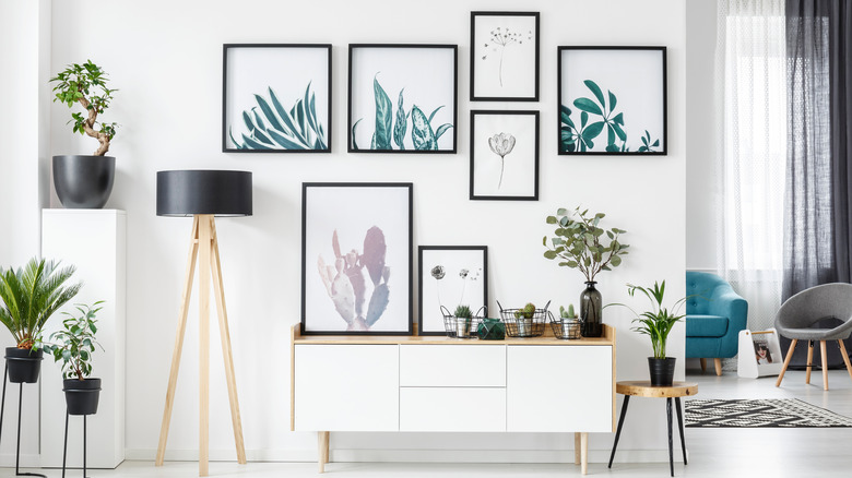
Frame It Easy emphasizes the importance of choosing the right sizes. Many choose to include one large frame as the focal point with smaller pieces surrounding it. Or, a grid style could be created with uniform frames and equal spacing. It all comes down to your specific preferences. American Frame also points out that different frames will create a casual look while using all the same frames will create a more formal appearance. For an extra casual wall, mix different types of art together, per Construction 2 Style. While some pieces could be framed, others could be canvas paintings. Also, mix orientations by placing some horizontal and some vertical.
Be sure to measure
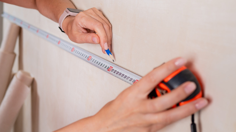
You'll need to measure both the wall and the space between the frames before hanging. Sarah Baeumler suggests beginning with 2 inches between each frame and expanding if needed, per HGTV. According to Construction 2 Style, pieces that are too far apart from each other can appear scattered or randomly placed. To create an intentional-looking design, typically leave 2 to 3 inches between each piece.
Frame Bridge explains how to measure the wall to find what size frames you need in a grid design. To do this, divide the width of the wall space by the number of frames you want in each row across, remembering that 2 inches need to be between each frame. For instance, a 40-inch wall with three pictures across will have 12-inch picture frames. To do the math, subtract 4 inches (the space between each of the three pictures) from 40, then divide by the three frames.
Pick the layout
There are many different layouts to choose from when designing a gallery wall. The most uniform look will come from a grid design, where all the frames are the same size. For more intricate designs, you could use multiple different frame sizes. Family Botanic outlines three popular choices. The first is the butterfly look, with one large piece in the middle and two smaller pieces on either side, one on top of the other. Or, you could choose a diagonal design, which has one large piece in the middle and three pieces scattered around it on either side. A double family tree design will have two smaller pieces on top of one another in the middle, then two large pieces on either side and two smaller pieces on the very ends.
To choose which layout will work best for your space without damaging the wall, you could use paper, per Frame It Easy. To do this, cut pieces of paper to match the size of each of your frames, then tape them to the wall in your desired design. Similarly, Sarah Baeumler recommends laying the pieces out on the floor to see how they will look in a specific style, per HGTV.

