Breegan Jane's Top Tips For Designing The Perfect Accent Wall
Breegan Jane says that being bold and trusting your design chops takes practice. She shared with Architectural Digest that her confidence and willingness to experiment have grown along with developing her craft. It seems a little daring has been a good thing for the interior designer, brand partner, and lifestyle blogger. We get to revel in the rewards, too – spaces with vivid color and pattern mixing that Jane uses to evoke an emotional response.
Playing it safe might require as much energy of the HGTV star. (Did we mention she is a designer for the series "The House My Wedding Bought" and the reboot of "Extreme Makeover: Home Edition?") Jane explained on her Instagram page that good designs — neutral and simple, even more so — necessitate her methodical 6 P's process: "Proper prior planning prevents poor performance." It's almost hard to believe the degree of consideration in the dynamic spaces she pulls off.
HGTV featured a tour of Jane's 3,000-square-foot renovated L.A. home and described the results as inspiring, inviting, and glamorous. She employs a scheme of global prints, high-contrast black and white, and luxurious textures throughout. Strategic pops of color, like a sunny yellow coffee table and turquoise bar stools, add a sense of impulsiveness and levity. Whether creating rooms for a TV family or her own, Jane brings earned expertise and her signature style. Let's look at how she approaches one of the easiest and least expensive ways to impact a space: the accent wall.
Cheerful and comfortable
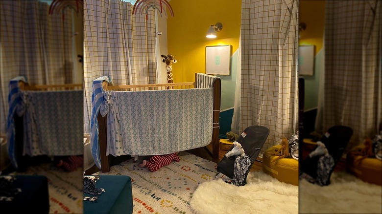
Breegan Jane created a vibrant nursery for her "Extreme Makeover: Home Edition" cohost and friend, Jesse Tyler Ferguson, and son Beckett. The designer paired with home décor retailer Pottery Barn to kit out the fun, gender-neutral space Ferguson shared with People. He wanted the room to have bright color and a cheerful, whimsical feeling, and Jane delivered. A striped aqua, teal, and yellow vestibule draws you forward into the space, which opens to palate-cleansing white walls and dark hardwood floors. On one wall only, an oversized, graphic pattern is painted the same yellow and shades of blue-green. Jane told Travel and Leisure teal enchants her as it reminds her of the sea.
According to Architectural Digest, Jane weighs several factors before beginning an accent wall design, including the room's size, shape, and function. She also leans heavily into the concept of story, considering what's important for the space to convey and to the people who live in it. The goal was for Ferguson's project to be joyful and comfortable. Jane believes that to be both, any loudness created by an accent wall needs to be offset by other elements; the overall design should be plotted before painting begins. In a balancing act, the rainbow-striped entryway and accent wall distribute the color weight evenly. Most items in the room are kept light and neutral, including a white crib, a cozy area rug, and rattan hampers.
Glamorous and functional
Regarding patterned accent walls, Breegan Jane relayed to Architectural Digest that sometimes she goes out of her comfort zone to attempt new complements of color and print. With each project, the combining becomes less daunting. If she is utilizing texture or pattern, Jane has to take care to afford the opposite space with as much attention. She admits there is no tried and true formula but rather a different juxtaposition of elements within each design that serves to balance one another. In an interview with Travel and Leisure, Jane explained that décor, artwork, and furniture can create a focal point in response to an accent wall; she prefers light furniture for a modern aesthetic.
In a Beverly Hills fine jewelry store, Jane designed a chartreuse wallpaper hand-painted with peacocks and butterflies. The delicate pattern and saturated color are countered by pale gray millwork, while brass lighting fixtures, glass display cases, and mirrors subtly continue the glamorous theme. The wallpaper pattern was developed further into packaging and other applications for the boutique. According to Jane, a powerful purpose of design is that it can tell people about your brand with just one look.


