The 2 Design Elements Battle On The Beach Pros Say You Should Always Harmonize
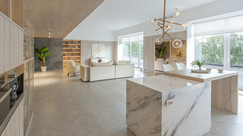
Season 2 of HGTV's "Battle on the Beach" has three teams competing to renovate beach homes in Surfside, Texas. In a recent episode, judges Sarah and Bryan Baeumler, who starred on HGTV's "Renovation Island," remind us that walls and ceilings need to complement one another, per Realtor. Thankfully, the days of white-painted popcorn ceilings are gone. Instead, design trends on ceilings range from shiplap, contrasting paint, adding molding, and exposing beams.
Sara Baeumler notes that one of the competition teams applied shiplap in a vertical pattern on the wall behind a bed and then brought it up onto the ceiling horizontally, which she felt did not make for a solid design look. With another contestant, she pointed out a bold paint color used on only one wall would have had a better overall design aesthetic if the ceiling had been painted the same color. To create harmony in a room, Baeumler points out that the design elements used on the ceilings and walls should work together.
Your ceiling is a fifth wall
The ceiling can be considered your "the fifth wall," according to Hogan Design & Construction. That's not to say that there is anything wrong with leaving your ceiling painted white. Thinking about your ceiling as another wall allows you to consider it as part of your design. While all design is personal, there are some elements of design that can help you achieve the aesthetic that you want.
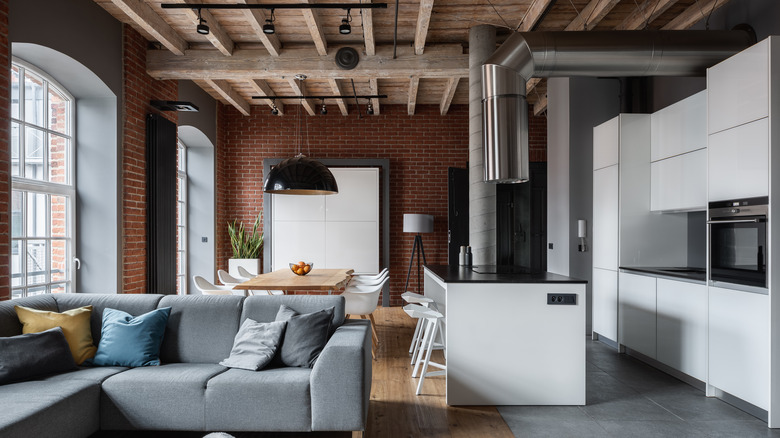
Renowned interior designer Candice Olson suggests using paint a couple of shades lighter or darker than the color on your walls for the ceiling to create a tranquil vibe. In the photo above, you find a modern, urban vibe comes from combining grey, white, and black with wood and metal, per Olson, and in this case, the red brick of the building. So, as you are designing your rooms, look up and include the horizontal wall above your head!

