The Best Blue Paint Shades At Home Depot
We may receive a commission on purchases made from links.
Painting is one of the quickest, surest ways to change a room, per MyDomaine. It's a project any skill level can handle successfully with helpful tips and preparation, and the assurance that mistakes can be painted over is a confidence boost. Trying out a trending shade or replicating a designer space feels well within the realm of possibility, while classic and timeless colors are always a go-to for their ability to endure and complement home decor. Blue is one such color. According to House Beautiful, it can be atmospheric, soothing, or full of vitality depending on the tone and sways from modern to traditional style or somewhere in-between. In addition, the outlet explains that blue harmonizes with an incredible assortment of other colors, woods, and metals. Painting service SurePro notes that it's a calming and comforting choice, perfect for creating a space that makes us feel nurtured and safe. Aside from any logical reason, we're just drawn to blue. Per Artsy, it's the world's preferred color; the art marketplace explains that we have overwhelmingly positive associations with it: clear sky, fresh water, and our favorite pair of jeans.
MyDomaine asked The Home Depot's Director of Trend and Design, Sarah Fishburne, to share their top paint choices for an impactful interior transformation. Not surprisingly, three were blues (of only seven non-neutral options); Fishburne relayed that blue is appropriate for any room in the house, and Better Homes & Gardens calls it a refreshing neutral. Read on to see which blue shades are the best of the best.
Moonglass
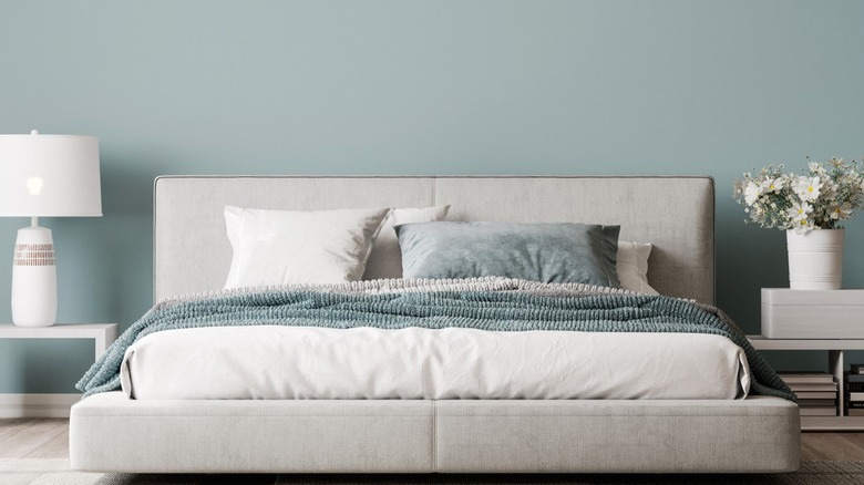
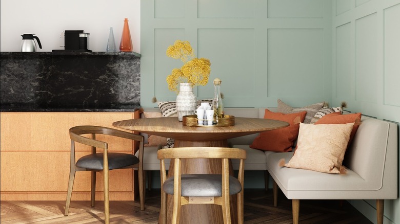
Sarah Fishburne chose Moon Glass by Behr, a soft and subtle aqua reminiscent of sea glass. It's similar to the paint company's Color of the Year 2022, Breezeway, but with a little more vibrancy. According to Better Homes & Gardens, this type of color conveys a historic tie-in that gives a home character; that could be why Fishburne recommends it for trim, doors, and ceilings, as well as walls. It's also lovely for cabinetry and millwork. Urban Raincoat by Behr (a near shade is featured in the first slide) was the other pale blue chosen; Fishburne noted that it shifts from blue to gray in answer to surrounding hues in the space. It could serve as what they call a signature or anchor color that appears throughout the rooms to create design cohesion.
Better Homes & Gardens notes that light blues are suitable for all rooms and, because of their clean airiness, recommends them for kitchens and baths. However, they caution against versions that skew powdery or sweet, suggesting that grayed tones provide counter to those qualities. The outlet says light blue mixed with white is a chic and current take on the timeless navy and white combination, or it can be earthy and bohemian when paired with the opposing warmth of rusts and ochres. These blues are serene, relaxing, and easy to be in.
NYPD
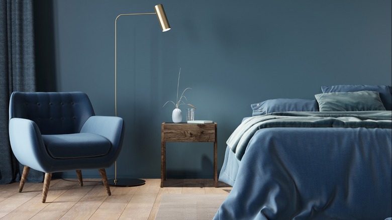
Last but not least is an inky and moody blue by Behr named NYPD. The dark tone can feel casual or formal, according to Sarah Fishburne. It can also be a springboard for white furniture and colorful artwork or a rich backdrop for warm wood. According to House Beautiful, deep blues are ideal in small spaces as they enhance a sophisticated and intimate feel. In addition, the dreamy shades are tranquil and calming — per Better Homes & Gardens, navy blue is most frequently described as relaxing.
While it would seem that these shades are too bold and saturated to have mass appeal, real estate brokerage, Sold cited that dining rooms covered in dark blues have shown to increase home values. Interior designer and real estate stager Taylor Spellman was confident recovering a homeowner's Tudor living room in a bold cobalt blue in an episode of her Discovery+ series "One Week to Sell." So if you're considering a deep blue for your walls, go ahead and dive in. You can always repaint.


