How To Style Your Home Inspired By The Harry's House Album By Harry Styles
With three songs sitting on Billboard Top 100 list, Harry Styles' newest album, "Harry's House," is proving to be a hit across all media platforms, full of dreamy soundscapes and tunes ranging from groovy jams to heart-wrenching ballads. The album's strength comes from Styles' lyrical prowess as a musician, not to mention his presence both on stage and in person, which has brought together a fan base that connects through community and great vibes, according to The Conversation.
Each song off the album gives a strong energy, so powerful that if you were to visualize its meaning, it would be more than enough to materialize into a design look. From the themes expressed throughout the album to Styles himself, who GQ called "one of the best-dressed men in the world" with incredibly elegant, bold choices, there is plenty of inspiration to pull from to create your own aesthetic based on the world he creates through music. If you're looking to capture the vibes of "Harry's House" in your own home, these suggestions are key to bringing these concepts and themes to life.
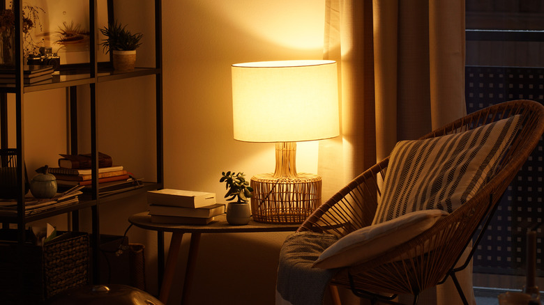
Lighting is everything — make it stand out
If you could pull one word to describe "Harry's House," it would be "mood." This mood fluctuates based on the tempo, subject, and instruments used, from the soft melodic tone of the song "Boyfriend," to the jazzy, upbeat song "Music for a Sushi Restaurant." Being able to create specific moods within your own space is thrilling, though seemingly daunting at first. But a great way to play with the mood of a room or home is with lighting.
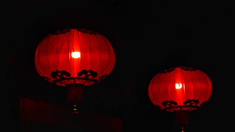
From color temperature to brightness and layout, enhancing the mood of a room will make a space more unique, even dreamy. Let's start with temperature, which can be better seen through colored lights. According to Shoreline Painting & Drywall, different colors can affect your or the room's mood differently. Blue hues or cooler tones can help with relaxation and even help with focus. Warmer tones such as white or yellow shades are better for rooms where you want to engage in lots of activity, like the kitchen or dining room. Depending on the room's function, keep this in mind when picking lighting pieces, be it a lamp or string lights.
Darla DeMorrow, a home designer, tells Realtor that mood lighting is best achieved when it comes from different levels and layers throughout the space. "Uplighting from the floor, lamps at varying heights, and lights on crown molding are all great considerations," she says. Various lighting displays create visual texture that makes a room more energetic or comfortable, depending on what you're going for.
Red makes more than one statement
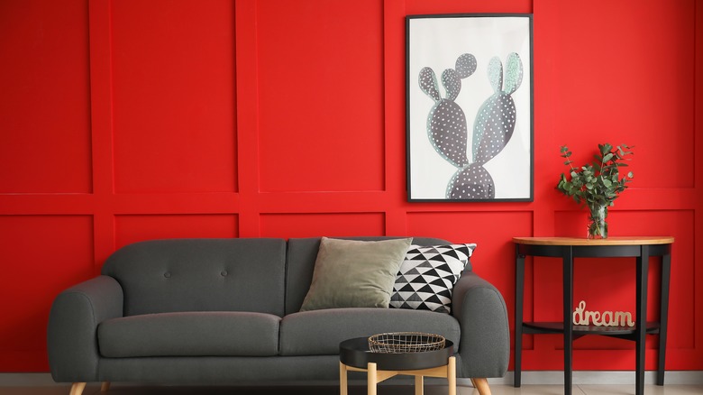
Love, lust, power — which color do these concepts make you think of? The color red! Red happens to be a powerful message carried throughout "Harry's House," appearing in songs such as "Grape Juice" and "Love of My Life." When it comes to the color red, the body endures psychological and physical responses when seeing it. According to the London Image Institute, red is associated with strong emotions and is meant to attract the most attention. Red is also energizing and exciting, often giving people confidence or motivation. All these can be said about "Harry's House," and when used in a design, it can be seen as energetic, powerful, and even masculine.
Because of the range of emotions it connects with, red can be interpreted in different ways just by being included in different home spaces. Foyr, for example, notes that in an office, the color red can be associated with feelings of leadership, focus, and ambition, whereas in the living room, it can inspire friendship and fun conversations. When utilizing this color, combine red with calmer tones such as neutral whites, beiges, or yellows to harmonize the space and create balance.
If red doesn't satiate, a rainbow palette will do
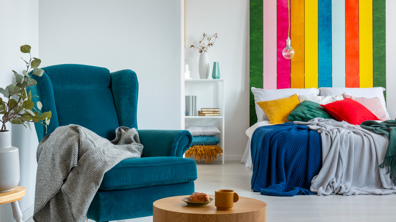
This might seem bold, but let's face it: Everything about "Harry's House" is bold. The first few lines of the song "Keep Driving" sing, "Black-and-white film camera / Yellow sunglasses / Ashtray, swimming pool," invoking a collage of bright, colorful, and fun images. So many songs on the album bring up images or dramatic moments full of color. That said, when using "Harry's House" as design inspiration, don't be afraid to go all out with color.
According to Sukhi, research concludes that the standard seven-color rainbow helps people relax, relieves anxiety, and boosts confidence. For a design layout, if a total rainbow seems a bit daunting, you can just pick a palette that is wide in range and as vibrant as you'd like. Designers at Stoneside Blinds & Shades recommend using a matching color scheme if you're especially interested in playing with lots of colors. Use the color wheel to see which ones match — start with one hue you especially like, and then choose between three to six shades on the right and left of it.
Embrace maximalism in your space
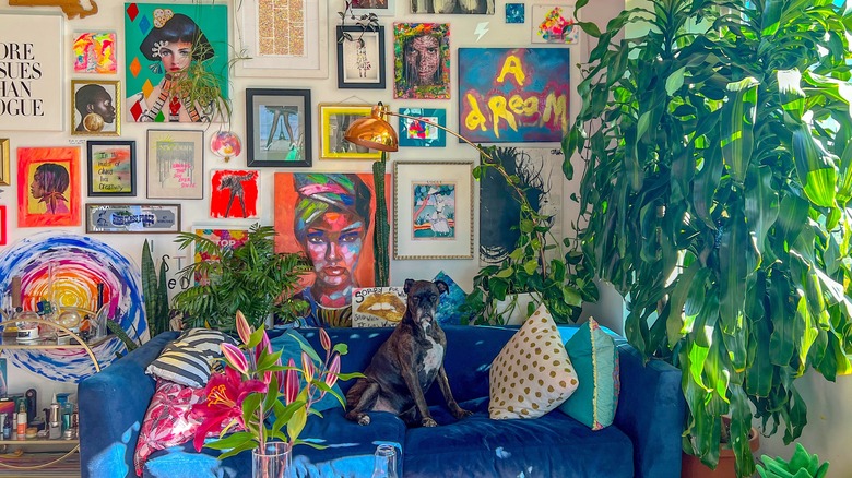
Boldness in color is a bit easier to materialize if there is a style that already embraces its use. And as noted, "Harry's House" is not afraid to reference color. Maximalism is the perfect interior style to demonstrate this adventurous use of color, and helps solidify "Harry's House" as the main design theme.
Though minimalism has had a profound impact on interior design as of late, some people prefer its exact opposite: maximalism. Diana Budds, a senior story producer at Curbed, tells Vox that minimalism is hard to live with. "These homes are impossible, they have no signs of life ... I just don't think that most people can live like that." But what is maximalism at its core? Keren Richter, an interior designer at White Arrow, told Vogue that it is the "art of more-is-more," highlighting "layered patterning, highly saturated colors, ample accessories, and art ... a real sense of playfulness and bold gestures."
The true beauty of this style is that it almost feels like playing dress-up in your favorite costumes or themed outfits. A moody Gothic Victorian home is as much maximalist as an all-out Memphis Design-styled space. As long as the colors, textures, and patterns are well balanced, and there is little to no space on your walls, it can be quite simple to bring maximalism into your home.
Vintage elements will showcase the groove of 'Harry's House'
One listen-through of "Harry's House" will showcase some powerful soundscapes, some of which allude to previous decades of music, from '70s disco to '80s synth. Styles himself has worked to incorporate more vintage into his own fashion, even working with Gucci to create a collection that highlights 1970s pop style, according to W Magazine.
If vintage fashion or styles also appeal to you, the best way to showcase them in your interior style is through vintage elements. What's great about doing this is that there are many ways to arrange and rearrange vintage accents, as there are no limitations to what goes with what if the eras highlighted are varied. As Kelly Wearstler tells Homes & Garden, "If you buy all your furniture new it's going to start to look dated quickly, but if you take the time to curate and shop in a variety of places, you end up with a much more timeless room."
The best way to do so is to use what you like. Pick lighting, furniture, or textiles that speak to you, as their charm will make you more confident when finalizing the space. Designer Henriette von Stockhausen agrees, noting, "Often the more contrived and forced an interior is, the less successful it is."
Emphasize curved lines and spherical accents
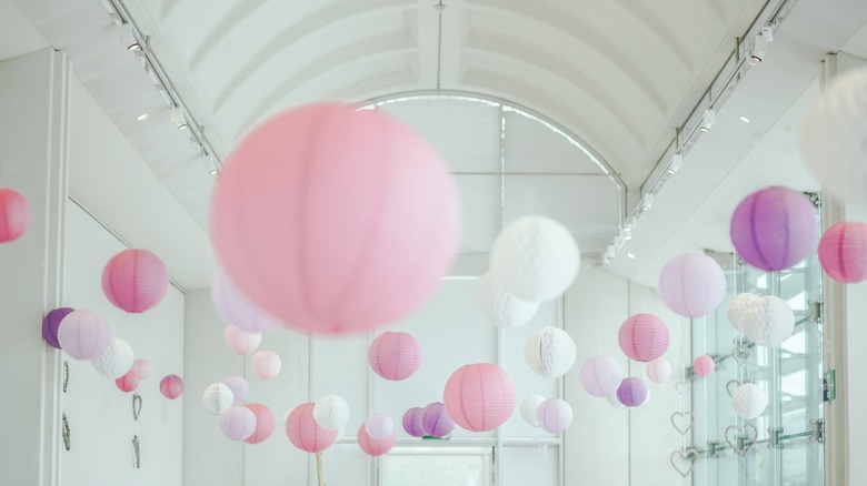
Though a house might consist of straight lines and clean edges, "Harry's House" as an album flows from one song to another fluidly, and carries similar themes until the end. You can represent the fluidity and easiness of the lyrics with curved lines or accents with round edges. And though what we find aesthetically appealing is subjective, there is evidence that shows curves and circles are found to be beautiful on practically a chromosomal level.
According to Smithsonian Magazine, scientists found that gentle curves, as opposed to edges or sharp points, are more appealing, even so far as creating stronger responses and increased activity in the brain when observed. This was thought to be based on the notion that curvatures are more relative to living organisms. Other research suggests that people find circles beautiful because of the shape of a human face, according to Science Focus. A disposition toward round shapes can be rooted in the idea that human faces and emotions are expressed through simple, usually rounded shapes.
Evidence aside, curves also offer interesting visual texture in design. This can be demonstrated in many ways, from the shape of your furniture or pillows to the style of frames hung on the wall. Curves also can mean more freedom with your space since there are no corners to measure or line up.
Show off your favorite nostalgic memorabilia
Nostalgia is a powerful theme and a great tool for creativity. In fact, according to Fast Company, several studies show nostalgia can bolster creative thinking. Educational psychologist Jonathan Plucker even notes that nostalgic memories give people information that is very different from what is happening in the present, granting inspiration from the past. Much of "Harry's House" is spent sifting through nostalgic memories, which creates a larger resonance with fans and makes it even more artistically interesting.
Nostalgia has also become increasingly popular as a design aesthetic. As Natasha Usher, founder of an interior design and architecture firm, tells CoBo, the comfort drawn from nostalgic design is from the history behind it. "The familiarity of the past makes it personally more relatable to people, which makes it easier to visually appreciate the design or piece," she says.
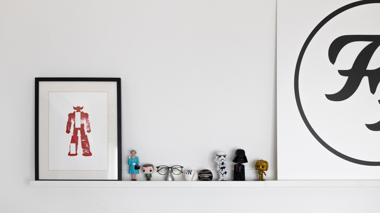
Rather than keeping your favorite memories locked inside the mind, displaying memorabilia from the past or present is a great way to showcase what makes you happy or feel nostalgic. Display these items in a designated area, like a wall if it's art or a bookcase for smaller items.
Upcycle accent pieces to add in a little freak
"Little Freak" is a song on Styles' newest album that discusses someone who might be a little messy and chaotic but still deserving of love altogether. Though usually a negative connotation, the word "freak" gains new meaning in this song. You can easily do this through interior design.
While it might be hard to believe, "ugly" has found its way into mainstream interior design. Similar to maximalism, which can seem almost chaotic at times, ugliness is embraced thanks to its stark contrast to minimalism and its shortcomings. As Jonas Nyffenegger and Sebastien Mathys, founders of the account UglyDesign on Instagram, tell Repeller, "Everything starts to look alike and people want and need more eccentricity and fun. Ugliness or maximalist is a cool theme because it is fascinating and much deeper than minimalist. Possibilities seem endless."
Ugly or freakish items can also find a place in an eclectic design space, which is a diverse yet curated combination of different aesthetics, according to MasterClass. Perhaps it's a garage sale lamp with intricate details that's in a slightly obnoxious color, or a chipped piece of furniture that deserves a second chance. Add it to your aesthetic, and you'll be channeling Harry in no time.
Use photographs to bring family back home
Another powerful song on the album is "Matilda," which pulls on heartstrings by discussing growing pains and the idea of chosen family, with nods to the classic story made popular by the '90s film. Showing off your loved ones is a great way to add comfort and warmth to your home. Decorating with photographs and displaying loving family moments is a great way to add them into your design, with deeper benefits in the long run.
According to SvenStudios, there are several psychological benefits to including family photos in your home, including boosting self-esteem by knowing you belong, as well as strengthening your chosen family unit altogether. And as noted by Style by Emily Henderson, there are many ways to organize these photos to fit your style. Large images work better with more scenic shots, which is great for family vacation photos or something taken with a wider lens. On the other hand, smaller frames are perfect for smaller moments. Family photos are also one of the easiest ways to tie in multiple elements from "Harry's House," from utilizing colorful photos, vintage frames, a circular collage — anything eclectic and fun, with heart and family at the core.
Highlight travel and destinations in your decor
Styles not only highlights many cities and locations throughout "Harry's House," but also points out how traveling and leaving home have impacted his life and relationships. For those who value trips taken or yearn to go further and farther, a great way to scratch the travel itch is to make these trips part of your home's decor.
Many designers work with clients who travel extensively and want to bring spoils home, even when these spoils are purely feelings. Carol Kurth, a principal of Carol Kurth Architecture + Interiors, tells Forbes that some clients have asked to "emulate the feeling" of a specific destination or hotel they traveled to. While this task might seem difficult at the onset, there are many ways to create this feeling or find a balance between home and abroad in one space. One way is through keepsakes, according to Kurth. "Sourcing keepsakes from travel is an incredibly personal connection, so I encourage clients to acquire things that move them and create a thread to that experience."
"Designing a home inspired by places you've traveled works the best when you create an overall mood to the room," Shannon Wilkins of Prairie Home Styling tells Mansion Global. You can do this by using colors, textures, artwork, and rugs. For a more on-the-nose approach, utilize globes, maps, and even photos of these destinations to put yourself into the space.
Incorporate fun, yet obvious motifs
With songs like "Music for a Sushi Restaurant," "Matilda," and "Cinema," this album is practically begging for some fun, on-the-nose pieces to represent it in your interior design. Mixing motifs into your design is usually a way to break up the monotony of a basic layout, but nothing about these style choices is basic.
Motifs in designs can seem a bit too whimsical, but with such eclectic, maximalist sensibilities of this type of space, whimsy alone can almost seem tame. Designer Tritia Gustine tells San Diego Home Garden Lifestyles Magazine that she got her start by mixing motifs in kids' bedrooms and that the level of whimsy should not just be for children. "It can mean the difference between a room that looks custom and one that looks like you ordered it out of a catalog," she says.
Accents like these work great if grouped together like collectibles, which can easily be worked into a design layout. Designers have all sorts of tricks when laying out collectibles, from creating visual layers with color and patterns, to transforming these pieces into art by creating a museum-style gallery (via Southern Living). Throw in some sushi or Japanese accents, or decorate with Matilda's iconic red ribbon somewhere in the room. You can also make a whole wall old Hollywood themed to shout out "Cinema." The possibilities are quite unlimited, so have fun with it!
Show off your wild side or a strong feminine presence
Harry Styles as a musician often blends the lines of feminine and masculine energy in many facets of his life and career, as per Blendtw. Styles' has even said, "I think there's so much masculinity in being vulnerable and allowing yourself to be feminine, and I'm very comfortable with that." Vulnerability and femininity are strongly demonstrated through "Harry's House" by its tones and subject matter. A great way to honor the album through your interior design style is to embrace femininity, perhaps with an added sense of wild or boldness to further demonstrate its strength.
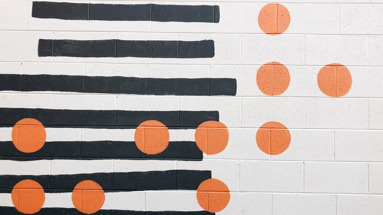
A great way to approach a room or home is to start with a balance between masculine and feminine details. MHM Professional Staging suggests balancing several key features of the room — including furniture, accessories, color, and patterns — and then finding where you want to contrast feminine and masculine pieces. For example, when it comes to patterns, geometric shapes with harsher lines appear more masculine as opposed to florals or dotted patterns that are thought to be more feminine. You can showcase one print on top of the other, or balance stripes and circles throughout. To turn up the wild factor, use color to express emotion in brighter hues or more saturated tones.
Keep spaces open to entertain
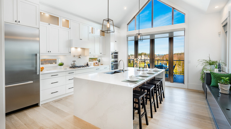
"Harry's House" often describes, within its songs and lyrics, scenes of parties, dances, and just places that invite a cast of characters. Through a designer's lens, you can interpret this kind of energy by earmarking spaces in your home to entertain. If your home allows, make larger rooms as open-concept as possible with space to gather without being too crowded. Also, think about the flow of the room. According to American Financing, creating a smooth connection between rooms allows guests to move easily and freely around the home, even if the space isn't as large as you'd like.
Another feature not to overlook is seating, and lots of it. Larger pieces like sectional furniture or chairs can create spaces within spaces, ideal for giving guests a chance to flock around to different groups and conversations. Baird & Warner also recommends adding comfortable seating in the kitchen, a room houseguests will naturally gravitate toward. Fitting your island with stools can make the kitchen a great central sitting area.
Don't forget intimate little spots to cozy up
With larger spaces, make sure to also allow for balance by including smaller corners or areas to cozy up. Much of "Harry's House" feels like conversations had amongst loved ones, which, if reimagined, should be held somewhere a bit more private. Experts at Circle Furniture say there are many ways to break up open spaces without making them feel cluttered. Design consultant Anne Bugatch says to "flip locations" of different rooms to give your spaces a more intimate feel. "Some open floor plans do not designate a living room or dining room. So being creative with the placement of furniture can help with creating coziness," she said. "Maybe the dining table was too small for the 'dining area,' but when it was moved up to a window in a smaller part of the open floor plan it gave the dining table a more proportionate space to reside in." Another suggestion is to add dividers like screens or open bookcases, which let you peer through to the space they're separating, making it feel open but sectioned off.
To make these smaller areas feel cohesive, use small, quaint accent pieces like plants or foliage. Skift suggests bringing the outdoors inside can make these areas feel more enclosed. You can also do this with rugs and mats as a visual separation of one flooring texture from another.


