How To Decorate Your Home Like The Early 2000s
We may receive a commission on purchases made from links.
The early 2000s are the latest era to make a return to what's trendy now. From cargo pants to butterfly clips, Y2K has made a comeback. Though many may look back on this era and remember things like fashion styles and pop culture moments, there also were decór trends that we saw throughout early 2000s homes. As VELUX reflects on, we've come a long way from what was popular in home decór at the time. Compare early 2000s living rooms filled with dark heavy wood furniture and kitchens decorated to feel like a Tuscan villa to the more light and breezy styles of today, and it's understandable why we diverged from what was on-trend at the turn of the millennium.
And yet, the style of that time isn't all bad — it's just in need of a fresh, new approach. If you're feeling nostalgic for early 2000s decór, but don't want your home to feel dated, we've got just the tips for tackling these trends in a much more modern way. (Yes, we're even tackling lime green wall paint.)
Shabby chic
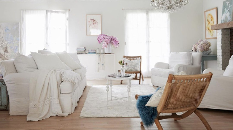
Shabby chic walked so the farmhouse style could run. Though the two styles have some crossover in terms of both being on the more rustic and lived-in side, shabby chic is certainly a style all its own. Decor Outdoor says this early 2000s popular aesthetic gives a "French country" vibe. It's known for soft and light colors; distressed, vintage-looking furniture; simple and comfortable fabrics; and even antiques. What made this style appealing was that it merged together both rustic and refined vibes — it carried with it the romanticism of European countryside living.
To embrace shabby chic today, go for white walls, neutral colors with pastel accents, and unique vintage finds. Focus on the little details spread throughout your home, rather than having a large statement piece. Shabby chic should feel breezy and effortless, but convey a sense of beauty. And don't forget that everything should be comfortable, too!
Tuscan style everything
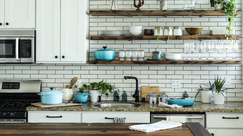
How could anyone forget the Tuscan style that had a chokehold on kitchens and bathrooms all throughout the early 2000s? As Wayfair breaks down, it was characterized by rich brown wood, iron and aged finishes, terracotta, and natural stones ranging from travertine and granite, to sandstone and limestone — all of which were finished with minimal sheen. It was rustic and a little ornate, dark but still warm and overall inviting. It was meant to look like a villa in Tuscany — and there are certainly worse places to emulate.
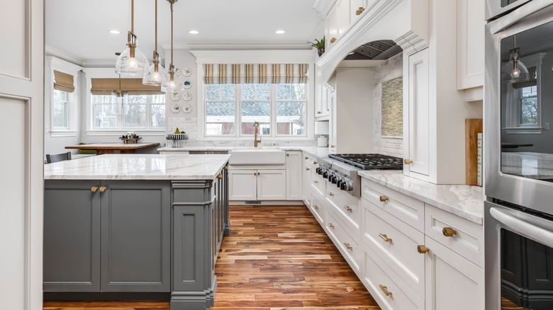
The thing with the Tuscan style of the early 2000s is that it now feels a bit too heavy-handed and dated. To make it more modern, think lighter colors and less clunky, ornate furniture. Paint the walls a soft white, and opt for cabinetry with sleek lines rather than carved detailing and raised edges. Less is more, which is pretty similar to the modern approach to shabby chic.
Lots of brown
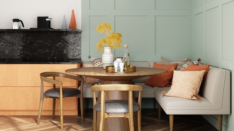
Dark brown was everywhere in the early 2000s. There was heavy brown furniture, brown bedding and curtains, dark wood cabinets, and even brown wall paint. Following this millennial era, interior design trends took a major step back from this chocolate hue, but now brown is trending again, but of course in a much more modern way.
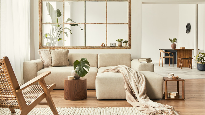
According to color psychology, brown conjures a sense of calm groundedness accompanied by strength and resilience (think of the trunk of a tree that's hundreds of years old). Therefore, it makes sense that people would gravitate towards brown for their home — those are some great qualities to have. "My motto is always brown, never gray," interior designer Jake Arnold told Vogue. "Shades of brown bring about warmth, earthiness, and calm that feel timeless and grounding." The way to incorporate brown now is by channeling warm minimalism. Whereas typical minimalism can make us think of an almost barren environment, warm minimalism incorporates nature in a way that doesn't overpower it. Arnold continues, "It provides a lovely complement and base for other pops of color in a space."
Green walls
While some people in the early 2000s painted their walls brown, others went for lime green. A bold choice, we know. Unless you want to go all-in and paint your walls with the ultra-bright hue, then let us help you tackle green walls in a modern way.
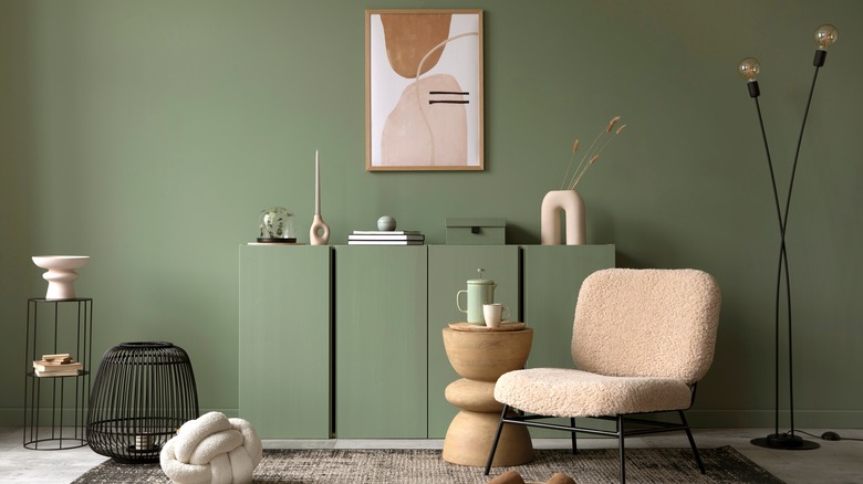
The key is to go for more subtle, muted, and earthy green tones, whether you're feeling a calming sage or a statement-making teal. If you're looking for some examples of these 2022-approved greens, turn to the professionals. Designer Rozit Arditi told Architectural Digest, "I love the Largo Teal from Benjamin Moore because, while it is a bolder color, it still has a calming undertone, and it can be used in various rooms of the house." For an earthy green, Linda Hayslett calls out Green Smoke from Farrow & Ball because it "has a very soft, tranquil quality." She continues, talking about a featured project, "I loved using it in this powder room because it brought in some of the natural elements from outside without feeling 'woodsy.' I love this perfect green because it can act as a neutral, so other elements can stand out in a room, but can also complement other colors such as gold, black, ivory, brown, mustard, plum, navy, and more."
Futons
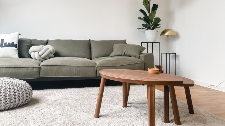
Futons served their purpose, but you can easily accomplish the same thing with a sofa bed. So, what's the actual difference between a futon and a sofa bed? As The Futon Shop explains, a sofa bed looks and feels like a traditional couch, with the mattress for the bed tucked away under the frame when it's not in use. It has both couch cushions for when it's a sofa and a mattress for when it's a bed. A futon uses the same cushion for both the sofa and the bed. They also look different too, with a futon clearly looking like, well, a futon.
There are many style options when it comes to sofa beds, so you can pick whichever one suits your home. From the compact Henry Sleeper Sofa by West Elm to the customizable Sloan Sleeper Sectional with a chaise by Interior Define, there are many ways to channel the functionality of a futon in a more modern way.
Squiggle home decór
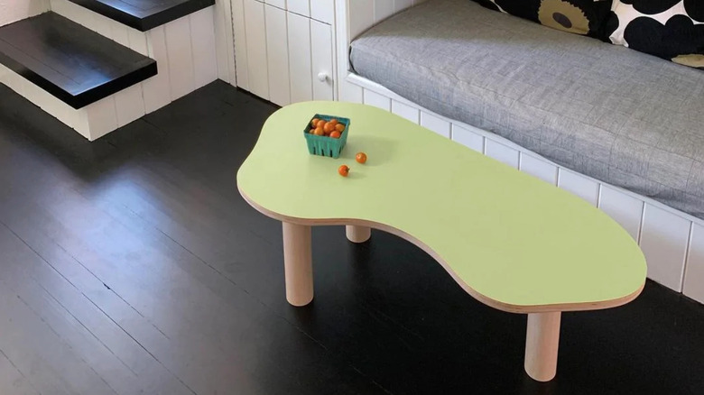
Look at a teen's room in the early 2000s, and chances are you'll see bright colors, playful accessories, and lots of movement when it comes to the shapes and angles of the furniture. In those days, no kid — or adult for that matter — was rocking a sleek, minimalist style. Now, we're embracing all the youthful Y2K vibes with the resurgence of squiggle home decór. Think candles twisted into funky shapes, bubbly mugs, and framed mirrors inspired by those made by Ettore Sottsass.
Amber Dunford, a design psychology expert and interior stylist, told The Zoe Report, "People feel more relaxed when surrounded by shapes that are curved or irregular." Gemma Riberti, Head of Interiors at WGSN, added, "There is an essential element of playfulness to keep into consideration: Squiggly and wavy silhouettes have a simple, naïve quality to them, especially when worked in pastel hues. Organic and soft, inviting and relatable: These qualities make squiggly designs the perfect accent piece to bring up a smile — definitely something consumers are in need of and will be willing to invest in (also because it can be worked at all price points)."
Fun, squiggle decór is also a great way to add in pops of color — without having to paint your walls lime green.
Lava lamps
Lava lamps have survived the decades. First reaching popularity in the late '60s, the lava lamp was invented a few years prior by a British accountant and maker of underwater nudist films (we're not joking). According to Smithsonian Magazine, he was inspired by a homemade egg timer he saw in a pub, that was made from a cocktail shaker filled with "alien-looking" liquids bubbling on the stove. He then set out to recreate the bizarre sight, using a lightbulb as the heat source rather than a stove. After the trend died down in the late '70s, it returned again at the turn of the century. Cool stuff.
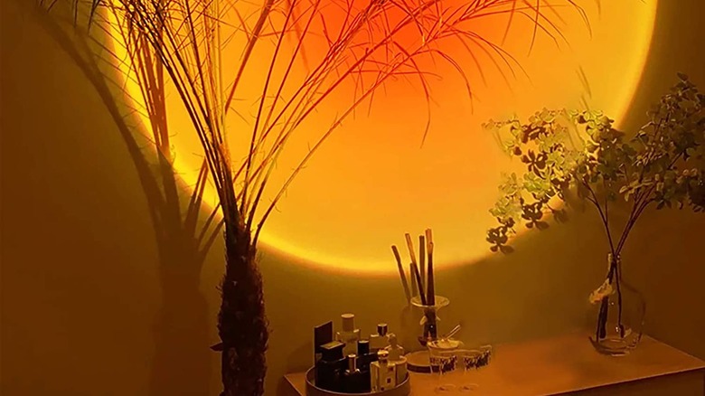
For a modern take on a lava lamp, check out a sunset projection lamp. These lamps cast a warm glow on the wall, similar to what you'd get from a setting sun. One such featured lamp is low-cost and highly reviewed (via Amazon).
Papasan chairs
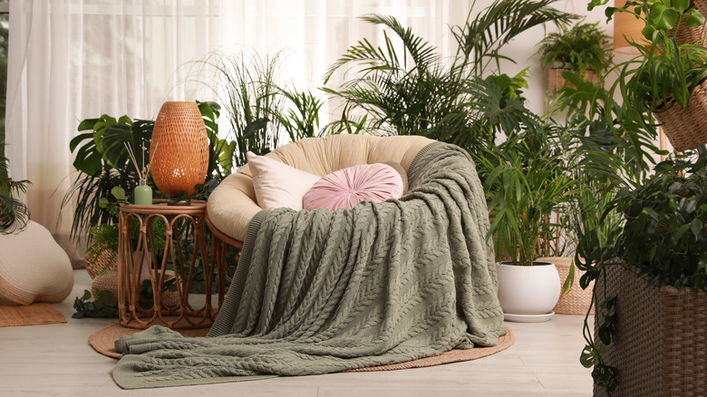
Also known as saucer chairs, bucket chairs, or even moon chairs, Papasan chairs were everywhere in the early 2000s. HowStuffWorks says they were the "it" chair to have at the time. It first became popular among U.S. military families in the '70s after soldiers became familiar with them while stationed in the Asia-Pacific, where it apparently originated. Then, Pier 1 started making them, and Papasan chairs became accessible to all. Interior designer Sarah Barnard told HowStuffWorks, "The rattan material and womb-like shape of Papasan chairs invites daydreams of an island vacation and can inspire impromptu naps. They are lightweight and easy to move about, with endless re-styling opportunities. Cushions can be replaced on a whim, and a colorful toss blanket can give an instant fresh face to a vintage chair. In recent years, saucer-shaped chairs have regained popularity, especially among boho-chic aficionados."
In all honesty, if you want a Papasan chair today, go for it! Or, for something a bit more contemporary, consider a cool bouclé lounge chair like those from CB2.
Granite countertops
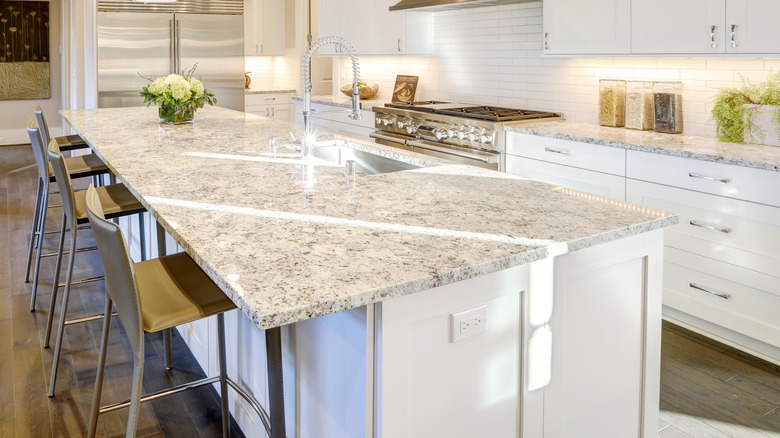
The go-to countertop choice in the early 2000s was granite. Typically, it was something in the warm, tan color family (to match a Tuscan-style kitchen), or black granite countertops with glossy white cabinets for a quintessential early 2000s look. Though these looks may be dated, granite itself shouldn't be. As Paul Batashev, CEO of Granite Selection, notes, "This natural stone outshines marble when it comes to durability. It's hardy, solid, and less porous." Batashev also touts granite's low demand for maintenance and durability.
There are two ways to approach granite scenarios you may find yourself in now: wanting to put new granite in your home or dealing with existing granite that may not be super trendy. For new granite, go for lighter, neutral tones. Think cool cream rather than warm tan. As for giving your kitchen a refresh without replacing the granite, Kylie M. Interiors recommends painting the cabinets or walls a more modern color, replacing the backsplash, and updating the hardware and light fixtures.
Oil-rubbed bronze finishes
Speaking of updating hardware, the early 2000s seemed to love oil-rubbed bronze finishes. You could catch this aged metallic look on cabinet knobs, faucets, and door knobs and handles. House of Antique Hardware explains that the finish was achieved by chemically darkening the surface to make it appear aged. Though it's not the most sought-after finish today, it makes sense it was popular at the time, especially considering browns and Tuscan styles were all the rage.
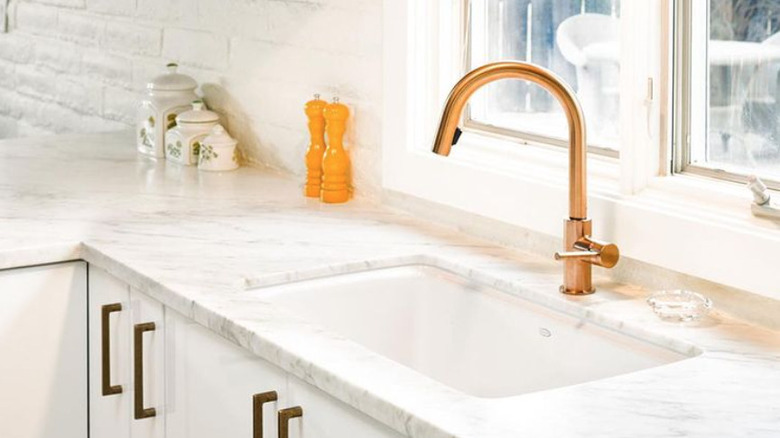
Today, oil-rubbed bronze is a little too dark. You can always go for gold, but we also recommend considering copper, which is very trendy right now. Gigi Landau-Royals, founder and creative director of design and staging firm Savill Royals, told The Spruce, "Copper, with its earthy russet tones, offers warmth and a cozy feel. Incorporating copper in your decór is a great way to bring warmer tones into your room. Unlike stainless steel, chrome, and even the high shine of gold, copper lends a warmer, softer aesthetic."
Dark, heavy wood furniture
The early 2000s were really all about brown, weren't they? In addition to brown paint and fixtures, dark wood furniture was also in. Not only was the furniture dark brown, but it was also heavy and clunky. Perhaps you or someone you knew had a massive media center cabinet in the living room for a TV and stereo, or a brown couch. All this would feel overpowering or even a little drab today, so let's look at how to pull off brown furniture in a fresher, lighter way.
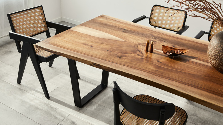
Yahoo recommends focusing on styling it with other vintage pieces. For example, pair an aged brown table with midcentury chairs, or fill your room with a variety of wood furniture from different time periods and styles. You don't want your entire furniture collection to be uniform, especially if it's all dark brown — that's when it starts to be too much. Also, you can use pops of color to brighten everything up.
Beaded curtains
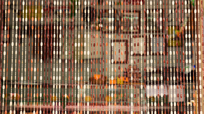
Beaded curtains were very trendy in the early 2000s. Whether you were a teenager who had a curtain made of colorful, sparkly plastic beads, or a young adult with an ultra-boho one with a butterfly on it, a beaded curtain was definitely the cool thing to have. And they can still be cool today, just so long as you approach them in a more modern way.
You don't just have to use a beaded curtain in a doorway — you can use it as a way to create some division in an open-concept room. This is great for those with studio apartments who want to differentiate a public living space from a more private bedroom area. Urban Outfitters has a great example of a beaded curtain that's more soft and subtle, and less Y2K. It can also be used to run along a solid wall as a textured decorative piece.
Accent walls
According to Style by Emily Henderson, accent walls were a big thing in the early 2000s because they allowed you to make a bold style statement without committing to taking the risk on the entire room. While this trend may not be in style anymore, we understand the concept behind it and believe there are ways you can still accent it up today.
Style by Emily Henderson continues to give some great pointers, like choosing an accent wall based on an architectural feature, rather than just a random wall. Paint around a brick fireplace, or a breakfast nook. Another approach is to use built-in cabinetry as the accent, painting those a fun color instead of the wall. Or, use a gallery wall as your accent. Sure, it's not paint, but it's definitely a statement. Style by Emily Henderson recommends mapping out your art prints and decór on the ground before you start adding holes to your wall. They also suggest starting with the biggest pieces and building from there. And don't forget to mix vertical and horizontal orientations.
Glow in the dark ceiling stickers
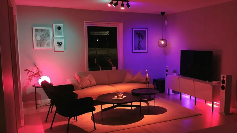
Glow-in-the-dark star stickers may have been awesome when you were a kid, but they're probably not what you want above your bed as an adult. (If you do, though, no judgment from us.) For a more mature way to add whimsical, decorative lights to your home, explore the world of LED lights.
By LED lights, we're not talking about the rope lights you see teenagers posting about on TikTok. The Philips Hue collection includes everything from light bulbs and pendant lights, to floor and table lamps that light up the surrounding walls. They're all Bluetooth compatible, which gives you the freedom to choose the color you want, even if it's just a bright glow reminiscent of those glow-in-the-dark stickers from your childhood. Our favorite thing about being able to control the light in the room is that you can adjust it to match whatever mood you're feeling at the time.
