The Ultimate Guide To Neoclassical Decor
Neoclassicism is an integral style in interior design found throughout different points of history. According to OfDesign, neoclassical design originated in the late 1700s and was made popular in modern times by Robert Adam, an English architect. Adam was known for juxtaposing different elements of Western architecture with traditional Roman and Greek elements. Today, neoclassical design is used by designers and decór fanatics to bring elegance and sophistication into any space.
Neoclassical interior design, although celebrating the revival of Greek and Roman philosophy and art, gained popularity in response to the Baroque and Rococo styles that were popular in the 18th century (via Lux Trim). Baroque and Rococo art and architecture both emphasized bright colors and ornamentation to showcase wealth (via Boise State University). Neoclassicism was seen as the exact opposite, focusing on simplicity. Neoclassical design elements can be found throughout modern design and incorporated into other design styles.
Add molding to walls
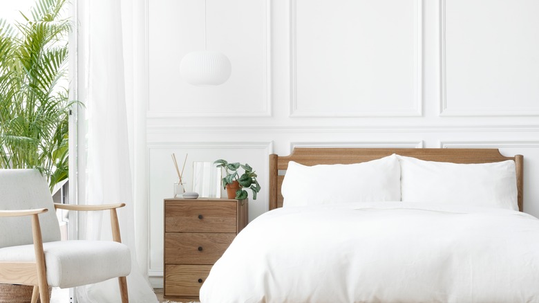
One of the key details in modern neoclassical architecture is adding decorative molding to walls. According to So Much Better With Age, wall molding adds character and depth to a room, creating visual interest and sprucing it up for a low cost.
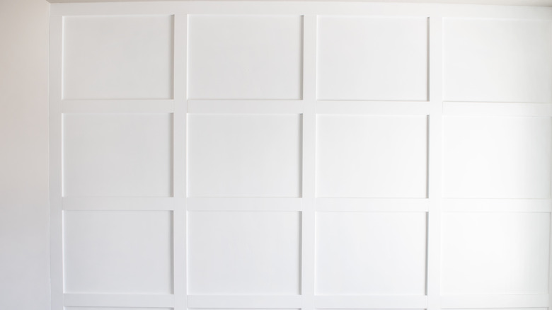
There are many different types of wall molding from which you can choose. The most common one found within neoclassical-inspired decór is applied wall molding. These accents sit on top of the wall and can be applied in virtually any shape, but are commonly applied as squares. Applied wall molding compliments homes with larger baseboards because it makes the room look monumental.
Board and batten, another common type of molding, used to be seen outdoors as siding, but it's become trendy to incorporate it inside. This molding uses narrow strips of wood and places them over joints of wider boards, creating a layering effect (via Kaycan).
You can also install raised panel molding, which is similar to applied wall molding. Instead of just the molding being raised, the entire panel is raised off of the wall.
Use muted colors in the room
One of the characteristics that makes neoclassical decór so popular is its simplicity. Unlike Baroque and Rococo, which are colorful and bring a lot of attention to themselves, neoclassicism focuses on simple beauty and small details. Instead of loud colors, neoclassical decór uses a neutral color palette.
According to the Nazmiyal Collection, neoclassical colors tend to be off-white, cream, grays, yellows, and other muted hues. Accents are commonly red, black, silver, or gold, and patterns are low-contrast and neutral.
Before you decorate a room, you should always come up with defining colors that will be used throughout the entire space (via Hey There Home). To ensure that a home flows well, designers recommend using a limited number of colors in the palette and incorporating them in different ways in the space. In neoclassical homes, you may want to incorporate the same shade of off-white on your walls, while playing around with different patterns and colors within your color scheme.
Decorate with exposed wood and metal
According to the Nazmiyal Collection, a common attribute found in neoclassical design is its use of exposed wood and metal in the furniture. This detail helps provide an outline and simple elegance to pieces from this era.
When incorporating neoclassical design into your space, it is not necessary to throw away existing furniture to replace them with period-inspired pieces. Instead, you can mix wood tones, or add furniture pieces that showcase metal scrolling or wood arms and legs.
A great way to decorate with wood in an existing space is to contrast wood tones between furniture and flooring (via Ballard Designs). If the flooring is dark, add light furniture to create a layered look.
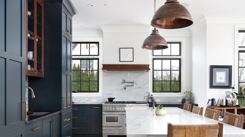
To mix metals, designers recommend grouping them based on their undertones. If you're decorating with warm metals, scatter brass, copper, and gold throughout a room to keep everything cohesive (via The Local Flea). You can also use warm metals to warm up a space, especially when it's a kitchen with steel appliances.
Grab inspiration from ancient Rome
The neoclassical movement takes its inspiration from Greek and Roman philosophy, art, and architecture. According to Decór Tips, homes in ancient Rome often had walls painted with intricate designs, and intricate mosaic tiling was featured on their floors. The furniture in the era involved chests, wardrobes, and seating areas inside the bedroom areas. Additionally, oil lamps made of metal were common decorations, along with sculptures, bowls, vases, decorative plates, and fountains.
The ceramic bust, or visage bust, is commonly associated with Rome and Greek traditional design. Nowadays, you can purchase one online or in various decorative stores in different sizes, colors, and costs, making them a very accessible neoclassical staple. To decorate with a visage, you can classically display them as the Romans did on credenzas or in gardens (via HGTV). You can also layer in visages of different sizes and materials to create a layered and eclectic look. Visages are also now available as vessels, or planters and vases. This is a great way to display flowers or decorative reeds.
Make sure your layout is symmetrical
A common detail seen in neoclassical architecture is its symmetry. This is something that wasn't very common in the 18th century, largely because Baroque and Rococo were the biggest design influences at the time. Neoclassical symmetry was attractive to people and gave the design its association with elegance.
According to Enhance Your Home, symmetry in design refers to balance that is visually weighed and distributed in a room. This is broken up into three general concepts: symmetrical, asymmetrical, and radical. Symmetrical balance refers to repeating items on a central axis; for example, making sure both sides of a couch are weighted with the same pillows. Asymmetrical balance differs from the intentional distribution of visual weight that is not balanced. This is used to make spaces feel more dynamic and layered. Radical balance centers on items weighted equally around a central point, like chairs around a table.
Use interior columns
Another neoclassical trend is using interior columns in a space. While some of these are structural, many are simply decorative. Because columns are associated with ancient Rome and Greece, they make a great staple for neoclassical-inspired homes.
Roomdsign says you can decorate columns in many different ways to blend them into different dominating design styles. For example, if you want a nature-inspired or Scandinavian space that's influenced by neoclassical design, adding in wood-based elements can bring together both designs. You can also use columns in a modern way to display art or wall sconces.
If you want to install a fake column, there are two shapes on the market, round and square (via Lushome). These columns come in three parts, and each can be customized to fit your design goals. They can also come in different materials and colors. Classic columns are often made from granite, marble, carved wood, or metal. However, to keep costs down, PVC and fiberglass are now commonly used and given treatment to look like classic materials. Adding in columns is a great way to bring architectural interest into an otherwise plain room for a relatively low cost. Interior ornamental columns typically range based on location, but the cost without labor to purchase a column is around $200-250 (via Porch).
Keep a spacious scale
In ancient Rome and Greece, homes were places of large gatherings. According to Decór Tips, many homes even had meeting areas built into them, and rooms were large and spacious. While our current rooms may not be on the same scale as in ancient times, we can trick the eye into thinking the space is larger.
Scale refers to how an item fits into its existing space, while proportion is related to how different objects relate to one another (via StoneGable). Many designers also use the golden ratio when planning out a space. This ratio, specifically 1:1.168, is known for its ability to create beautiful things and is seen throughout design and nature.
By using scale and proportion, you can make your space appear larger than it normally is. To give the appearance of a high ceiling, use smaller furniture pieces (via MasterClass). Additionally, leaving negative space on walls and surroundings helps prevent a room from looking too busy.
Make use of natural light
Natural light is an important part of any design style. According to Stewart Shafer, lighting is one of the elements that impacts a room right away and is integral in the overall design of a space.
Lighting is broken into two categories, natural and artificial light, and both work together to create a usable and beautiful space. A great way to incorporate more natural light into your space is to install more avenues for light to get out or bounce around. Roof lights are a common way to bring in more light, especially in a traditionally dark space (via Croft Architecture). You can also install solar tubes or sun tunnels into your roof, and these help intensify the amount of light that gets filtered into a room.
You can also decorate with items that reflect light, like mirrors or other metallic surfaces. These surfaces bounce light around the room without having to do major construction. You can also paint a room a light color to create the appearance of light.
Fake big windows
If you don't have large windows, there are ways to fake their appearance. According to Impressive Interior Design, you can build a fake window with a lightbox. This is commonly used in basements and areas where a window or skylight cannot be installed. If you don't want to build a lightbox, you can also install electroluminescent sheets onto your wall. Additionally, you can take a whiteboard and paste a photo of a scenic view to create the appearance of a window, but this option does not flood extra light into a room.
To make existing windows appear larger, you can hang curtains 6-8 inches above the typical window frame (via Thistlewood Farms). Additionally, you can add molding above windows and create the appearance of a taller window.
You can also purchase larger curtain rods and fill them with fluffy drapes and window finishings to create the appearance of a larger window (via HomelyVille). Larger rods allow you to push curtains all the way to the side, hiding the window frame and making the room flood with natural light. This also helps give the appearance of a larger room.
Use mirrors to bounce light
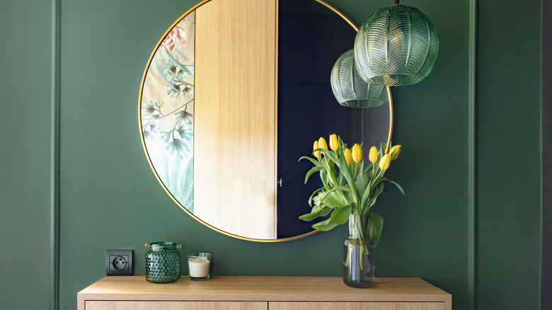
Mirrors are great decoration pieces that bring depth and light into a room. According to OKA, mirrors are used by decorators to amplify light, create drama, and add unique reflections into the room, giving it more visual interest.
Mirrors can also brighten a room, especially when they're placed opposite a window. Adding a mirror to a space will help it feel more open because of how it reflects light and the optical illusion of reflecting the surface back. In windowless rooms, mirrors also can help maximize the appearance of the room because they increase scale and change the way light floods in. Mirrors are also excellent at creating symmetry and adding shape to an otherwise plain floor plan.
Many neoclassical-inspired styles use mirrors to help bring neoclassical touches into the design. French-inspired designs are one of the most neoclassical styles that uses mirrors throughout their decór. French-style mirrors are sculptural or covered in carved details. To bring this style to your space, you can purchase an antique mirror or DIY using scrolling, a simple mirror, and some glue (via Tidbits & Twine).
Showcase — or fake — high ceilings
Because ancient Roman and Greek rooms were so large, a big part of neoclassical architecture is evoking that type of scale. One way to do that is to create the illusion of higher ceilings.
According to Hope Designs, to make ceilings look larger, keep window treatments simple and have lower-sitting furniture pieces. Lower furniture works well with keeping scale smaller and making a room appear larger and more welcoming to guests. Additionally, you can paint your crown molding, walls, and ceilings the same color, removing the breakup effect of having colored walls and a white ceiling. If you don't want to paint everything the same color, just painting the crown molding and ceilings the same will reduce the separation. Having consistent color throughout large parts of a space allows the walls to appear more elongated.
You can also use vertical lines on the walls to draw your eye up and make a space appear taller. Alternatively, you can use horizontal lines on a wall, either through molding or wallpaper, to create the effect of a wider room.
Make it look elegant
Neoclassical design is synonymous with elegance in the design community. Even when your dominant design style is something other than neoclassical, you can use neoclassical items to make a space appear more luxurious without being gaudy.
According to One Kindesign, using an elegant color palette that compliments decór is a great way to bring elegance into a space without having to do much. To avoid clutter, which makes a room less elegant, you can also incorporate functional furnishings that act as additional storage.
One way to make a room look instantly elegant is to centerpiece it around one item, for example, a bed (via CasaOne). Purchasing padded or tufted headboards is an easy adjustment to make a room appear more expensive. Additionally, a taller bed allows you to use the under area as storage, keeping the room clean. You can also work in lighting that is warm-toned to give the appearance of luxury (via Intaglia Home Collection).
Use a cozy rug
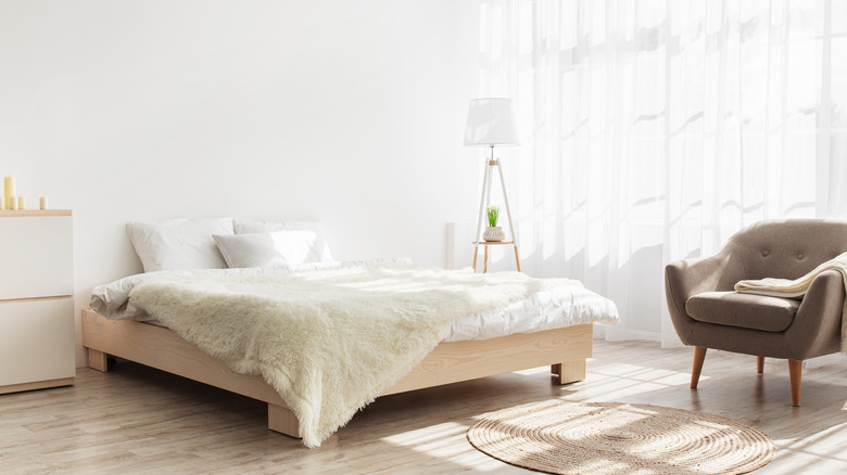
Cozy rugs are a great way to create an inviting space, even if you cannot create a larger-looking space. Because neoclassical design focuses on having room for entertainment and being welcoming, bringing in coziness is a wonderful way to still get the look, even if you can't do anything drastic.
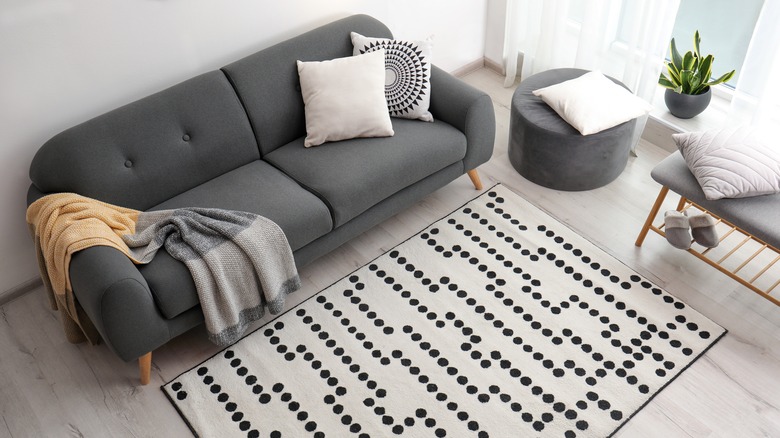
According to the Nazmiya Collection, layering rugs is an awesome way to bring coziness into a room. This technique is similar to layering pillows and blankets in a room to bring more texture and color. Shag rugs are also seen as more comfortable, making them a great staple for neoclassical-inspired rooms. Rugs are also a wonderful way to bring in texture and patterns, something often found in many neoclassical spaces.
When placing a rug, it's recommended to purchase one large enough that all the legs on furniture touch it (via Asmara). This creates a definite seating area and group conversational areas away from other areas.
Use neoclassical fabrics
One of the fastest and easiest ways to bring neoclassical inspiration into a space is to use fabrics of that era or inspired by their design. According to Adriene Chinn, neoclassical design is known for its intricate floor details, woven carpets, painted wood, and insets with colorful stones. The furniture and fabrics are often geometric, and upholstering became more advanced during this era. Because of this, painted silks, sophisticated loomed patterns, and printed textiles are seen throughout neoclassical design. Things like silk, muslin, cotton, and glazed chintz are more common in use.
To decorate with fabric, you can create a textile art piece from it and hang it on the wall using window beams (via Curbly). You can also wrap it around canvases to create an expensive-looking art piece. Additionally, fabric can be used to create your own DIY rug or Roman shades.
You can also mix fabrics and textiles to create the appearance of depth and visual interest in your room. To mix patterns, focus on ones that have a similar color scheme (via Lushome).
Go big with a chandelier
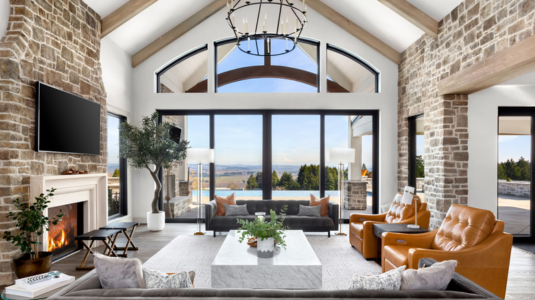
A common staple in elegant design is a giant chandelier that becomes the focal point of a room. Throughout different neoclassical-inspired decór trends, a chandler is often found in grand rooms to bring luxury into a space.
According to Luxxu, statement chandeliers are perfect for introducing personality and drama. They also create a focal point wherever they're hung, which can help distract from unattractive details in a room.
Before purchasing a chandelier, pay attention to scale, direction of light, and the controls that the light has (via Lightology). One common mistake when buying a chandelier is getting a chandelier with light outputs that glare instead of causing light to glitter, and this may not always be what you would want from a space, especially if you are purchasing a more classic-inspired chandelier. Purchasing a light fixture that's too large will throw off the scale of your room and make everything in the space feel small and claustrophobic.
