The Ultimate Guide To Art Moderne Decor
Art Moderne, also known as Streamline Moderne, is one of the most recognized design styles with its iconic retro curves, pastel colors, and nautical finishes. According to Atomic Ranch, Streamline Moderne is a style in the Art Deco movement that ushered in the way for mid-century modern. Streamline moderne arrived toward the end of the Art Deco era, peaking between the 1930s and 1945 (via Circa Old Houses). It was a transition from the Roaring Twenties and the Great Depression and represented the excitement of the future.
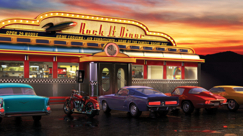
The designs began to focus on simple, aerodynamic forms that mimicked ships, airplanes, and cars at the time. Streamline design appeared in every aspect of culture during this period, including diners, motels, cinemas, shopping centers, bus terminals, and restaurants. The style became synonymous with the post-Depression era. Here's a look at the Art Moderne style and how to bring it into your home.
Art Moderne vs Art Deco
While you may not consider Art Moderne and Art Deco the same, the two styles are part of the same movement. According to Circa Old Houses, Art Deco was the most common in the early 1920s and 1930s for commercial and public buildings. After the Great Depression, Art Moderne, or Streamline Moderne, became the dominant architectural style.
Art Deco draws inspiration from avant-garde painting styles that were popular in the early 20th century, like cubism, Russian constructivism, and Italian futurism. The style was also in response to the Art Nouveau style that preceded it but worked in inspiration from ancient Egypt and pre-Columbian art. Because of these influences, Art Deco focused on symmetry, geometric patterns, clean lines, and colored glass, terracotta, or glazed bricks.
By contrast, a hopeful future inspired Art Moderne. Smooth, curved surfaces took the place of geometric patterns. Art moderne buildings were low and horizontal, while Art Deco buildings were grand and tall (via Designing Buildings Wiki). Additionally, Art Deco focused on bold colors and embraced eccentricity, while Art Moderne primarily focused on white with small splashes of accent colors.
How it came to be
According to Creative Market, one of the things that made Streamline Moderne so timeless is its aerodynamic inspiration. While the Art Deco movement was known for its ornate details and bright colors, Art Moderne took a more subdued approach. Instead of focusing strictly on beauty, the function became the emphasis.
After the Great Depression and economic downturn from 1929 into the late 1930s, people had less tolerance for overly elaborate architecture. Instead of traditionally beautiful and intricate pieces, industrial designers had to adapt to the new era in an affordable way. They stripped down or streamlined elements that were overly ornate in Art Deco and created Streamline or Art Moderne. Instead of tall buildings with geometric lines, Art Moderne architecture draws inspiration from ships and planes, using rounded corners, stripes, and glass blocks (via SoCal Stair Climbers). Streamline Moderne is called the ocean liner style in France because of its ties to nautical elements.
Decorate with retro curves
According to The Westologist, Art Moderne features smooth curves because its primary focus is on aerodynamic inspiration. The aerodynamic design is associated with speed and travel. Many Streamline Moderne-inspired cars, trailers, trains, and boats are still known for their iconic design. Streamline was also designed to be mass-produced, unlike Art Deco.
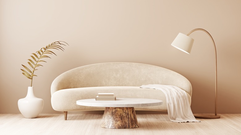
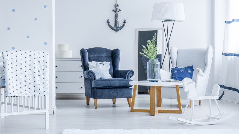
If you want to decorate with curves in your space, there are many ways to go about it. The easiest one is working with curved furniture or art pieces. To create a Streamline Moderne-inspired room, pair a curved chair with a rectangular-shaped coffee table or wall-to-wall bookshelves. For an authentic Art Moderne touch, include round windows reminiscent of portholes, incorporate a curved floor lamp in the living room, or look for round mirrors for the entryway. You can also use the curved items as focal points and design your room around them, especially when they're large-scale items.
Bring in pastels
Unlike Art Deco, Art Moderne doesn't use many colors, instead opting for white as the focal shade with pastels as accents. According to Archetypical, buildings of the Art Moderne movement were rarely a dark color. Instead, they typically were white or pastel-colored stucco.
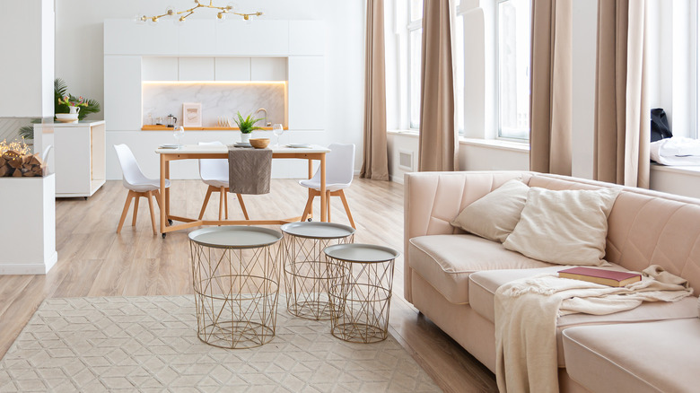
If you want to bring some Art Moderne flair into your home, stick to an off-white color scheme with little pops of pastel colors. Creating a pastel color palette can sometimes be difficult because there are so many versions of each color. However, following basic color wheel principles can help make the process easier (via Art in Context). Pale pinks, blues, and greens will add a fun pop of color to your Art Moderne-inspired space. When looking at colors, pay attention to the chroma or the saturation level. Lower chromas are paler, while higher chromas mean the color is bold. You should also pay special attention to the value or brightness of the color, which tells you the shade.
Embrace glass bricks
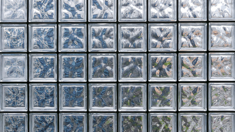
Art Moderne uses different textures and reflective materials to honor nautical themes and minimalist influences. One of the most iconic details from this era is the use of glass bricks in interior and exterior designs.
According to Clever, glass bricks are used in design to separate spaces while keeping floor plans open and inviting. You can style them with warm colors and matte textures for a chic look. These bricks also offer more insulation than the typical window pane. Glass blocks are more challenging to break than traditional windows, making them a little bit safer, especially in areas like a basement or bathroom (via Window World of Bloomington). The bricks can come in different finishes and exterior trim colors, like white, bronze, clay, or black. If you want to work glass blocks into your home, you can use them instead of a shower door or, for more privacy, replace traditional windows with glass bricks (via WMGB Home Improvement).
Opt for a white color palette
Art Moderne homes and structures were not colorful by today's terms. Instead, the designs were primarily white or off-white with small pops of color. This color palette came from the drive to make the Art Deco style more attainable.
While it may be tempting to purchase white paint when designing an Art Moderne space, it won't be the most aesthetic choice. According to Maria Killam, white walls often make a room look worse because it shows how much light the area naturally gets. You cannot trick the eye into thinking a space is brighter than it is. White walls also reflect whatever color is coming in through the windows. For example, if you're near trees, you'll notice your walls reflect a hint of green.
Using an off-white shade that offsets these reflections with undertones is the best way to pick a tone for your space. Undertones of paint can be blue, pink, yellow, tan, green, violet, and gray (via Behr). Looking at a color wheel should help determine which color will best offset your room.
Incorporate asymmetrical details
One of the most contrasting details between Art Deco and Art Moderne is their facade design. Art Deco focuses on symmetry, while Art Moderne shifts away from that entirely and features asymmetrical facades and layouts.
According to Highland Design and Build, our eyes process symmetrical images, which is why traditional designs often feature symmetry. While symmetrical designs can be relaxing to our eyes and feel natural, asymmetrical designs are more fun and dynamic.
To use asymmetrical concepts in your floor plan, pick a focal point like a fireplace or large-scale furniture item and build your design around it. Make sure to use coordinating elements, like colors, patterns, shapes, or textures that make the design feel connected. Even though it may be tempting to place the same items on two end tables opposite each other or ensure the throw pillows on a couch are all the same color, use odd groupings to get an asymmetrical and dynamic look.
Play up corner windows
Rather than hide awkward corners, Art Moderne focuses on showing them off and making them integral parts of our designs. While many of us may not have the 1940s-inspired rounded window or glass brick wall patio, our modern architecture still features awkward windows that can seem almost impossible to decorate.
According to Homesteady, corner windows in small rooms need to stay open and uncluttered, which helps ensure the space feels inviting. It's also a good idea to avoid blocking windows with furniture and use adjustable curtains.
You can also use valances along the entire corner to create a cohesive style (via Centurian Window Fashions). To create a put-together look on your corner window, layer window treatments like curtains and sheers with blackout blinds to filter out light. This style allows you to keep the room light and airy without feeling too heavy on one side. Additionally, if you have a bay window, you can use customized drapery and rods to help blend it with the rest of the home (via Style by Emily Henderson).
Smooth out your walls
The Art Moderne movement is known for smooth details, walls included. Textured walls are common in American houses and go in and out of trend every few years. While you can still follow Art Moderne design with textured walls, smoothing them out is a good idea.
According to Epic Home Ideas, you can smooth textured walls with a joint compound to fill in recesses. Smooth walls are timeless and easy to repaint. Plus, they're one of the easiest to clean. Before you smooth out a wall, clean it properly and fix any flaws with a light rake and compound (via DAP). Also, be sure to sand down the entire wall and get rid of any imperfections using 100-grit sandpaper.
If you're unable to smooth out or paint your walls, you can also use a peel-and-stick wallpaper to provide the appearance of smoothness. Although it will not be as good as removing the texture, vinyl material will hide many imperfections. When installing peel-and-stick wallpaper, overlap your strips slightly so that the wallpaper doesn't shrink back when exposed to the elements (via WallPops).
Let yourself get nautical
Art Moderne is known for its nautical influences. Bring the seaside vibe into your home with coastal decor like shades of blue, shell details, driftwood decorations, weathered wood, aquariums, or curved furniture and accessories. Hang up some ocean-themed wall art or According to L'Essenziale, aquariums are great features for a room, especially when they become the focal point. Before designing, purchase an aquarium and stand that offers your marine life the space and environment they need. If you don't want live fish, buy fake fish or a digital aquarium. Digital aquariums have a digital screen that looks like real fish, often used in therapeutic practices for dementia patients (via New Vision).
You can also use nautical-inspired stripes in a room with textiles or a wall covering (via Impressive Interior Design). Opt for a breezy, seaside color palette with soft blues, pale whites, and natural wood tones.
Go wild with line patterns
A signature element of Art Moderne style is its use of aerodynamic lines to represent travel and speed. Today, you can use this trend in any way that flatters your home. According to Foyr, horizontal lines add stability and timelessness, indicating the boundaries in a room. Designers use horizontal lines to make a room appear more spacious. While vertical lines add height and significance to a room, diagonal lines create visual interest or separate a space visually.
You can also use lines to play with abstract interior design. This style mixes retro decor and minimalist elements shared with Art Moderne, like colorful lamps, wall art, and bold accessories (via MasterClass). To incorporate this design, play with contrast to create attention, focal points, and a sense of balance. You can achieve this effect through colors, line textures, placement, and layering. For example, consider contrasting colors like bright pink with dark tones or metallics.
Draw inspiration from retro car styles
The Art Moderne movement is best known for its effect on the auto and manufacturing industries. According to Hemmings, the 1930s was about adding beauty to cars, household items, clothing, and architecture. Since the 19th century, cars were assembled entirely for function, with few frills and decorative elements (via Hemmings). By the time Art Moderne started developing, the design goal for society was celebrating homegrown designs and machine advances. Sleek zeppelins and metal-bodied airplanes were becoming the norm.
Visual appeal was a selling factor in items introduced during and after the Great Depression, and industrial artists made ordinary things beautiful. Look to older cars from the era for inspiration when adding Art Moderne style to your space. For example, in the 1950s, cars often had nautical-inspired fish tails (via The Bunget Arts & Culture). Hang up wall art inspired by vintage cars in your home or purchase textiles with automobile prints.
Invest in retro appliances
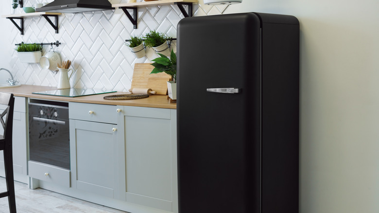
Retro appliances never went out of style, and you can find them online and in-store in many places today. According to Lushome, retro fridges can be great accents to modern kitchens, and their vibrant colors and unique shapes make a strong statement. The Smeg brand is known for colorful retro-inspired appliances with a modern twist. Items from the Art Moderne era were known for their soft curves, shiny handles, and vibrant appearance. You can purchase virtually every appliance and electronic in a retro design with modern-day features like energy efficiency, Bluetooth, and rechargeable capabilities.
To mix modern with retro, focus on keeping your color palette consistent throughout your home (via Hommes Studio). You can also integrate your vintage or retro pieces into the space using raw elements, like brickwork, textured linens, and layered walls. This tip will help display them to perfection. Additionally, you can call attention to your retro items by playing with scale.
Style elements in groups of three
Symmetry wasn't a significant part of the Art Moderne movement, so group items in odd numbers using the rule of threes. According to TalieJane Interiors, the rule of three involves arranging objects in odd numbers for a more visually appealing and memorable look. This style can work with any odd number, but three is the one most commonly used. Follow this rule when styling your coffee table, bookshelf, lighting, or vignettes.
The rule of three works because it looks more dynamic to the eye and challenges the brain (via Welsh Design Studio). When staging, group three objects that are similar in shape, color, or size or group three different pieces together. You can also group three books, candles, or decorative vases. You can also use the rule of three when arranging your furniture. For example, place three pillows on a couch or three different seating areas in a formal sitting room.
Get futuristic
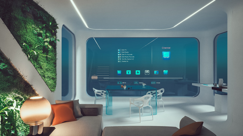
The Art Moderne movement focuses on futuristic forms and celebrates innovation. You don't need to follow the exact shapes and lines to bring the Art Moderne philosophy into your home. According to Foyr, futuristic design embraces minimalism, curved furniture, and glass, metal, plastic, or leather materials. Large pieces with splashes of color or the same color palette carried throughout a living space are characteristic of this style. Nowadays, futuristic interior design draws inspiration from science fiction and promotes ideas like time travel.
To bring futuristic design into your space, focus on items with curved shapes, smooth lines, glass details, and cutting-edge technology. Incorporate advances like touch-controlled blinds and doors (via Automation Switch). Additionally, Smart electronics are a significant part of interior design practices and architecture. Look for Smart sofas to control your living room lighting at the touch of a button while watching your favorite movie, or invest in a smart refrigerator to keep track of food expiration dates.


