No Demo Reno's Jennifer Todryk Shares Her Favorite Kitchen Must-Haves
Jennifer Todryk is the Dallas-based designer and host of HGTV's "No Demo Reno," just launching its second season of home makeovers. The series' premise is to overhaul interior spaces while undertaking minimal demolition via HGTV; within that framework, Todryk's aim for each project is to drastically improve function and aesthetics for the resident family while utilizing the current footprint. However, she admits to having knocked down a few unnecessary walls; the skilled rehabber claims it doesn't qualify as a demo if it's not load-bearing or can be removed without a permit. Todryk runs a tight ship during filming, ensuring that every piece possible is upcycled or sold to save money or generate income for the renovation. As a budget-friendly matter of practice, she often repaints; brick fireplaces and kitchen cabinets are great candidates for a quick upgrade. In cases where cabinetry is replaced, Todryk tries to find a purpose for it elsewhere in the home, such as in a laundry room or entry.
On her blog, The Rambling Redhead, Todryk shared the process and some coveted before and afters from the recent no-demo makeover of her personal kitchen. The fresh, updated space is now full of charm and style; it's completely unrecognizable from its brown and drab beginnings. Todryk also highlighted her favorite pieces in the new space. Let's take a look at these must-haves.
Classic and neutral elements
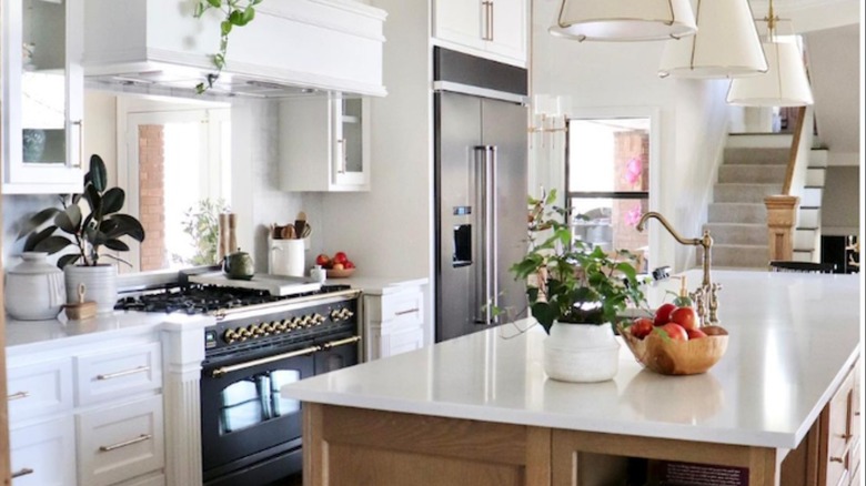
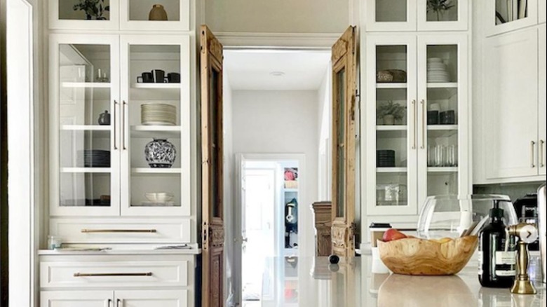
Jennifer Todryk's kitchen features a palette of neutral colors and natural elements, per The Rambling Redhead. Refinished oak floors are combined with light wood and classic white cabinetry. She opted to mix finishes, keeping the island natural and painting perimeter cabinets white. This gives the sense of a room being made over time, conveying history — a perfect application for affording newer, standard-build homes some character — while, according to Homes & Gardens, it may make the space seem more expansive. Todryk continued the scheme with creamy countertops and a backsplash of Carrara White marble tiles. To add a quaint touch, the ceilings were covered in shiplap, and a salvaged and weathered door highlights the passage to the adjacent hallway.
The designer created contrast in the serene space with a 48" glossy black range with shiny brass hardware and seven burners. To maximize function, Todryk chose an undermount sink fitted with a colander, cutting board, and drying rack for the large island. An elegant gooseneck faucet, cabinet hardware, and pendant lighting carry the warm metallic look throughout the kitchen. The brass details make the room feel slightly glamorous; interior decorators use metal accents like fashion stylists use jewelry. It seems that Todryk likes a shiny thing or two, or perhaps she's just a fan of gleaming kitchen gadgets — a countertop air fryer, double toaster, and Nespresso coffee maker made the cut. We're not surprised about the caffeine machine — something's gotta fuel her no-reno get-up-and-go.
Hidden organization
Jennifer Todryk is no stranger to a bit of chaos, nor how to corral it, so she selected a whole cadre of items to organize the foodstuffs and supplies for her family of five. Purely functional pieces help take advantage of pantry storage space, such as plastic bins, canisters, risers, stackers, a tiered lazy-Suzan, and pull-out baskets. Todryk relied on wooden trays and pegboards for deep drawer organization and utensil storage.
To create a more personalized environment and introduce color, pattern, and texture, she layered favorite finds and small decor objects around the kitchen on countertops, shelves, and inside glass-fronted cabinets. Earthy terracotta serveware and black iron candlesticks complement warm acacia wood salt and pepper grinders and plates, reinforcing the room's natural theme. Todryk repeated materials used in the renovation to create cohesion. Per DIY by Style, that simply means things stick, or go, together, and it can be achieved by echoing prints, hues, or materials. Marble salt cellars were chosen to match the backsplash, and black dinnerware speaks to the drama of the range. Color is brought in with chinoiserie urns and vases in cobalt-blue and white. The whole room is an entirely individual curation of pieces that makes the kitchen feel welcoming and lovingly used.


