Ty Pennington's Secrets To Making A Small Space Feel Bigger
Ty Pennington is a guy-of-all-trades: carpenter, TV show host, author, designer, brand collaborator, and Emmy award-winner, per Wide Open Country. His official website further describes him as a leader in the field of volunteerism; this quote illustrates a prevailing principle regarding his role in design — "It's about the joy of doing things for others ... random acts of kindness can restore your faith in people'" (via Ty Pennington).
Pennington is widely recognized as the eager to make a difference star of ABC's "Extreme Makeover: Home Edition" — the series which, according to the Television Academy, garnered Pennington two Emmy wins, and previously for TLC's "Trading Spaces," his initial injection into home décor television over two decades ago.
Currently, Pennington commands the HGTV program "Ty Breaker," where his home improvement skills are pitted against a featured designer. On the series, he aims to show homeowners how they can make the most of their current residence while the designer attempts to persuade them into a new one. In the episode "A Boxed-In Box of Boxes," Pennington visits Atlanta, GA, and a family of four living in a too-small cottage. As shared by Realtor, their home has tight and cut-off spaces, but the couple is determined to stay put and renovate for themselves and their children. Throughout the remodel, Pennington chooses design methods and treatments that help the home to appear updated, larger, and more open. Let's explore his tips for the intelligent renovation of a tiny space.
Uniform flooring makes a difference
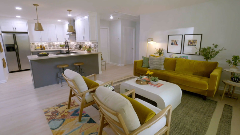
Ty Pennington and the episode's star designer, Alison Victoria, of "Windy City Rehab," decide that the home's interior will feel less cramped if they remove some existing walls, creating an open flow between the kitchen and living room. However, this leaves them with the challenge of inconsistent flooring. Since a portion of the space already had maple hardwoods, the duo opted to match them with engineered hardwood, staining them both the same shade for a uniform and clean look. Additionally, Realtor notes that the light finish ensures a more expansive feeling; Real Homes suggests the flooring material should be appropriate for the entirety of the open space, considering durability and function.
During the kitchen transformation, Pennington replaces appliances and cabinetry and takes the opportunity to build interest with paint color; he chooses to contrast white top cupboards with medium gray bottom cupboards. The hardware is the same for cohesion and preventing a sense of busyness. Due to limited square footage, breakfast bar seating acts as a kitchen table substitution, ingenious in its use of low stools that don't impede visually and tuck out of the way when not needed; it also affects a transition from the kitchen into the living room area.
Hang artwork on neutral walls
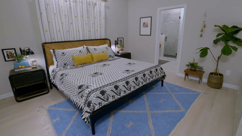
In the couple's bedroom, Ty Pennington wanted to enliven the space with a bold striped accent wall, but Alison Victoria was concerned such a statement would overwhelm the small room. She convinced him to stay with a neutral and airy backdrop of white paint, adding interest instead with an area rug and pops of color in the accessories. Still, according to Realtor, Pennington felt the room should have more energy, so he painted a large artwork incorporating the room's color scheme. Art is a perfect way to introduce hues, texture, and movement; plus, it's an instant focal point and makes a room feel complete, per My Move.
For the bathroom, the team set their sights on keeping things neutral while providing visual interest; additionally, they wanted to avoid the typical subway tile. A patterned, low-contrast shower tile provided a subdued yet unique treatment that Victoria liked for its bohemian style. In a clever turn, Pennington showed his resourcefulness with a sliding mirror above the vanity — maintaining the function of the only window in the room and ensuring air circulation and light flow into the space.


