Bad Home Advice Dished Out On Dream Home Makeover
HGTV is normally the go-to network for lovers of all things home renovation, however there is another player throwing its hat into the home and garden ring: Netflix. The streaming service has updated its programming to include more and more reality content around house flipping, real estate deals, and home makeovers that are good enough to make Joanna Gaines jealous.
One of the shows leading the charge is "Dream Home Makeover." According to The New York Times, the program stars the likable married couple Shea and Syd McGee who own Studio McGee out of Salt Lake City, Utah. The pair got their start using Instagram to gain traction for their home design business. Executives at Netflix took note, and the rest is television history. The McGees have a very popular, Pinterest-y design aesthetic that tends to go over well with most viewers. However, most of the show's episodes, while peppered with sweet moments between Shea, Syd, and their children, also have some major style missteps. Here are a few that raised our eyebrows the most.
Style a bathroom with upholstered furniture
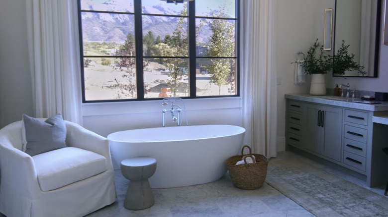
We thought it was a bit strange when Shea McGee decided to style a master bathroom with a full-on upholstered chair, as having fabric this close to the tub is a recipe for mold, mildew, and overall yuckiness. According to Modo Bath, it is important to have seating options available in the bathroom for things like doing your skincare routine, applying make up, or even getting dressed (we are partial to putting our shoes on while sitting down). However, wood is a much more common material than upholstery for use in spaces with lots of water, especially when the seat is as close to the tub as Shea placed this one.
If upholstery gets wet, it can be quite the ordeal to clean off the resulting mold, including using homemade remedies, and in some extreme cases, needing to hire a professional cleaning team, or replacing the item entirely. So, to save yourself the hassle, skip this tip from "Dream Home Makeover" and stick with wooden seating instead.
Ditch your stone fireplace
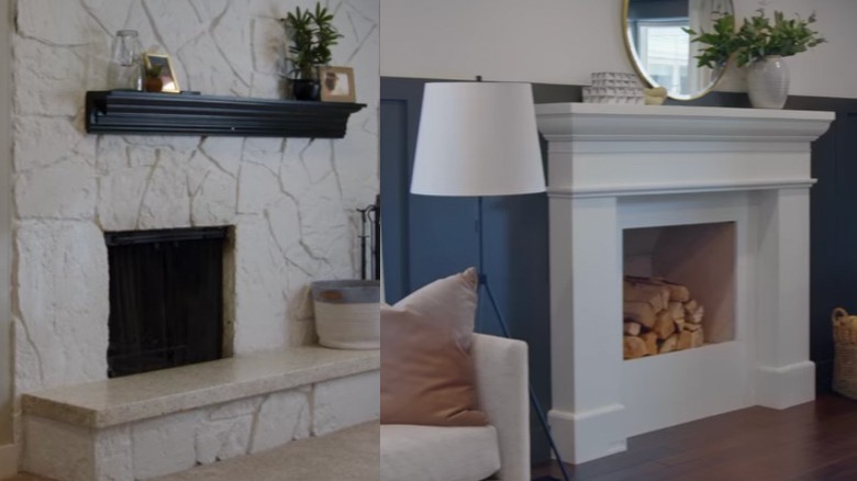
In the same home as the couch in the bathroom, Shea and Syd McGee decided to rip out one couple's beautiful stone fireplace and replace it with a barely functional façade instead. They also got rid of the hearth in this makeover mistake, robbing the house of a great seating and décor display area. According to Maria Killam, you need to take a pause before doing any sort of work on your stone fireplace.
Instead of ripping the whole thing out and completely changing its look, most fireplaces typically tend to look a lot better with just a fresh coat of paint instead. Painting also offers a less permanent change to homeowners who are trying out different décor looks around their home, as it's easier to change things up again to suit your taste. In any case, removing stones in favor of a bland wall and adding a nonfunctioning fireplace is almost never a good move.
Make a playroom utilitarian
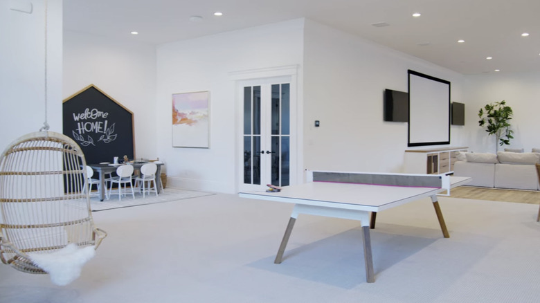
One of the most bizarre redesigns on "Dream Home Makeover" is the basement children's playroom that was just entirely ... white. Why suck the color out of a children's playroom? Even the ping pong table, which is typically a bright and fun spot in any sports room, was a bright white. The space looks more like a sterile hospital room than a place for children to play and explore.
According to Crate and Barrel, the best way to create a room for your children is to first think about how your kids specifically will use the space. Do they enjoy playing video games? Then you can focus on a great setup for them. If they seem to be a bit more crafty, then think about setting up a creators space just for them. Next, mix things up with different kinds of places to relax around the room. This could be bean bags, couches, soft mats, etc. By offering your child lots of texture and color, you'll make it a space they feel more comfortable spending lots of time in.
Place greenery just for the heck of it
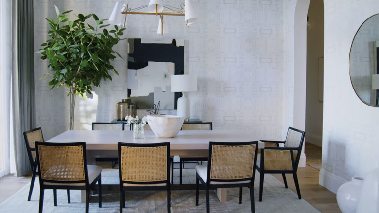
If you randomly buy one plant and place it in your house without much thought, it shows. Unfortunately, this is a trend on "Dream Home Makeover." In this example, the tree in the dining room seems to be added as an afterthought. It throws off the symmetry of the space and is too large for the place it sits, causing overcrowding near the table. Its height also doesn't work with the rest of the furniture in the room, causing conflicting visuals.
According to Michigan Gardener, when choosing the size of the plants you want to place around your home, starting small is often better. This can be difficult if you want the room to instantly look finished off with a larger plant, like a small tree, but starting off with a fully grown plant can easily cause the overcrowding problems seen on "Dream Home Makeover." If you start small, you'll have a chance to get to know the tree a bit better and even gain a better understanding of whether it eventually needs to be relocated outside instead of living out its days in your dining room.
Replace knick-knacks with meaningless fashion pieces
In real life, we gather décor for our homes over time. However, on design shows like "Dream Home Makeover," experts like the McGees take everything from their clients' homes and swap it out for a sleek, yet often bland, redesign. When the episode is over, you really can't tell who lives in the space, as it looks like a model home instead of somewhere a real family lives. This is because it has been wiped of all personality.
According to RentCafe, the small items we gather over the years to display in our homes (some call them baubles, some call them knick-knacks, some call them clutter) are what really make the space our own. Each piece is there because it caught our eye at some point for some reason. Maybe we brought back a plaster dolphin from a vacation in the Bahamas when we were a teenager, or a painting of roses caught our eye during a recent trip to Target. Whatever the reason, the practical advice stands: don't get rid of these things or your house will be boring.
Choose lounge chairs with no support
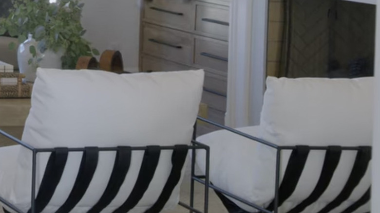
Even when you are just lounging around at home, you still need to think about comfort as well as style. With this in mind, chairs in this living room redesign on "Dream Home Makeover" don't really make a lot of sense. The leather straps on the back of the chairs hang a bit low and don't seem to offer much support, so you would never be able to remove the large pillows. In turn, these pillows appear very soft, as if they would not offer much support either.
According to NouHaus, proper lumbar support is key to remaining pain free. Our lower backs are particularly susceptible to injury, so it makes sense that the furniture in our living room should be keeping us safe and comfortable, not leaving us vulnerable to stiffness and potential pain. Instead of chairs like these, consider using armchairs with a real, firm back to properly support your spine.
Wash out your kitchen with too much white
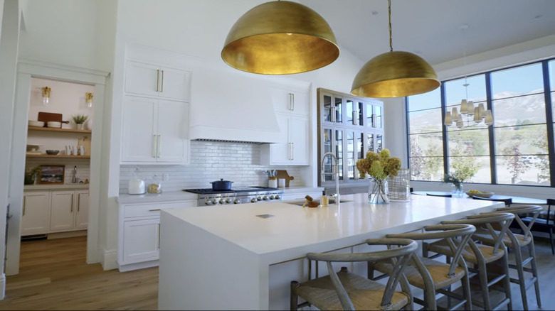
White is a popular color, but too much of it can make your home feel like a hospital instead. Shea and Syd McGee LOVE using white in the houses they redesign on "Dream Home Makeover," sometimes to the detriment of the space. For example, the large white island in this kitchen paired with the white cabinets, the white walls, and the white brick is overwhelming. The few gold accents present don't do enough to offset the sheer amount of the color present.
According to Today, using accent colors correctly is the key to ensuring that a white room doesn't lean too far into boring territory. In this case, the McGees could have avoided white overload by painting the stove's range hood a different color, as well as choosing a bolder color for all the drawer and cabinet pulls. In addition to this, if all the cabinetry and counters are already white, experts suggest making the walls an accent color, too.
Choose an uncomfy couch for the theater room
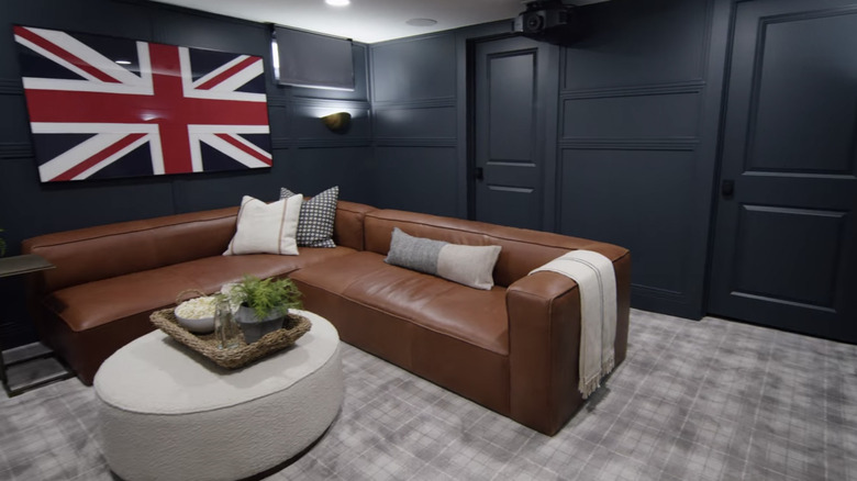
Spending hours watching movies on a shallow leather sofa does not sound ideal, so it's a bit confusing to us why Shea and Syd McGee chose this particular couch for a media room. Yes, leather furniture is high quality and high class, but it's not necessarily thought of as high comfort. According to Explore Home, the most important thing to think about when choosing a couch for your space is your lifestyle. For example, if you have a large family, you need a sectional because you inherently need more seats, or if you have a dog, you should probably get a stain-resistant couch.
The homeowners on this particular episode of "Dream Home Makeover" specifically asked for a theater room where they could relax and enjoy time together as a family. At first, and even second sight, the couch the McGees chose does not accommodate that. Instead, based on other episodes of the show, it seems to lean more into their personal style.
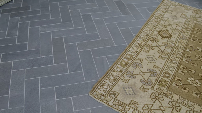
Style the bathroom with a rug
Bath mats are functional, but bath rugs are not. Shea and Syd McGee seem to really like styling bathrooms with things that don't really belong in them on "Dream Home Makeover." For example, here we see that this new master bathroom clearly has a rug, not a bathmat, leaving us with a lot of questions. According to Parachute Home, having a proper bath mat is an essential part of a bathroom as they can actually keep you safe. They do this by absorbing excess water on the slick bathroom floor, so we don't slip and fall.
Bathmats are often designed with their proximity to moisture in mind, so they don't mold or mildew. However, a bath rug, like the one we see on the show, is mainly for decoration. It doesn't offer any protection from slipping and falling either, nor do its materials prevent it from being ruined by moisture. So, deciding to use one in your bathroom is questionable home advice.
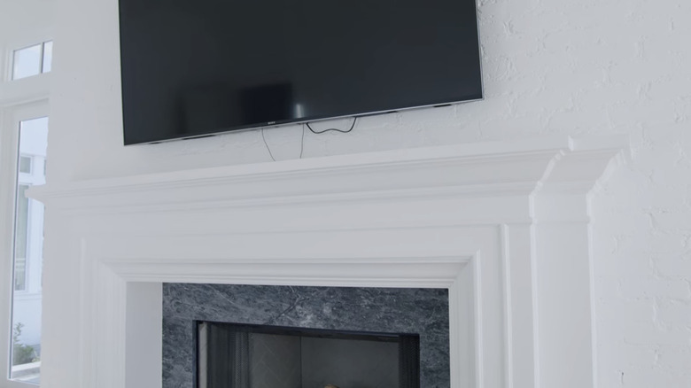
Leave TV cables visible
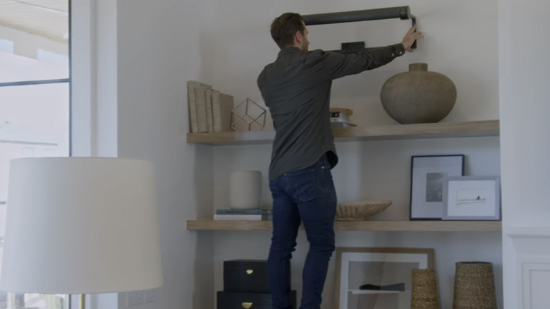
This one is a pretty basic mistake, but it's an easy enough design tip to avoid. If possible, don't leave your TV wires visible, especially if you have a wall mounted TV. It's pretty tacky and can really ruin the overall aesthetic of the space. We are really surprised the McGees and their team didn't think to tuck these wires away before filming the final reveal shots for the episode. According to CNET, there are plenty of different ways to keep your cords tidy and they all require different levels of difficulty.
If you don't want to spend too much money, or invest too much time into your cables, then you can simply buy a cable cord or sleeve so at least they aren't all tangled up. If you can plan ahead, it's a great idea to install your TV right in front of a power point so you don't have to worry about them showing in the first place. If this isn't possible, you can also purchase chic plastic covers to hide the cables from view as you shepherd them down toward the floor.
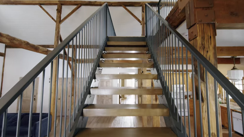
Use open slat stairs in a house with kids
Floating staircases can be dangerous for young children, so it's a bit confusing as to why they seem to show up so often in the houses on "Dream Home Makeover," given that so many of the families that participate in the show have little kids. According to Viewrail, many parents have concerns about using open slat stairways in their homes; however, all licensed contractors would only install staircases that adhere to International Residential Code standards.
Many parents would agree that even though a set of stairs is structurally sound, it would not prevent their young child from finding a way to injure themselves. Even as children grow and baby gates come down, there is a larger chance of an injury occurring because of the wide, open nature of the gaps between the steps. If you have children, it's better to avoid the risk entirely, no matter how much you might like the style.
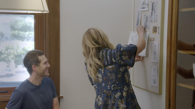
Organizing chaos, instead of embracing the spontaneous
You don't need to perfectly organize a bulletin board to look like it wasn't perfectly organized. This is one of the most heartbreaking moments on the show: Syd McGee takes a few drawings and mementos from their client's family and places them neatly on a bulletin board in their new kitchen. However, Shea McGee comes up behind him and takes them all down, saying it doesn't look realistic enough. She proceeds to restyle the board, giving the impression that even spontaneity needs to be curated.
According to Hey Sigmund, sometimes it's important to pause and embrace the chaos and other messes in our lives. We can be grateful for the reasons behind everything that's wild about our lives. If we have a messy home, it could be because we have a loving family to share it with. Don't feel the need to style authentic moments in your home, like putting together a bulletin board. Instead, take it little by little and let it come naturally.
Overcrowd seating areas
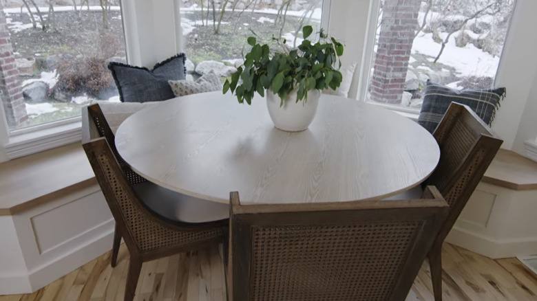
You don't need to cram as many seats as possible into a space, which is what seems to have happened in this breakfast nook. It's possible that three chairs would have worked if the seats were a different style, but the ones Shea and Syd McGee picked are unfortunately way too bulky and make the nook look cramped.
If you are working with a smaller space in your dining area, don't try to overfill it. Instead, according to Well and Good, you should start your furniture search by looking at brands that focus on pieces especially made for smaller rooms. By doing this, you are ensuring you won't compromise on the quality of the work available to you, and you don't have to bump elbows with your neighbor every night while trying to eat dinner. You can do other things to make the area seem larger, like making sure it is well lit and using mirrors to enhance the space. However, if you have too many chairs, or they are too big, these other elements won't really work.
Buy a wicker table with a loose weave
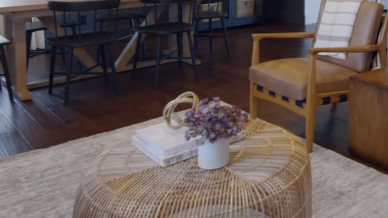
When you are selecting items for your home, style is an important factor to consider, but the function of the item, especially if it's furniture, should also be paramount to your decisions. Because of this, it's a bit confusing as to how this wicker table in particular made the final cut for inclusion on "Dream Home Makeover." It looks like most things will just fall right through this table, making it kind of useless in a main living area.
While wicker is traditionally used outside, more and more it is considered a casual indoor option by many families as well. According to Cozy Corner Patios, the weave of wicker furniture is a sign of its quality. For most items, the weave should be tightly wound with rows of material that are close together. If there are gaps, they should not be big enough to slip your fingers through.

