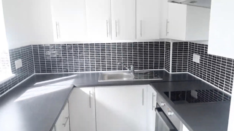
30 Amazing Small Kitchen Remodel Before And After Photos
Small kitchens have taken the world by storm as tiny house movements have gone mainstream and more people seek to create an informal kitchen-dining-living space, as noted in Architectural Digest. Petite kitchens can feel impossible to optimize and decorate because the canvas is so small. But don't fear — there are loads of ways to make a tiny kitchen a functional space and the heart of the home. A few big benefits of renovating a small kitchen are fewer building materials, less time, and minimal cost. So let's dive in and start your tiny kitchen makeover journey.
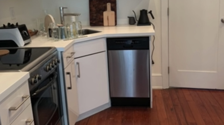
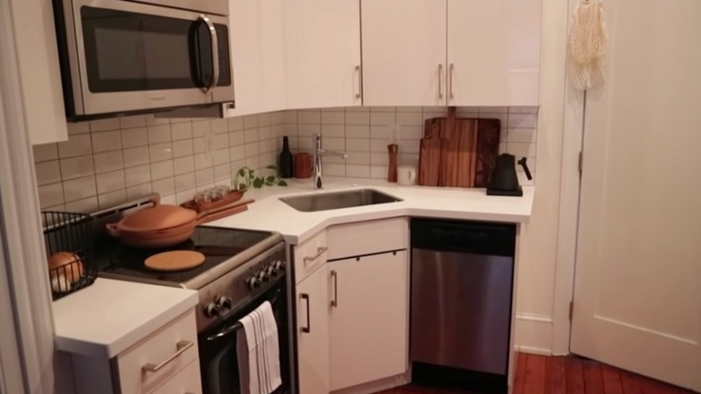
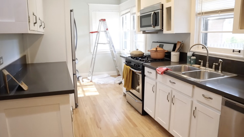
We've covered some of the best ways to make your small kitchen seem bigger, but to give you an extra dose of inspiration, we've curated some of the most amazing small kitchens before and after. Plus, many of our picks are both budget and renter-friendly, so anyone with a small kitchen can customize and beautify their space.
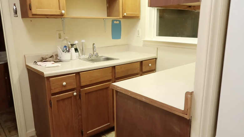
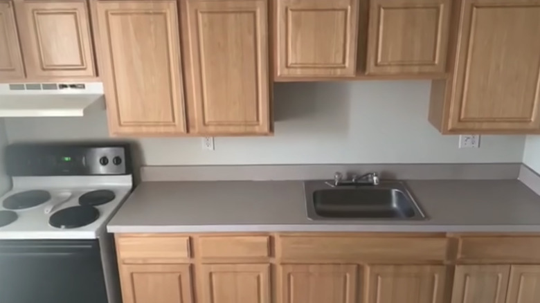
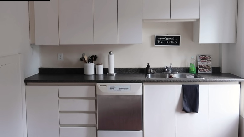
1. Before: Drab, characterless galley
Not only does this kitchen lack character because of its builder-grade cabinets, minimal features, and laminate countertops, but it's also an inefficient use of space. This galley kitchen desperately needed some charm and more prep areas.
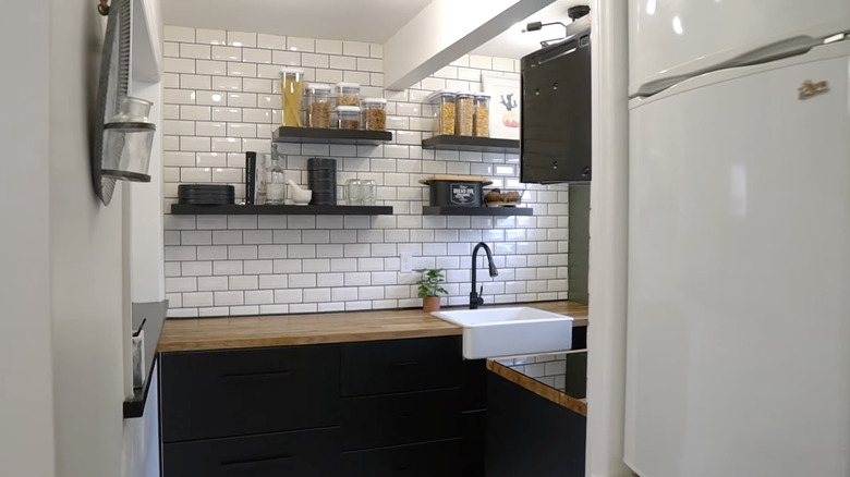
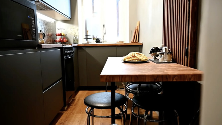
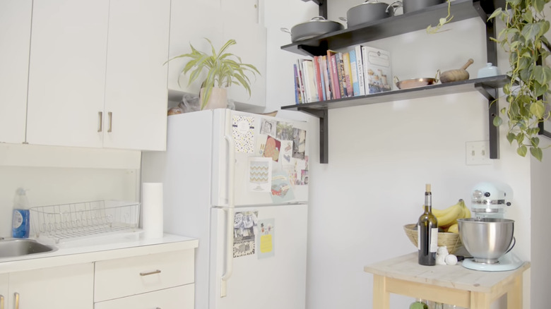
2. After: Charming minimalist upgrade
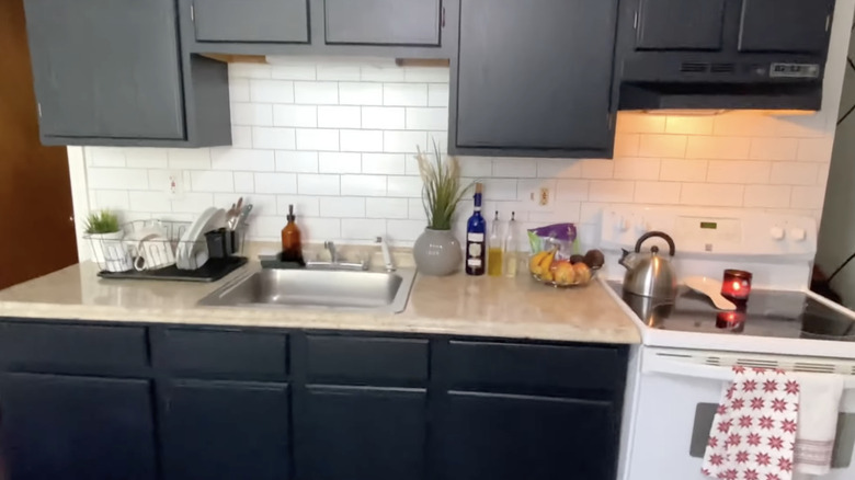
The switch to black Ikea cabinets makes this space feel brighter and more prominent by drawing the eyes to the ceiling. Plus, butcher's block countertops add a warm, rustic touch that makes even the tiniest kitchen feel welcoming.
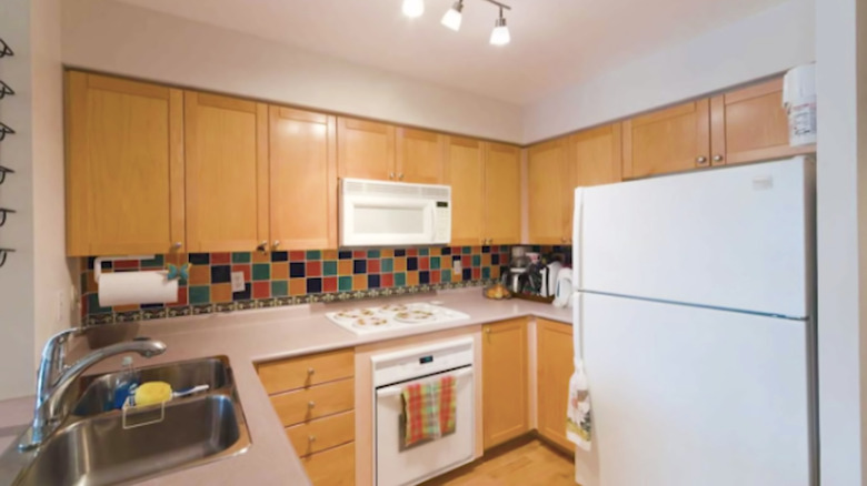
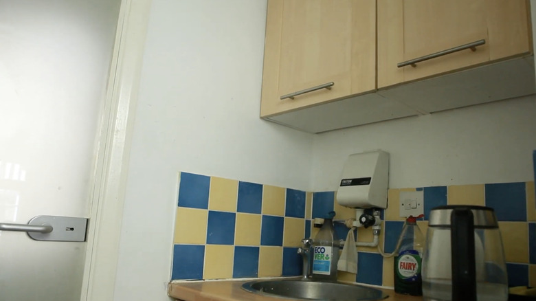
3. Before: 2000 and late tiny kitchen
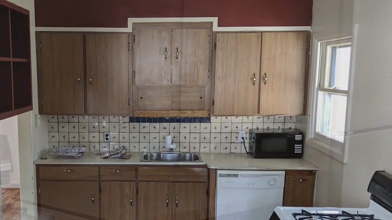
Even colorful tiles can't save this kitchen from looking tired and out of date. In this case, it gives the kitchen a mish-mashed and confusing aesthetic, especially with the 2000s cabinets and outdated hardware.
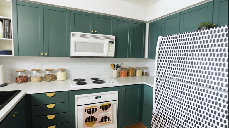
4. After: Spunky mod kitchen transformation
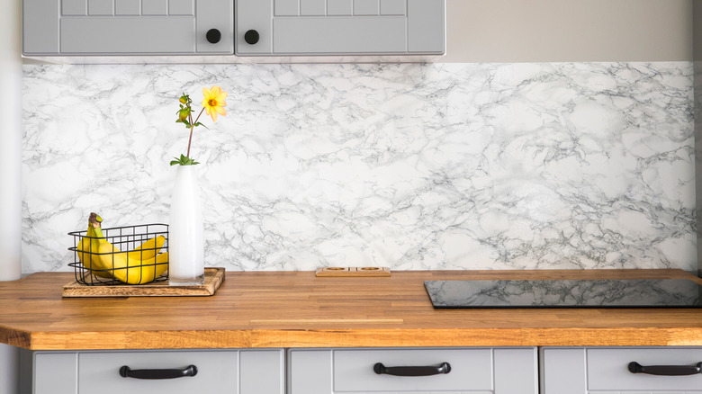
Fortunately, there's no limit to how much contact paper you can use. Wallpapering your fridge is a great way to add some character to your rental's white fridge. We also want to note the significant impact of changing the stove's burners to a matte black, as this helps to create contrast and visual interest.
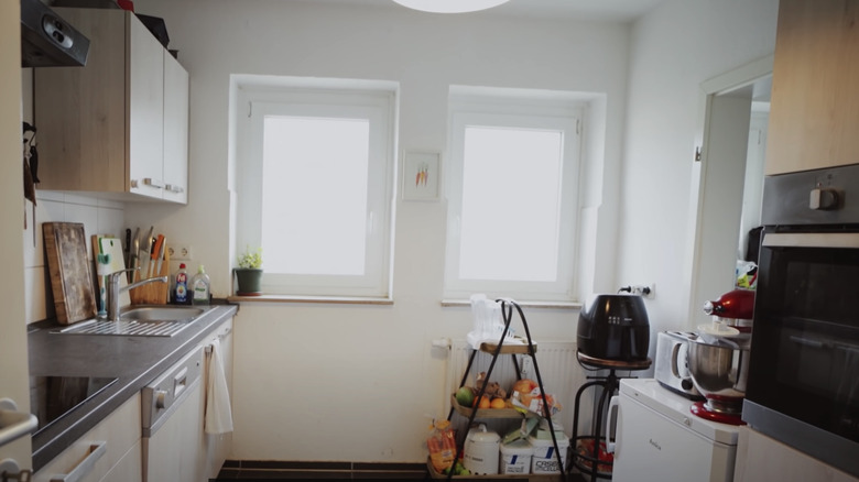
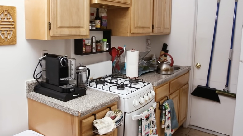
5. Before: Cluttered kitchen nightmares
Tiny kitchens can be frustrating not only for their limited counter space but also because it can be hard to find pre-fabricated storage solutions that will fit the area. But sometimes, you have to get creative, and that's what this homeowner did.
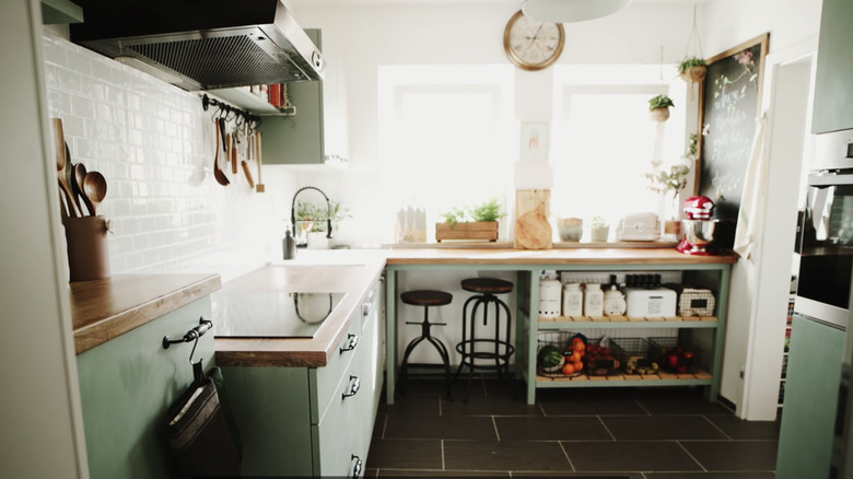
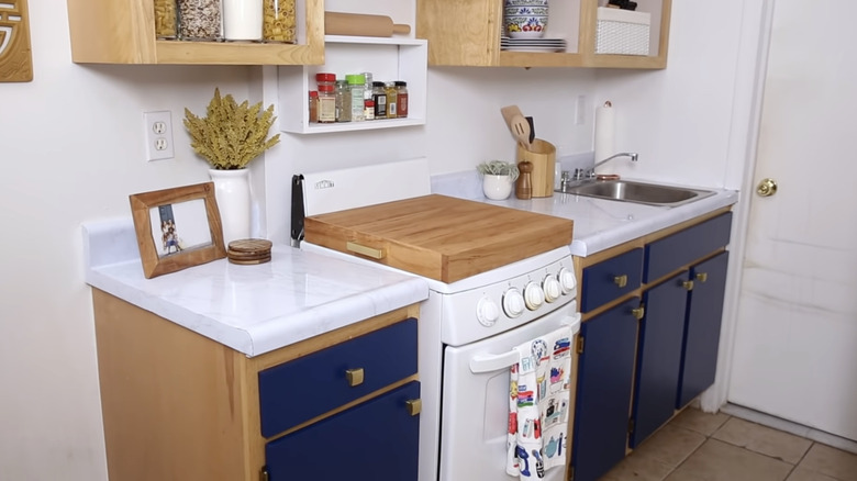
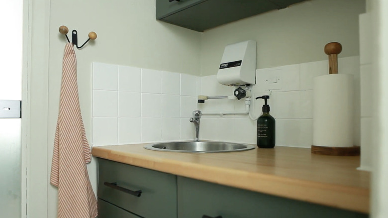
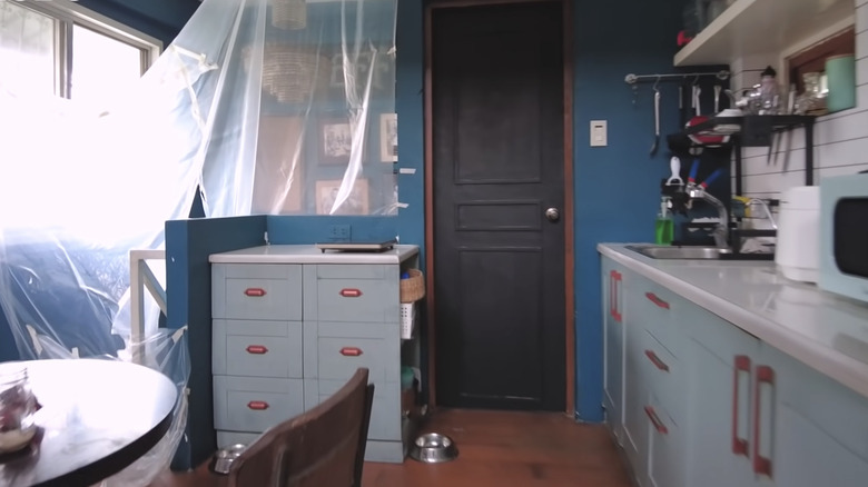
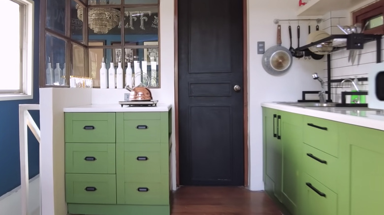
6. After: DIY custom furniture makes a big impact
We are not saying everyone can custom-make such an attractive storage solution as YouTube user Her 86m2, but watching her full demonstration almost makes it feel like we all could. Combined with a fresh coat of sage green paint, this tiny kitchen is 100% certified cozy.
7. Before: The shaker cabinet dilemma
While you may have gathered that contact paper is a renter's dream, you might have a problem applying it to your shaker cabinets. Shaker cabinets have a recessed panel that makes seamless coverage impossible. Or is it?
8. After: Super budget-friendly kitchen makeover
YouTuber Beauty is Ageless pulled off the seemingly impossible and completely renovated her renter's kitchen for under $30 with the help of contact paper. And no, those aren't new cabinet doors. She used a cheap poster board to cover the recesses for a smooth, polished finish. Genius!
9. Before: Tiny and unstyled mini kitchen
This rental kitchen is giving immediate bachelor vibes thanks to the vast amount of items left on the counter. And because this is a rental, options may seem limited, but there is a lot you can do with a small, temporary space.
10. After: Custom cabinet doors transforming the space
Don't lose heart if your landlord tells you that painting your cabinets is a no-go. It's shockingly simple to create new doors that you can swap out with the original cabinets for a striking update. Plus, contact paper can make a huge difference if you turn your cabinets into open shelving.
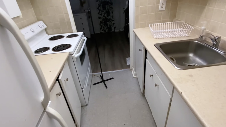
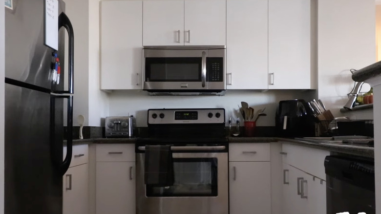
11. Before: Cramped city living
If your kitchen looks like the set from an episode of Dexter, you might need an upgrade. The white stove and cabinets make this space feel anything but airy and light.
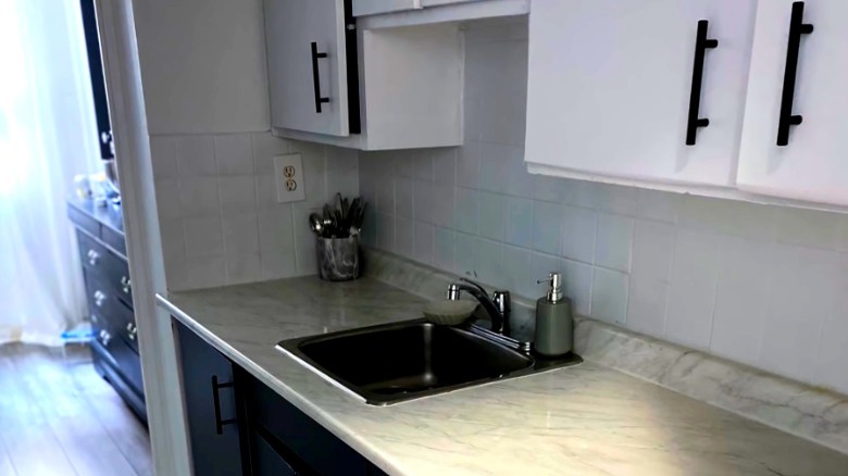
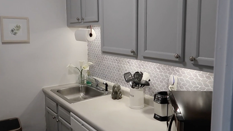
12. After: Dramatic black and white transformation
Remember those bland white cabinets? They're still there, just much improved with modern matte black hardware. The peel-and-stick backsplash and marble countertops also give this kitchen a high-end finish.
13. Before: Basic rental kitchen
While there's nothing wrong with this rental kitchen, it could use a little love. When working with a great canvas like this, especially with rich wood floors, you only need to tweak a few things for a stunning kitchen setup.
14. After: Cafe-chic kitchen counters
With white peel-and-stick subway tile and dark "grout" (it's actually sticky black tape!), this kitchen gets an instant facelift. You can make your tiny kitchen feel like your favorite chic coffee shop with a few thoughtful details. Check out this makeover tutorial by Ariane on YouTube; she even shows how to DIY an at-home drink menu.
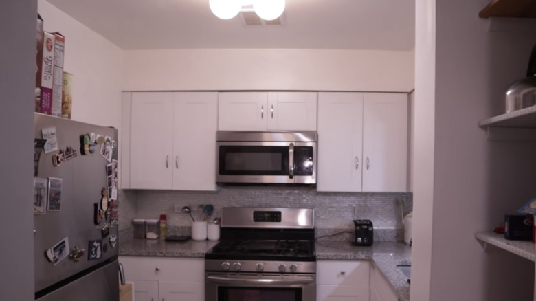
15. Before: Builder-grade kitchen
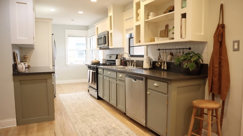
Even though this kitchen is pretty well outfitted with classic shaker cabinets and sleek grey countertops, it lacks character, coziness, and charm.
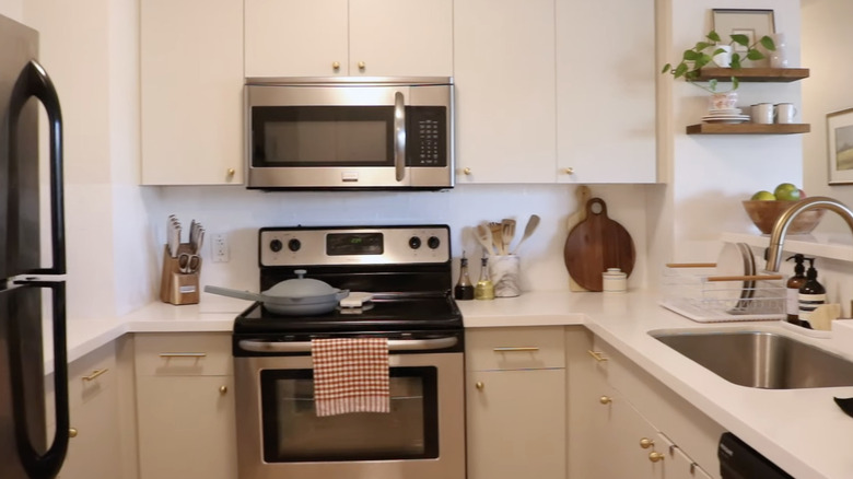
16. After: Sage green with envy
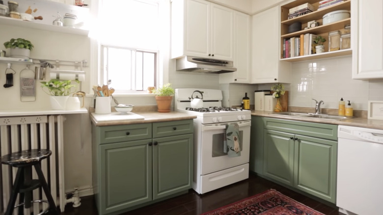
If you haven't noticed, sage green cabinets are very much on trend. This gorgeous shade is cozy and has a ton of character but can read as a neutral. Plus, this kitchen can easily be styled and switched up for dramatic looks with the two-tone color scheme.
17. Before: Shabby, not chic
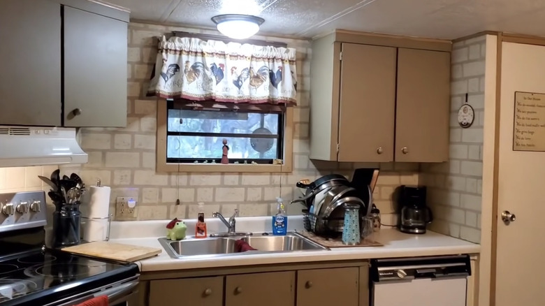
Mobile homes can have contemporary styles, but this outdated farmhouse kitchen requires attention and updating. While the materials are in pretty good shape, the space looks dark and forgotten. Let's see how it turns out.
18. After: Tiny home, big style
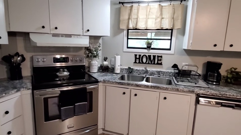
Stripping this mobile home's kitchen into a classic black-and-white color scheme gives the space a significant refresh without having to remove any existing structures. Assumed they got a new countertop? That's contact paper again for the win!
19. Before: Starving for style
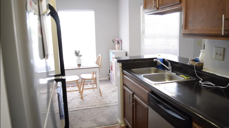
When you're a student or young professional living in a rental, it can be hard to customize your space, especially on a tight budget. But sometimes, an area can look incredibly different with just a little styling and care.
20. After: No-reno makeover
This makeover by Actually Ali DIY proves that you don't need to knock down walls or even bring out contact paper to give your tiny kitchen a makeover. Hanging some paintings, adding some plants, and organizing can be just the thing to refresh your kitchen.
21. Before: Cramped European kitchen
If you've ever gone abroad, you've probably noticed that kitchens are, on average, much smaller than in the United States. This presents an extra challenge when making spaces feel spacious, functional, and stylish.
22. After: Scandinavian minimalist kitchen
This isn't a new backsplash, and just a few coats of paint brought this apartment kitchen into the 21st century. This makeover shows that you don't need to buy new hardware for your apartment — matte black spray paint can elevate the aesthetic of your cooking space.
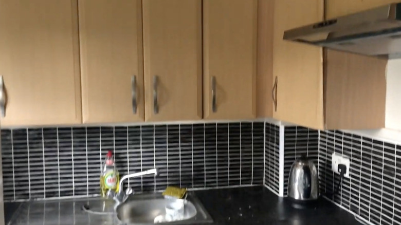
23. Before: Dark and dreary kitchen
One of the biggest problems with kitchens, especially in apartments, is their lack of natural lighting. Such conditions can make a space meant to be the heart of the home feel dreary and depressing.
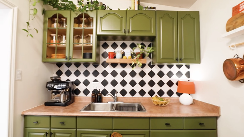
24. After: Retro chic kitchen
While the cabinets are darker (hello, avocado green!), this space is much brighter and happier. Note the countertop lamp that adds color and much-needed lighting. Plus, this makeover proves that you don't have to get rid of your traditional cabinets — use the character that already comes with your space and elevate it whenever possible!
25. Before: Dim and drab kitchen
You could certainly do much worse for a kitchen, as the counters, cabinets, and appliances are modern. Still, the white, stainless steel, and grey everything makes this space feel a bit clinical and sterile.
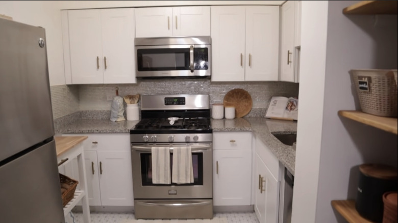
26. After: Tiny upgrades make a big difference
This is an excellent example of small changes that can make a big difference in a space. By changing the hardware to a warm brass and adding wicker and wood elements, this kitchen is much cozier.
27. Before: Outdated 2000s kitchen
Some kitchens are so cramped that even a window fitted to the space isn't enough to brighten the entire area. The drab builder-grade interior makes the room feel more cramped and joyless.
28. After: Dramatic refresh
Black and white is a classic for a reason — the white paint treatment on the cabinets helps to reflect light and make this space feel light and airy. Best of all, no messy backsplash removal. Sometimes a kitchen needs a fresh coat of paint.
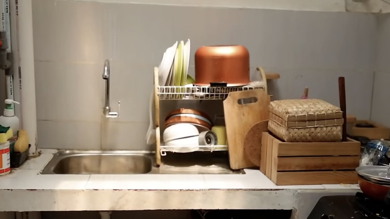
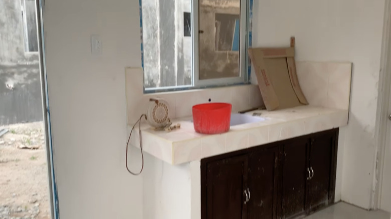
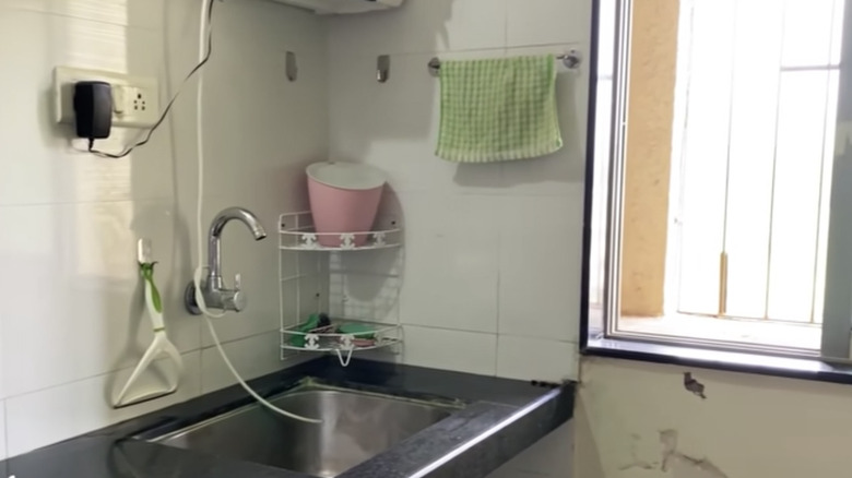
29. Before: Dilapidated kitchen needs TLC
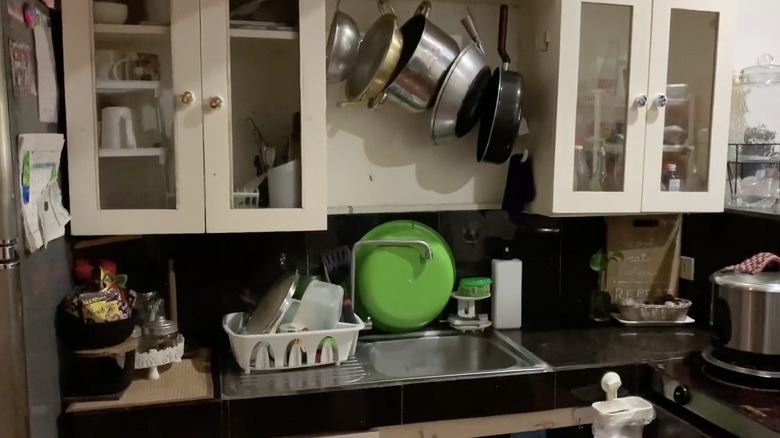
This tiny kitchen is not a case of less is more. Exposed pipes, aged and stained countertops, and no practical storage solutions are not minor issues to come up against, especially for someone on a tight budget.
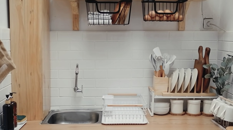
30. After: Dramatic transformation
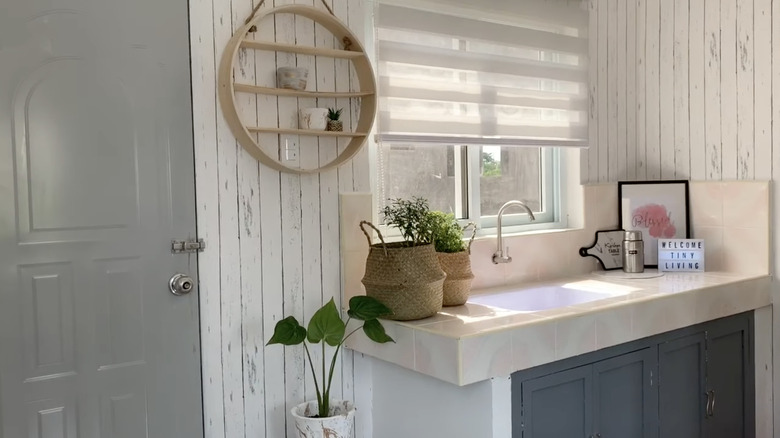
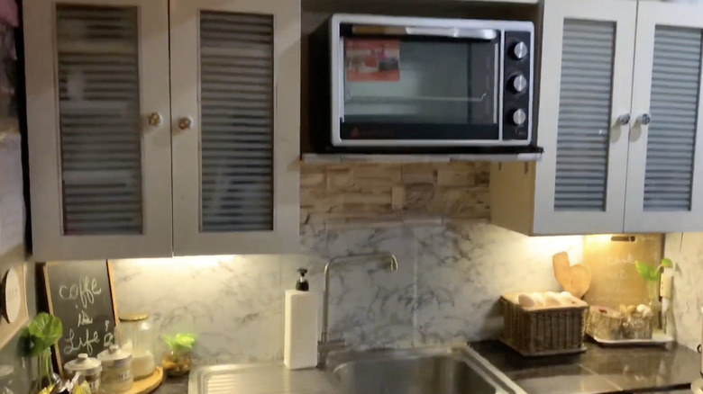
Have a difficult time remembering what this space used to be? Clever use of contact paper, a column to block piping, and darling decor have transformed this kitchen. To see other creative ways TIRANISSYA transformed this kitchen, you must watch the full tutorial because the results are breathtaking.
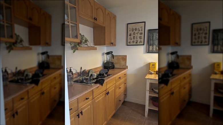
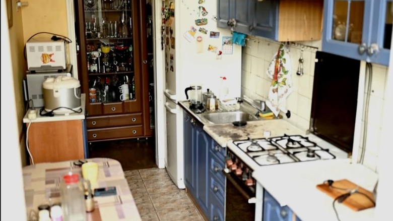
31. Before: Cluttered kitchen lacking storage space
One problem many people have is that their kitchens do not have proper storage to accommodate appliances like a toaster oven, rice cooker, and slow cooker. Stacking appliances can make a small space feel even more cramped and make for a less inviting place to cook and eat.
32. After: Gorgeous urban redesign
Hello, green cabinets again! This calming tone pairs beautifully with masculine wood tones and butcher's block countertops. Plus, by installing larger cabinets, the appliances are happily tucked away and brought out on an as-needed basis. Now, this kitchen looks like a lively place to cook.
33. Before: Blue is beautiful in moderation
We love bold color combinations and even blue-on-blue color schemes. But because the color families are so far apart in tone, this combo doesn't work.
34. After: Cafe-chic kitchen
Taking inspiration from your favorite coffee shop is a great idea when remodeling your kitchen. The green cabinets, black hardware, and fresh coat of paint make this space cozy and cute.
35. Before: A kitchen that could be anywhere at anytime
Apartment and condo kitchens are typically designed to be easily recreated in every unit in the complex and sometimes even across multiple properties. But this isn't a great way to make your kitchen space feel unique to you, as seen in this tiny kitchen.
36. After: Warm up the space
While the differences in this makeover are subtle, they make a huge difference. Gold cabinet hardware and a light grey paint coat on the cupboards and cabinets make a huge difference. Plus, the two custom floating shelves are an affordable addition that adds a ton of character and visual interest.
37. Before: Lighting is everything
One of the best things this kitchen has is the excess of natural light, making the space feel effortlessly dreamy. But chipped cupboards, stained counters, and shelves that get in the way of prep space make this kitchen less than optimized.
38. After: Easy-breezy kitchen transformation
Removing the bottom shelf and painting it white frees up physical and visual space for an even breezier look. Marble contact paper transforms the countertops, while paint touch-ups on the cabinets make a difference. Remember to ask your landlord if they have extra paint for maintenance that you can use without violating your lease agreement.
39. Before: Tired tiny kitchen
These cabinets have seen better days and gotten damaged during renovation projects. Plus, the lack of wall features washes out this gorgeous tile countertop.
40. After: Femme and fresh kitchen
Brightening up the space and adding visual interest is our friend peel-and-stick wallpaper again. Plus, with the fresh coat of paint on the cabinets, you can finally see the darling and unique pink and white ceramic tile countertops.
41. Before: Sad little LA kitchen
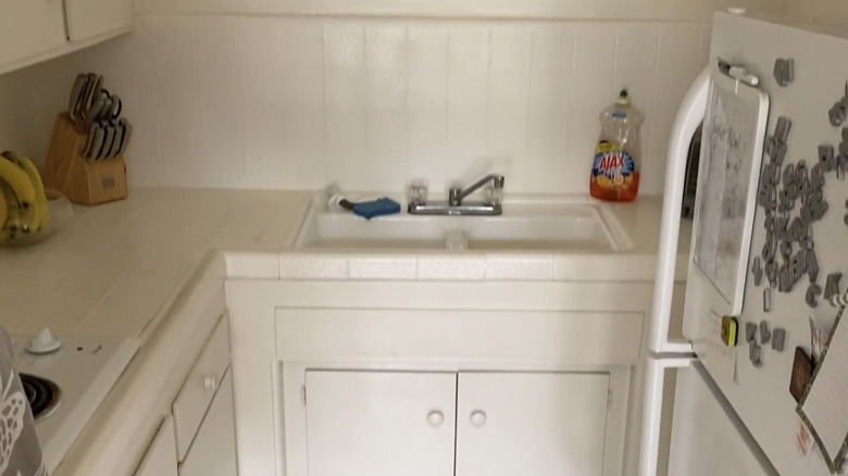
Living in the city can be challenging, and these white and dim kitchens don't make it easier. But calling a rental home doesn't mean you need to live in a room that makes you sad or blow your paycheck on a space you won't be in the long term.
42. After: Washi for the win
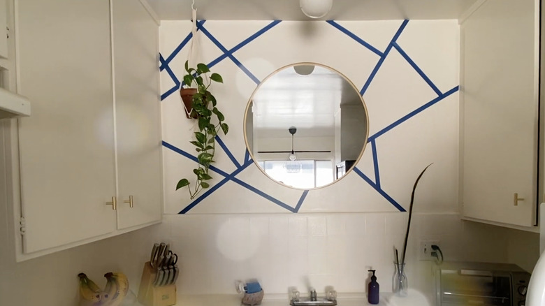
Plants and mirrors are your friends when you're renting. This clever DIYer used washi paper tape to create a temporary statement wall that doubles as affordable décor. With a little time and effort, washi tape can be one of the cheapest ways to upgrade your room.
43. Before: Boring neo-traditional kitchen
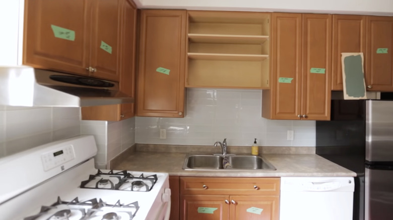
This kitchen is fine — not good, not bad, just fine. So it's no wonder the homeowner wanted to give this space a facelift. Note the clever labeling to make reinstalling a breeze.
44. After: Farmhouse modern kitchen update
Two-tone cabinets are a great way to make a space feel colorful and full of character without overwhelming the eye. Don't feel like you have to swap out all the hardware — make use of black spray paint for a cheap upgrade. And it's nice to see you again, sage green!
45. Before: Outdated cabinets and tiles
For a long time, people valued having wood finishes over the quality of materials, which is how we ended up with kitchens that look like the one above. This kitchen desperately needs a makeover; perhaps, a functional layout, new appliances, and exciting paint choices will make a significant impact.
46. After: Fresh, modern kitchen
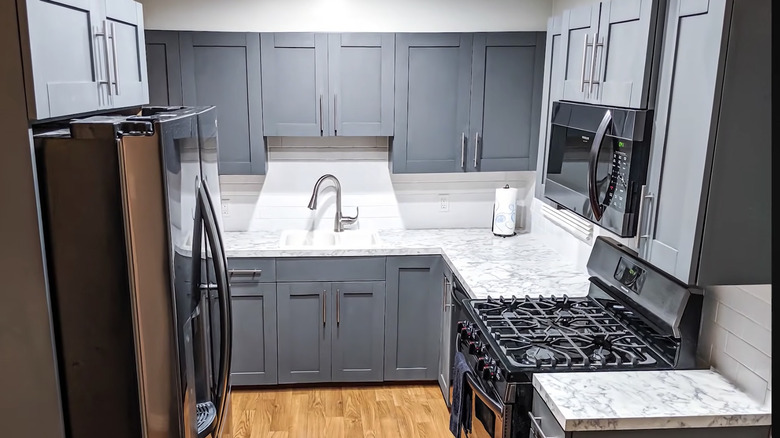
If you've got the budget and the skill to do a total kitchen demo and reno, then this time lapse from Let's Try It! will give you a ton of inspiration. The blue-grey cabinet color is a gorgeous shade that reads neutral while working to accentuate the grey veins in the marble countertops.
47. Before: Run-down characterless kitchen
Here are those wood cabinets that every unit had installed in the '70s and '80s again. While they aren't hideous, they don't add charm or warmth to the tiny, dark galley kitchen. Let's see what the homeowner did with the space.
48. After: Gorgeous, gorgeous grey
Quick heads up that painting your cabinets will not be a solution in most rental units, but some tenants receive permission to paint away. In this case, fortune favors the bold, and the unique peel-and-stick backsplash adds texture and character to the space.
49. Before: Drab and dingy kitchen
That's a lot of white, and though it's lovely at times, it doesn't seem to complement this space. While the black and white aesthetic works in some tiny kitchens to make the room feel classic and breezy, in this case, white cabinets on white walls make the place look characterless and bland.
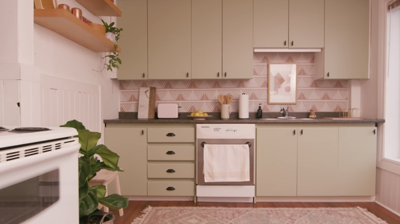
50. After: Farmhouse meets boho-chic
Don't be afraid to go bold with your backsplash choice. The unique color and print of the one seen here warm the whole space and pair beautifully with the sage green cabinets. Adding hardware to the cabinets also makes them appear expensive, though on the lower end.
51. Before: Sad run-down kitchen
Not every apartment has a solid foundation to work with, as seen in this kitchen with almost no storage space and dilapidated walls. But clever recycling and repurposing of materials can go a long way, no matter the state of your kitchen.
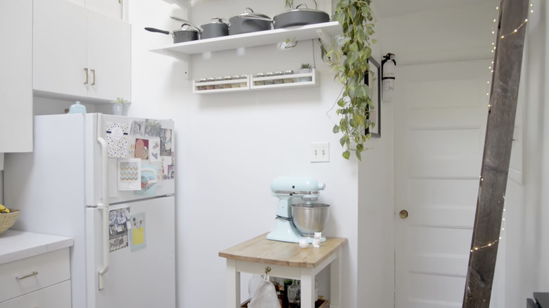
52. After: No-budget kitchen makeover
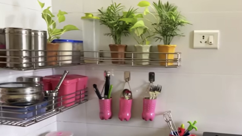
Wire racks, plants, and cheeky repurposed soda bottles make this space feel bright and unique. Working with what is available to you is a great way to stretch your budget and will certainly make your kitchen a place you actually want to spend time in.
53. Before: Cheap cabinets need a refresh
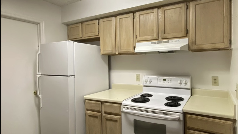
Unfortunately, the bright white of the fridge and stovetop only highlight the dingy yellowed countertops. Plus, the fluorescent lights often found in rentals aren't doing this kitchen any favors.
54. After: $50 rental-friendly kitchen makeover
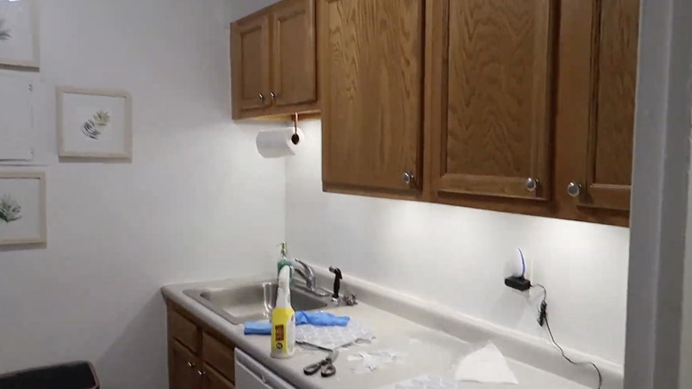
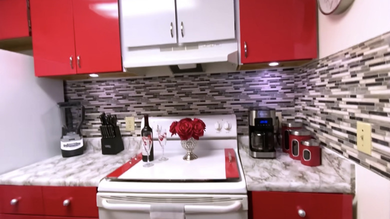
If you're having a hard time figuring out how this renovation is renter-friendly, you're not the only one! The YouTuber yoduvh Essentials attached laminated boards over the cheap builder-grade cabinets for a sleek and ultra-modern update. She also installed push lights under the cabinets for a more dynamic and attractive aesthetic.
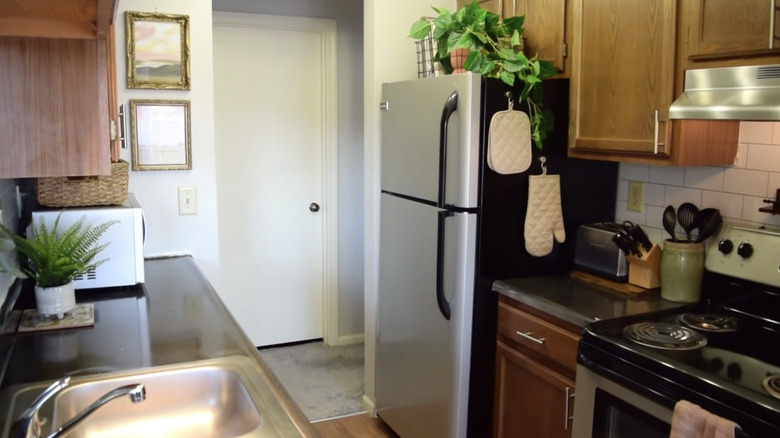
55. Before: Cramped NYC kitchen
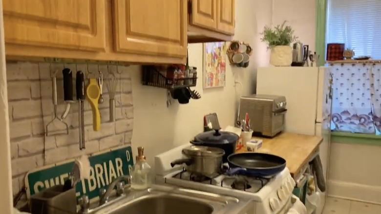
This tiny Astoria apartment is what many city dwellers probably see in their kitchens. With so little storage space, things have a habit of just stacking up on the countertops, which results in even less counter space than before.
56. After: Glam rental-friendly update
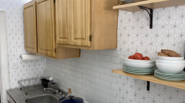
Bright geometric wallpaper and a new shelving unit help lift things off the countertops, making the space feel a million times more spacious. While you may be unable to gut the kitchen, remember that hanging shelving only requires a few screws and that holes can be patched at move-out.
57. Before: Itty bitty kitchen
While glass cabinets can be beneficial in always seeing the location of items, it can also be tricky if your objects are less than Pinterest picture-perfect.
58. After: Contact paper is everything
Using window film is a cheap solution to help conceal the contents of the cabinets while adding visual appeal. Additionally, warm yellow lighting under the cabinets makes the space feel cozy and warm rather than cramped and rundown.
59. Before: Renter's yellowed kitchen
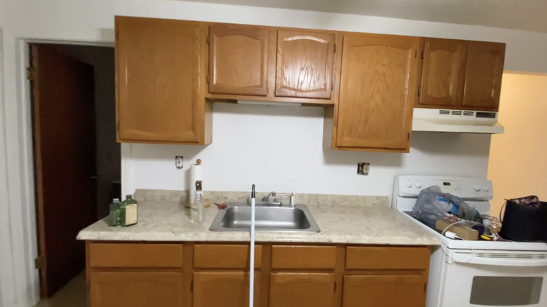
The yellowed linoleum and the cheap wood-finished cabinetry make this kitchen look stale and uninteresting. While this is a rental, you wouldn't want to be stuck with these finishes long-term.
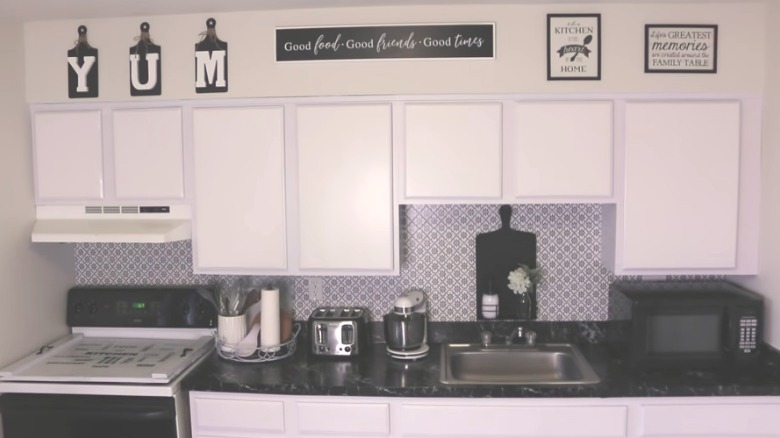
60. After: Renter's black and white paradise
Let's never stop singing the praises of peel-and-stick wallpaper and how it can transform spaces from drab and bleak to clean and modern. We also give many props to the YouTuber Juju's Journey for keeping it real and showing how much time it takes to make this magical material work.
