30 Creative Fireplace Makeovers That Will Blow You Away
Fireplaces are an extremely versatile thing to have in the home and they can definitely be redecorated or built from scratch. They can be a main focal point in your living room or bedroom that gets your guests talking, or they can be subtle to add texture and dimension to your space. Either way, renovating fireplaces into something new and show-stopping can be a fun, creative project.
When it comes to remodeling a fireplace there are a few things to pay attention to that can make small changes into noticeable ones. A typical renovation day involves thinking of how you want your fireplace to look once it's finished and buying the materials to get the end result. You'll want to consider replacing or adding a mantel, using either brick, solid wood, or a new paint job, or tiling the hearth, according to Kyle M. Interiors. Adding small décor items around your fireplace can also make a big difference to the way it looks.
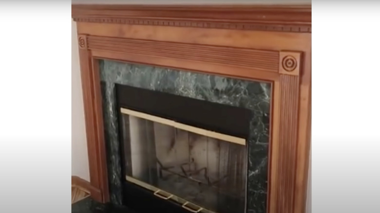
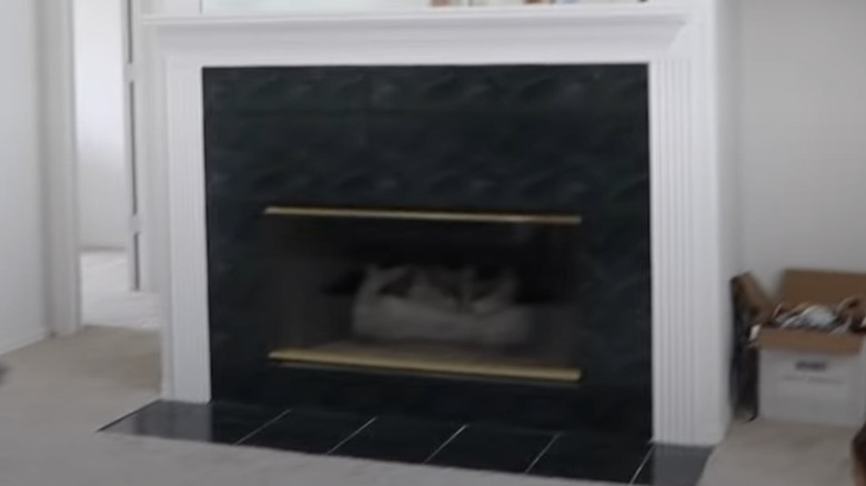
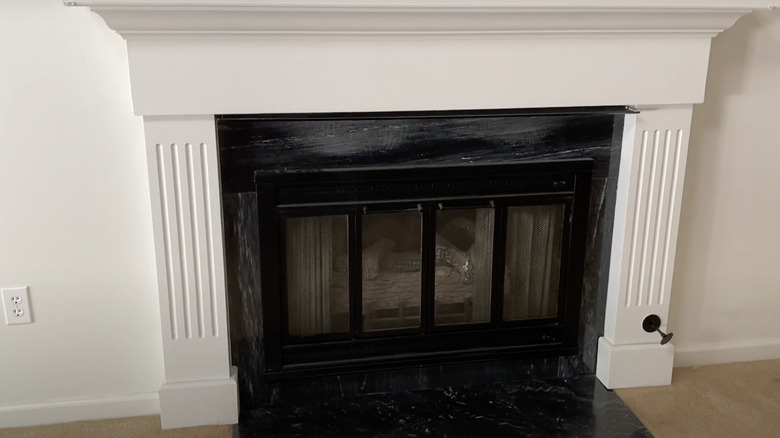
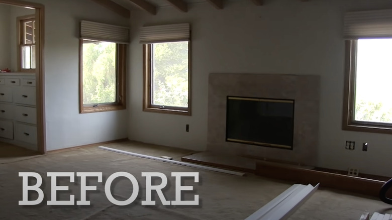
Before: Dated Fireplace
Although this fireplace is in perfect condition, without any damage to the wood or granite, it does have a dated look and the granite doesn't match well with the wood finish. The granite accent seems out of place, especially with the black and gold doors that open to reveal the inside of the fire.
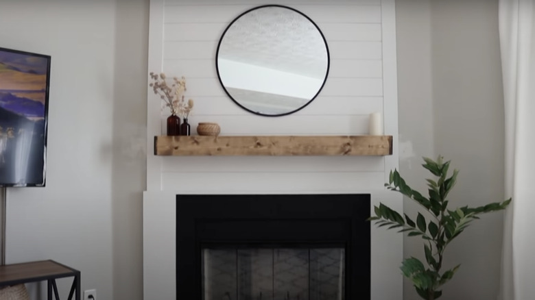
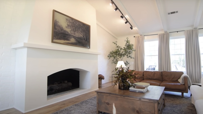
After: Modern fireplace
A complete makeover, the new fireplace relishes a white, sleek background with the same black base, but there are new glass doors instead of the gold ones. It's brighter and has a touch of farmhouse style with the wood mantel. It's simple yet eye-catching.
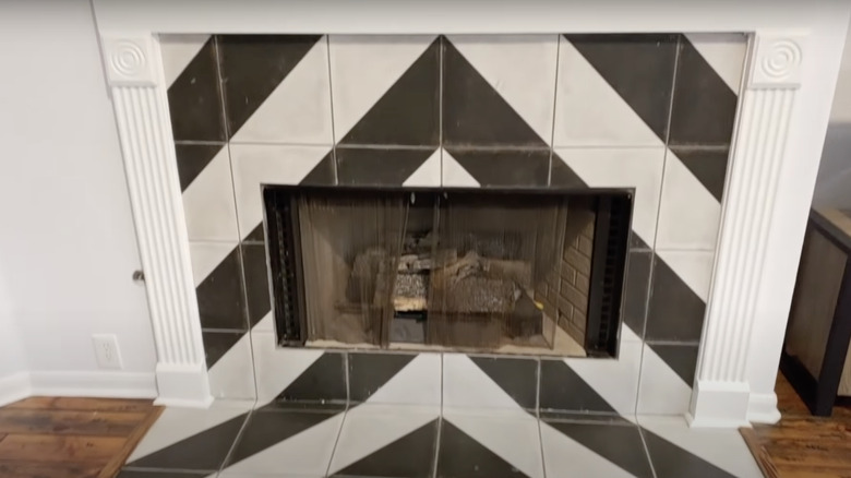
Before: Mismatch disaster
While the black and white chevron tiles give the fireplace a unique look, it clashes with the wood flooring of the house. The tiles themselves have also lost some of their color and definitely have some dirt that needs to be cleaned up in between. The curtains also need to be replaced with ones that aren't rusty.
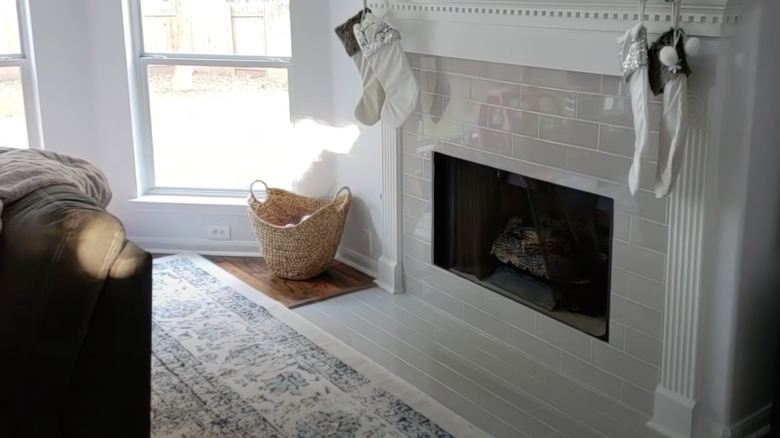
After: Elegant fireplace
This fireplace received the perfect makeover with the newly installed gray-white subway tile that doesn't clash with the wood flooring. It livens up the space and blends in with the wall perfectly. The trim and mantel were kept, which ties the entire look together.
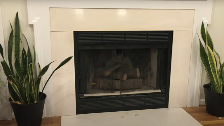
Before: Basic fireplace
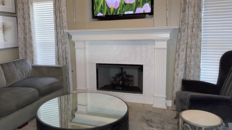
This fireplace is simple yet bland with the white trim and black base that definitely need some help. A black base is fairly common to see in new homes, so replacing it with something brighter and with texture will give the wall more personality.
After: Textured fireplace
The upgraded fireplace gives the room a whole new look with the textured tile veneer. Although the gray color of the tile is close in color to the white shiplap wall, it still stands out since it's not just a plain solid background.
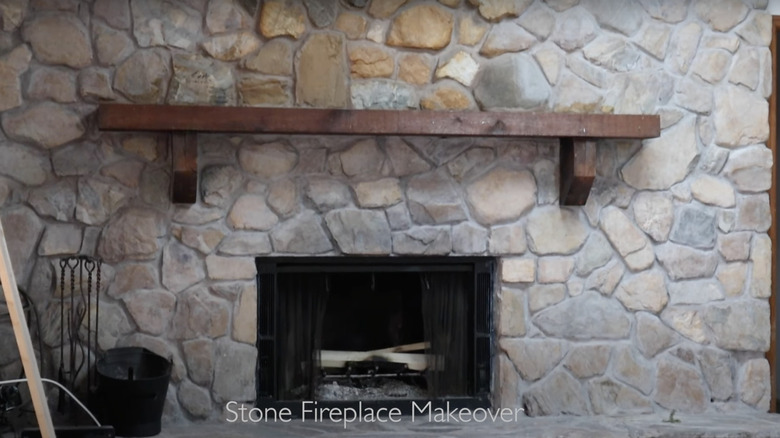
Before: Dirty and old fireplace
The entirety of the fireplace including the length of the rock wall needs a lot of help. As you can see there are stain marks just above the opening of the fireplace, and the rocks on the wall are dirty, making the room look dull.
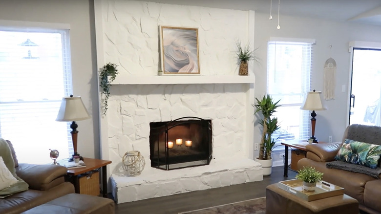
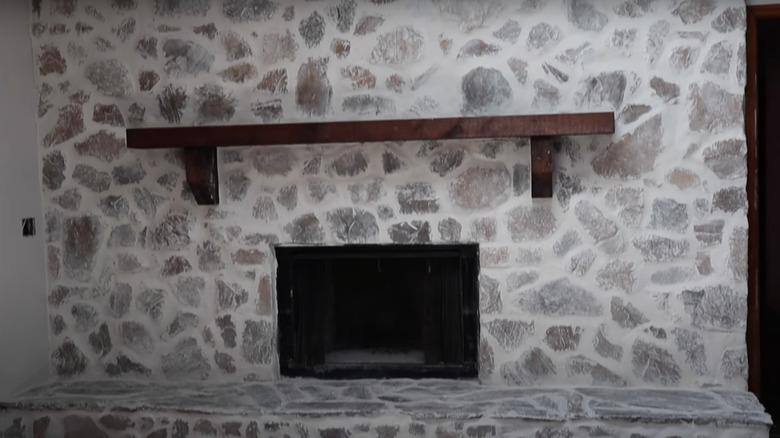
After: Striking new paint job
A little paint can go a long way and it did for this fireplace, the white color makes the entire wall and room brighter and gives it a chic look. The surface of the stones is still visible through the paint, so it adds great texture to the wall.
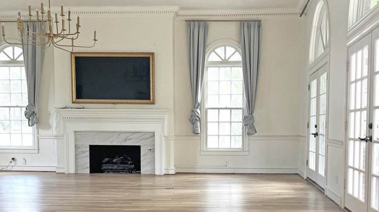
Before: Rundown fireplace
Red brick fireplaces are traditional in many homes, but can sometimes become hard to work around when you're trying to decorate your space. This red brick fireplace has chipped bricks that need replacing, or a new look altogether to flow with the rest of the room better.
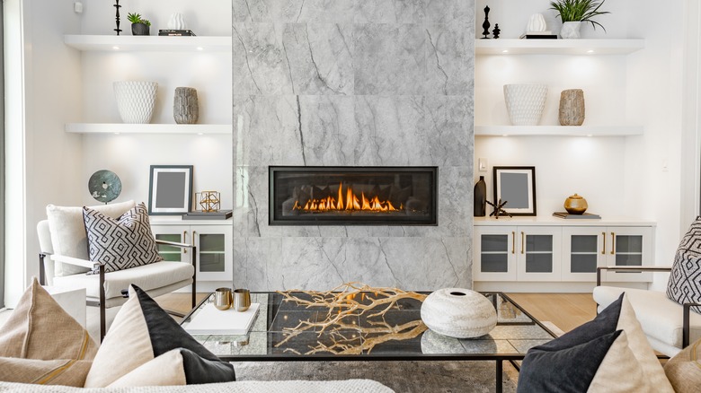
After: Luxurious marble fireplace
The fireplace wasn't the only thing that got updated, the entire room is completely brand new. Focusing on the fireplace, the red brick was replaced with gorgeous marble slabs that give the room an elegant and luxurious feel. The new white walls make the fireplace the main focus of the room.
Before: Plain fireplace
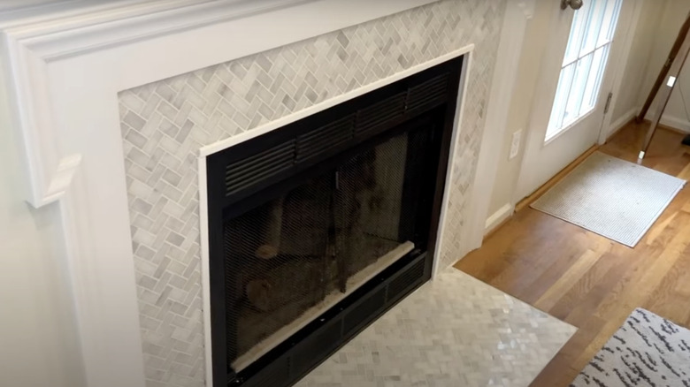
With a lack of any detailing, this fireplace has a plain off-white base around the black fire. The floor has a few stains that need to be removed or replaced to give the fireplace a fresh new look. The tiles around the fireplace are also uneven.
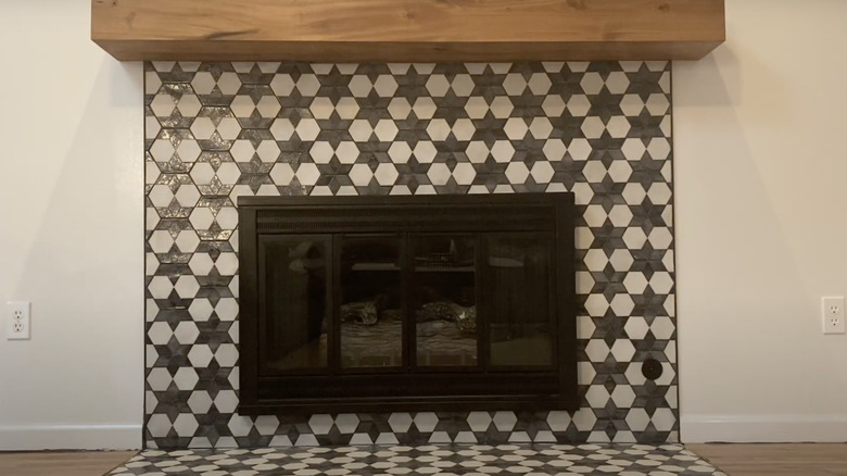
After: Ornate tile fireplace
Out with the solid background and in with a stunning textured tile background. The gray and white pattern draws attention to the fireplace, instead of it hiding in plain sight this ensures you notice it. The tile gives and fire gives the entire room some personality.
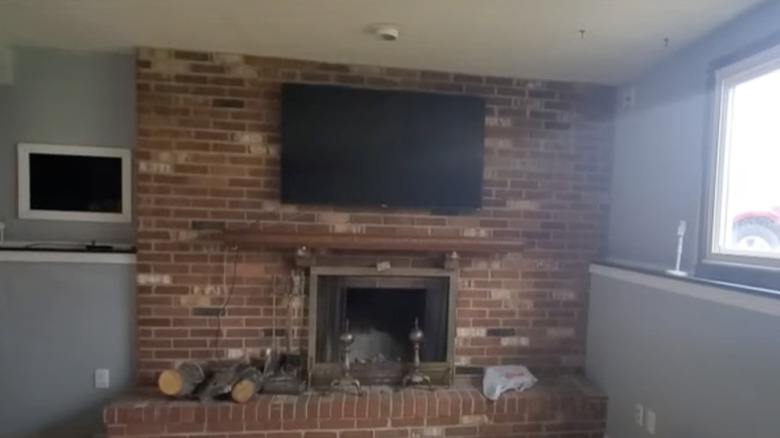
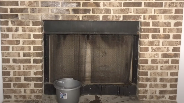
Before: Dull fireplace
The only way for a brick wall to work in a home is if it complements the other wall colors. This brick wall fireplace has chipped bricks and the inside of the fireplace needs some sweeping as well as the top part of the mantle where the wood lays.
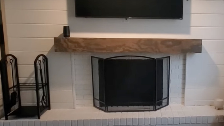
After: Black accent fireplace
With a complete renovation, the red brick has been long forgotten since the new white display of shiplap and white brick features. It makes the entire room an inviting place to be. The fireplace itself was also cleaned out and has a new black metal screen to keep the dust and ashes inside.
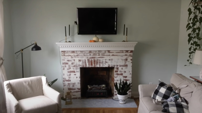
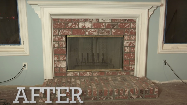
Before: Patchy fireplace
After one renovation, this fireplace was left with a patchy white paint job over the red bricks. It looks out of place against the mint colored wall and the rest of the room. It definitely needs a new paint job or a complete new sets of bricks.
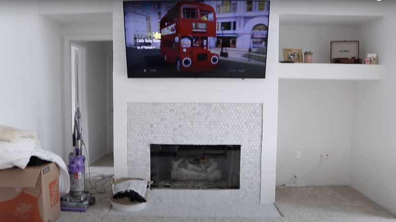
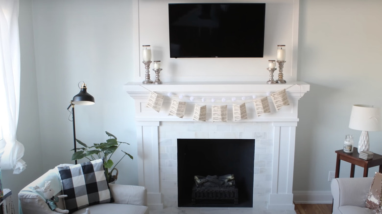
After: White brick fireplace
After the red bricks were replaced with smaller white bricks and beautiful white panels it gives the entire fireplace a lavish look. The newly installed white mount behind the television elongates the fireplace and turns it into an accent wall. It adds texture to the room and makes it look clean without the loose wires.
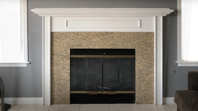
Before: Granite fireplace
The granite around the fireplace would work best if the wall was a beige color instead of gray to prevent a clash. The gold accent on the doors also looks rundown and needs an upgrade to give it a fresh look.
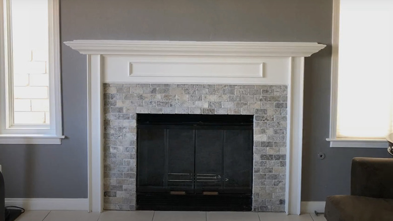
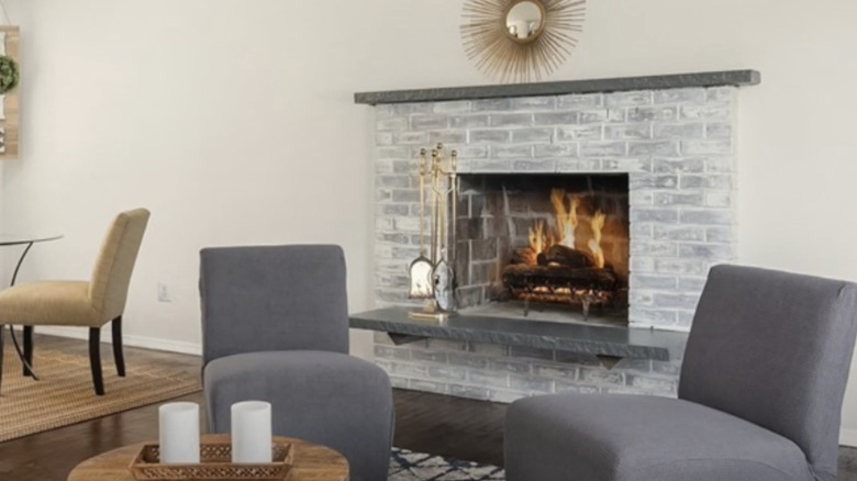
After: Multicolored brick
While the walls didn't change, the fireplace got a gorgeous upgrade with beautiful gray bricks that match the walls. It also got a new paint job, with the gold trim now being black. It creates symmetry and makes the room feel expensive.
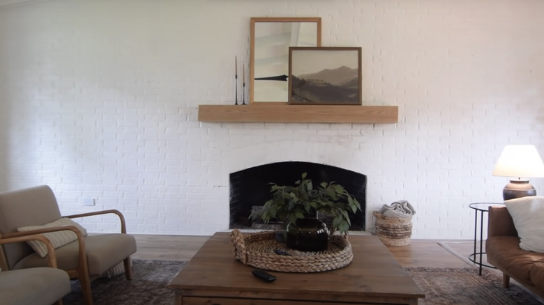
Before: Hole in the wall
This fireplace is simple and plain by just being a hole in the wall. The wooden shelf above it gives the wall some color and texture, but the black hole looks out of place in the room.
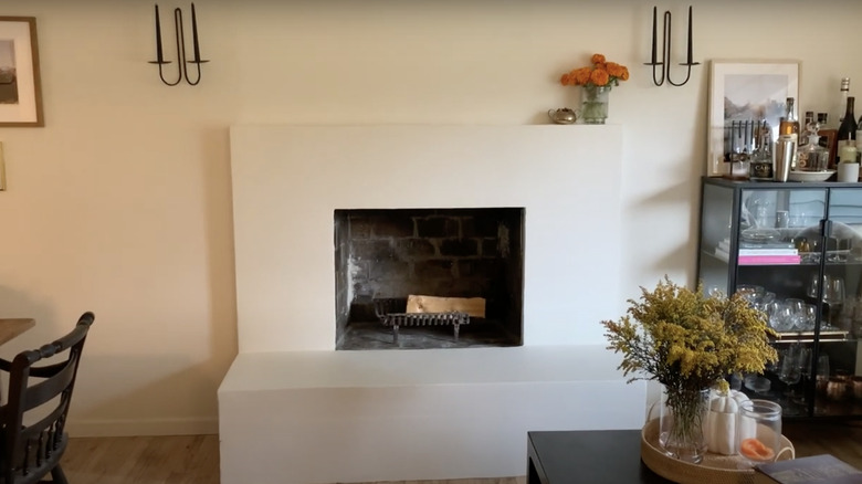
After: 3D fireplace
While the fireplace still looks like a hole against the white wall, there's been a huge transformation of the wall itself, with a new custom-built fireplace. It adds a 3D effect to the textured wall making it the main focus of the room.
Before: Classic fireplace
Most fireplaces have either a red brick exterior or a classic white trim with black doors. This fireplace has the latter, a beautiful white trim, and a ledge with a black interior. It is scuffed, so it only really needs a new paint job.
After: Starry fireplace
Possibly the most unique fireplace anyone has created, this beautiful new fireplace has a star-themed vinyl around the newly painted doors. Instead of the white ledge, there's a brown one that matches perfectly with the wood flooring. It makes the room feel fun and gives it an early 2000s feel.
Before: Rustic fireplace
This rundown fireplace is in dire need of a clean-up from the ash that spilled out from the inside of the fire. It needs a new set of bricks and doors to restore it back to how it was first built.
After: Plant filled fireplace
Out with the brown brick, in with pearly white bricks that make the space brighter. While white brick can often look plain and simple, the green plants add color to the space. The doors also got replaced with new wire screens.
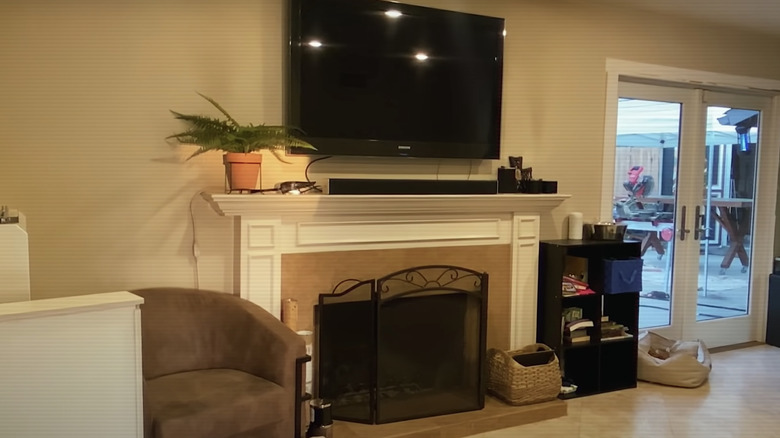
Before: Traditional fireplace
There's been many white trimmed fireplaces with a brown interior and black doors and this is just another one of those, but now there's too much going on around it that needs to be cleaned up. Once the arm chair and cubbies are removed along with the smaller décor the fireplace will come out of hiding.
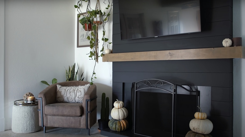
After: Black shiplap fireplace
This striking new fireplace is completely different from the way it looked before. Instead of a brown background, there's a new floor-to-ceiling black paneled background with a brown ledge that separates the fireplace from the tv. It looks more organized and put together with minimal décor around it.
Before: Stone tile fireplace
While the white exterior looks in tip top shade, the stone surrounding the fireplace is rigid and uneven. They could've been designed to be the same size instead of having large stones at the top smaller at the bottom. They need to be replaced to make the fireplace look symmetrical.
After: Lavish fireplace
The great thing about renovating a fireplace is you can use the most simplest inexpensive items to spruce it up to look elegant. This new fireplace kept its stone tile, but was covered with a white peel and stick wallpaper. It makes the room feel put together and the fireplace becomes the main focus of the room.
Before: Dated fireplace
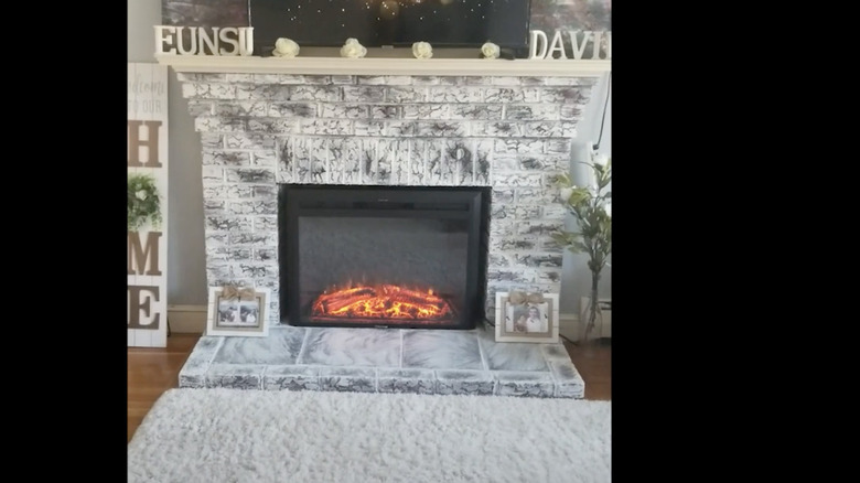
The multicolored brick of this fireplace is dated and destroyed by the burnt marks from the fire. The hearth tile needs to be replaced with a new color, while the brick surrounding the inside could do with cleaning.
After: Grunge fireplace
Although the old brick didn't get replaced, it was repainted with white paint, making it look grungey but also worn out with the black streaks poking through the paint. It makes the fireplace look funky. A screen door was also installed and is different from most others since this one pulls down from the top.
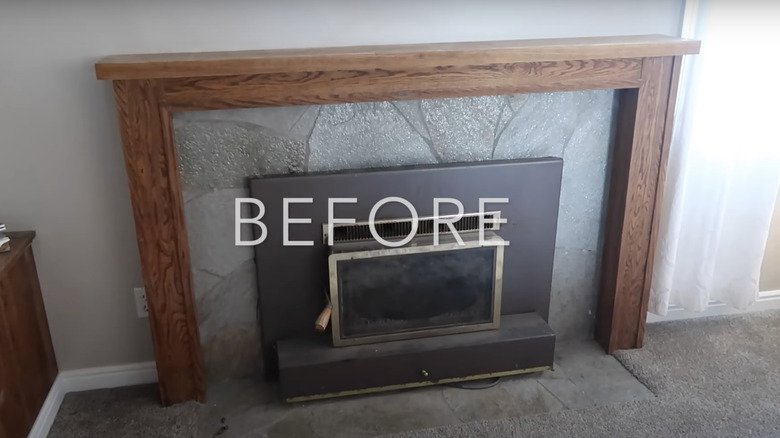
Before: Mismatched fireplace
The wood surrounding and stone mantel definitely mismatch the black fireplace since they're different colors and textures. If it were all gray or all wood then it would work well, but it looks odd, especially against the carpet.
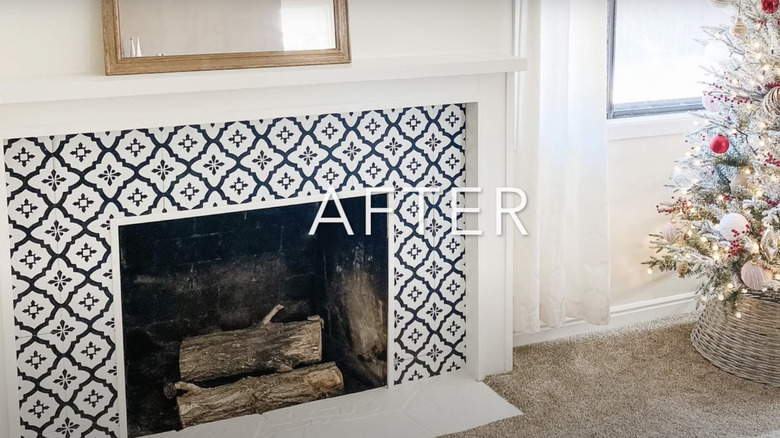
After: Gorgeous patterned fireplace
With a completely new design, this fireplace replaced the wood surrounding with a white solid surrounding and hearth. The old stone is now a beautiful comet pattern with a peel and stick wallpaper covering. It makes the room feel elegant and luxurious.
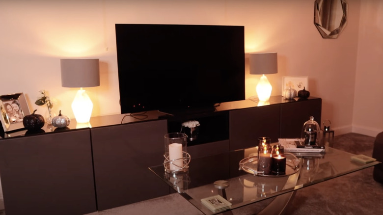
Before: Lack of fireplace
The most interesting fireplaces are the ones that are built from scratch. This before shot obviously doesn't have a fireplace, but there's definitely space for one, if the television entertainment stand is removed.
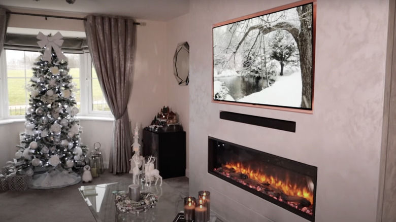
After: Opulent fireplace
This custom-built fireplace is possibly one of the most stunning fireplaces yet. It makes for a great accent wall since the television, sound system, and fireplace are all on the same wall. The fireplace is low and subtle, but draws attention when it's turned on.
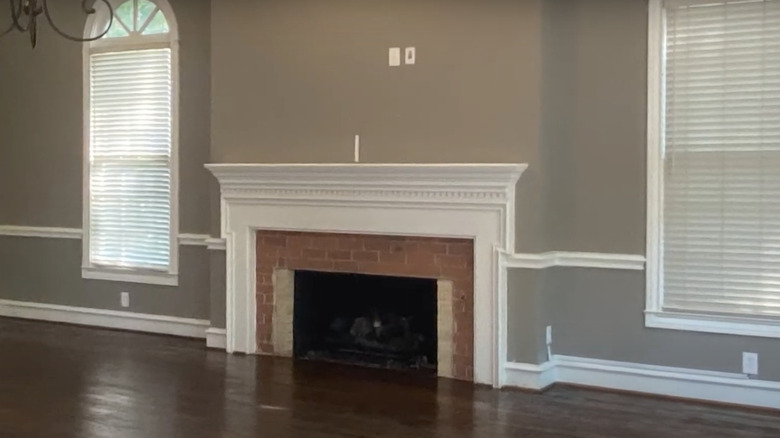
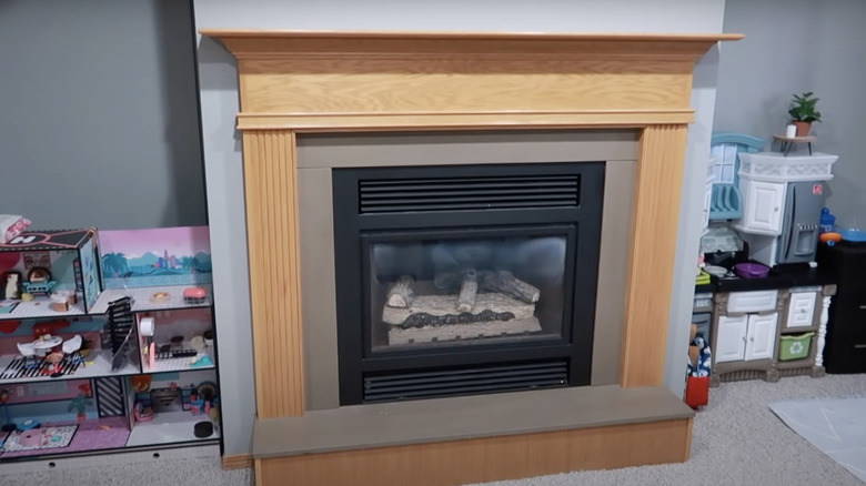
Before: Modest fireplace
This fireplace is mundane with the wood base and the taupe mantel, but it does match the theme of the room's gray walls and light gray carpet. Even though it's a standard fireplace with minimal problems, it can still use an upgrade to make it eye-catching and less boring.
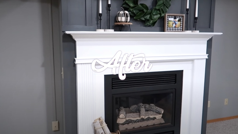
After: Chic fireplace
This new and improved fireplace is everything and more, encompassing a chic aesthetic with the all-white surrounding against the charcoal wall. The added décor of the candlesticks and green wreathe gives the wall personality, instead of it being empty, and makes the room feel cozy.
Before: Antique fireplace
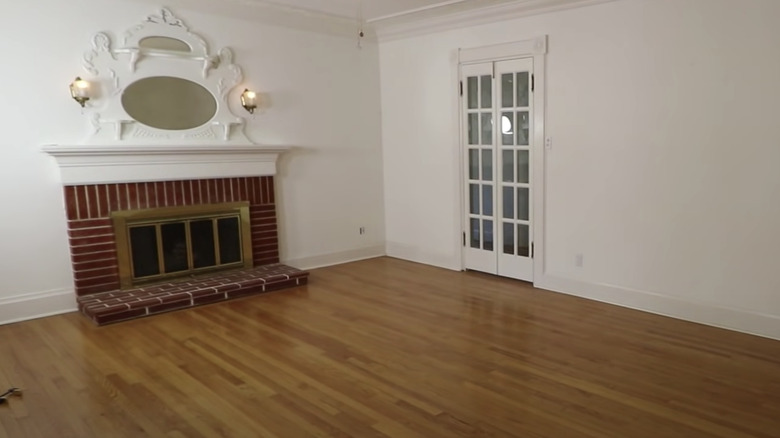
The traditional red brick and gold doors can make any room feel like you're in an antique shop. Its white mantel with the hanging mirror gives the room a haunted feel, so a whole new fireplace is needed.
After: Farmhouse fireplace
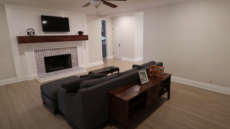
While the fireplace didn't get a whole remodel it did get some new features such as a mahogany wood mantel that matches the drawer cabinet. The entire wall changed from a basic white to a light gray with a wood-paneled accent wall. The red brick now has a light white layer, making it more subtle.
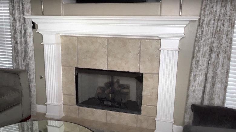
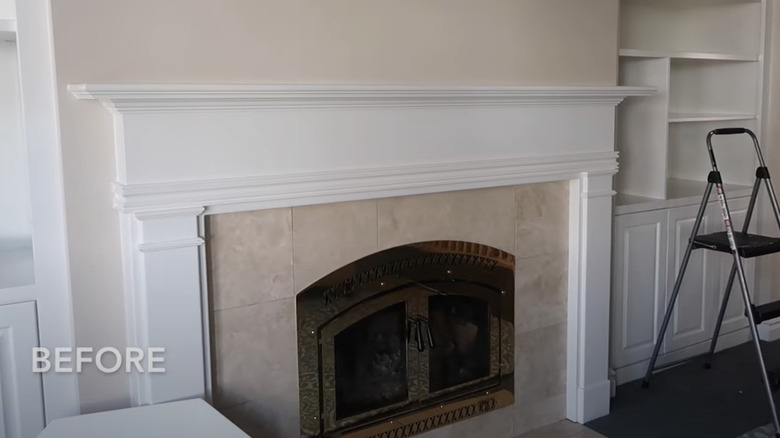
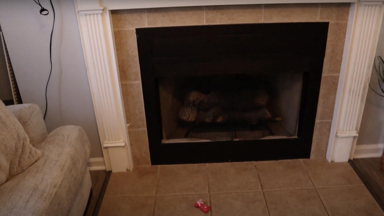
Before: Beige tone fireplace
While this fireplace doesn't have any unavoidable issues, it could use a new interior surrounding the doors to make it look more luxurious instead of using basic beige tile.
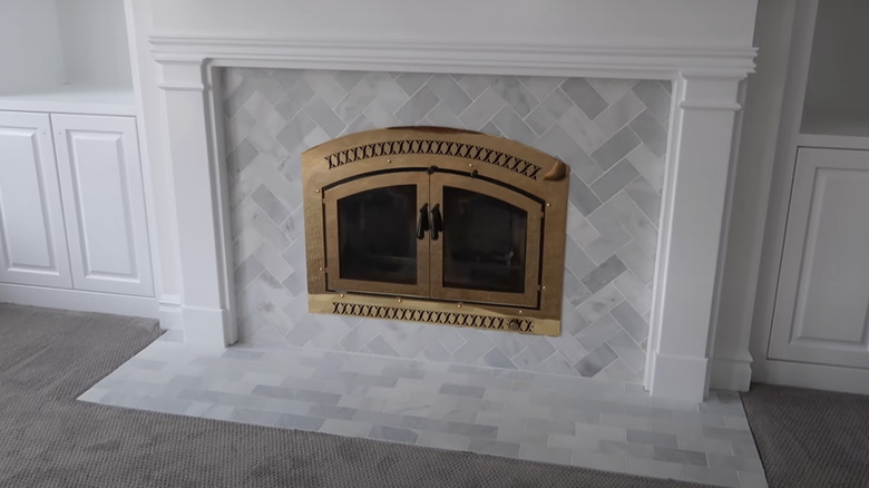
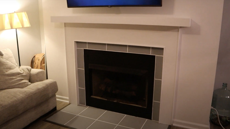
After: Charming fireplace
The old stone tile was replaced with this striking gray tile that makes the room look sophisticated, especially with the gold doors that were kept.
Before: Neutral fireplace
This plain fireplace looks washed out from not being maintained or repainted over the years. It could use a new color, along with a mantel, to give the surrounding wall some more texture.
After: Industrial fireplace
A completely new fireplace with a gorgeous white mantel and panel on either side. It matches the freshly painted windows, but the new brick makes it look aged. While it's still a creative take on it making it look authentic, the bricks could've been repainted to look new.
Before: Muted fireplace
The stone on this fireplace is striking, but the white surrounding panels throws off the entire thing. If it were a solid white without the decorative detailing then it would stand out, but it looks like there's too much going on.
After: Minimalistic fireplace
The transformation of this fireplace is outstanding with the simple white surrounding and mantel. The tile was changed to a light gray, which brings the entire fireplace to the main focus of the room and makes it feel cozy.
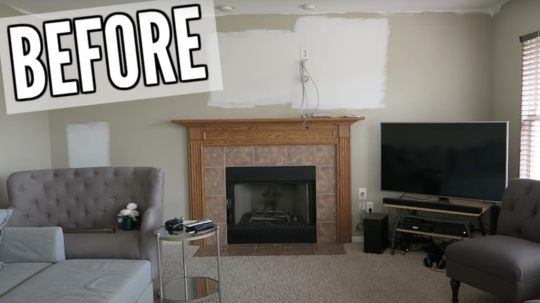
Before: In the making
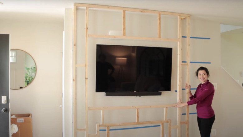
Another custom-built fireplace in the making, with this spacious wall. If your tv can be mounted on the wall, then you have enough space to tuck in a small fireplace below. Use every inch of space, and it has the potential to be turned into something amazing.
After: Superb fireplace
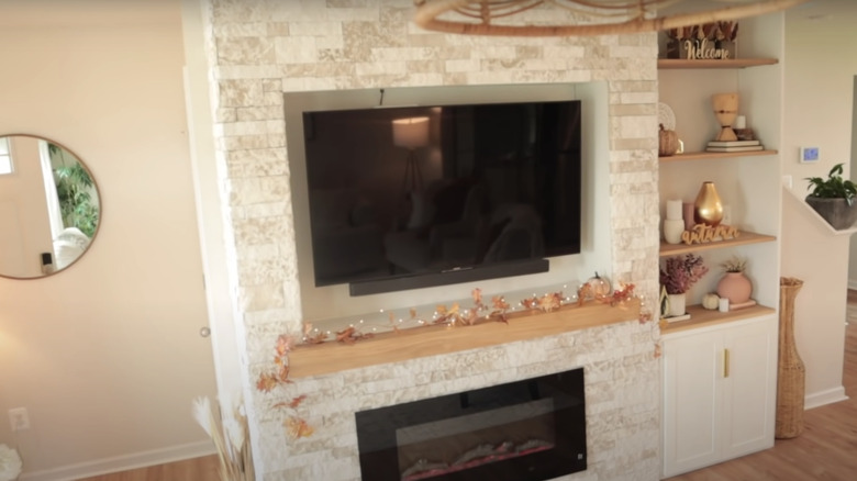
This newly built fireplace is truly breathtaking with the white brick wall and small fire below the wood mantel. Since the white bricks draw attention on their own, there can be minimal decoration above the mantel. With built-in shelves and cabinets, it completes the entire wall and makes the room feel put together.
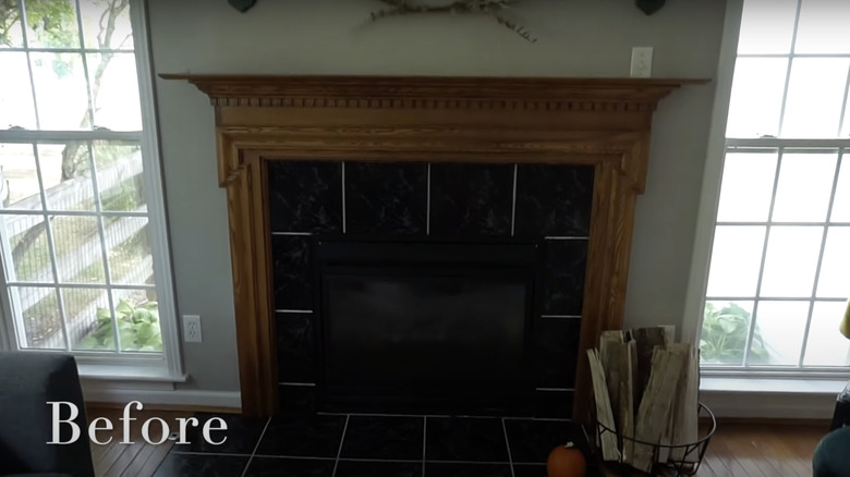
Before: Moody fireplace
While there are a few interesting features with this fireplace, they don't necessarily complement each other, such as the black and white tiles with the wood surrounding and sage green wall. There are too many colors, especially dark ones, which make the entire room look dark and moody.
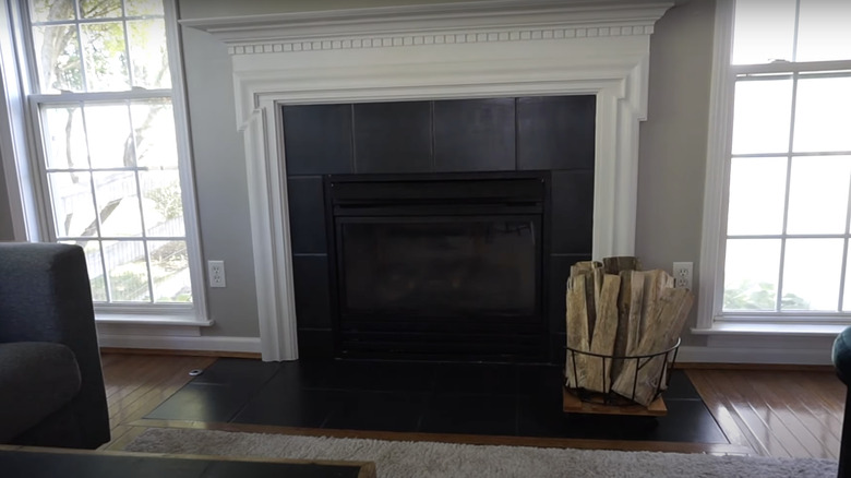
After: Contemporary fireplace
This renovated fireplace replaced the wood finish exterior and sage green wall with a white surrounding and light gray wall. It makes the room and fireplace look radiant, and the basket of wood makes the best décor item; it's within reach for the perfect occasion.
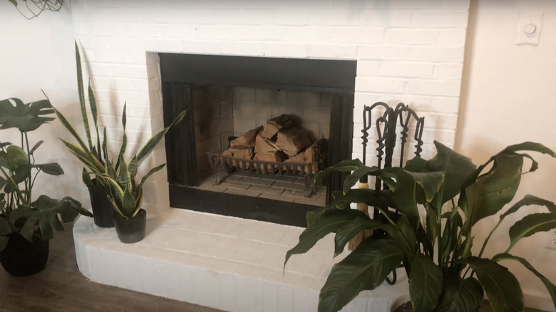
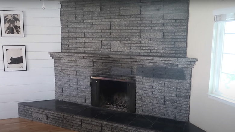
Before: Stained fireplace
This fireplace would be beautiful if it weren't for the stains and ash marks on the charcoal bricks. It needs a solid paint job to get rid of those marks and make the fireplace pop.
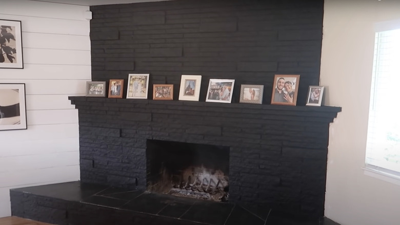
After: Spooky fireplace
The old charcoal fireplace was a safe color to go for, but this new paint job makes the fireplace and room feel spooky with the dark black color. It's a perfect monochrome interior with black and white colors in the room, which is perfect if you're looking for a minimalistic style.
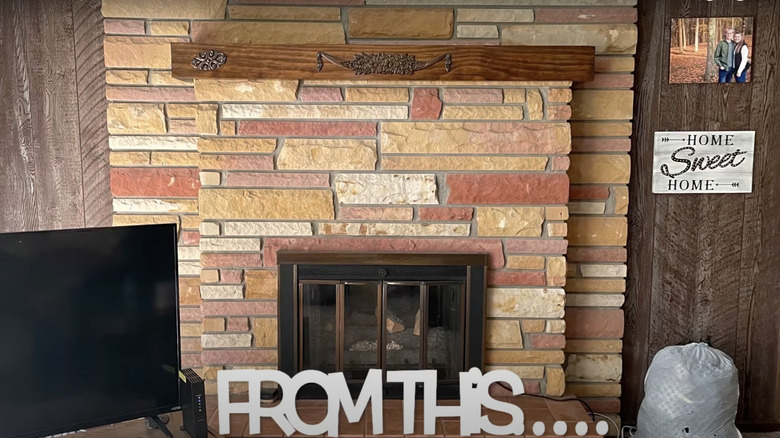
Before: Country fireplace
This fireplace is striking with the different toned bricks and solid wood mantel. It doesn't necessarily need to be changed, but if the rest of the living room is redecorated, it may clash and need to be painted a different color.
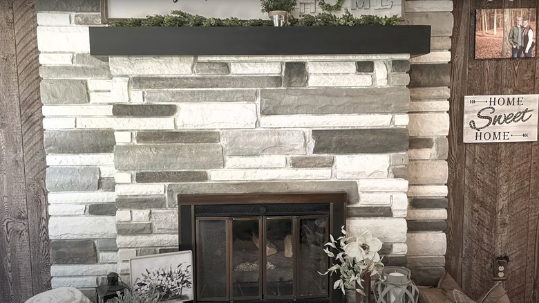
After: Snazzy fireplace
While the orange and yellow bricks were a unique touch to the living room, these white and gray bricks make it easy to match various décor pieces. It complements the wood wall better than the old bricks and makes the room feel more welcoming.
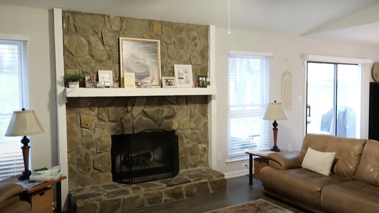
Before: Medieval fireplace
The stones on the wall are clean and dust-free, but they are definitely dated and make the room feel more medieval than a cabin. While it could take a long time to remove the stones, painting them could brighten up the place, and with the right decorations make it more modern.
After: Leopard fireplace
The new pointed stones make the fireplace look like a snow leopard's coat on the wall. It gets rid of the medieval feeling in the room and makes it look more rustic and inviting. There could've been a black wire screen in front of the fireplace to make it look less like a hole in the wall.
Before: Gray fireplace
The gray brick of this fireplace has faded and could use some new paint or a whole new look. The gray leaves limited room to pair it with bold furniture and décor items, so sticking with white or black can expand those options.
After: Bare fireplace
Even though the gray brick could've worked for certain furniture pieces, this white refurnished fireplace makes room for funky colored furniture. It also adds texture to the room and an extra seating area for guests by the fire.
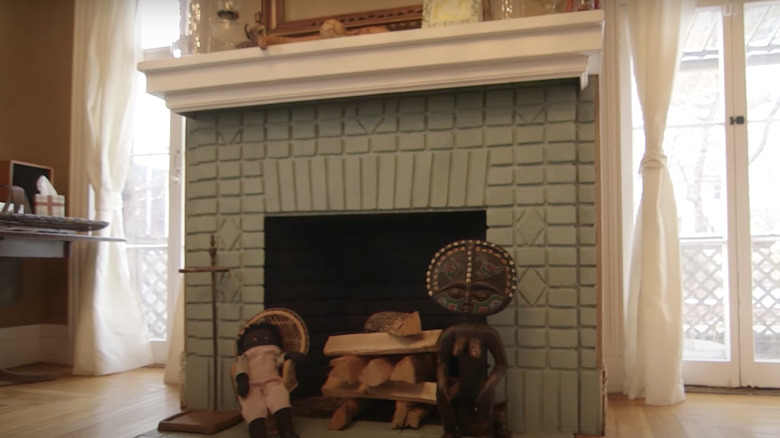
Before: Tiki fireplace
The tiki dolls and wood cover up most of the fireplace entrance making it appear smaller, and the detailing of the veneer is dated. A new style could spruce up the fireplace and removing the dolls would make it look bigger.
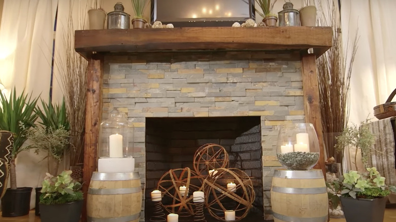
After: Lodge fireplace
This new and improved rustic fireplace gives the whole room a new look by adding volume and height with the stone veneer and wood accents. It makes the room feel like you're staying in a log cabin in the woods.
Before: Overused fireplace
The stone and wood combination has been seen many times, and although it's the perfect size for the room, it definitely needs a change. The stone veneer and wood mantel clash with each other and doesn't work with the rest of the room.
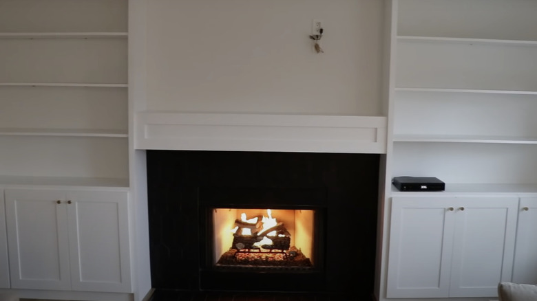
After: Gimmicky fireplace
The transformation of the entire wall is a mouth dropper, with the new shelving units and pitch-black fireplace emitting its bright light. It looks like a dark tunnel where you can see the light at the end of it. The new fireplace stands out well in the all-white room.
