5 Colors You Should Never Paint Your Home Office
As the world has moved to more remote and flexible forms of work in the past few years, many of us have converted parts of our home space into mini offices. Whether you have taken over the kitchen table or dedicated an entire room to the cause, ensuring that a space makes you feel productive and inspired is key. Furniture types, mirror and window placements, the general setup of light and airflow, and the use of color — these factors make or break your workspace.
Not only does color affects the mood but also impacts how we experience a space. A room can feel hotter, colder, bigger, smaller, and so many other things just based on the dominant shade on the walls. This is why it's essential to know a bit about color psychology to make the right choices for the different parts of the house, Stoneside notes. The color scheme of your WFH space needs to maintain a certain level of calm, inspiration, and neutrality that welcomes you any time of the day. It needs to neither over nor underwhelm you and be suitable for long stretches of productivity. This balance is tricky to achieve, and certain paint colors that can bring about the opposite effect should be avoided.
1. White and other neutrals
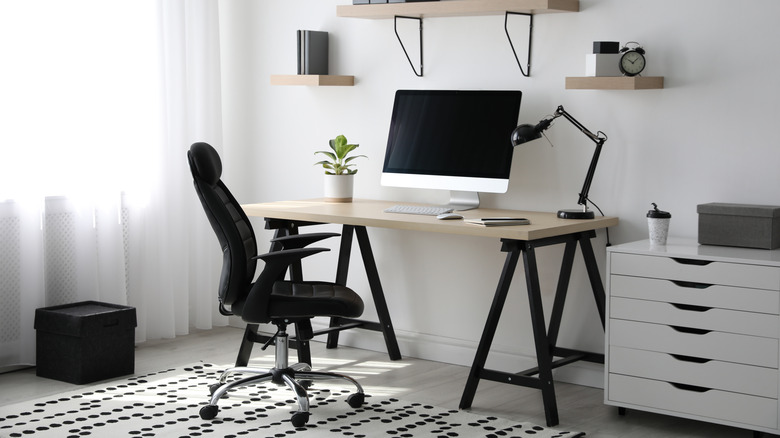
What color paint do you see on the walls of most offices, clinics, and banks? It's prevalent to find white or neutral paint there because it gives the appearance of a professional and tidy space. These shades are a popular choice for an office because they communicate cleanliness, simplicity, and efficiency, Painters Inc notes. In addition, it feels like a blank background that can accommodate all types of décor, furniture, flooring, etc. However, too much of a neutral color can portray your office as boring.
It can make you feel unproductive and drained of inspiration as well as energy. Studies have shown that offices painted white and other neutrals can bring about feelings of unhappiness and depression (via Entrepreneur). Too much of a naturally moody color like gray can also bring down the mood, reduce confidence, and even put you in a state of hibernation. Major Painting suggests using these neutrals sparingly and alongside other colors. Mix things up with other colors to get the best effects from all shades!
2. Red
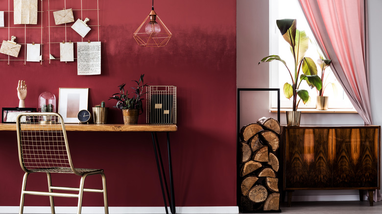
Definitely not a neutral shade; red is always associated with passion, tenacity, and even increased blood flow. Need to call attention to something? Trying to invoke love and desire? Red is that color! However, when setting up a workspace, a red paint job will be counter-productive as it can put you on edge and result in over-stimulation. Our bodies produce a strong physical reaction to this color, which isn't ideal when you're trying to stay in work mode most of the day. This is also why red is hardly used in the bedroom — it doesn't provide a calming environment for rest and relaxation.
Determined to use red anyway? It's best to cut it down to only some hints because it then works positively to boost energy and motivation when you need it. The shade of red you choose is also crucial. As per Home Stratosphere, earthy, calm, muted hues will work better than the loud, bold reds.
3. Yellow
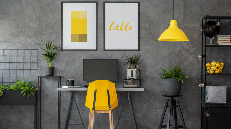
Working from home is already tough since you are in your comfort zone, so your office should be as neutral as possible to allow you to work. Yellow is known to lift spirits and make a space feel cozier, so this bubbly, cheerful energy is best suited for the bedroom and kitchen walls. However, it is known to hold very strong feelings and evoke strong emotions, which isn't ideal for a work environment.
According to Oldfather Group, yellow reminds us of old decor styles and can make a space feel smaller. This color can also cause eye fatigue, which is one of the worst things to have if you're already battling with staring at screens all day. If you must include yellow, do so in little pops here and there that will communicate your fun personality and also be a great source of energy while you work. Even a yellow art piece hung on the wall or something bold on your desk can be enough to give your mood that lift.
4. Bright green
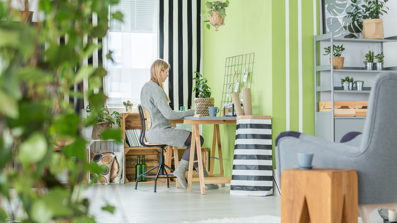
Green is a popular color for a wall because it brings a soothing feeling into the room. It calms but also inspires, and its endless shades range from vibrant to relaxing. Green can be what you're missing in your living room, kitchen, or transitional space. However, a home office needs to encourage focus and provide an opportunity for concentration, which is why bright shades of this color are more of a distraction due to their strong energy. Like yellow, bright green may boost your creativity but won't be calming enough to allow you to sit in for long amounts of time (via Allwomenstalk).
If you have a creative job and need that push while you work, opt for an emerald or leafy green (i.e., very light or very dark) instead. They can provide the calm you need while working. You can also bring calming greens into your office in their most natural state: plants! A jade plant, for example, can give you just the right touch of life and color you need in your workspace without needing too much attention.
5. Brown
From your Zoom calls to getting energy from the sunshine outside, light is an important part of working from home. Thus, it's better to avoid the color brown because it won't reflect the light that comes in and will cause you to depend on other light sources, per Oldfather Group. In addition, if your home office is small, dark colors will emphasize the lack of space, which means you won't feel comfortable while you work. They can also make a room feel serious and heavy, hindering the level of openness and brightness needed to dive into your work.
But if you love brown so much, you can apply it to the furniture and décor pieces instead of the walls. Brown pieces will bring that earthy, homey feel to the place and also feel a bit sophisticated. Wooden furniture, for example, can be a great scheme for your office, per Autonomous, so, avoid the brown walls to ensure you look clear and bright when you turn on your video for the daily calls!

