Bad Home Advice Dished Out On Queer Eye
Making over a house is obviously more challenging than it looks on TV, but the "Queer Eye" Fab 5 makes it seem like installing flooring, cabinets, appliances, fixtures, and plumbing is a breeze. According to IMDb, the show's design experts, which include Tan France, Jonathan Van Ness, Karamo Brown, Bobby Berk, and Antoni Porowski, make over someone's house in just a few days. However, for most remodeling projects, the process takes months.
Even minor renovations take a few days to three months (via Legal Eagle Contractors). Medium projects like a complete kitchen renovation can take up to six months. Moving electrical outlets, switches, and fixtures might require a permit. You'll need to have a licensed contractor do the work to pass muster, not to mention the safety factor of installing wiring in your home. While the Fab 5 make remodeling look like a snap, their fabulous results take a lot more work than what you see on the show.
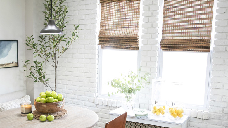
You should paint your exposed brick
Once you've painted brick, you can't go back. Since brick is porous, it soaks up the paint and traps it below the surface, making it impossible to remove without damaging the brick. If you decide to paint it, that's a permanent decision that requires some thought. Masonry of Denver advises against painting brick because you can trap moisture in the brick behind the paint.
If you do want to paint your brick anyway, you should always use moisture-permeable paint from places like Purity Limewash for this project to make sure that the brick and the paint job last. Brick isn't hard to maintain as a DIY project, and it looks great when it's cleaned up. Use vinegar and water, cream of tartar paste made from water, or baking soda and dish soap to clean your brick, and, of course, a little bit of elbow grease (via HGTV). However, there's no need to cover up your exposed brick with paint. You can show it off instead.
You can use your kitchen the same day you remodel
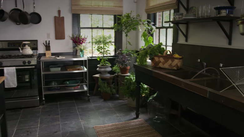
On "Queer Eye," it often appears like the kitchen is revealed to the makeover subject the same day the renovation is complete. However, there's a reason that kitchens can take a long time to remodel. The paint on your cabinets alone needs one to two weeks to dry. Before that, the surface is vulnerable to scratches, per Paint My Cabinets. Avoid returning them to regular use until the paint fully cures.
In addition to drying time for cabinets, flooring can also take a while to settle after installation. Waiting for the glue to dry on flooring can take one day to a week, depending on your floor type. Walking on new flooring or putting furniture on newly finished hardwood is a mistake (via 50 Floor). While they don't show these drying times on "Queer Eye," the floors would be ruined if actually done in the amount of time the show presents.
You should banish color from your palette
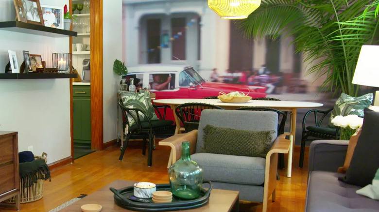
Many of the new home interiors on "Queer Eye" feature a lot of gray, off-white, and beige. These neutral colors are understandable because the designs created by the experts on the show need to fit with a wide variety of tastes and the homeowner's belongings. However, color is for more than just backsplashes or kids' rooms.
Expert interior designers use bold colors all the time in their designs. Monochromatic isn't the only color technique to use in a room, as you can see from award-winning designs on 2LG Studio. Color is the bedrock of any interior design (via Amy Wax Color Consultant). Color should be a central part of a design to help express the personalities and tastes of the people living in the space. Color can affect how a room feels and the overall atmosphere of your home, so it's essential to use some bold, personality-evoking color in your overall design.
You should paint your rented apartment any color you want
The design experts on "Queer Eye" often choose to paint all kinds of surfaces in rented homes to change the overall look of the space. While this is great from a design perspective, the Fab 5 likely signs contracts and gets permission from landlords to paint in real life. Not everyone will be okay with a drastic color change. Most of the time, tenants will have to promise to change the color back before they move and potentially hire professional painters to do the work.
According to Apartments.com, there are usually conditions you must agree to before applying paint. Sometimes the property owner will prohibit painting due to the potential future cost of fixing mistakes, repainting, and repairing the damage. If you were to paint your apartment or rental property without permission from your landlord, you would be opening yourself up to losing your deposit and incurring fees.
You should have light-colored furniture in a house with small kids
This one might seem obvious, but the practical qualities of your furniture are just as important as the looks. Kids can often be stain-making machines, creating spills, dirt, and art-based accidents. There are many kid-friendly options for simple clean-up, but white and off-white furniture is more prone to stains. Light-colored pieces are impractical if you want your furniture to last with small kids in the house. If you choose to use lighter colors, a washable slipcover is ideal.
Lorri Dyner Design points out that going dark with color can be a practical design choice for preventing stains. If you decide to go with a lighter color, it's best to use outdoor upholstery, as it is naturally liquid and stain-repellent. Designing with kids in mind can be challenging, but thinking practically and aesthetically will make your furniture last longer. No one is thrilled about spending money on a new cream-colored couch only to have grape juice spilled on it immediately.
You should hang art on every surface
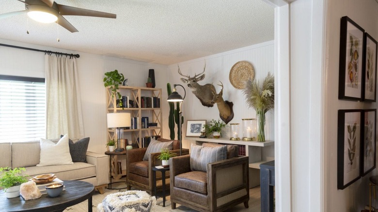
Sometimes the Fab 5 goes a bit overboard with art in small spaces. Covering every available surface with a piece of art or framed photograph can make it look crowded. Having artwork certainly makes a house feel more like a home, and putting up some pieces that reflect your personality is an ideal way to personalize your design. However, too much can look busy and make it challenging to pick out particular artwork.
While the neutral tones of some art make this less noticeable, crowding every wall and surface of a room with pictures will cause the details of your pieces to get lost. Leave one wall blank to allow your eye to rest, says UTR Decorating. Even better, choose one wall to showcase your artwork rather than hanging pieces all around the room (via 1stdibs). This tip will create a gallery-like effect, drawing your eye to the art. Smaller pieces should be showcased in smaller spaces, keeping scale in mind.
You can remodel your bathroom in a day
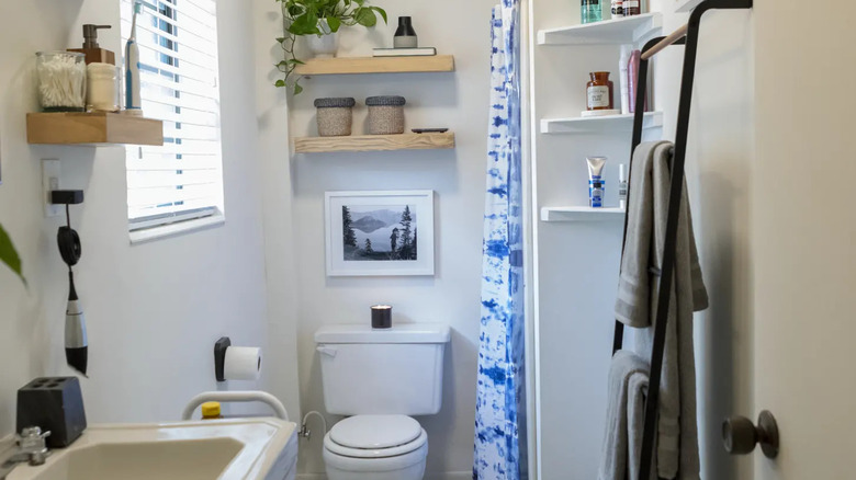
The "Queer Eye" Fab 5 make bathroom renovation projects look like a breeze, sometimes even ripping out plumbing and electrical practically overnight. However, it actually takes longer than that to go through the design and permitting process. Even a small bathroom renovation can take as long as five days — the amount of time the show has to complete the entire makeover.
According to Bath Tune-Up, the timeline for moving walls, plumbing, and electrical can be as long as eight weeks. You'll also need to budget time to complete the permitting process. Tiling alone can take up to 10 days since the glue and grout need to cure. While the design experts on the show likely already have permits and designs ready when they begin, ordinary homeowners will need to slog through this part of the process before starting their bathroom renovation.
You should paint everything in a room the same color
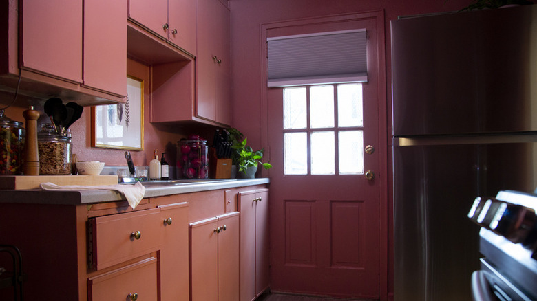
An all-one-color kitchen might sound like a good plan, but having at least some color variation, even in a smaller space, will break up the monotony and highlight unique features. If you've got dark pink cabinets on top, going for a shade or two lighter on the bottom row is a way to create interest and build a clean line.
While a monochromatic theme can be attractive, you should include some contrast with a different shade or tone from a similar palette. Decoraid suggests adding some neutral touches to add variation to your overall design. Using tone or a bolder shade of your overall color will make your home look less drab and add subtle contrast to your room. In a small space, painting everything with one color can actually make the room feel smaller, so consider using some variation to get the most out of your paint job.
You can mix lots of different patterns together
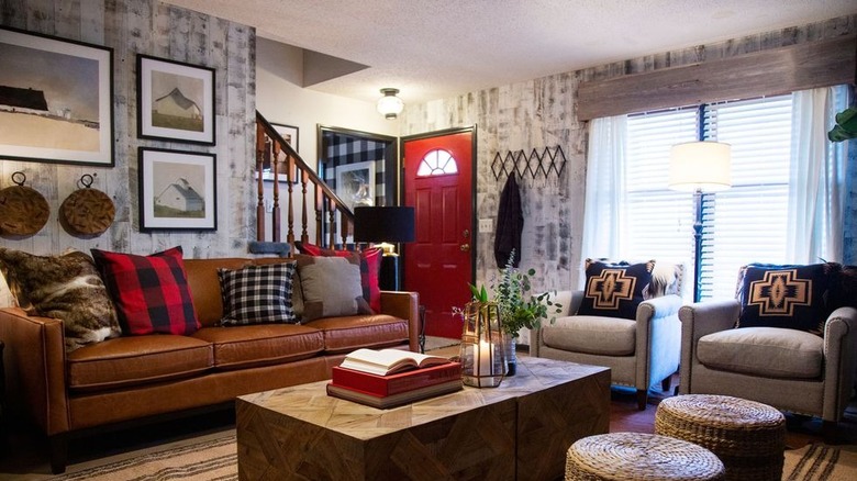
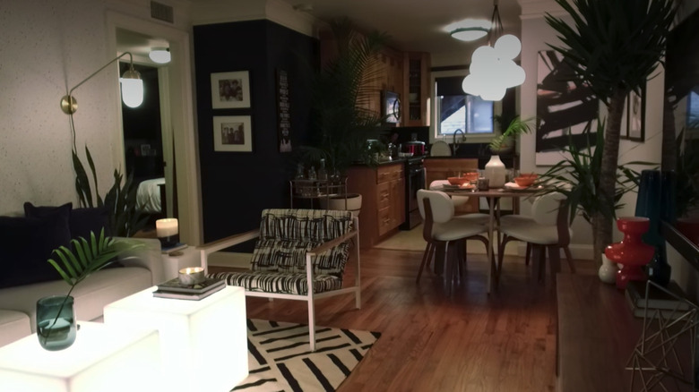
The Fab 5 seem to love patterns, and that's great, but they don't all go together. Mixing patterns is an art, not a science, but there are still some simple rules to follow to get the best look and avoid chaos. Using scale differences and solid colors will help blend multiple patterns, according to MasterClass. Using similar colors when picking out different prints will help tie the various elements together and make it feel more intentional.
Using the 60-30-10 rule for colors makes picking out multiple patterns simple. In this rule, 60 percent of a room is the dominant color, 30 percent the secondary color, and 10 percent the accent color. Following these basic guidelines can help you choose a balanced color and pattern scheme for your space. Instead of clashing patterns, you can look forward to visually-pleasing contrast and defined shapes.
Open shelving is always a great idea
It's challenging to build storage space into a small apartment. If you lack storage, it can be hard to organize your kitchen utensils or belongings on a shelf in a visually appealing way. If all or most of your shelving is open, your kitchenware will be out on display. You might feel like you need to buy new dishes if your current pieces are old or mismatched.
While from a design perspective, this can look good, needing to buy brand new matching dishes is not always a good idea from a practical perspective. Plus, you will have nowhere to hide items that aren't part of your design concept, causing your open shelves to look cluttered and messy. According to Southern Living, another practicality to consider is the possibility of some items gathering dust and living out in the open. Open shelves might require extra cleaning if you plan to keep all of your kitchenware out in the open.
Neutrals are best, everywhere
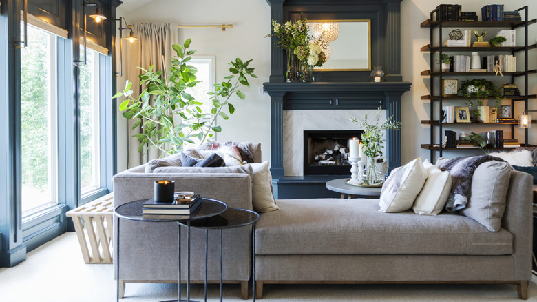
Many of the homes redone by the Fab 5 on "Queer Eye" are a neutral paradise with creamy beiges, tans, and whites. While this look works for some spaces, it's not the only design solution. You can use color in sophisticated ways to bring out your personality and create a unique atmosphere. Using colors from the same color family can be just as effective as neutrals at tying various rooms together. Plus, it's usually a lot more interesting.
Even if you don't want bright blue walls or red tile on your backsplash, there are ways to experiment with less intimidating colors. As design expert Patrick Mele told One Kings Lane, "If you aren't comfortable using strong hues in a big way, start small, with key accessories like textiles — pillows, throws, area rugs — that can be switched out as your mood changes." Using crisp whites with bold patterns will bring out the richness of the hue.
Landscaping is easy to change overnight
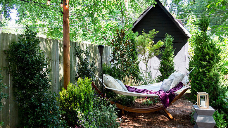
While there are many stunning exterior reveals on "Queer Eye," transforming your yard into a tranquil oasis can be a lot of work and upkeep. Designing, planning, and implementation will take weeks, if not months. The Fab 5 likely take more than five days to design and execute some of their landscaping projects. If they manage a shorter timeline, their method must be expert-level and not something easily accomplished by a DIY enthusiast.
Outback Landscape stresses the importance of keeping budget and practical needs in mind during the landscape design process. While we don't see it on the show, there's likely a specific budget and plan that makes it possible to execute landscaping projects quickly. Since ordinary gardeners probably don't have the luxury of an entire crew of professional accountants, landscaping experts, and designers, it might take a little longer to get the job done.
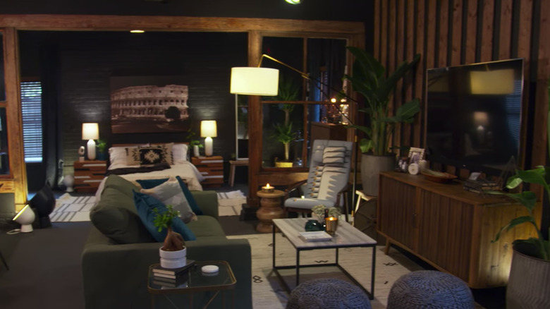
You should paint your bedroom a dark color with busy wallpaper prints
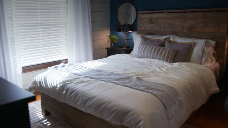
While "Queer Eye" proves that a bold wallpaper print or bright color can look great on a bedroom wall, they don't consider the science of sleep. According to Our Sleep Guide, soft blue is the best color for sweet dreams, and you should avoid using saturated colors in your bedroom. Red, bright white, and gray tones will evoke energy or gloominess.
Want to know the worst color for a bedroom? It's purple because it stimulates brain activity, making it hard to drift off to sleep. Colors on the red end of the spectrum stimulate the adrenal gland and increase your heart rate, keeping you from being in the right mood for a good night's sleep. Minimal contrast, soft lines, and flat finishes are all elements that will make your bedroom better for sleeping. The Fab 5 puts beautiful rooms together, but they don't necessarily pay attention to how color can affect sweet dreams.
You should live in a house the way you stage a house
All the Fab 5's home makeovers are staged and ready for cameras, but while this is visually appealing for TV, living in a space is much different from photographing it. In pictures, you can frame out piles of kids' toys, laundry hampers, and any unsightly evidence of human presence. However, a space used in everyday life will have clutter and flaws. A beautifully organized closet fit for a camera crew is perfectly fine, but everyone has dirty laundry (literally) in real life that doesn't magically get washed and folded.
QC Design School points out that the art of home staging is primarily for advertising purposes when selling a home. It's intended to evoke certain feelings and stimulate the buyer's imagination. To create a successful interior design, input from the person using the space is essential. Expressing the client's style and creating a feel for a room is different from designing it to appeal to a broad audience of potential buyers. The Fab 5 often creates spaces to appeal to a viewing audience, but it makes you wonder about the people who live there.

