How To Decorate Your Office Like The Try Guys
If you've ever found yourself exploring YouTube's trending page or watching Buzzfeed video after Buzzfeed video, you've probably heard of the Try Guys. The foursome, which includes Ned Fulmer, Eugene Lee Yang, Zach Kornfeld, and Keith Harbersberger, got their start when they filmed a video for Buzzfeed, entitled "Guys Try Ladies Underwear for the First Time," in 2014, as told by The Highlander. The guys, who never intended on becoming internet sensations, suddenly found themselves racking up millions of views on videos of them simply trying things out, such as different foods, DIY projects, beauty products, and more. In 2018, the crew split from Buzzfeed to create their own digital empire, which allowed them to buy a gorgeous office space that they recently had expertly designed.
In the early days after leaving Buzzfeed, the Try Guys moved into Fulmer's newly vacant home, which was only about 1,000 square feet. Later, they moved out of his house for several reasons, including, but not limited to, the COVID-19 pandemic, their business growth, and a huge rat problem, as described by the guys in an Architectural Digest interview. Before moving, they were forced to fit 15 people into the old house where they had to share one bathroom. Their new custom-designed production space in Burbank, California, is about 5,000 square feet, and, similar to their last office, Fulmer's wife, an interior designer by trade, was in charge of decorating the new headquarters.
Make an impression on the first entrance
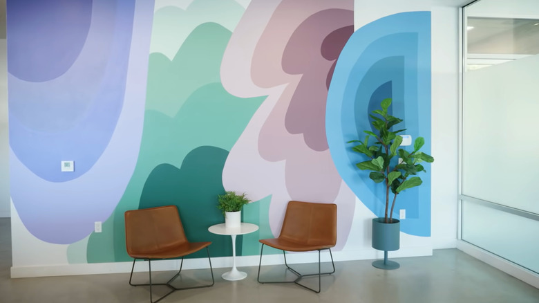
In the new office, the first thing you see when you walk in is a huge mural with blue, green, purple, and pink designs, which represent the four Try Guys. The color scheme can be found throughout the office, particularly embedded in the line-drawn triceratops found in several rooms. The mural wall was designed and painted by a well-known artist on Twitter who goes by Mert. The artist also painted other cool designs throughout the office, including on the electrical panels, as seen in the Try Guys interview with Architectural Digest.
When you walk into the office, it instantly stands out as a space for the Try Guys brand. It is also uplifting with great lighting and great design. It is notably polished, colorful, and masculine, which is the exact vibe that their interior designer was going for. When designing an office space such as this one, you must know exactly what you want your first impression to be. Before you make any big purchases when decorating your office, ask yourself if you want to present your space as masculine, feminine, polished, abstract, monotone, colorful, or something else.
Don't be afraid to use color
Color can easily make a workspace happier, more fun, and more cohesive. Like the Try Guys, you can use color all over your office to evoke different emotions to help employees through their days. You may be familiar with basic color psychology, which says that green makes people creative, blue increases critical thinking, and red promotes physical activity, as explained by Douron. Color used correctly can make the spaces in your office feel safe, productive, or creative.
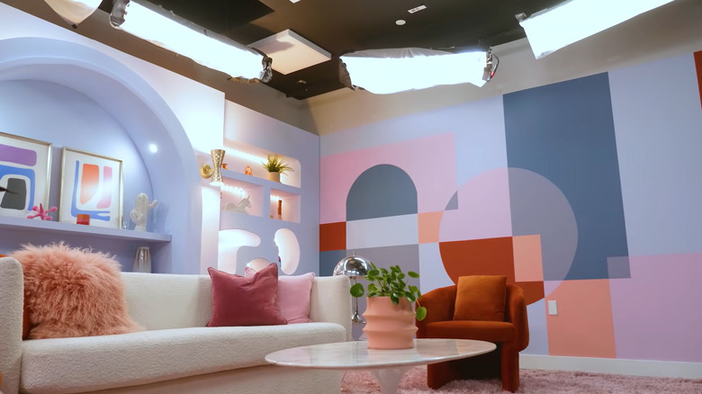
While the Try Guys may not have initially been going for this result when helping to design their primary filming space, purple is actually one of the most suggested colors to evoke feelings of relaxation and safety, as per Treehouse. Eugene Lee Yang says in the interview with Architectural Digest that they were happy that the filming space turned out comfortable and non-threatening. They wanted it to feel like a room where there is no tension or pressure. The décor and the comfy couch in the center of the room certainly add to this mood, but the purple color might accomplish this as well.
Opt for an open office plan
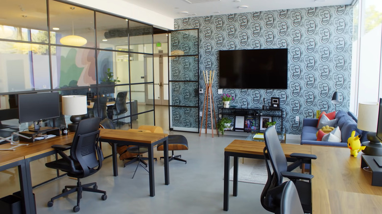
In truth, the Try Guys office is not a true open floor plan. There are several rooms separating the workspaces. However, the entrance certainly functions as an open floor plan by presenting several sections inside the room that serve different uses. The room opens into a cozy sitting area where videos can be filmed in front of the aforementioned mural. Beyond that space are lots of computers, chairs, and a table. The Try Guys mentioned in a video produced by Architectural Digest that they do their best brainstorming when they can meet in the middle of a room around a bunch of people and talk things out. This area is perfect for that.
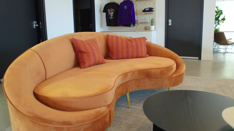
To the left of the computer area is a 70s-esque velvet orange couch and a coffee table for quick, intimate meetings throughout the day. The designer of this entrance did a lot of work to make this small space shine in many ways. One thing that was also done to make the office feel both larger and more open was adding several interior windows that connect the separate rooms with a single pane of glass.
Always keep in mind when arranging an open floor plan that you need flow, as explained by My Move. In an office, you need ample walking space as well. Creating a flow for movement can help increase productivity — move furniture away from the walls to allow for easy pathways for people and their energy.
Go for the mid-century modern aesthetic
What is mid-century modern style? As per The Spruce, this aesthetic is defined by functional furniture with a simple design as well as bold accents and many wooden pieces. You can not achieve a mid-century modern design without clean lines, unique shapes, and teak wood.
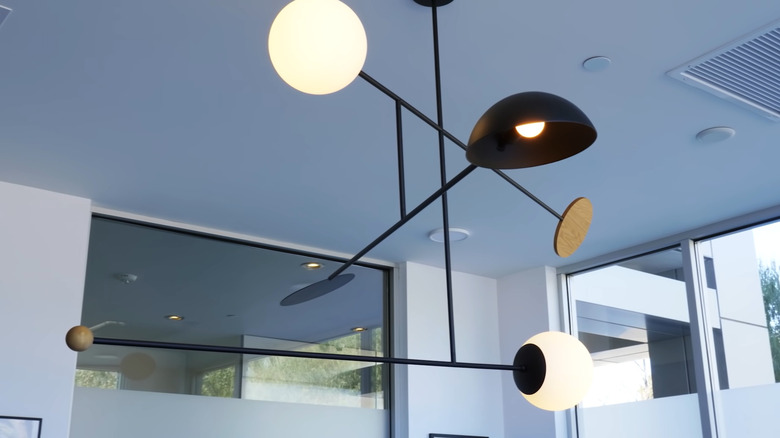
The Try Guys' new office space is decorated with mid-century modern in mind. Much of their furniture and design features reflect the popularity of this trend, which has resurfaced since the 1950s. Some specific pieces they have used to achieve this aesthetic include an Eames chair and ottoman, a couch with wood accents, and the Astro Mobile No. 1 chandelier, which was designed by Andrew Neyer, as shown on the Lumens website.
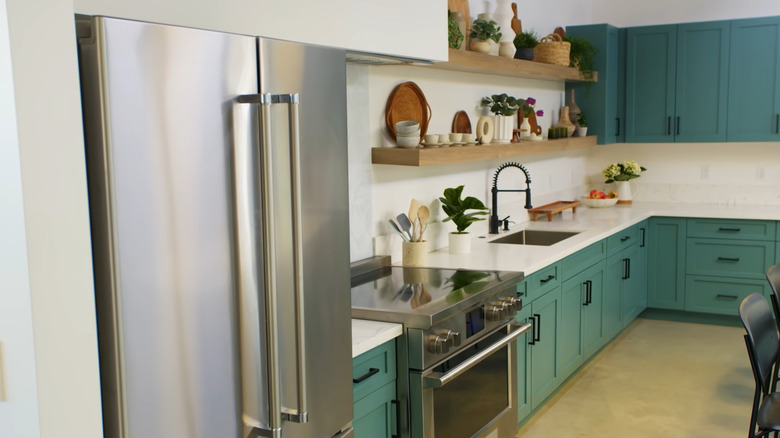
One area of the office that shows off a true mid-century modern design is the kitchen the guys use for filming. It features muted turquoise wooden cabinets, permanent stage lighting, and a stick-on backsplash behind the oven that can be removed to create different looks for different shoots.
Accent walls, accent walls, accent walls
In the Try Guys' headquarters, it's difficult to find a room without an accent wall. From large murals to simple wallpaper, it's important for the guys to have a wall in every room that can make a good photo backdrop or just something cool to look at during meetings and work time. Most often, the wall is strategically placed where attention needs to be drawn. For example, in one of the meeting rooms, the accent wall is the backdrop for a television.
If you want to try an accent wall in your office, be sure to make a few considerations first. Benjamin Moore lets us know that we should select a wall with a purpose. An accent wall always draws a person's eye, so it's important that it connects with the aesthetic of the rest of the room. A dark, bold wall will set the same mood for a room even if the rest of the walls are white. A pastel wall can create an airy, playful vibe if the rest of the room is neutral. Don't be afraid to play around with textures and patterns. Solid color walls are a thing of the past. Try wallpaper, fabric, or even metallic paint.
Don't overlook wood accents and wooden walls
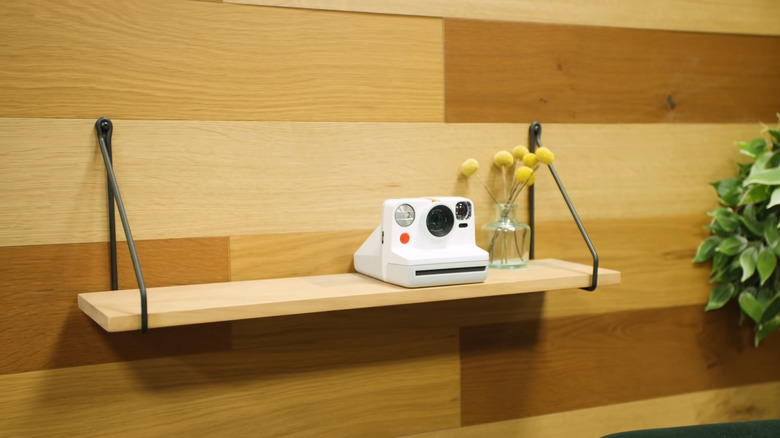
You can't mention mid-century modern without talking about wood. The Try Guys' office has several wooden details lining the walls and the floors and making up much of the unique furniture pieces. One of the first uses of wood you'll notice when entering their office is the wood-paneled wall with a small seating area beneath it just behind the computer area. This simple wall feature sets the sitting area apart from all other sections of the room. In the office, there are many more examples of this.
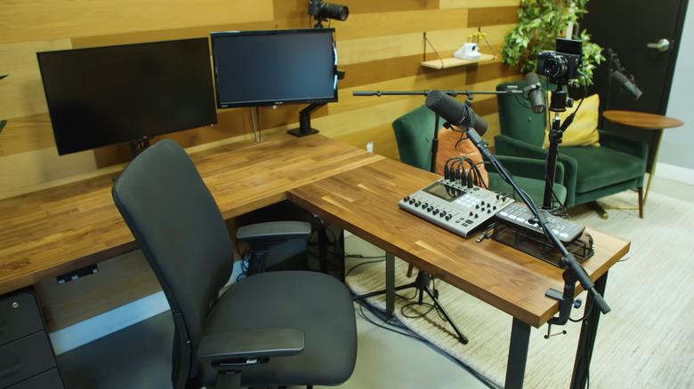
The best example is in the podcasting room. In the interview with Architectural Digest, Eugene Lee Yang and the guys show off one room that has been styled with wooden walls, which make the space feel warm and inviting, as told by the Seattle Times. However, the wood walls serve additional functions. Mixed and matched treatments of wood on the walls complement every skin tone, so the Try Guys' guests will look their best and never washed out during filming.
Another great thing about wood walls is that they are a natural sound dampener. They are one of the best materials you can use if you are concerned about acoustics for recording. Try adding a wooden accent wall to your office to warm up the space.
Give open shelving a try
Open shelves have always been popular for displaying knick-knacks, photos, and books. The Try Guys have given open shelving a shot throughout many of the rooms in their office. One space that uses this nicely is their merch shelves at the entrance. The whole section of the wall is actually a pegboard that allows shirts to be hung directly on the wall. However, the pegs can also be used to hold up shelves. On one shelf are stuffed triceratops slippers. On another is a black duffle bag with the group's logo on it. The shelves can be rearranged in any order to display the merchandise that they are currently selling. They also allow for easy access for visitors or new employees.
The kitchen is another room that uses open shelving. In the interview with Architectural Digest, the kitchen shelving displayed plants in white pots, wicker plates, wicker baskets, tiny espresso mugs, and other wooden decorations. In the video, the Try Guys let us know that they will switch out different props for different themes as they see fit. When you decide to use open shelving in your own office, you can do the same by adding new elements during different seasons. Better Homes & Gardens suggests using open shelving above your stove, cabinets, or kitchen island to maximize storage and add charm to your office kitchen.
Cover every base when it comes to technology and convenience
In the world of YouTube, video-making convenience is key; throughout a single workday, dozens of meetings may be required in order to talk about lighting, props, prep, food, guests, and more. None of that should be interrupted by an under-performing laptop or hard-to-use equipment. One space that is often used in the Try Guys office is the ready-to-go film and podcast space, complete with great lighting, audio equipment, and pre-setup technology. All they have to do is hit a switch and they're ready to go.
Yet, the ready-to-go film room isn't the only convenient aspect the Try Guys added to their custom-designed production space. Smaller conveniences, such as floor plugs in the kitchen and other parts of the office have been added as well. When designing your office, think of convenience first. According to Squarefoot, you should always start your office planning by noting the technological requirements, finding the right furniture, and looking at your options.
