40 Incredible Living Room Makeover Before And After Photos
The heart of the home is generally considered the kitchen, the space where everyone gathers around for meals. However, anyone can easily argue that the living room is the true core. Its sole purpose is to relax, unwind, and connect with others. We kick our feet up, escape with a movie marathon or good book, and entertain friends, so the living room should be comfortable, but it should also be attractive.
According to Good Housekeeping, the living room should be where most of your design efforts occur. You can put careful and intentional planning towards the textures and colors you decide to bring in, the layout that will give you a nice flow, and the style or mood you'd like the room to evoke. If your living room looks a little worse for the wear, or you're starting fresh in a new home, look through these 40 before and after makeover photos. They will inspire and motivate you to put a little love into a space that will love you back.
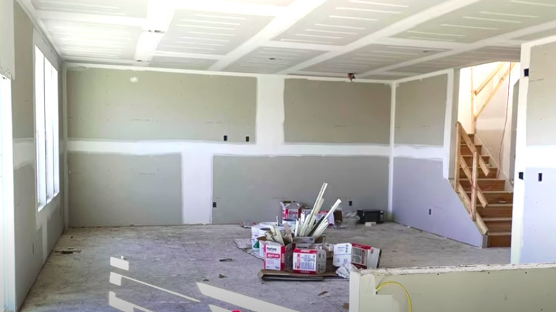
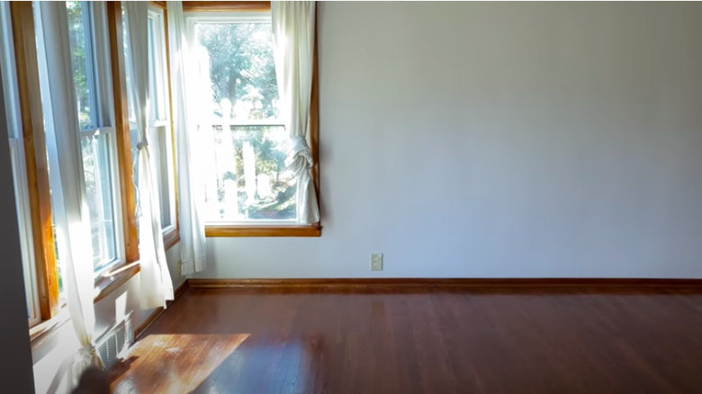
Before: A clean slate
While the walls and floors are bare, the window treatments look dated. The large-sized room and tall ceilings serve as a great canvas to create a lived-in living space.
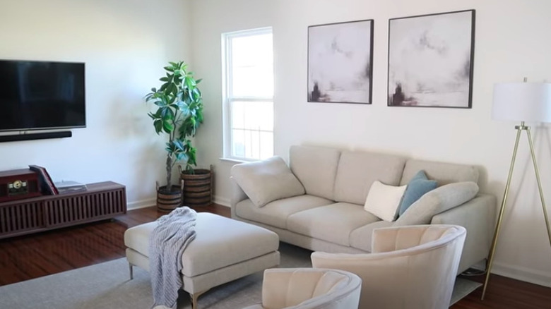
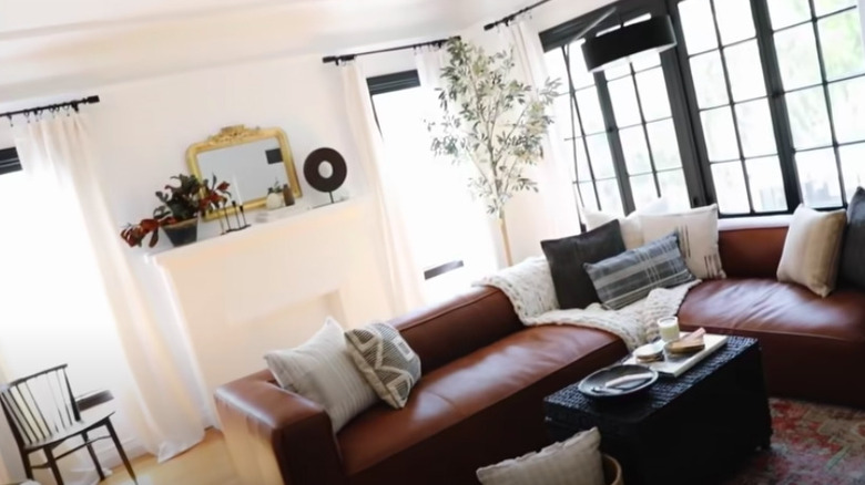
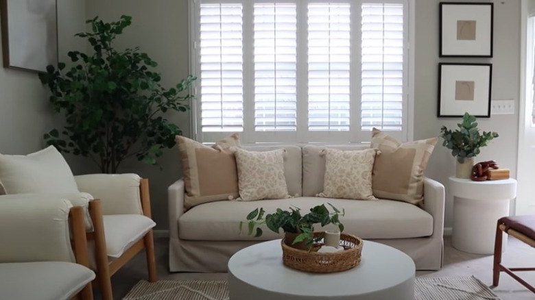
After: A cozy retreat
The warm neutral tones, soft textures, and plants are inviting at the end of a long day. The old, vertical blinds were replaced with modern pull-down shades and curtains, while the empty wall became a small art gallery.
Before: Basic and boring
This living room has good bones in terms of size, natural lighting, and the fireplace feature. However, nothing about it is particularly remarkable as the color scheme and décor are bland. In addition, the furniture doesn't quite fit the space, appearing too small for it.
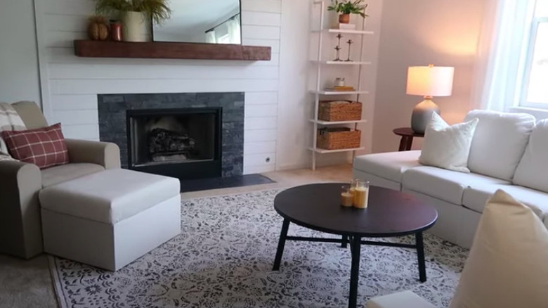
After: Standout living area
The most obvious difference is the updated fireplace with darker features, the new mantle with a mirror, and the tall shiplap wall. The sofa and side chair were swapped out for more size-appropriate pieces. A new rug, coffee table, and wall-mounted shelving unit were added to give the room visual interest.
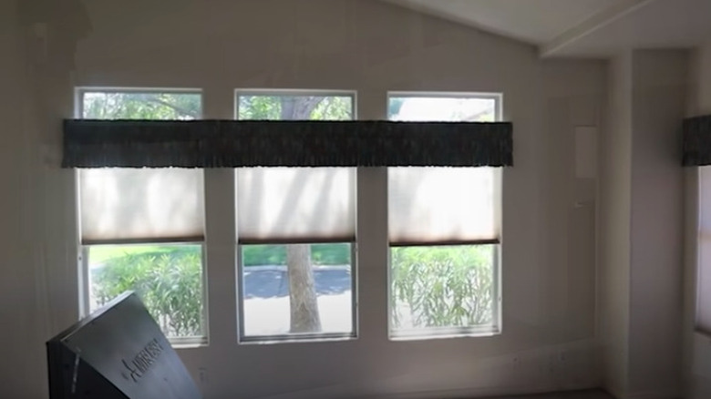
Before: Bare and dark
A clean slate, this living room is begging to see some décor and natural light. The tall ceiling and large windows are a good starting point, but the oddly placed valance and shades keep it dim.
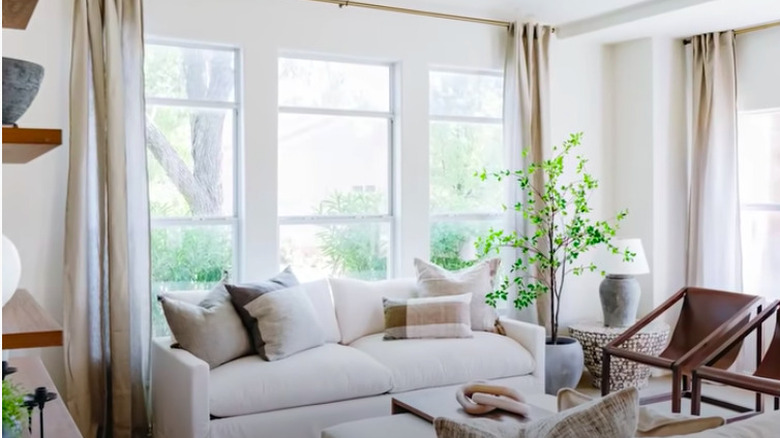
After: Beautiful and bright
This room feels infinitely brighter and more open after replacing the window treatments with simple tall curtains and painting the walls a lighter color. The floating wood shelves, leather chairs, and the statement side table are just a few of the décor pieces that bring the space to life.
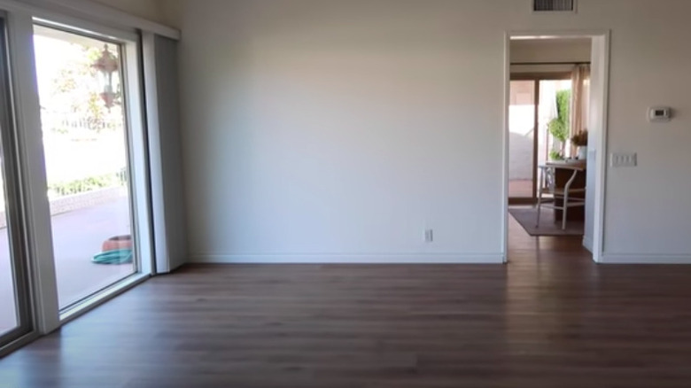
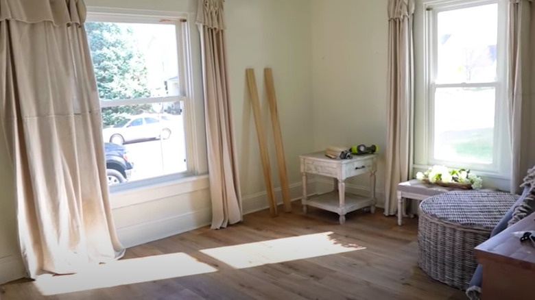
Before: In limbo
This living room is in the middle of getting new hardwood floors and patiently waiting to be put back together and decorated for enjoyment.
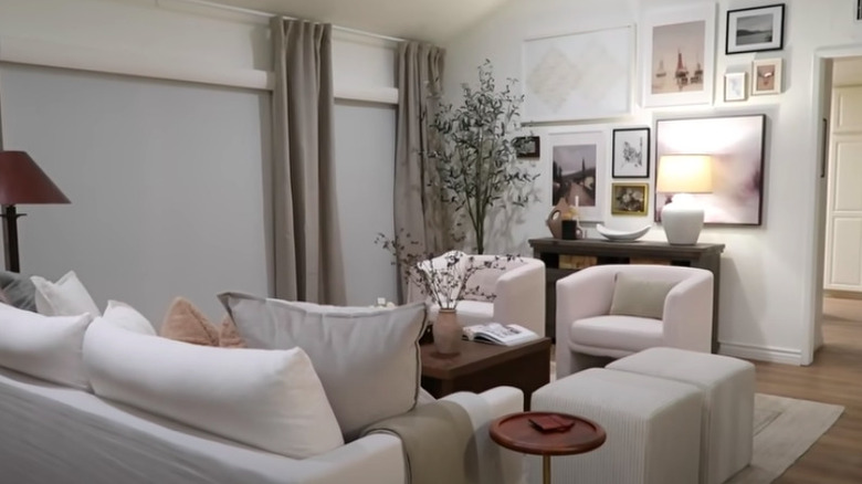
After: Finished to perfection
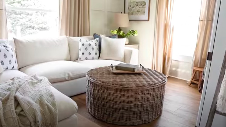
While on the small side, the space is cozy and charming when completed. The light floorboards mix well with the white couch and beige curtains, while pops of darker colors, such as the brown wicker ottoman and gray patterned pillows, add a nice contrast.
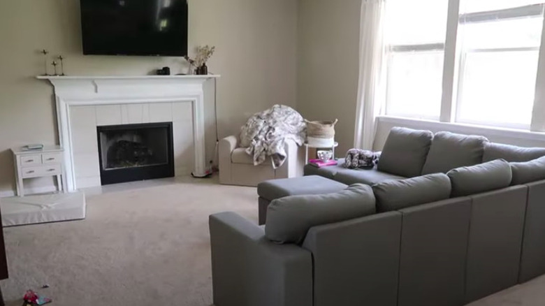
Before: So-so
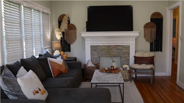
The small pops of boho style in this living space aren't enough to make it feel finished or well thought out. The dark gray couch clashes with the light stone and white trim on the fireplace, as well as the medium-toned hardwood floors.
After: Stunning
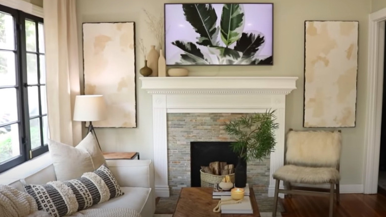
Even though the changes were purely cosmetic, they made an impressive difference in the space. The blinds were replaced with tall curtains that light up the whole room when left open. The lighter couch and wall pieces flanking the fireplace are a much better match for the paint and floor tones.
Before: Drab
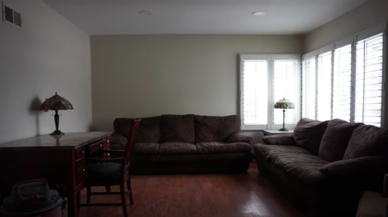
Despite the larger corner windows, this living room is dark and dingy. Unfortunately, the tan walls and dark brown furniture do nothing to alleviate the issue.
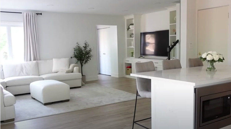
After: Fab all-white area
The biggest difference between the old space and this one is the removal of a wall, which creates an open concept layout. However, that wasn't the only change that helped to brighten the whole area. Painting the walls a lighter color and adding white furniture also creates a sunny mood.
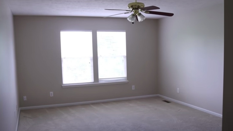
Before: Lonely space
This empty living room is a bare canvas, waiting just waiting for its makeover. With neutral walls and floors, as well as a basic, square layout, it's perfectly primed to go in any direction.
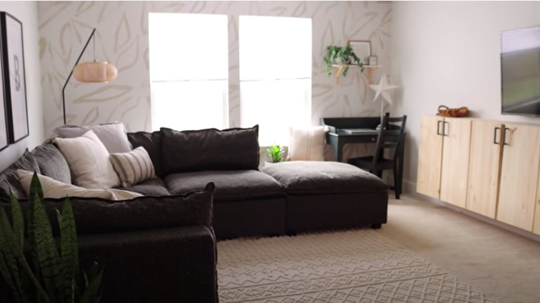
After: Live-in area
There's a lovely contrast between the light and the dark features, along with the separation between the relaxation and work zones. The patterned accent wall provides a fun and unique focal point.
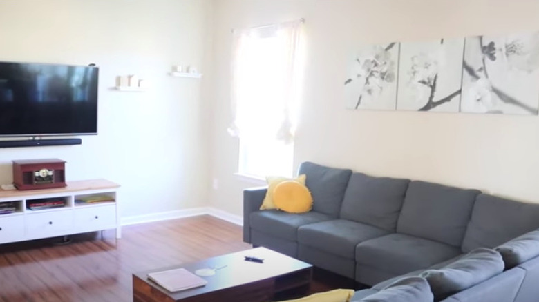
Before: Careless planning
Everything in this space seems to be thrown together haphazardly. From the oddly spaced floating shelves to the mismatched gray, yellow, and brown accents, the living room doesn't particularly feel homey or stylish.
After: Well thought out
Keeping the layout the same, this new living space is much more welcoming and on-trend. The neutral furniture and area rug warm it up while new artwork, plant, and statement light fixtures bring in a much-needed style.
Before: Barebones
This living room had been stripped of everything original, which usually indicates that a major makeover is about to be revealed.
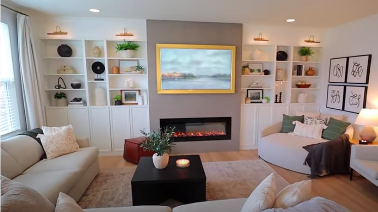
After: Built-in beauty
The transformation of this space certainly did not disappoint. Two large built-in units with task lights flank the focal point, which is the fireplace. The owner took a classic approach to the décor, but some subtle trendier pieces keep it fresh.
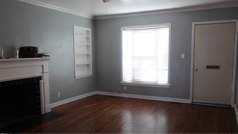
Before: Dull and uninviting
While it has a lot of potential, with the beautiful fireplace being a standout detail, this living room looks dark and uninviting. The fact that it is the first thing you see when you enter the house means that it needs a little extra attention in the design department.
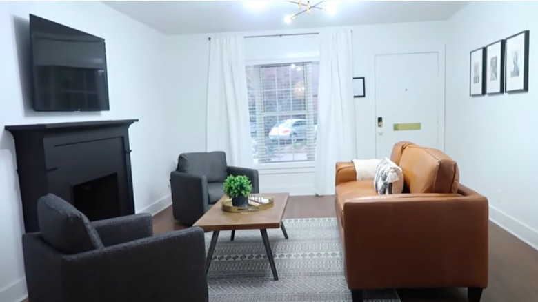
After: Vibrant
One of the most noticeable differences in this room is the paint color. The blue walls were colored white, adding an overall brightness to the space. The floors were redone, the built-in shelves were removed, and the fireplace was painted a matte black. Simple décor, a window treatment, and a statement light fixture finish it off nicely.
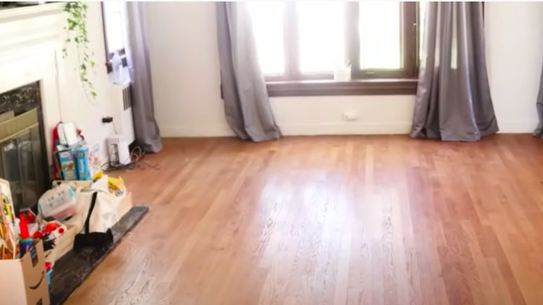
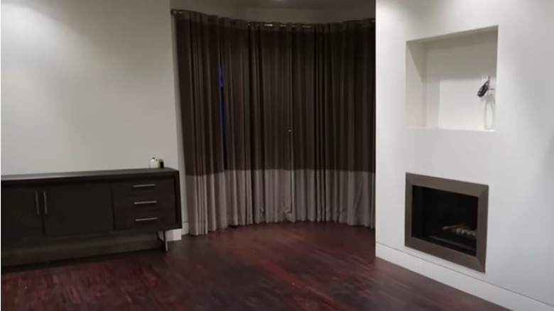
Before: Ready for anything
The original characteristics of this living room are absolutely charming. However, the gray curtains clash with the brown accents, and the fireplace is currently being blocked by clutter.
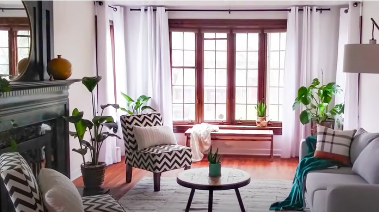
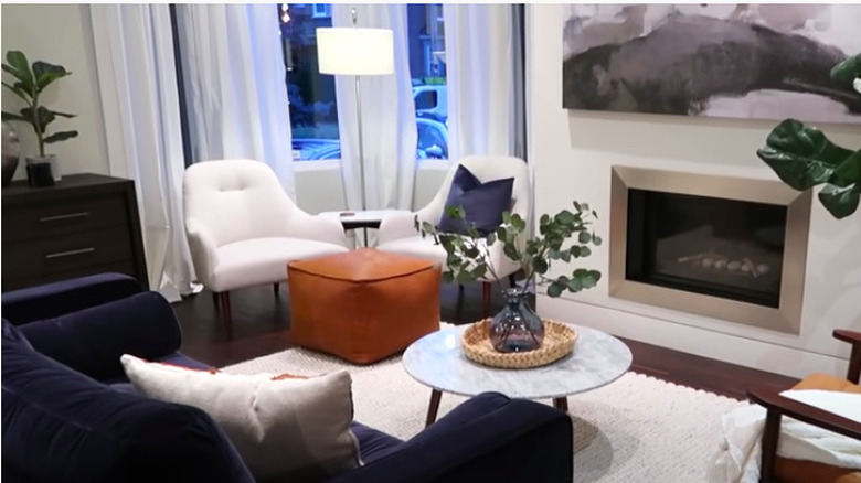
After: A delightful retreat
Keeping the original hardwood flooring and window trims was an excellent choice; they serve as the backdrop for the rest of the design. The fireplace was painted a dark hue to make it pop, while the mix of patterns, greenery, and white drapes give the living room a fresh aesthetic.
Before: Moody gray
This almost completely gray living room isn't doing much to make anyone feel comfortable and relaxed. It feels cluttered yet still empty at the same time.
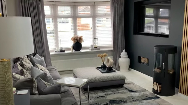
After: Still moody but glamorous
Subtle changes were implemented in this room, but they made all the difference. The wall opposite the couch was painted in a dark, rich shade, and an accent wooden slat area shines in the space. An area rug brings in visual interest, while a tidier bay window sill removes some of the visual clutter.
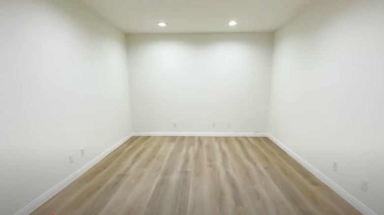
Before: Vacant basement living space
Having a finished basement as extra living space is a luxury not everyone has. However, decorating the bare space can be a bit of a challenge. The lack of windows and natural light in this room, in particular, is an issue.
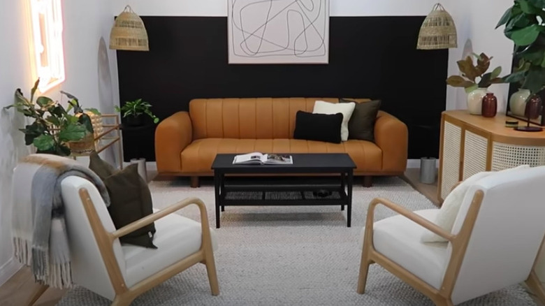
After: Stunning sanctuary
This makeover is truly a thing of beauty and doesn't exude the look or feel of a basement whatsoever. On the contrary, the décor is on-trend, the greenery brings some sparks of life into the space, and the lit-up sign gives the illusion of brightness.
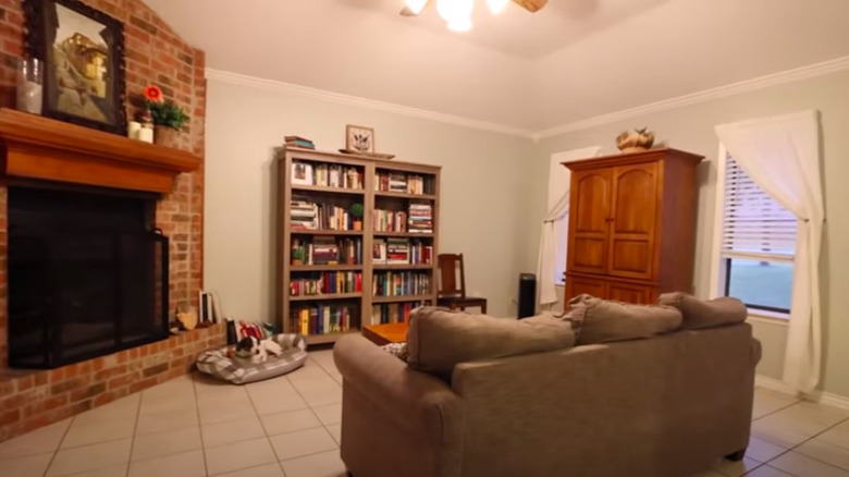
Before: Homely
Aside from the prominent brick fireplace, there isn't too much that will catch your eye in this living room. The floors feel bare and cold, and the furniture is large yet still fails to fill the space.
After: Homey
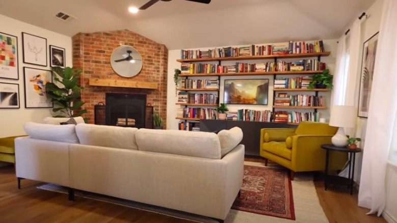
Now, this is a living room worth relaxing in. The tile floors were replaced with hardwood, and a beautiful area rug was added. The furniture is more size appropriate while new curtains and mantel freshen up the space. What's more amazing? The added visual interest from both the gallery wall and extensive bookshelves.
Before: Gloomy
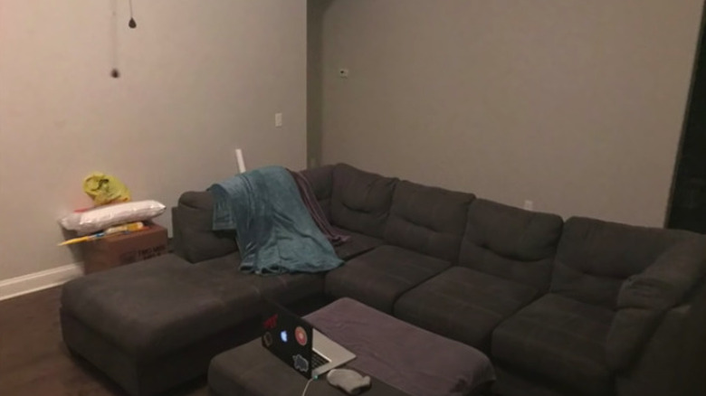
The overall low lighting exaggerates the dark furniture and flooring in this living room. There's no personality or sign of style in the space whatsoever.
After: Glorious and bright
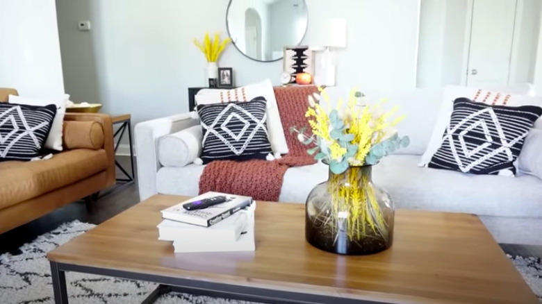
This space is nearly unrecognizable from its former state. Two smaller and light-colored sofas replaced the old, ill-fitting, L-shaped couch. A console, coffee table, and end table serve as functional yet aesthetic features, while the white walls and the hanging mirror help brighten the room.
Before: Uninspired décor
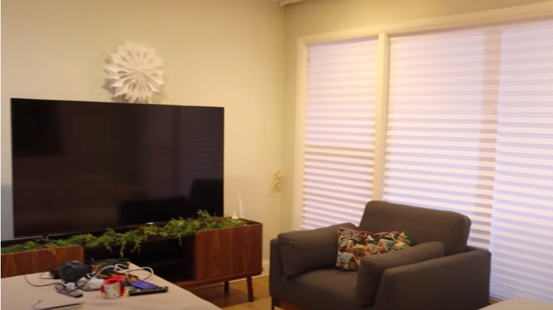
Possibly the only thing of any interest in this living room is the TV stand planter. Other than that, there really isn't much that catches the eye besides the outdated blinds that stunt the natural light.
After: Refined
While the TV console was kept, it is no longer necessary to use it as a planter for a distraction. The blinds were replaced with drapes, letting a lot of light in, and the chair was moved to face it. Neutral décor pieces create a chic look.
Before: Cluttered
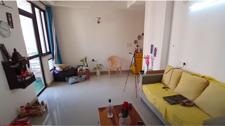
Although most of the wall space is bare and there isn't an excess of furniture, the space still feels jumbled. As a result, there's no strong sense of style, and much of the potential is wasted.
After: Colorful
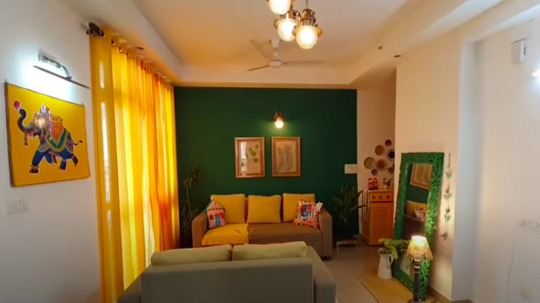
Keeping with the spirit of the sunshine hues on the couch, this living room is now a vibrant mix of yellow and green. The change in the layout creates a more welcoming environment, and t space also benefits from new lighting fixtures, drapes, and greenery.
Before: Blended browns
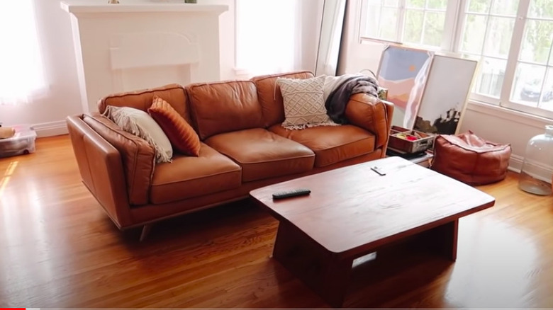
This living room is clearly about to go under a redesign. For now, the brown floors, couch, and coffee table meld together in a fairly boring way.
After: Bold contrasts
The choice to paint the window casings in black was bold but beautiful. Bringing in matching accent pieces such as the curtain rods, lamp, coffee table, and pillows brings the entire room together. Lastly, the new, larger, L-shaped sofa is a more size-appropriate fit for the space.
Before: A dramatic emptiness
The tall ceilings and interesting layout is an exceptional canvas for whatever style this living room is about to be transformed into. However, the talk, dark drapes are preventing sunlight from pouring in.
After: A designer's dream
Fortunately, the curtains were swapped for new ones in both a lighter material and color, which, in turn, brightened the room. The furniture fills the space beautifully and creates a luxury finish.
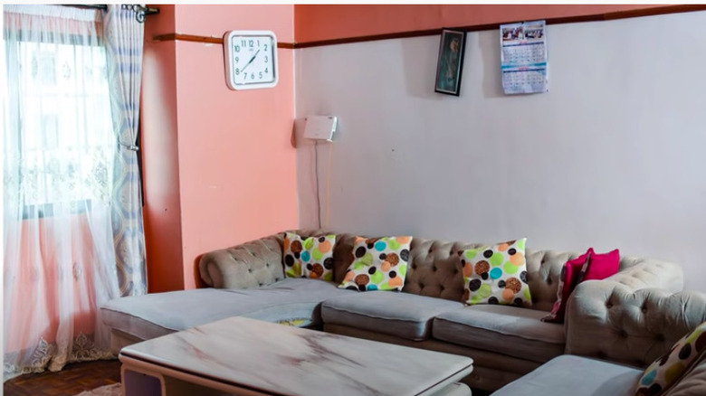
Before: Simple and uninspiring
Despite the pops of color, this living room is as plain as possible. None of the furniture nor décor match, and the lack of lighting makes the space look dingy.
After: Sophisticated
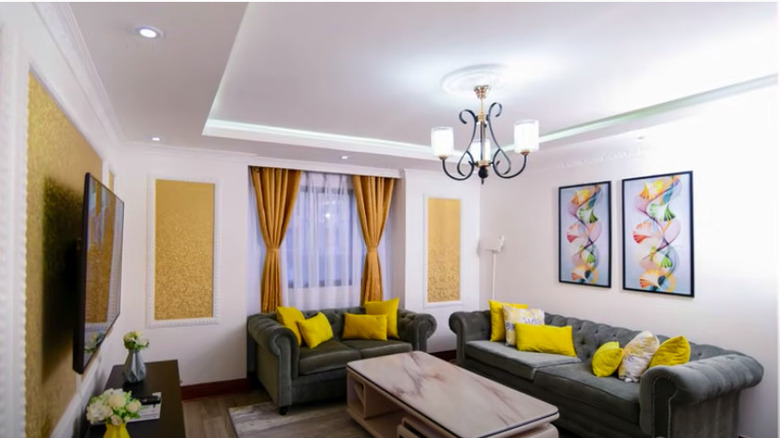
This room is barely recognizable but in a good way. The color-blocked peach walls are now white with accent gold-framed décor. Brand new couches and pillows replaced the previous tired-looking ones and are in a more appropriate placement within the living room. Overall, the space looks more brilliant than before.
Before: Stuffy
This open-concept living room looks fine at first glance. However, having guests over to relax can quickly become problematic when faced with the small, seemingly uncomfortable couches. In addition, the coffee table dominates the space and doesn't quite match the rest of the décor.
After: Comfy
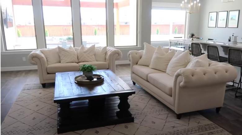
A large, plush L-shaped sofa is the star of the living room and can hold an ample number of people instead of the previous furniture. The coffee table is now more appropriate for the size of the space and is a more modern match for the décor.
Before: Quaint
One could easily argue that this room is cute and cozy. The neutral décor and plants make it feel like home; however, the dark wood-trimmed molding and hardwood floors give it a slightly somber tone.
After: Striking
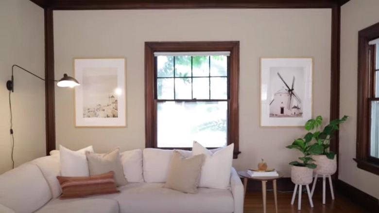
The lighter flooring and white trimmed molding alone help to brighten the entire space. The new artwork and furniture, such as the couch, update the décor, and oversized curtains and rods make the room seem much larger than it actually is.
Before: Primed for décor
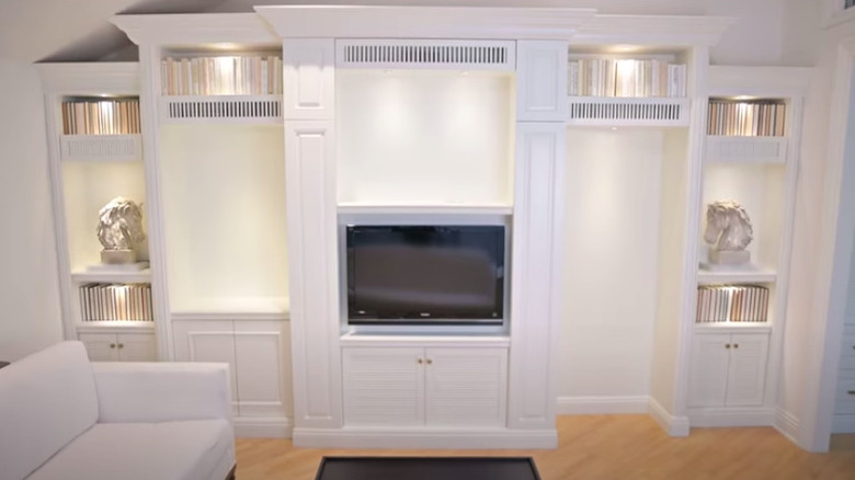
This living area was blessed with a grand built-in, which creates an ideal canvas for any interior designer to work with and decorate.
After: Perfectly finished
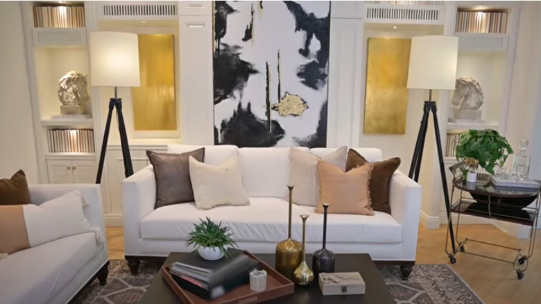
This made-over living room's mostly black and gold motif does not disappoint. With the TV moved for the purpose of hanging a sizable painting, a couch was also positioned to center the built-ins. Matching tripod lamps and a bar cart add a delightful touch.
Before: Miss
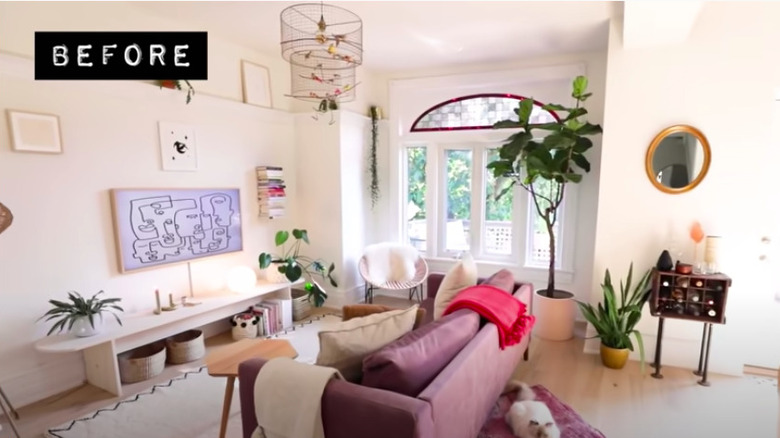
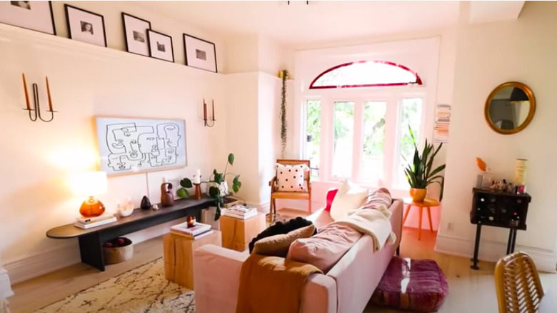
This living room's potential is unmatched, from its large open layout and spectacular natural light to its unique wall ledge and elliptical window. However, the furniture and artwork placement choices don't allow it to shine as bright as it should.
After: Hit
With the layout being the same, subtle décor changes were made that drastically improved the look of this living room. Now, candlestick sconces flank the TV, and matching black and white framed photos adorn the high ledge. The furniture was upgraded except for the TV stand, which was painted a much darker color for contrast.
Before: Clear canvas
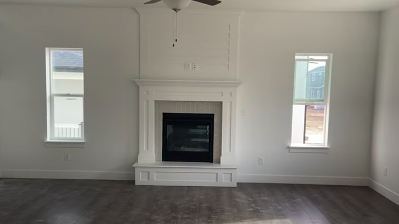
An empty living area holds so many possibilities, especially when it has good bones. Beautifully done hardwood floors, fresh white paint, and a remarkable fireplace give this room the perfect head start.
After: Classic style
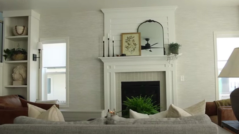
The décor chosen for this living room is the epitome of class: Neutral furniture arranged to face the fireplace allows for an intimate and cozy atmosphere. Bookcases were added for additional storage, and the delicate touches on the mantle complete the look.
Before: Out-of-place red rug
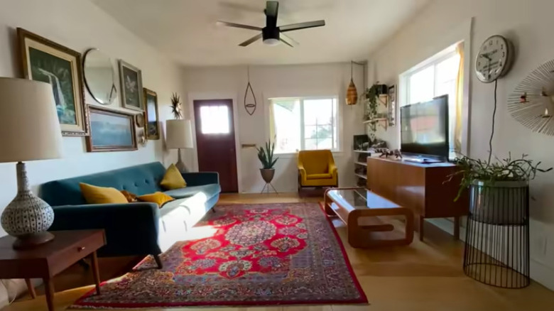
This whimsical living room is a thrifter's dream come true. However, the large red rug is seemingly out of place when compared to the color scheme throughout the rest of the space.
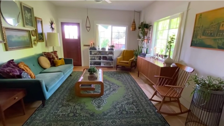
After: Green and yellow grace
The simple exchange of rugs would have been enough to make a massive difference in the space. But small swaps such as in the artwork, pillows, and furniture placement also help uplevel the whole living room.
Before: Mismatched pieces
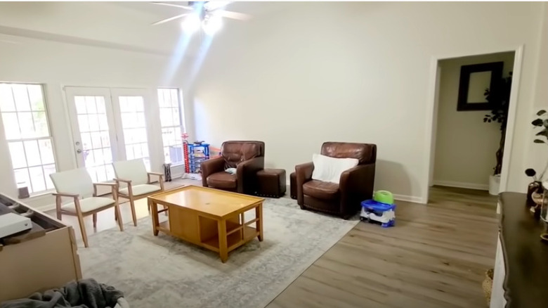
Due to its expansive size, this living area should have adequate furniture. However, the pieces clash with each other in an obvious way. The toys scattered around are typical for many homes but add to the cluttered environment.
After: Beautiful balance
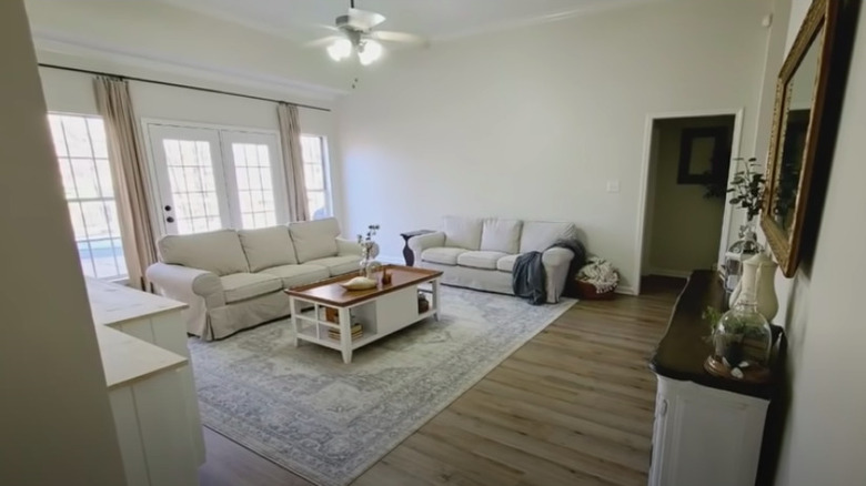
Two matching sofas replaced the mish-mosh of chairs, and that change alone makes a massive difference in the space. The oak wood coffee table was repurposed by giving it a simple paint job, and a long, high curtain rod with drapes dresses up the windows.
Before: Laidback décor
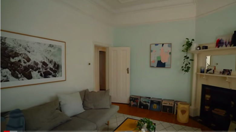
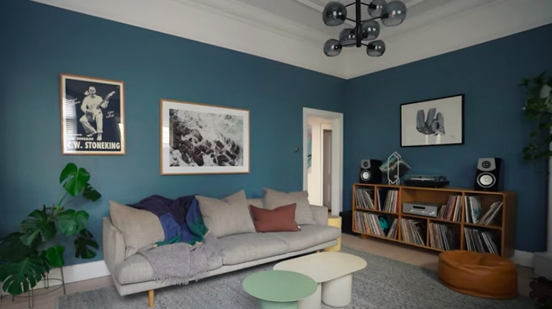
The unique fireplace and mantel are overpowered by the colors and décor choices in this living room. The pops of mint green and records lining the floor give it a carefree but also careless feel and clash with the rest of the furniture and artwork.
After: Edgy
The dark-hued blue walls and unique, gray light fixture not only look stunning in the space but also add the element of intention when it comes to the design. The records in a cabinet clean up the room, and the black and white artwork brings it all together.
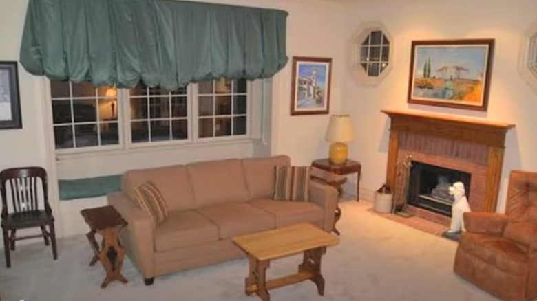
Before: Outdated
This living room appears as if it's been stuck in a time capsule. Everything from the furniture to the carpet and the artwork to the valence curtains create an overly dated look.
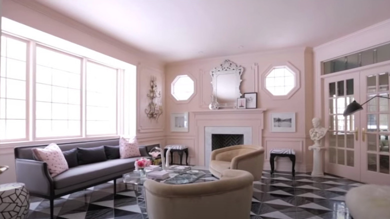
After: Formal yet cute
It's hard to believe that this is even the same room as before. The carpet has been replaced with stunning black and white tiles, and the entire room was painted a pale pink, including the trim on the octagon windows and fireplace. Delicate wood trim was added, as was new furniture to update the space.
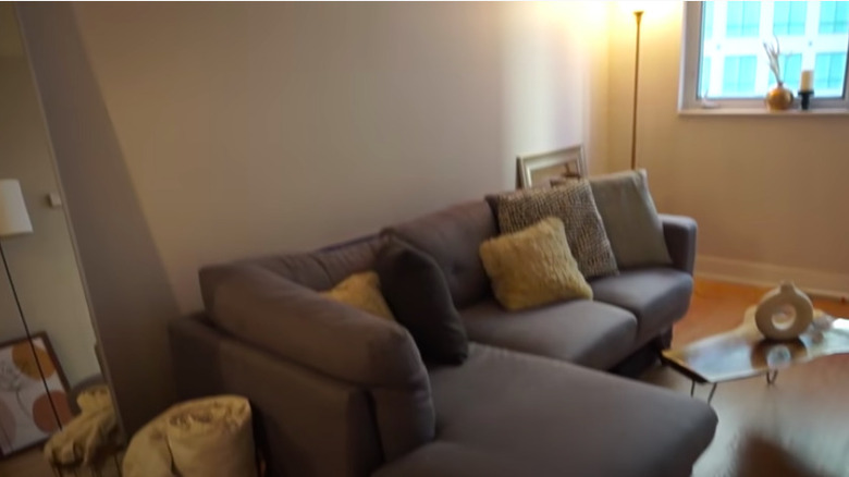
Before: Boring and cold
If it weren't for a handful of decorative pieces, this space could be mistaken for a barren bachelor pad. The generic gray couch and lack of carpeting feel cold and uninviting.
After: Aesthetically-pleasing
The addition of the wall molding was an excellent decision as it gave the space some visual interest. White walls and both the light-toned sofa and area rug brighten the room, while modern shaped décor such as the end table and floor lamp give the space an artful appearance.
Before: Comfortable but casual
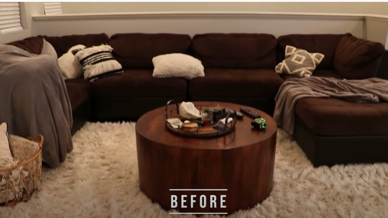
While it looks like a cozy hangout spot, the current sofa seems worn and takes up entirely too much space in this living area. While there was an attempt, the style is most certainly lacking in the space.
After: Deliberate design
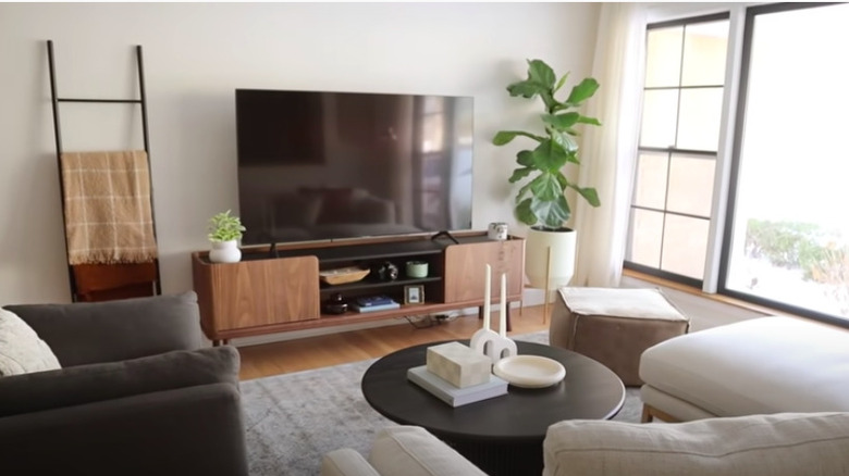
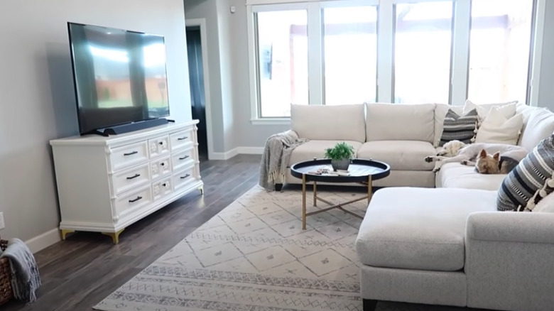
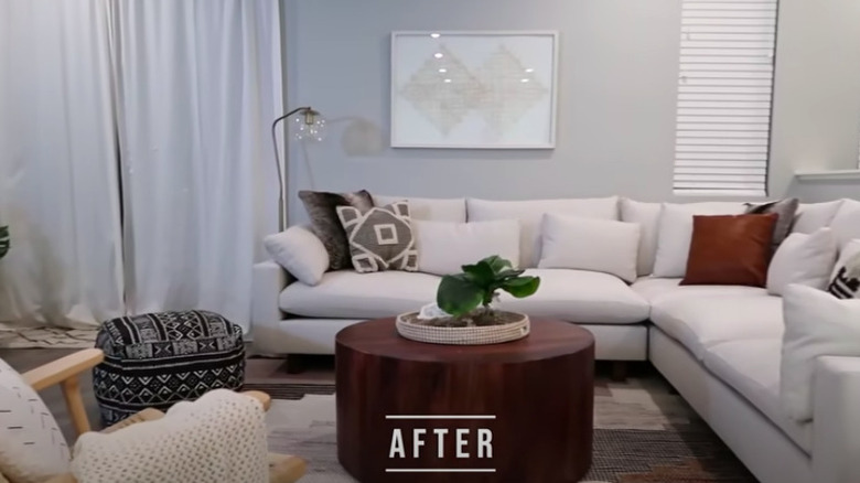
Retaining the round wood coffee table was a good call as it anchors the rest of the room. The modern white couch fits against the wall much better than the last one, allowing for a better walkway. The brown and black boho accents and the greenery freshens up the whole space.
Before: Ready for more
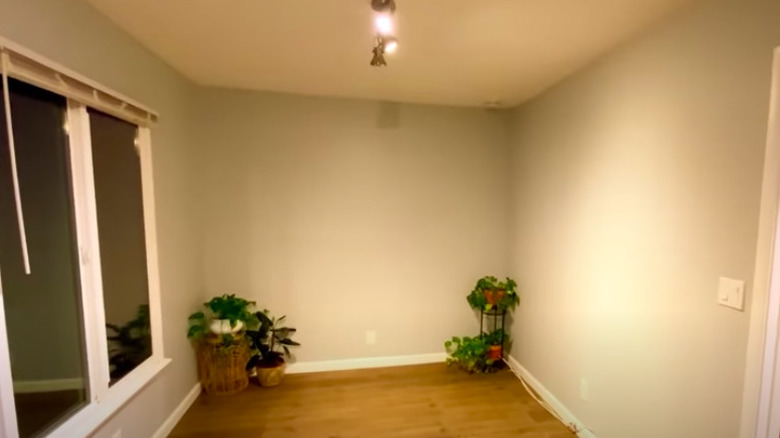
It seems unlikely that a lot can be done in this modestly sized living area. However, the large window and hardwood flooring provide a good foundation, and the plants indicate it's about to come to life.
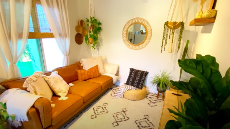
After: Bold and relaxed
This newly designed room packs a lot of style in a small space. The brown and cream color scheme and the plants and natural décor pieces are delightfully relaxing.
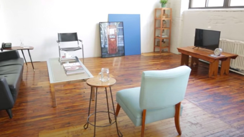
Before: Unfinished room
Not one piece of furniture in this living space seems to fit, both in style and size. The hardwood flooring and large windows letting in natural light are great features. The space is simply missing flair.
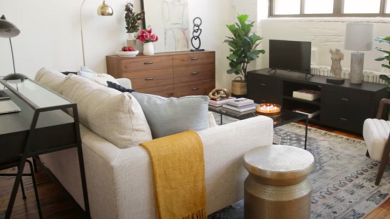
After: Sweet setup
The room is now set up to be both a living area and a home office with the zones clearly separated. All of the furniture has been replaced with more modern and size-appropriate pieces. The addition of an area rug was the best choice.
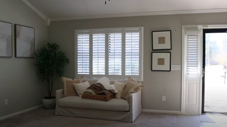
Before: Lacking substance
With this room at the home entrance, it should give a good first impression. However, the lack of furniture and even the crooked wall décor can easily let visitors down.
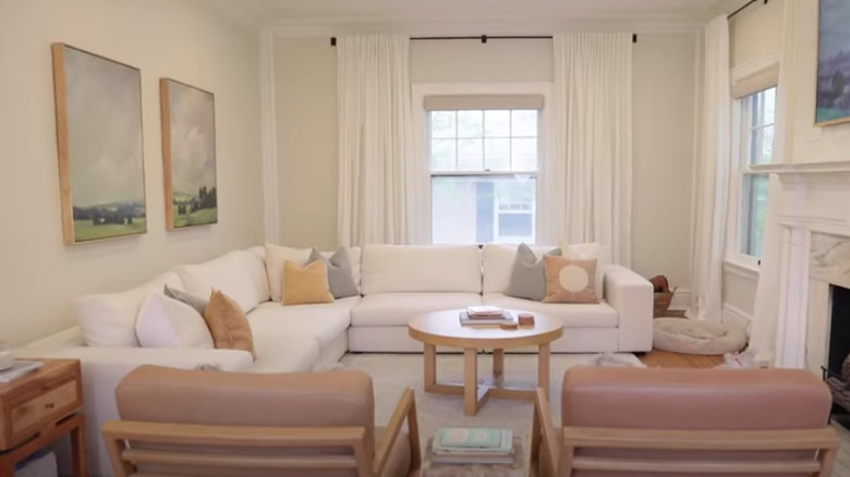
After: Comforting neutrals
The addition of armchairs, coffee, end tables, and a stool bring both style and seating into the space. In addition, natural décor accents and greenery assist in making it feel homey.
Before: Empty space
This living room has marvelous natural light and solid hardwood floors. However, the different wood shades on the trim conflict with the flooring. Thankfully, the mostly empty room is ready to be transformed.
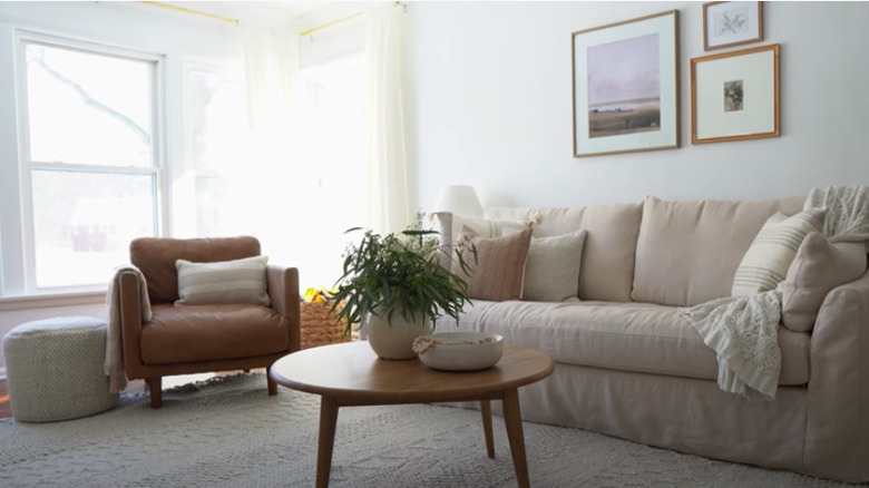
After: Cozy nest
While uncomplicated, this transformation is still a charming one. The original flooring was kept while the trim was painted white to blend in with the walls, and an area rug was added to warm up the sitting area. The furniture and décor were kept simple yet appealing.
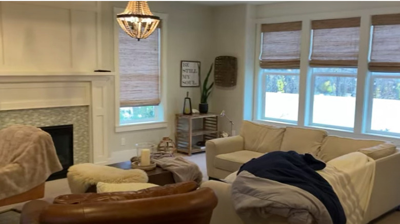
Before: Mediocre
There's no doubt that this living room is stunning with its elegant fireplace and substantial natural light. The décor, however, leaves something to be desired and doesn't do the space justice.
After: Timeless
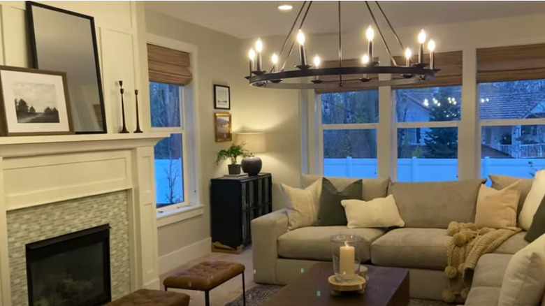
The wagon wheel candle chandelier is truly the star of this makeover. Aside from that, the new furniture, classic décor, and simple mantle styling refine this room from its previous state.
Before: Cold and unwelcoming
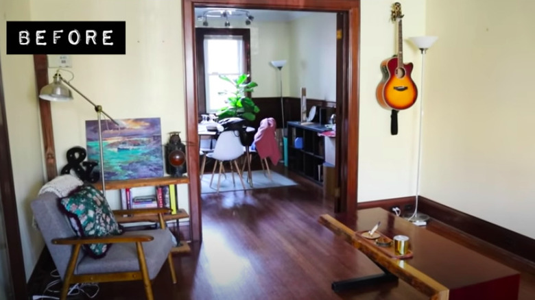
The Tudor style dark wood is stunning but other than the pale painted walls, there isn't much contrast in the room to make the trim stand out. The wooden furniture blends into the floor and looks uninviting at best.
After: Warm and inviting
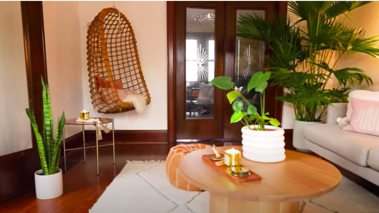
This made-over living room is now the ultimate relaxation spot. A soft, neutral couch and hanging rattan chair create snug seating, and the plants are a breath of fresh air in the space.
Before: Antiquated
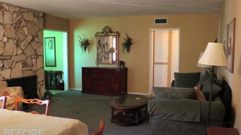
The out-of-date décor undermines the beauty of the stone fireplace in this living room. The green carpet, seating style, and dark wood accent furniture all feel out of touch with current trends.
After: Eclectic
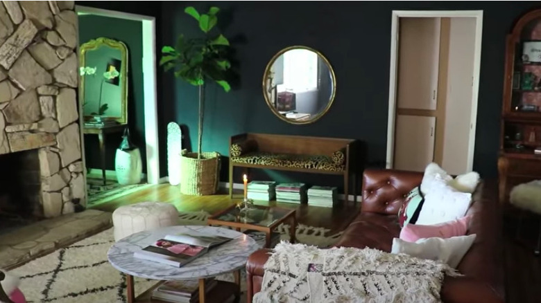
The new space packs a serious style punch even with different elements mixed together. One of the most impactful differences is the hunter green walls, with the removal of the carpet a close second. In addition, a new leather couch was brought in and also moved away from the wall, allowing for a better flow within the room.
Before: Busy
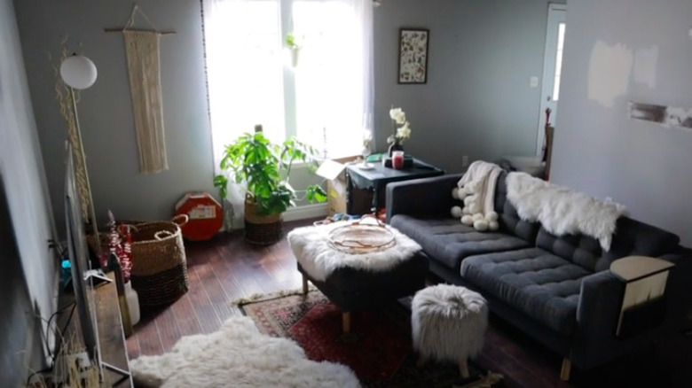
There's a lot going on visually in this room, and it's not necessarily pleasing to look at. So many items are cluttering up the floor, and the gray furniture and the blue walls darken the whole space.
After: Calming
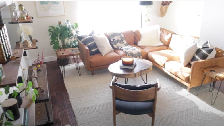
The new sectional sofa creates a more friendly environment and provides a better layout for the living room. A simple, single-area rug replaced the multitude of smaller ones, and floating shelves now use the vertical storage space.
Before: An overstuffed mess
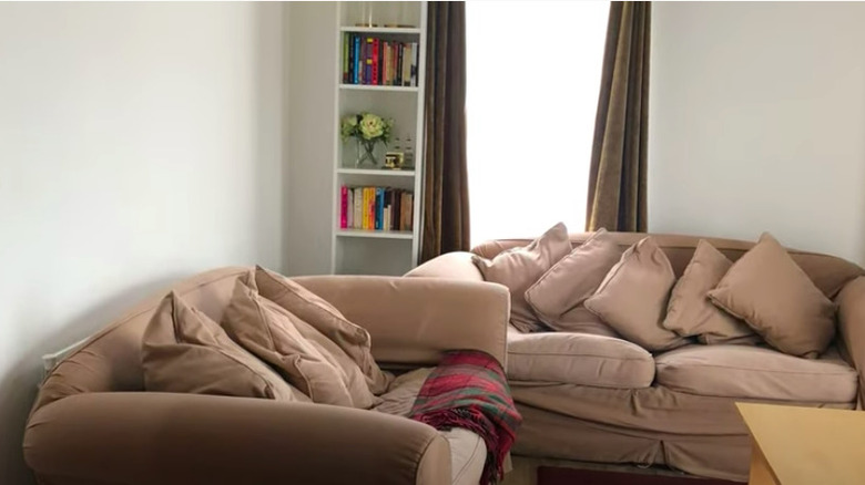
Both shabby sofas in this living room are too large for the space and utterly overrun with pillows. Besides a basic coffee table, crooked bookcase, and heavy curtains, there isn't anything exciting or welcoming about it.
After: Art deco bliss
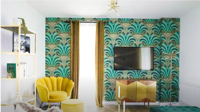
The old living room pales in comparison to its current state. Now, it showcases the art deco style elements through the geometric shapes in the armchair, TV stand, and wallpaper pattern. The brilliant emerald and gold accent wall pairs perfectly with the gold accent furniture, light fixture, and long curtains.
