15 Amazing Mobile Home Remodel Makeovers You Have To See To Believe
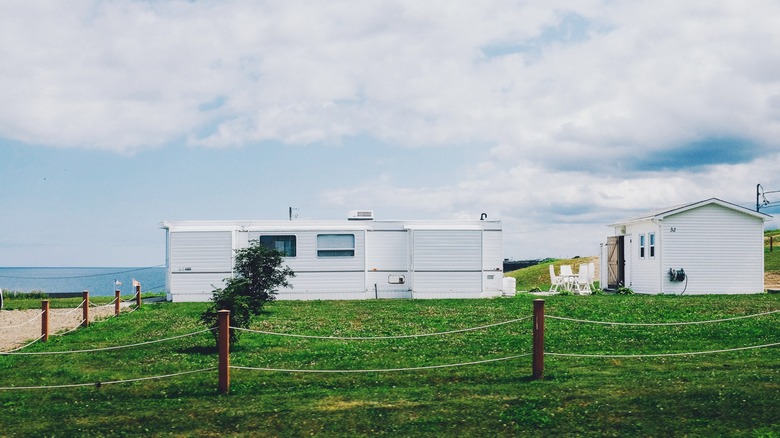
As homes become more expensive and rents for apartments increase, mobile homes can be a great alternative. Purchasing a mobile home is cheaper than buying a home, especially in popular states such as California and New York. The beneficial aspect of mobile homes is that you can easily renovate and fix them up when compared with the labor required of an entire house, according to Home Nation. They're also environmentally friendly and can be taken anywhere, so folks don't have to live in one location for a long period of time.
Renovating your mobile home can increase its value while making it feel cozy and homey, per Mobile Home Living. Whether you're remodeling just one room or the entire kitchen, living room, or exterior, there are a variety of ways to introduce a fun new layout. Check out these before and after mobile home makeovers to get some inspiration for your space.
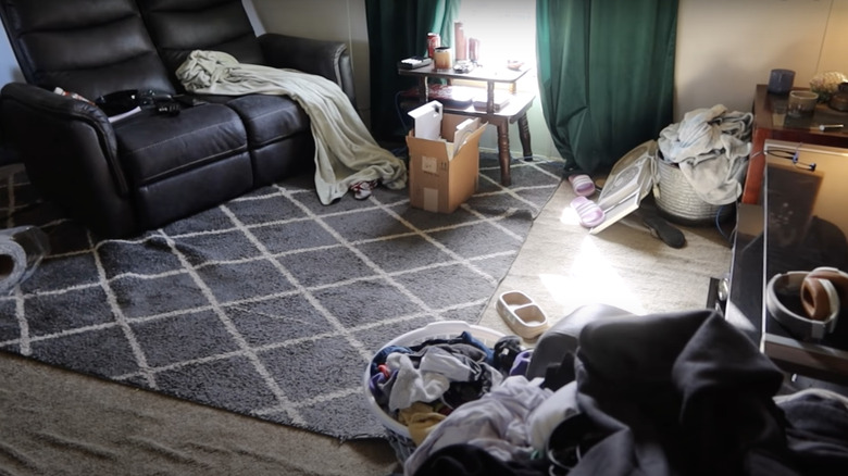
Before: Mismatched and unorganized
This mobile home's living room looks more like a closet than a communal space with various clothes scattered everywhere and opened boxes lying around. The design is a bit mismatched with the uneven diamond print rug on top of the carpet; it definitely needs to be replaced.
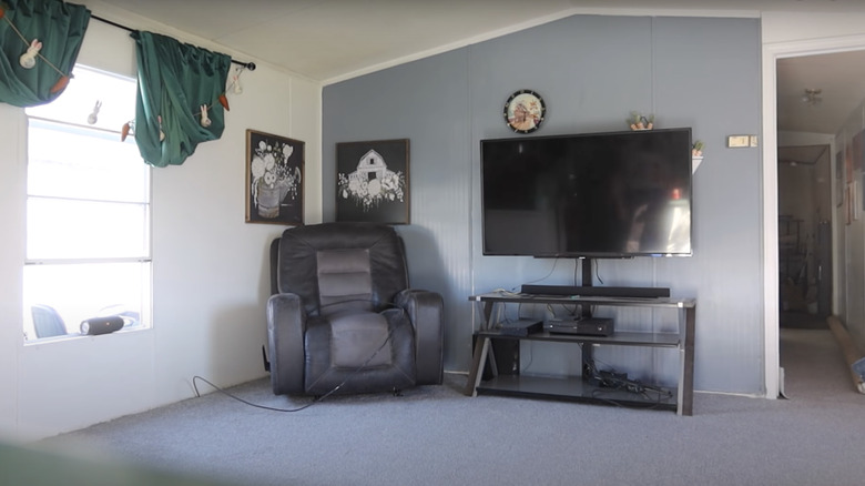
After: Monochromatic upgrade
A complete transformation happened in the new space with beautiful new blue carpet that matches the periwinkle accent wall behind the television. The clothes and boxes were picked up and put away, and the green curtains give the living room some new color. It feels spacious, clean, and breathable.
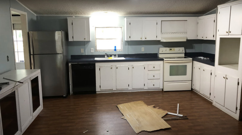
Before: Ordinary and tightly packed
This mobile home kitchen, while clean, doesn't have any outstanding features since most of the cabinets and appliances are lined up against the walls. The cabinets and stove look dated and need to be upgraded along with the countertop of the island since they're too dark for the wall color.
After: Modern and sleek
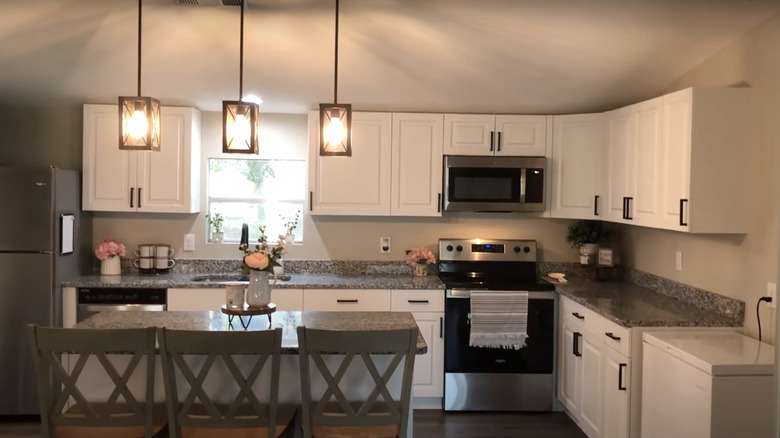
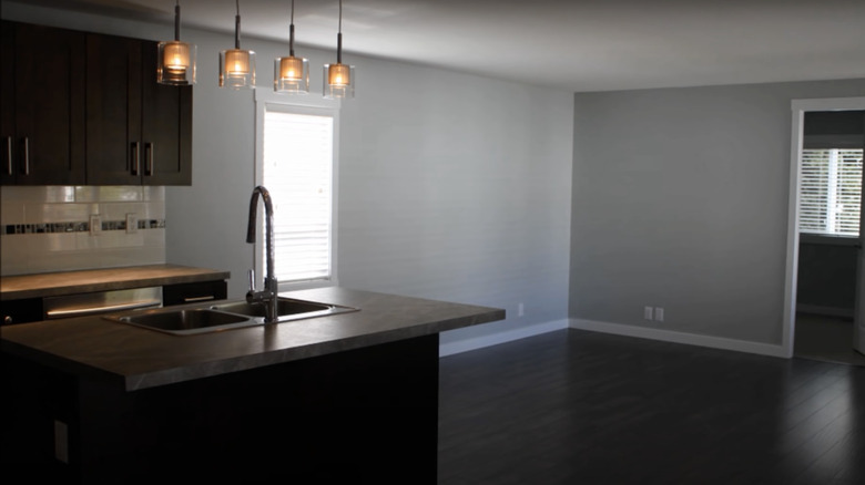
A stunning transformation with a complete new set of white cabinets, granite countertops, matching stainless steel appliances, and a new light gray wall color. The addition of the small island was the perfect touch since it gives the kitchen texture, especially with the hanging light fixtures. It makes the kitchen feel luxurious.
Before: Functional but dated
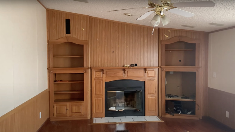
This living room does have a beautiful accent wall with a fireplace, but it's in need of an upgrade due to a few chip marks in the wood. The room also features too much wood with the floor, the accent wall, and wainscoting, so it needs a different style.
After: Bright white interior
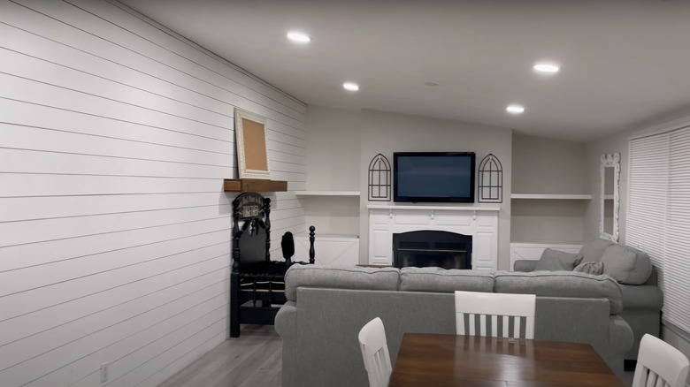
The new living space includes a gorgeous white wood panel accent wall that complements the gray flooring. The wood was removed all around the fireplace with solid gray walls and shelves, and instead of a wood exterior fireplace, it has a stunning white exterior. The LED lights make the space bright and the added furniture makes it cozy.
Before: Rundown
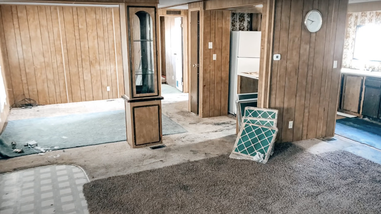
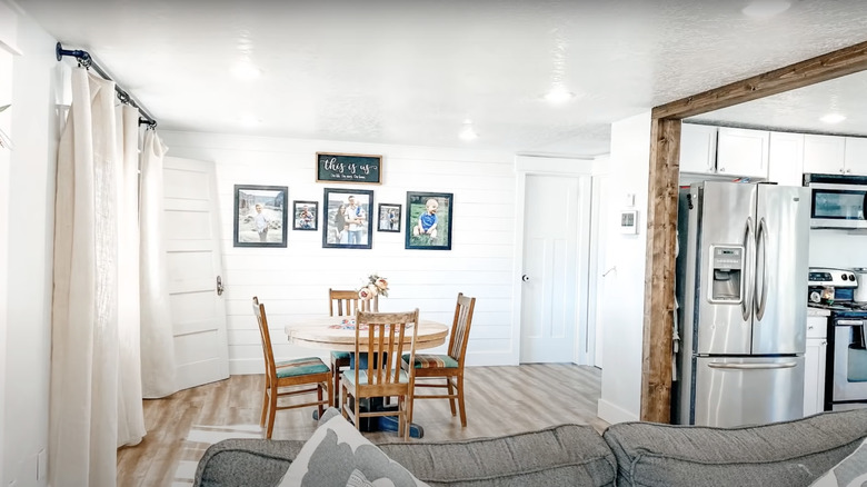
This part of the mobile home has secure wood panel walls, but the flooring is a disaster. There are stains on the carpet that need to be removed and it doesn't match the linoleum tile by the entrance. The kitchen looks like it needs a new set of cabinets as well; there's definitely potential for the space.
After: Open and airy
This after transformation is a true jaw dropper with the new oak flooring and white wood panel walls. The eclectic style of the room makes it feel homey and put together. The wood accent trim in the kitchen creates a great barrier between the kitchen and the rest of the space.
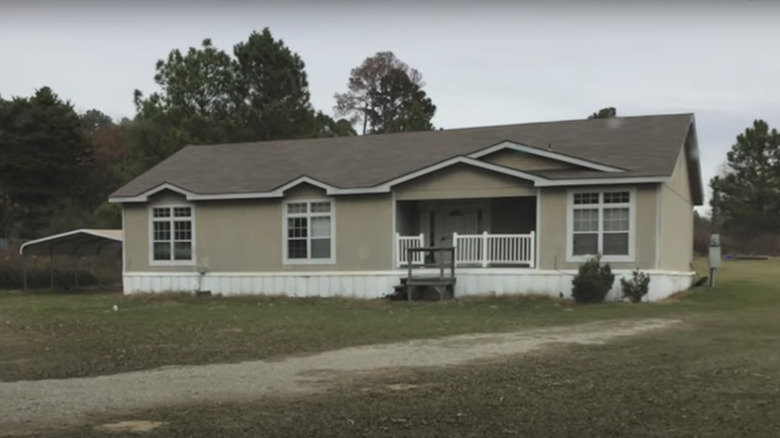
Before: Mundane exterior
While the outside of this mobile home doesn't look out of shape other than the unsteady wooden stairs that lead up to the porch, the color scheme is a bit bland and could definitely use a livelier color.
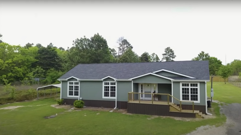
After: Striking green exterior
Replacing the beige with a viridian green color makes the mobile home stand out and feel welcoming for visitors. The updated stair ramp actually connects to the home and fits its style as well by maintaining the same brown color as the rest of the trim.
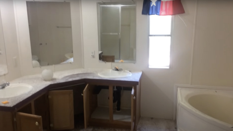
Before: The bare minimum
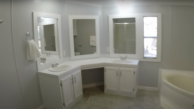
This mobile home bathroom doesn't have any interesting features other than the soaking tub. The cabinets are too dark for the countertops and the cement flooring. It needs a new paint job and new cabinets.
After: Minimal changes
While the bathroom looks almost the same, a few tweaks were made that brighten it up. The cabinets were replaced with white modern cabinets and it has an open space to put a small chair. The mirrors were also upgraded with white borders and the walls received a new paint job.
Before: Plain and cluttered
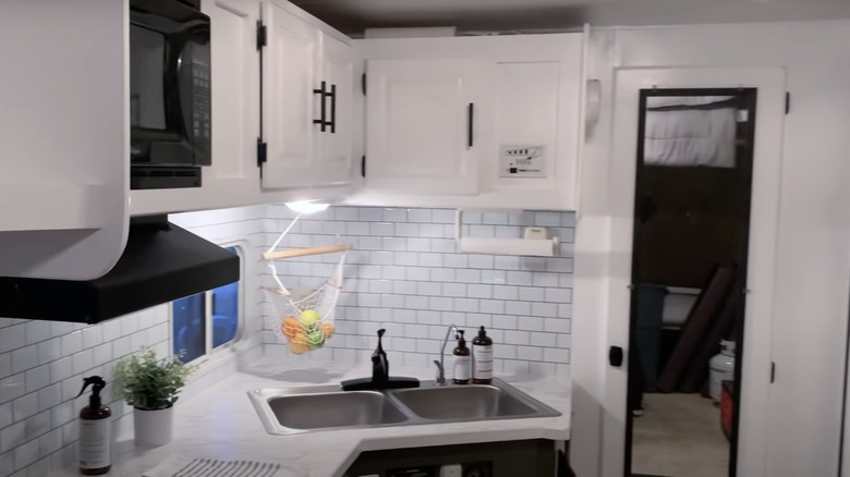
While this mobile home is smaller than the previous ones, it has a dated interior kitchen that could use some color to make the space feel bigger and brighter.
After: A whole new upgrade
The subway tile backsplash makes it feel like you're in a completely different home, especially with the gorgeous marble countertops. The wood was completely replaced with a white interior, including the white cabinets with black handles. It makes the space more modern and aesthetically pleasing.
Before: Too much tile
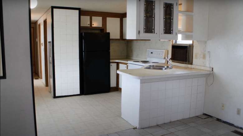
While a tile backsplash can do wonders to a kitchen, too much tile can overwhelm the space, especially if the colors clash. The brown wood trim from the cabinets just doesn't mesh with the black trim of the tile. The kitchen could benefit from a symmetrical color scheme and style.
After: Open space
The remodeled kitchen has tons of extra space since the outer part of the kitchen was removed and an island was installed. The gorgeous mahogany wood cabinets match the new wood flooring perfectly, and the tile was reduced to a small backsplash. It makes the kitchen look airy and modern.
Before: Simple style
The furniture of the living room pairs great with the oak wood flooring, but clashes with the wood fireplace. A simple repaint to the fireplace can keep the room in sync with the furniture.
After: Farmhouse style
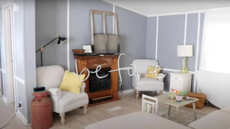
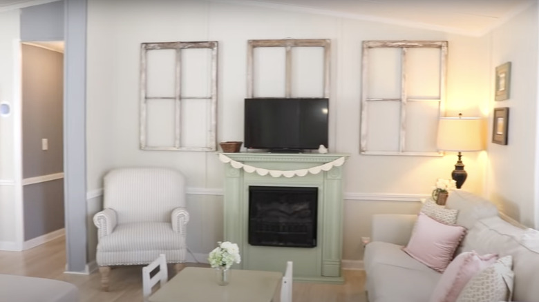
The newly painted fireplace makes the space appear more feminine while providing the perfect accent wall. The furniture was switched around, making the space feel cozy, and the walls were repainted white with unique wooden window trim hung above the fireplace.
Before: Crammed and far from functional
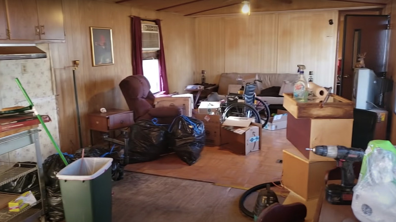
This living room desperately needs some help; getting rid of all of the opened boxes and installing some new wood flooring throughout the entire space would be a good start. The wood-paneled walls are basic and deprive the living room of personality.
After: Cozy and chic
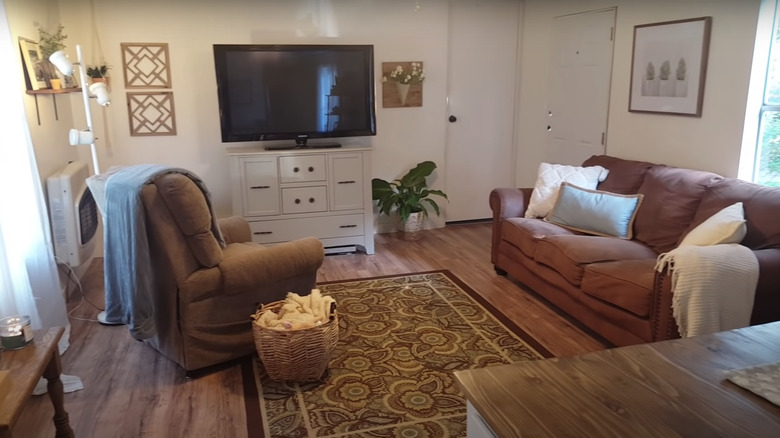
After the remodel, this living space looks brand new with maple wood flooring and white solid walls hung with various wall décor pieces. The gorgeous television stand is modern and stunning, making the rug the perfect eye-worthy item.
Before: Unnecessary island
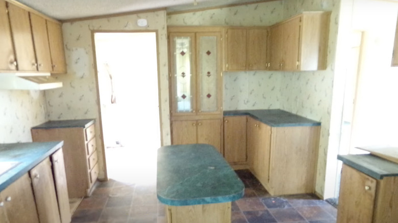
There's a lot going on in this kitchen, starting with the dated wallpaper that needs a fresh print and the teal marble countertops that mismatch with the look of the cabinets and tile flooring. The cabinets are rundown and in dire need of a new paint job, and some new appliances can definitely be installed.
After: Fresh and updated
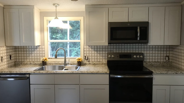
This fresh new kitchen has a cool patterned backsplash behind a new set of stunning white cabinets. There's a beautiful single light fixture hanging right above the sink that illuminates the space. The old countertops were replaced with new granite countertops while stainless steel appliances finish off the space.
Before: Falling apart
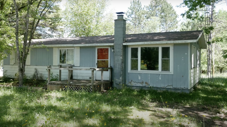
The exterior of this mobile home is sadly rundown and needs a new look. The blue wood panels are cracked at their base, the chimney is out of style, and the wood porch needs some love. A great paint job can make this home pop.
After: Elegant and simple
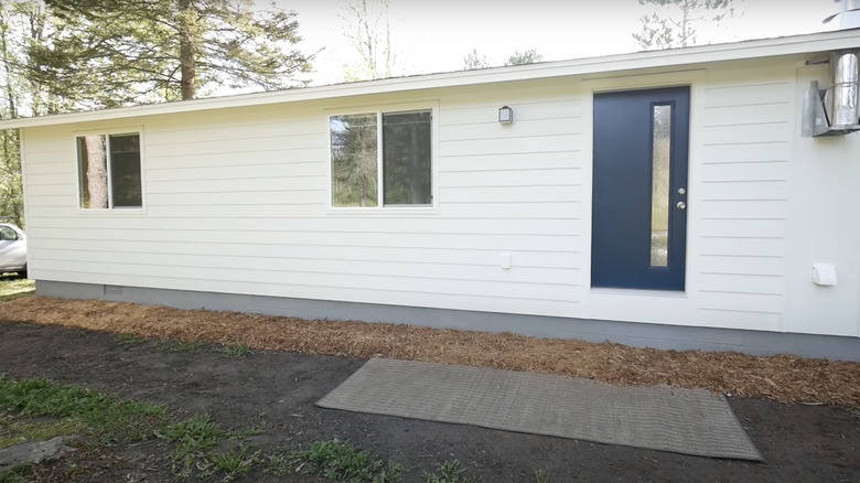
This mobile home underwent a complete transformation with a beautiful pearl white paint job and a new wood panel installation. The door was upgraded to a fancy navy blue color with a long thin window.
Before: Burning red
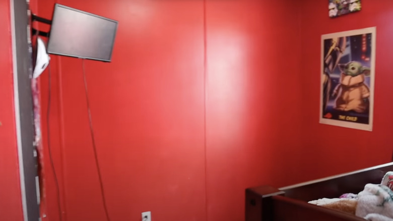
This red bedroom is too bright for its own good. The shade is a great choice, but it could've been used as an accent color instead of taking over the entire room. The television cables could have been hidden in the wall so that they're not displayed and all over the place.
After: Stylish new room
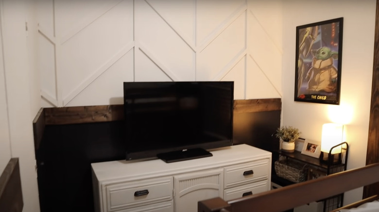
The red walls are long gone and now a clean white interior has arrived with some stunning texture to give it some personality. The mahogany wood wainscoting matches the wood of the bed and creates an interesting barrier with the white television stand. The TV cables are long gone, hidden behind the stand, which makes the room look clean.
Before: Stuffy and small
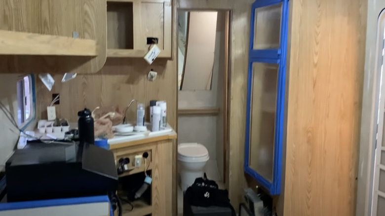
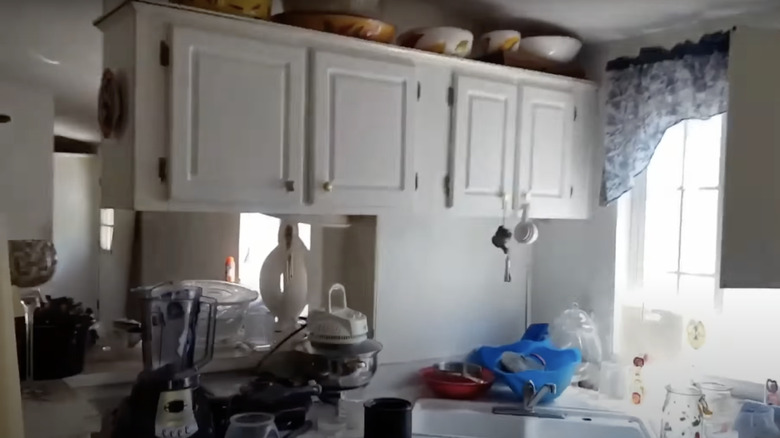
When a kitchen is first designed as an enclosed space, it can look small and cluttered, especially when it's packed with various décor pieces and appliances. This kitchen definitely needs some cleaning up and some color to make it look less monochromatic and bland.
After: Mid-century modern look
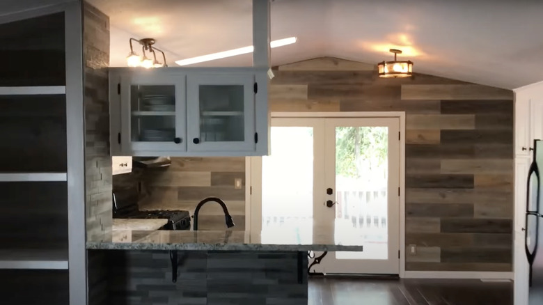
This kitchen received more than just a simple sweep — it was given a complete 180-degree transformation. The bare white walls were replaced with lavish wooden panels throughout the entire space. New granite countertops took the place of the old white ones while the cabinet knobs were updated from silver to black.
Before: Boring wood
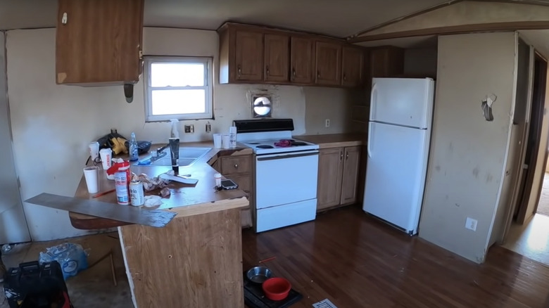
This mobile home kitchen has unoriginal standard wood cabinets that need to be refurnished with some new paint. The walls need a new paint job as well since they're rundown and stained.
After: Opulent white cabinets
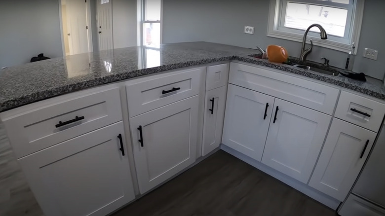
This gorgeous kitchen has new pearl white cabinets with black handles and stunning granite countertops. The wooden flooring also got replaced with a gray oak wood, and the walls were repainted in a light shade of gray. The kitchen feels luxurious with the new updates.
