15 Bathroom Vanity Remodels Before And After Photos You Just Have To See
When it comes to bathroom vanities, they give your space tons of personality, which, depending on how you style, it can make or break your bathroom. There are so many different styles you can choose from. Whether you want a single or double sink or a pedestal or vessel, you can find a style to fit your home. Some vanities can be expensive, which is why you can always turn them into a fun project and completely transform your own vanity.
You don't need to go all out and make a whole new vanity; a little paint job goes a long way and won't cost you too much. A new countertop will make a huge difference in your space. Home Stratosphere suggests familiarizing yourself with a few materials before diving into your project so that it lasts for years. Then, it'll be easier for you to decide how you want to change your vanity with better quality materials. Here are some before and after vanity remodels you can use for inspiration.
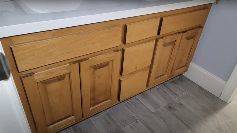
Before: Dated and plain vanity
This plain vanity has an older oak finish that definitely needs a makeover in order to match the gray wood flooring. Also, the cabinets don't have any knobs or handles; it can be hard to open them because the inside can get sticky.
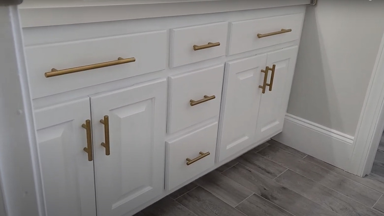
After: Bright and modern vanity
This new and improved vanity has a stunning white finish with beautiful brass handles. It illuminates the bathroom and matches better with the wood flooring; you don't even realize it's the same vanity.
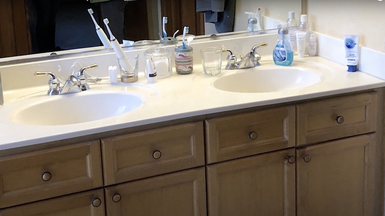
Before: Neutral vanity
This double vanity has the perfect amount of counter space, but the cabinets are bland and basic, with the same wood finish on the knobs. Even though it has a lot of room for multiple things, the look of it can be upgraded.
After: Luxurious vanity
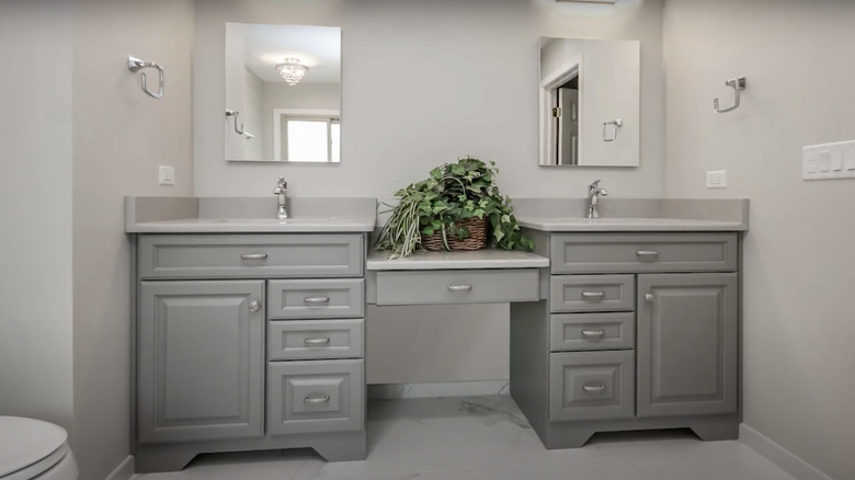
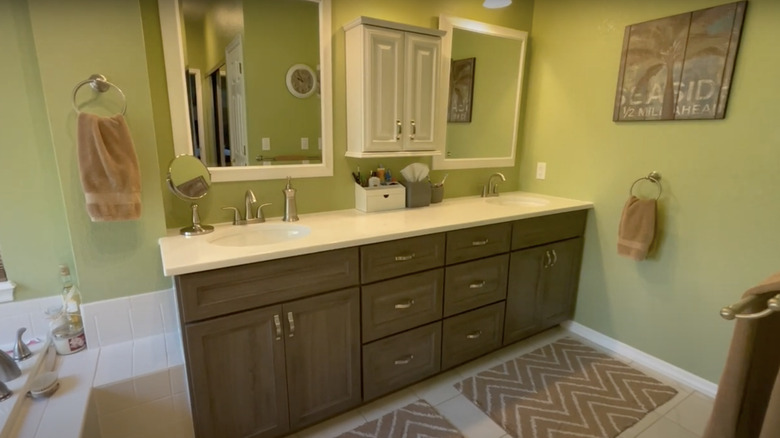
Instead of one long countertop, this new vanity was broken up, which allows for a cleaner and personal cabinet for the couple. Even though the middle pieces were removed, there is still just as much storage with the multiple drawers and full cabinet. The gray finish and silver handlebars match the small details of the bathroom.
Before: Dark and crowded
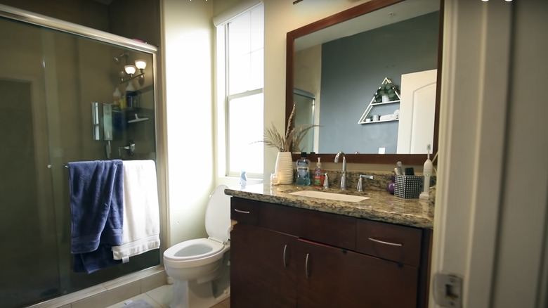
The bathroom itself doesn't get much lighting, and the dark mahogany vanity doesn't help the space either. The granite countertop looks odd with the finish of the wood since it's lighter, yet it should've been a smooth countertop finish.
After: Illuminating vanity
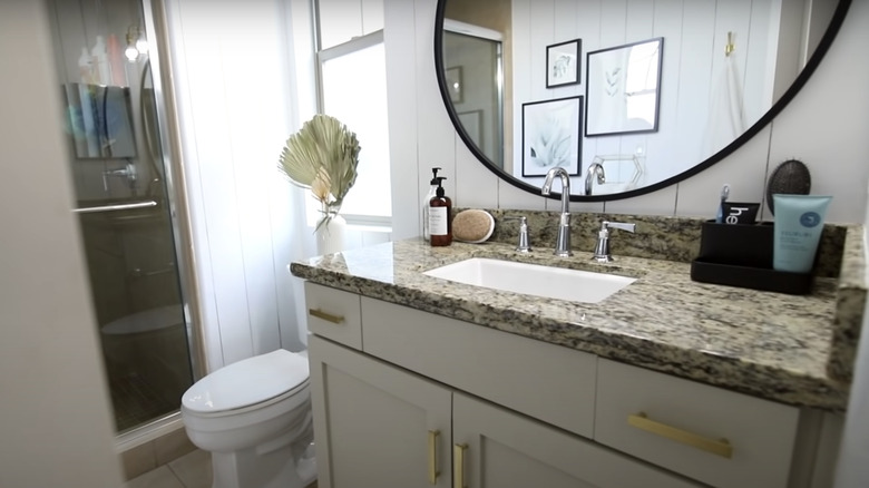
While the granite countertop was kept, the cabinets were painted white which made the space look bigger and brighter. The owner also replaced the mirror on the wall, adding width to the room. The bathroom feels spacious and clean with the remodeled vanity.
Before: Damaged yet simple vanity
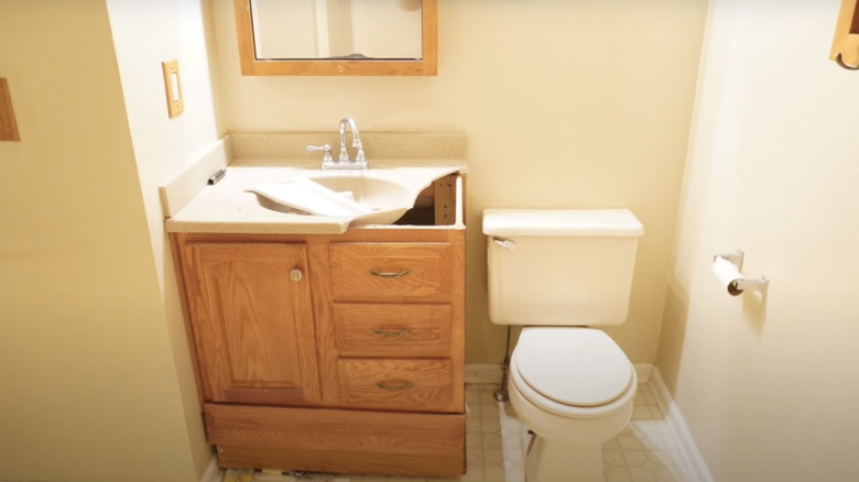
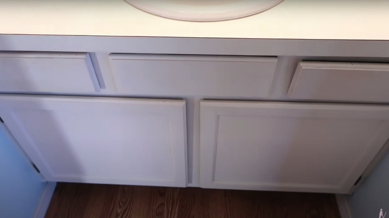
This cabinet was in the process of being remodeled due to its broken countertop, but either way, its look is small and simple. It has ordinary silver handles that don't stand out against the oak wood finish. The main problem is the size of the space; it's limited, but it can hold a cooler vanity.
After: Good as blue
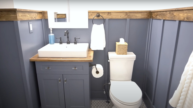
The entire bathroom got a nice touch-up with the blue paint job. The vanity upgraded its doors and sink, standing out a lot more than the old oak vanity. The glass knobs match back to the sink handles and towel rack beautifully, and the mirror was painted a stunning pearl white.
Before: Mismatch disaster
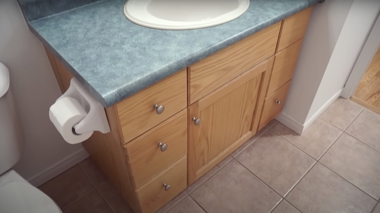
While this vanity is in pristine condition, the light blue countertop looks awkward against the oak finish cabinets, which also doesn't work well with the tiled floor. In addition, there are too many colors being thrown together, making the space jarring.
After: Striking match
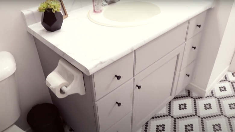
The color palette in the new bathroom works a lot better than the previous one, with a subtle neutral gray to match the marble countertops. The black knobs on the cabinets also fit the new tile print, bringing the whole look together.
Before: Dull and flat
This vanity has the same look as the previous vanities we've seen so far, except this one has a random white cabinet in the middle of the oak-trimmed mirrors. In addition, a cabinet has a white mark that immediately catches one's attention.
After: Clean and classic
This remodeled vanity kept its spacious countertop but is now neatly organized with a basket for all the miscellaneous things. The oak wood finish got changed to a gray-white oak finish, and the mirrors' trim was painted white, matching back to the cabinet in between.
Before: Mundane and rusty
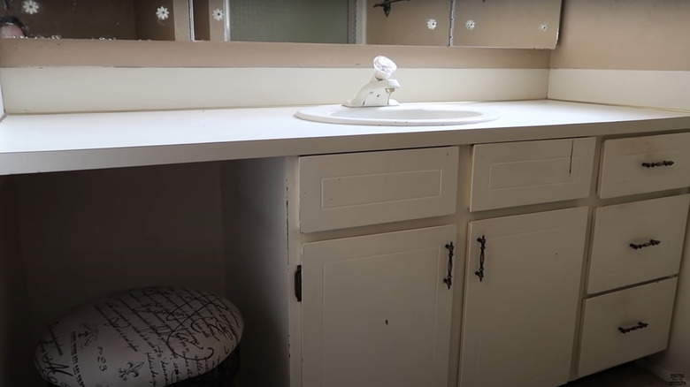
The paint job on this vanity is in desperate need of a new one. The drawers have some sort of stain above their handles, and there are spots where the paint has chipped. The cabinet handles look rusty and worn out as well.
After: Stylish and new
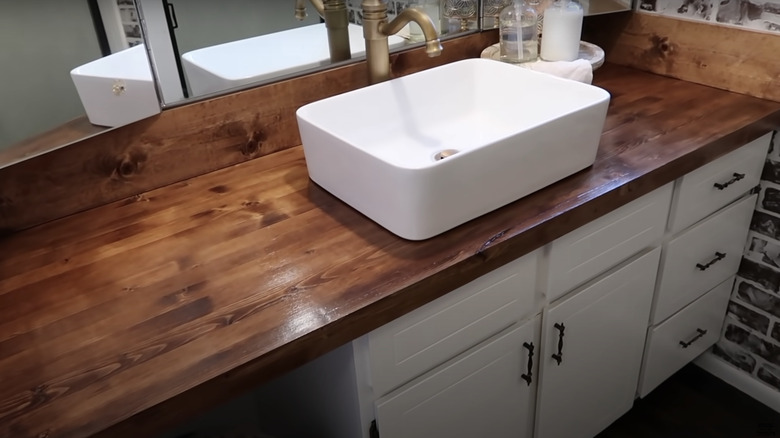
The updated vanity kept its white base, but it definitely got a new paint job, as needed. The countertop was replaced with a beautiful mahogany finish and a gorgeous porcelain vessel sink that has a brass faucet.
Before: Monochromatic vanity
This vanity has mauve cabinets with a white countertop and a basic sink. There aren't any colored handles or knobs that could give it some texture. There's nothing exciting about it that grabs your attention.
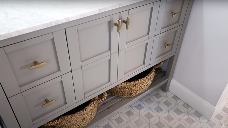
After: Opulent vanity
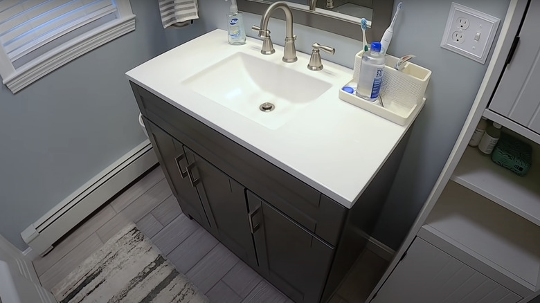
This vanity got a complete makeover with new light gray cabinets and beautiful brass handles. The countertop was replaced with a marble finish, and there's extra storage space on the new bottom shelf. The floors also got replaced with new tile making the room feel clean and put together.
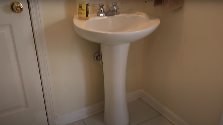
Before: Pedestal with no room
This sink doesn't look like a vanity since it's missing some cabinets to place toiletries. It also doesn't have any counter space; you could only fit a hand wash and possibly a couple of toothbrushes. Even though the corner of the sink is small, there's still a way to fit a small vanity.
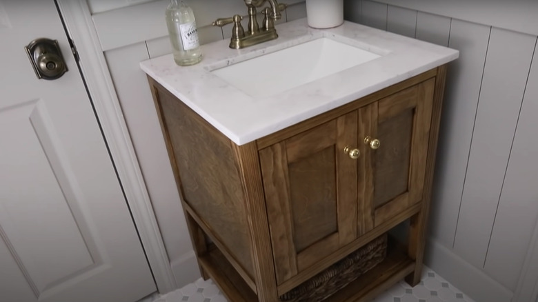
After: A whole new vanity
While the corner didn't grow, the vanity did with new gorgeous oak cabinets and a marble countertop. The cabinets have beautiful gold knobs and an extra shelf on the bottom for more storage. Even though the counter space is still limited, there's enough space for a cup to hold the toothbrushes.
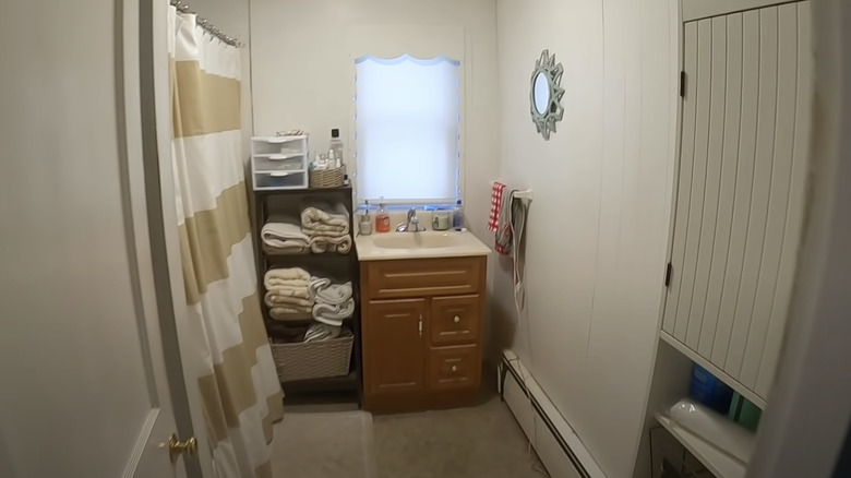
Before: Dated and crammed
This bathroom is tiny that everything is crammed inside, and the vanity doesn't have a mirror since it's located under the window. It looks dirty and right with the built-in shelving unit right next to it. This vanity definitely needs some help.
After: Spacious and classic
This vanity got a whole new look and a new location: It got moved adjacent to the window and has a new mirror above it. The countertop was expanded to have more storage for toiletries, and the cabinets have a stunning gray oak finish with silver handles that match the faucet.
Before: Traditional vanity
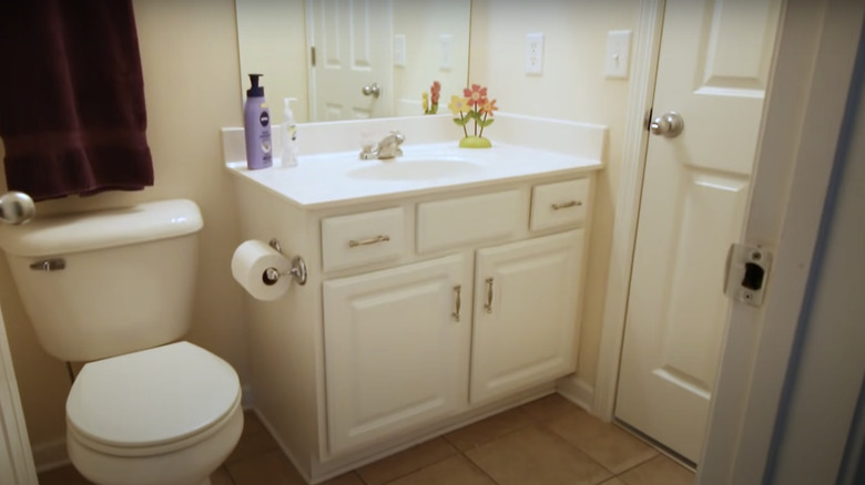
This white vanity may be intact, but it doesn't stand out in the all-white bathroom. It looks dull with the lighting hitting it and simple with the style of cabinets and drawers it has.
After: Simple touch-ups
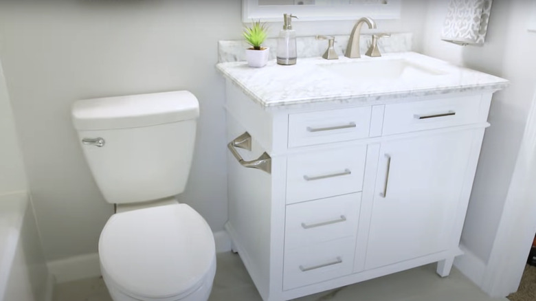
The white vanity look stayed the same, but the cabinets were changed to have more drawers, and the handles were switched out with modern-style ones. The countertop has a new marble finish, and the lights were also switched out to make the bathroom look brighter. It now feels like a luxurious hotel bathroom.
Before: Double vanity
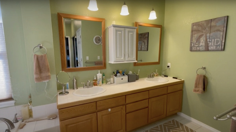
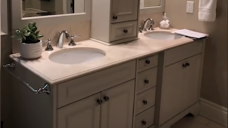
The neutral tone bathroom is great for beginners, but it goes out of style after a few years. The extra cabinet in the middle of the two mirrors takes up a good amount of counter space and looks a bit awkward being in the middle. As a result, the bathroom looks dark and lifeless.
After: Flashy vanity
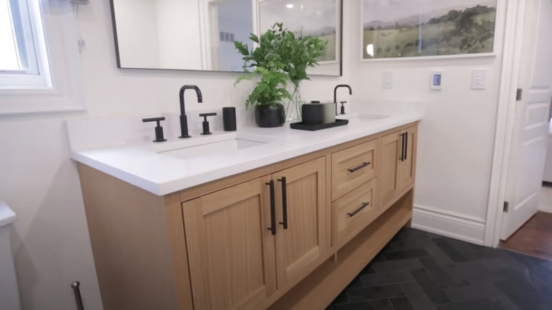
The middle cabinet from before was removed in this improved design, allowing for extra space and a new large mirror to take up the wall. It makes the bathroom feel bigger, and with the paint job, the room also looks brighter. The oak finish on the cabinets pairs perfectly with the black handle.
Before: Abandoned vanity
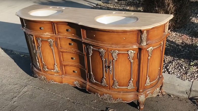
This abandoned vanity definitely needs some love and a new look. The wood finish is dated and has a few chipped pieces, and the metal detailing is also out of style. It's missing a few knobs and their respected faucets, but it's a one-of-a-kind find.
After: Luxurious emerald vanity
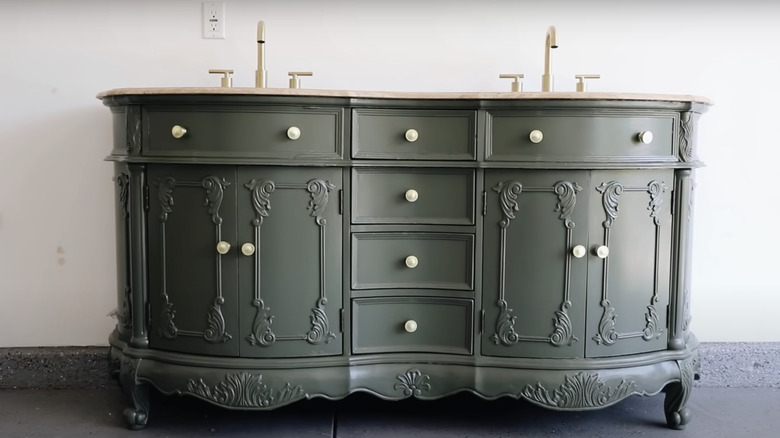
With its new gorgeous gold knobs and emerald green paint job, this vanity makeover will truly make your jaw drop. The newly placed faucets match back to the knobs, and it's perfect because nothing was added or removed but touched up with new vibrant colors.
Before: Builder basic
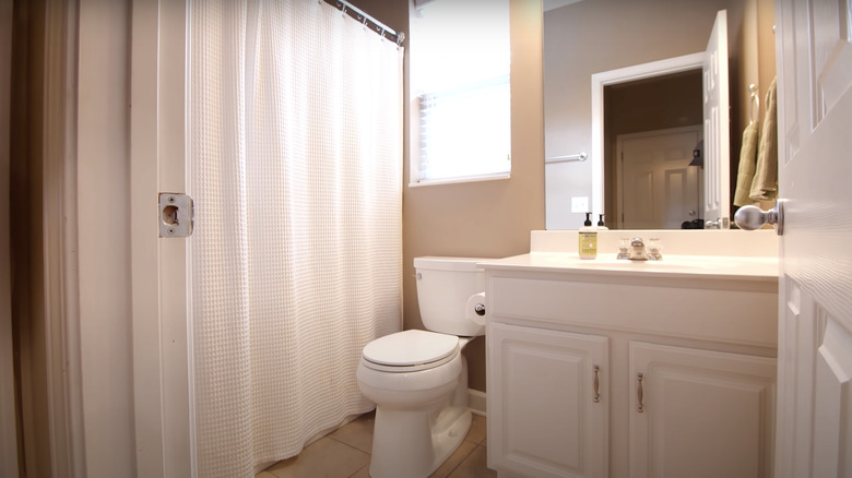
While a monochromatic look can work in a bathroom, there is such a thing as too much white. The vanity is in a great condition lacking the need for a new paint job, but the bathroom's feel is giving that of a doctor's room.
After: Navy blue vanity
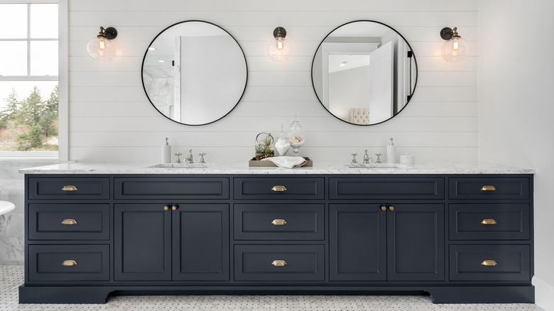
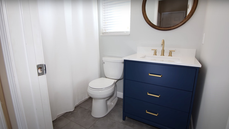
This navy blue color on the cabinets gives the white room a gorgeous touch of color and life. It stands out just the right amount with its gold handles and faucet. The wood trim around the mirror also pairs great with the navy blue; it feels like you're on a fancy sailing ship.
Before: Crackly cabinets
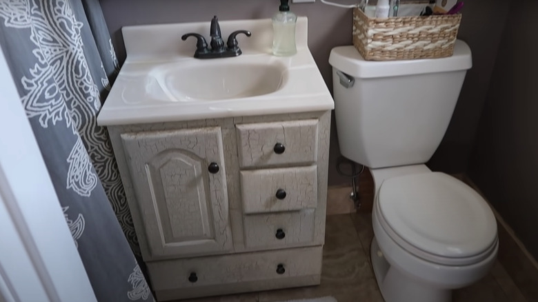
This vanity is definitely giving Coraline from the Other Mother vibes with its crackly black and white cabinets. It's creepy and uncomfortable to look at for too long. It doesn't match at all with the shower curtain or tiled flooring, so it needs a new look.
After: Calming gray
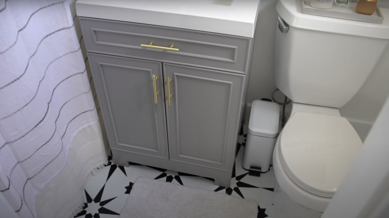
Most of the drawers were removed and replaced with two solid cabinets and a stunning new light gray paint job. It's simple yet effortless, and the gold handles match beautifully. Even though it's still a smaller vanity, the style makes the space feel completely new and clean.
