20 Incredible Exterior House Remodels Before And After Photos
During the springtime, many people eagerly head to garden centers and nurseries to buy plants and flowers that will brighten up their yards. It's also a great time to take a look at the exterior of your home and consider an update. Sometimes adding shutters, removing old awnings, or changing the paint color can make a huge difference. Whether it's a DIY project or one that requires an experienced contractor, updating the exterior of your home not only gives you a new look to enjoy but can add to the value of your home.
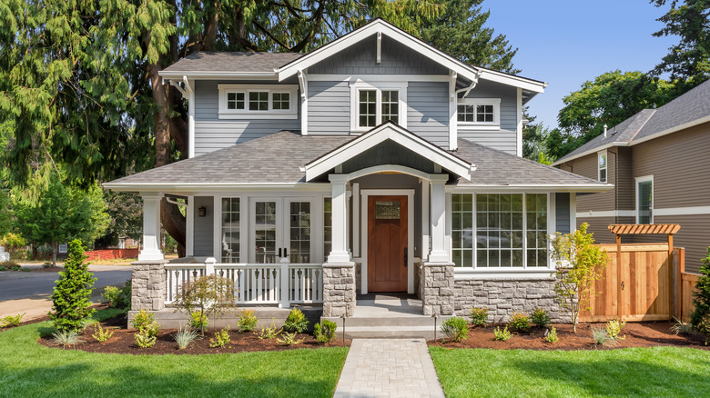
Some of the most frequently seen exterior remodels that change a house from boring to inviting are new paint, decorative trim, altering the appearance of the roofline, and adding a front porch, points out Better Homes & Gardens. A clean front walk and a well-kept yard and garden add to the overall curb appeal. Here are 20 before and after exterior remodels that can inspire you when it comes to your own home.
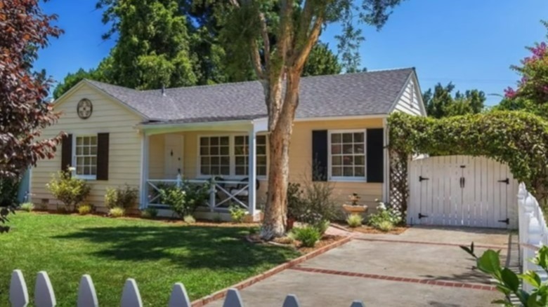
Before: A traditional ranch exterior
The exterior of this ranch-style house is charming and traditional with a small, covered entry. Sometimes a renovation is just about the owner's preference and not because the exterior is run down.
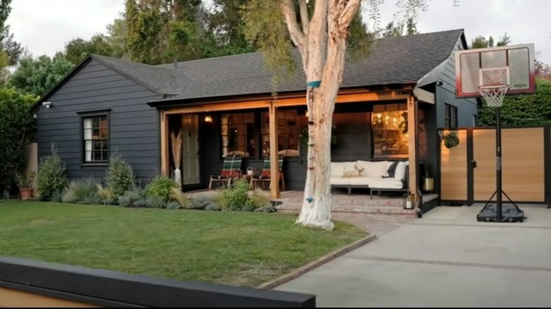
After: Outdoor living space
Extending a wood header across the front of the porch and removing the railings opened up the covered entrance to become a new outdoor living space with a more modern vibe.
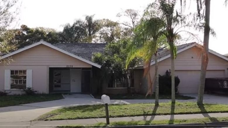
Before: Dark entry
The screened-in lanai at the entry and the shrubs and small trees in front of the bay window make this house look very dark and dreary.
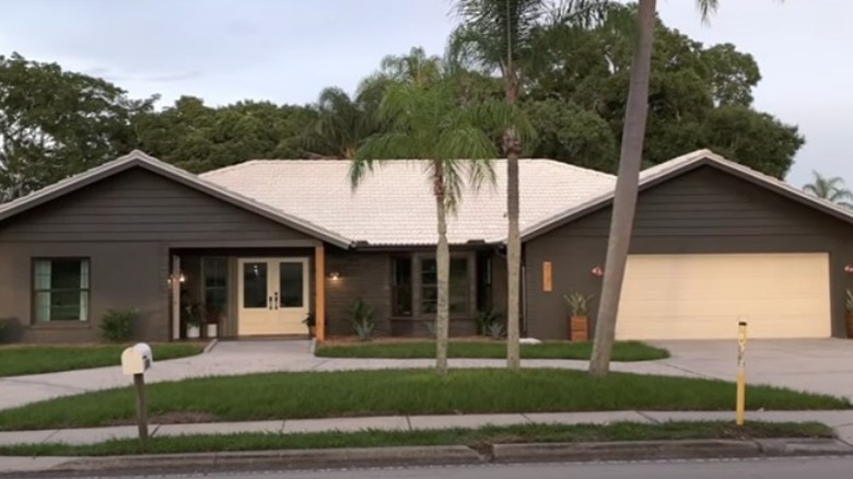
After: A double door and brighter paint
This house looks bright and updated just by removing some shrubs, taking down the screened-in entry, and changing the paint color. A new, double door in a light color makes the entry the inviting focal point of this house.
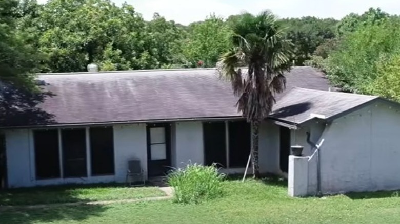
Before: Worn out exterior
Water-damaged stucco needs to be removed and a new roof added just to stop the deterioration of this house. The overgrown palm tree creates a dark corner and adds to the unappealing exterior.
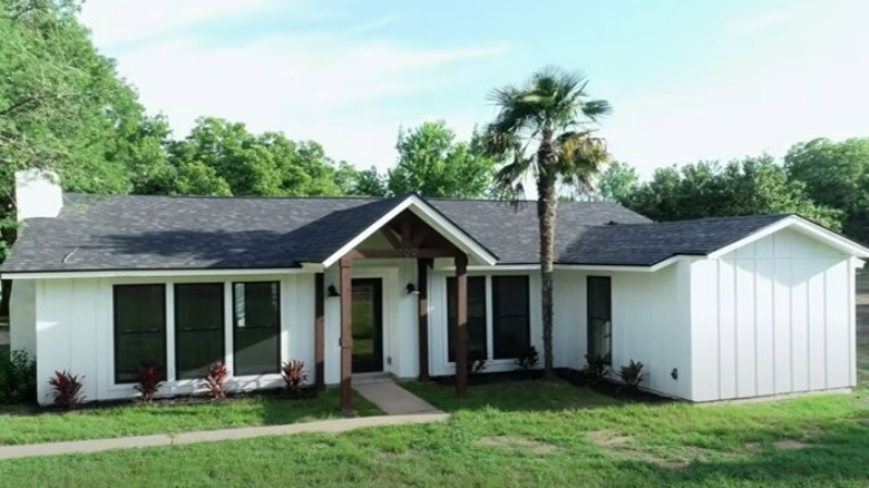
After: A gabled entry, vertical siding, and a new roof
New board and batten siding in a creamy white color invokes a farmhouse vibe and contrasts with the dark roof. A gabled entry adds dimension to the exterior while providing a welcoming touch to the house.
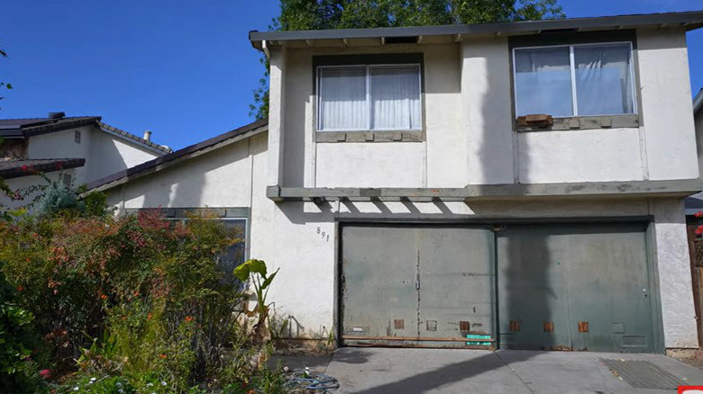
Before: Run down and sagging
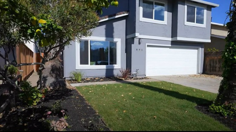
The second story on this house is sagging because of a rotted garage header. The overgrown front yard and general run-down condition of the exterior make this a house in dire need of a makeover.
After: A facelift for the whole exterior
Removing the overgrown bushes and adding sod create an open and inviting front yard. The house has new paint while the old, single-pane aluminum windows have been replaced with double-pane windows and wide trim molding. The garage header has also been replaced, and a new garage door was added.
Before: Incomplete porch
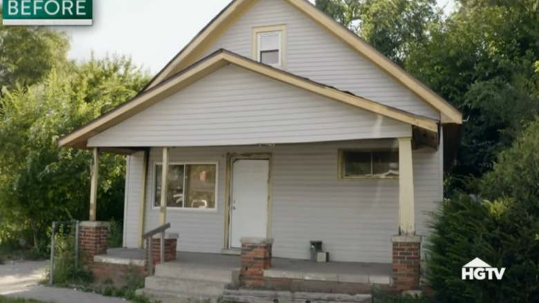
The porch on this house was never completed. The support columns are missing, mismatched, and may not be providing enough support for the roof. The stairs and porch surround are chipped and overgrown, and the front door and windows are missing trim molding.
Atter: A porch with pizzazz
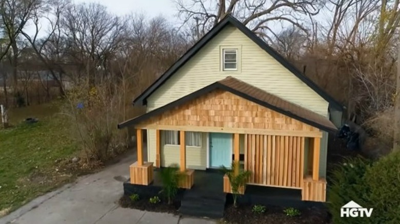
A honey-colored, wood stain on all the new wood surfaces unites the look of this porch. Vertical boards placed at an angle create a privacy screen along one side of the porch. Black paint on the stairs, floor, and foundation really make the porch a stand-out feature!
Before: Overgrown and abandoned
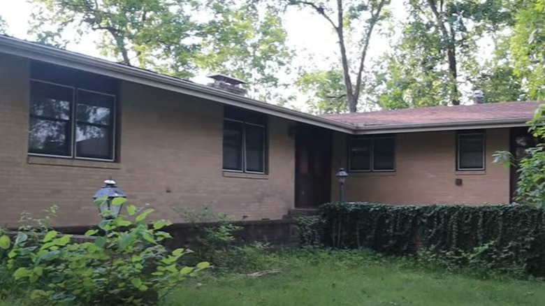
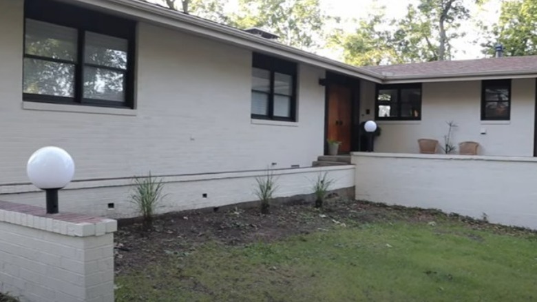
This house has clearly been sitting empty. The original blond-colored brick on the house is dirty and the front retaining walls are overgrown with ivy.
After: Powerwashed and painted
Once the overgrowth was removed from this house, it was power-washed to prepare it for a fresh coat of white paint. This, combined with the black window trim, immediately updates and brightens the exterior. The dark storm doors were removed to reveal the warm wood tones of the double front doors.
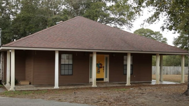
Before: Caged by columns
The first thing you see on the exterior of this house is the white, evenly spaced columns, which make it appear caged.
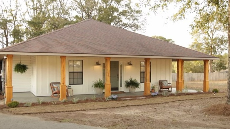
After: A modern farmhouse vibe
New board and batten siding and creamy, white paint bring the house into focus. The lighter-toned wood on the columns draws your eye to the house rather than creating a barrier. A few plants along the front of the house add a welcoming touch.
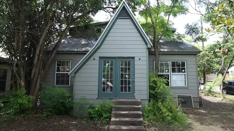
Before: Overgrown and odd
This house looks a little like Hans and Gretel gone wrong! A cluster of trees is growing so close to the house that the trunks are leaning on it, while the bare concrete steps are crowded with overgrowth. The asymmetrical roofline makes this entry look like a mistake.
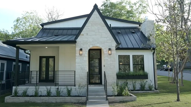
After: Bright and balanced
A porch was built out to open up the front of this house. The gabled entry was brought into balance and surfaced with stone, then painted in the same white as the new board and batten siding. The raised flower beds add to the overall curb appeal.
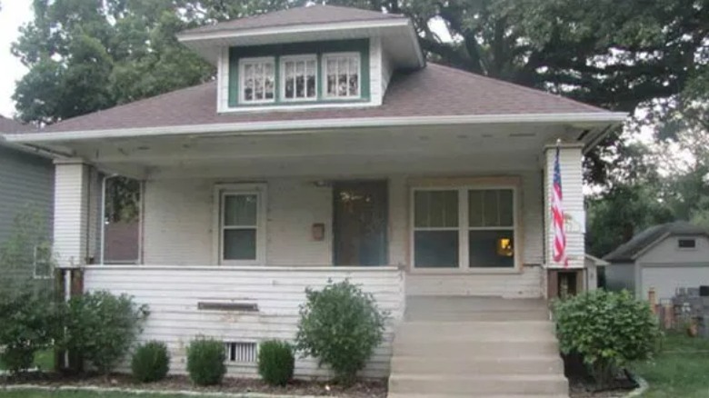
Before: Faded bungalow
What might be a cute, 1920s bungalow is hidden by faded and peeling paint. Boxed-in porch columns and horizontal siding instead of porch rails hide the potential.
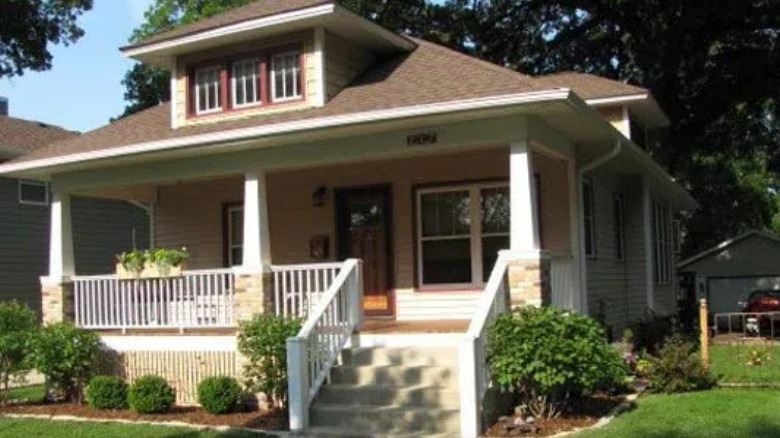
After: The Craftsman details are back
Craftsman-style columns and traditional railings on the porch returned this 1920s bungalow to its period charm. Instead of boxing up the front of this home, the porch is now an open, welcoming feature.
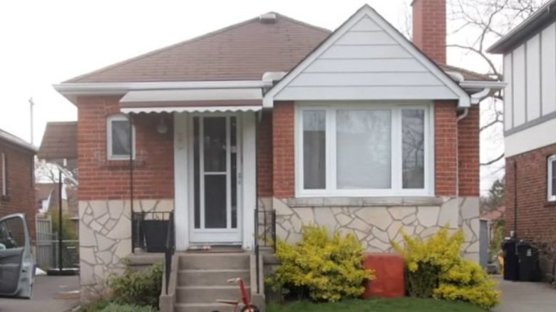
Before: Too many siding finishes
The only statement this small house makes is that there is too much going on with the three different siding finishes, a faded entry awning, and overgrown shrubs.
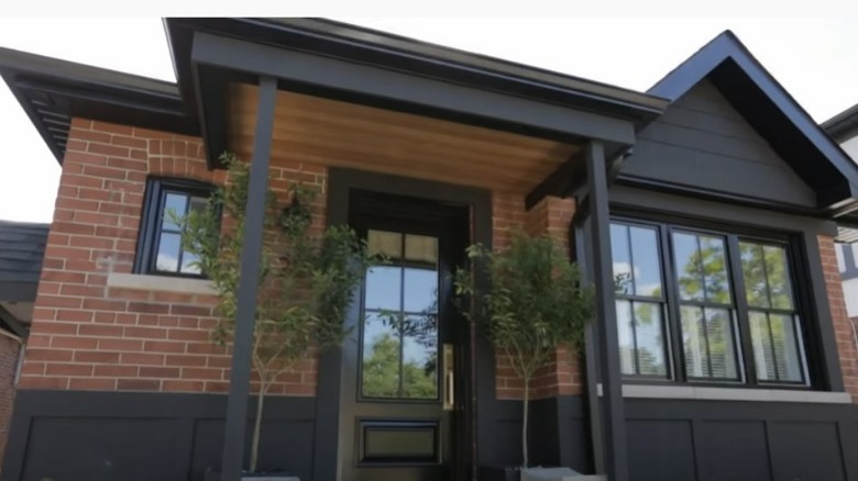
After: Details and color that stand out
The brick portion of the house was kept intact, while the rest was covered with black board and batten siding. The colors and textures work together to make the features of the house stand out, and the new covered entry adds dimension.
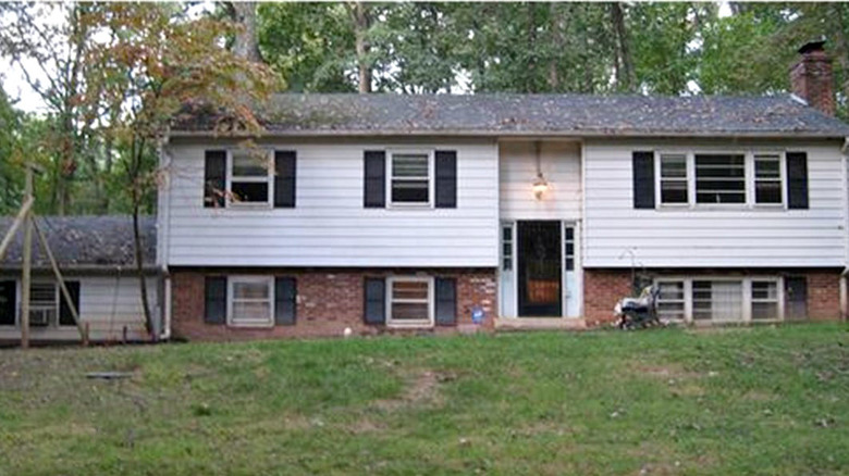
Before: An uninspired split-level
Nothing about the exterior of this split-level house is inviting. The white siding, brick veneer, and black shutters don't make you look twice at this house.
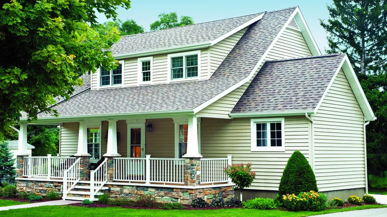
After: Unrecognizable
Instead of a ground-level entry, a wrap-around porch was added just above the lower level of the house. A new double door was raised to line up with the new windows, and a second story was added with dormers on the main house and a similarly shaped gable on the addition. This house has a whole new look, and it's definitely inviting!
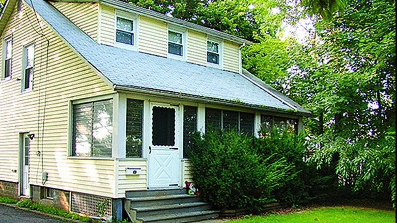
Before: Enclosed and dated
An awkward, enclosed porch, unfinished steps, and out-of-control juniper bushes box off the house from the yard.
After: A front porch opens up the house
Opening the enclosed porch creates an airy entryway, while a Craftsman-style door adds more charm than the former, builder-grade white one. A curved flower bed is framed with concrete pavers, which go well with the new, sage-green siding.
Before: No distinct features
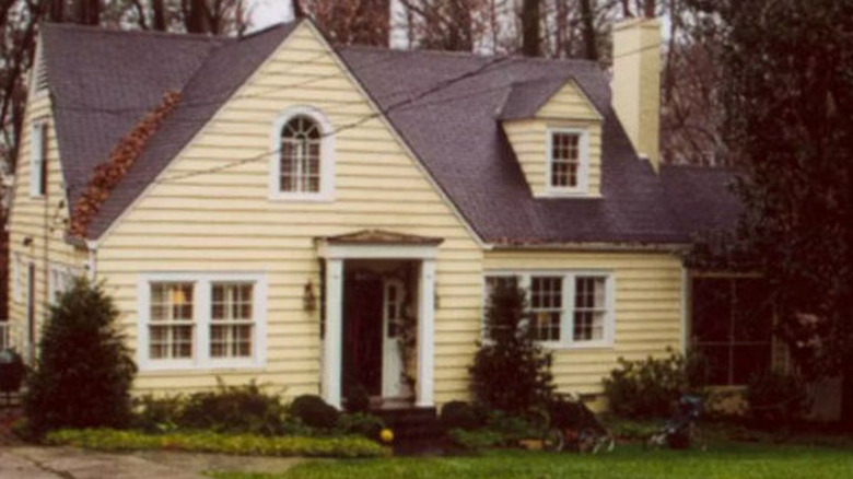
There are no distinct features that stand out in this house. You just notice a lot of yellow paint and a small, Palladian-style window in the gable, which doesn't go with anything else in the architecture.
After: Small changes create a big new look
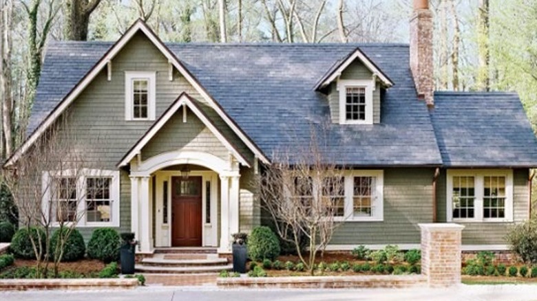
An updated style was created by changing the roofline of the covered entry to reflect the existing gables. The arched window was replaced to match the other windows, and all the windows and gables were emphasized with decorative trim. The paint colors highlight the house and call attention to the new features.
Before: Nice but basic
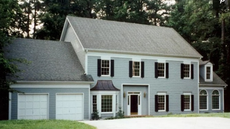
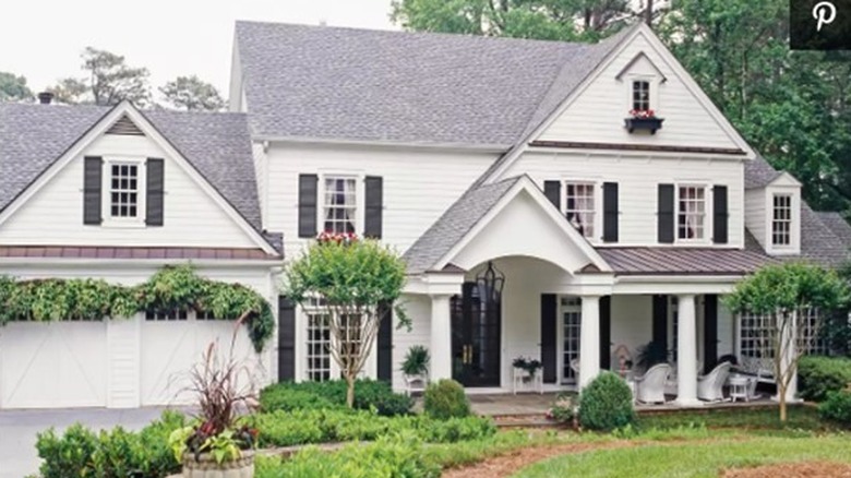
This same Colonial-style house can be seen in subdivisions across the U.S. Your attention is drawn to the house's dark shutters, large palladium windows, and the metal roof above the bay window, but the overall look is not one of a warm and inviting home.
After: Gabled and gorgeous
The two main roof lines were opened up by inserting front-facing gables with a window. The roofline was brought down to the gabled roof over the new front porch. Large, first-floor windows and transoms are framed with tall shutters and more traditional window features. New plantings and window boxes add personality to this inviting home.
Before: Stark and uninspired
This home's stark black-and-white color scheme and relatively flat facade make this a tired-looking 1930s Colonial Revival house.
After: Country charm
Nothing invites visitors like a front porch! This one covers nearly the whole front of the house and sits on an attractive stone-veneer skirting. Extending the roofline makes the porch feel original to the home. A sandstone color, a new roof, and new windows trimmed in white brighten and lighten this home.
Before: Peeling paint and an overgrown bush
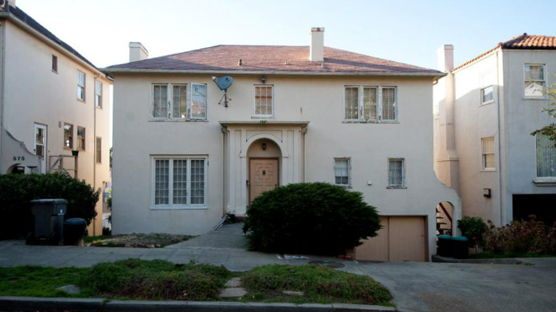
The beige stucco on this house is faded and peeling. The solid color hides the decorative details over the front door, which is mostly obscured by a large bush.
After: Stylish and chic
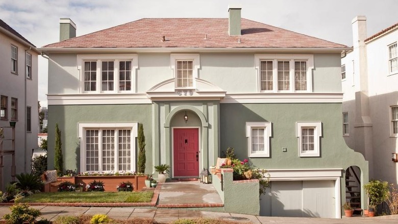
Decorative molding was added across this house and around the windows to create visual interest. Two tones of paint highlight the existing details around the front door and make the home feel even larger. A new front walk, grass, and flowers create a small lawn to the left of the front door. This house has style!
Before: Flat front and awkward entry
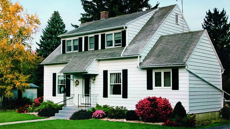
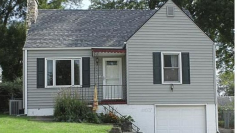
This Cape-style home has a flat facade and an uninviting entryway. The white paint on the foundation and garage door create a stark, visual separation between the house and its foundation.
After: Cute and blue
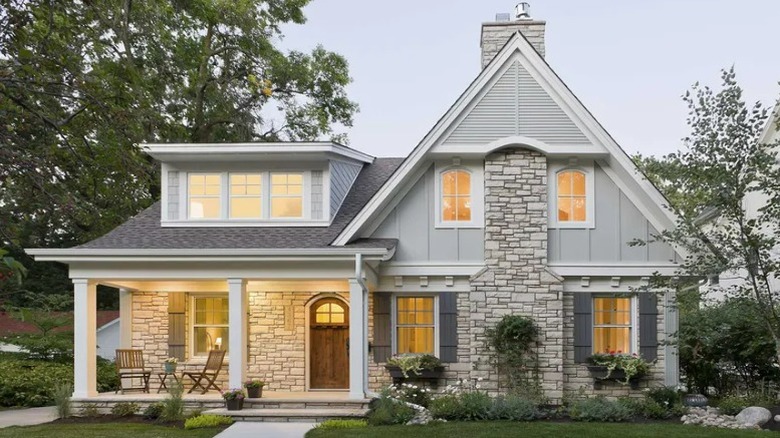
The new front porch is large and welcoming. A gabled portico, new dormer, and louvered vent details in the main gable peak balance the facade and add cottage charm. The house and foundation are united with the same paint color and complemented by the new front door and a carriage-style garage door.
Before: An odd assortment of features
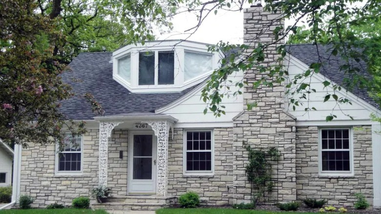
This house has several features that do not fit together, including the oddly shaped dormer, a filigreed portico, and a massive limestone chimney.
After: Architectural details that work together
This house went through a huge transformation with new architectural details, including the covered porch with a projecting roofline and a larger shed dormer with a similar overhang. A front-facing gable partially encloses the chimney and bisects new windows. Other details include shutters, battens and dentil wood trim, and a cottage-style door that mimics the second-floor windows.
Before: Depressed in the 70s
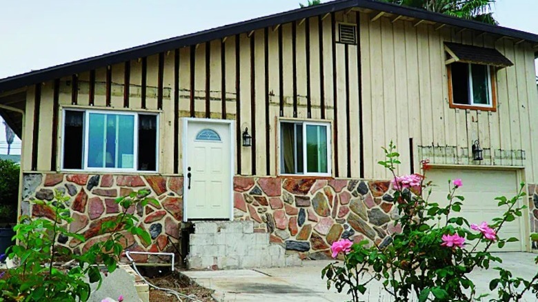
The roofline of this 1970s split-level house wouldn't stand out as much if it weren't for the damaged siding and stone veneer siding that was added around the steps.
After: Gabled roof porch adds balance
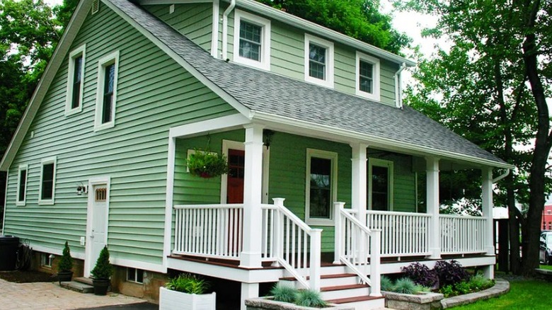
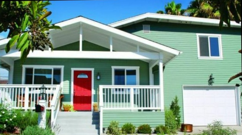
Removing the stone veneer and adding fresh, green paint and white trim immediately update this house. The new gabled covered porch adds balance to the overall look of the house and hides the previously asymmetrical angle of the roof.
Before: Bland 1990s
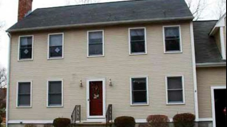
This beige 1990s Colonial-style house has no visual interest. The only decorations are a few, low shrubs and wrought-iron railings.
After: The farmer's porch adds dimension
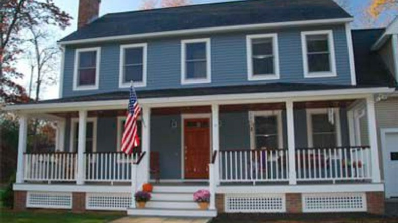
Blue-gray paint plus a red door immediately brighten up the outside of this house. White trim and brick footings on the front porch really make this house stand out.
