How To Decorate Your Home Like Mia's Loft In The Princess Diaries
Who wouldn't want to live in a converted firehouse? No one does this look better than Mia Thermopolis in the 2001 movie "The Princess Diaries." IAMNOTASTALKER takes us inside Station 43, the decommissioned firehouse where Mia and her mother lived in the film. The real Station 43 is a residence and art studio owned by Carolin Hagenstroem (via SFGate). In 1976, Dr. Steve Shohet bought it in an auction. He set it up as an artist's studio, and Hagenstroem continued the tradition when she purchased the home. She currently lives upstairs, while the downstairs is home to Ryan Smith, a goldsmith and hatmaker, and Anastasia Podlysovka, an architect and painter.
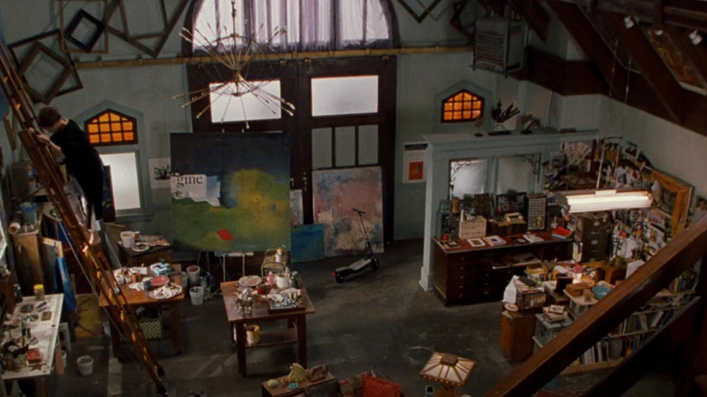
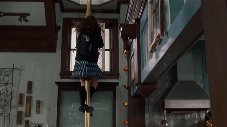
The home is more subdued in real life than in the film. Minimalist decor, natural wood, and neutral white walls bedeck the modern-day version of Station 43. In the movie, the residence features creative paint colors, vintage appliances, and an open concept living area full of artwork created by Mia's mom, Helen Thermopolis. We have all the tips and tricks you need to recreate the look of Mia's loft from "The Princess Diaries," right down to that brass fire pole Mia uses to get to school each morning.
Add a spiral staircase
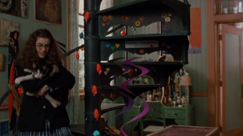
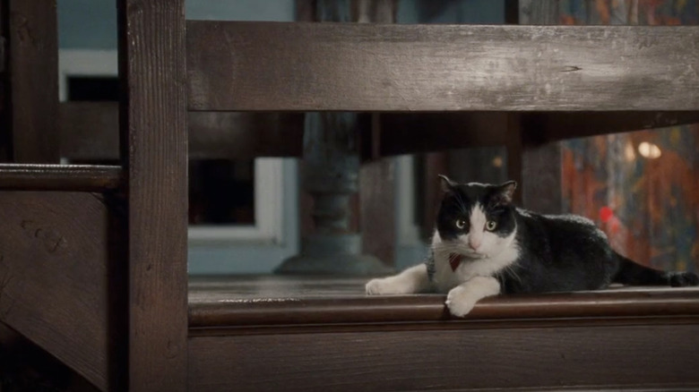
Let's start with that fantastic spiral staircase in Mia's bedroom. It went up to Mia's "tower," the secret attic space on the roof. Even if you aren't trying to recreate this look at home, there are many reasons you might want to add a spiral staircase. As Home Decor Bliss explains, one of the primary reasons people opt for spiral staircases is to save space. A typical spiral staircase is smaller than a traditional version.
Staircases can be fiberglass, wood, metal, or glass, and some even have built-in storage. There are many ways to decorate a staircase wall and make it your own. However, they do pose some challenges. Spiral staircases are narrower than traditional ones, making them more challenging to climb. Plus, only one person at a time can fit on each step, making them less than ideal for high-traffic areas. Lastly, carrying boxes or moving furniture up and down can be difficult or impossible because of the winding nature of these stairs. You can DIY a spiral staircase or order them premade. Eclettica makes a version worthy of the fictional firehouse in "The Princess Diaries." The stairs fold up into a vertical stack of drawers when not in use. The Italian company can embellish them with the photography or artwork of your choice for a personal touch.
Maximize natural light
Another gorgeous aspect of Mia's loft? The natural lighting. The best way to get more light in your space is by adding windows, skylights, or doors. If you're designing your house to include natural lighting, you can use a tactic known as "daylighting." Simonton Windows describes this as placing windows strategically to maximize the amount of light in your home.
Daylighting has multiple benefits. It's good for your health and reduces your energy bills. However, it involves significant changes that could come with a hefty bill. If you don't have the budget for that, you can use paint colors, mirrors, or glazing on the windows and doors you already have to amp up the glow. You can use lighter paint colors to reflect more light or glass and ceramic tiles in a kitchen backsplash (via Essence). Higher gloss paints, mirrors, and mirrored surfaces will reflect natural light and make a room look brighter. White sheets or furniture can also help brighten a room. Adding a chandelier can increase natural light and add sparkle to your room.
Create an open concept living area
An open concept floor plan may be the only practical design element in Mia's loft. This style is excellent for spending time with friends and family. Designing Idea defines an open concept floor plan as a space where typically separated rooms flow together as one. These traditionally include the living room, kitchen, and dining room. The open concept works well in homes of all sizes. Still, small ones benefit from appearing larger when using this decorating style. You can always add sliding doors for temporary room dividers for more privacy. Barn doors work well because they easily slide open and close to accommodate your needs.
An extra benefit to adding sliding doors to your home is that they can bring in additional light. You can darken the room for movie night but get plenty of daylight during the day. The open concept floor plan first became popular in the 1950s when entertaining was an inclusive affair (via The Spruce). It became commonplace in the 1990s, but this design style has pros and cons. Some of the cons include the costs to heat and cool a larger space, poor sound control, and lack of privacy.
Safely hang your artwork
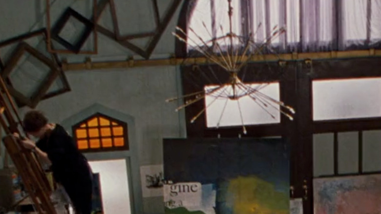
Another cool feature in Mia's loft is the artwork mounted to the eaves in the living room. As spectacular as these art pieces look on what is, let's face it, a film set, hanging art on a sloped wall poses a challenge. The biggest drawback to this display is gravity. All four corners need to secure to the wall. If this is a look you're hoping to emulate, some things can help. According to Home Decor Bliss, you should use keyhole hangers, hook and loop tape, museum putty, L-brackets, or J-brackets to mount artwork to your sloped walls.
Keyhole hangers are brackets that allow screws to lock into place. They will hold your art in place and secure it against the wall. Hook and loop tape is better known by its common name, Velcro. The trickiest part of pulling off this look is lining up the Velcro on the wall with the lining on your artwork. Museum putty is an excellent choice if you are trying to avoid damaging your art, ceilings, and walls.
Add a Sputnik chandelier
Remember that eye-catching chandelier hanging in the middle of Mia's living room? It was a Sputnik chandelier. According to Houzz, these beauties draw inspiration from the Sputnik launch in 1957 and are a classic detail of mid-century modern homes. They are typically a mix of blond woods and bright colors, and these gorgeous retro lights are making a comeback in contemporary homes.
Like the one in Mia's living room, the space-like light fixtures tend to feature brass arms with a single light bulb at the end. They are also available in silver if that's more your style. Lumigado has Sputnik chandeliers in traditional brass varieties, silver, copper, and wood. For a more non-traditional version, there's one with brass and green bulbs. If you want something ornate, look for Sputnik versions in brass and silver or with blue bulbs (via Eye for Design). No matter which style you choose, it will make a beautiful addition to a living or dining room.
Choose mosaic tiles for your kitchen floor
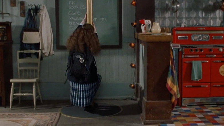
The crazy, multicolored floor in Mia's kitchen might be hard to replicate in the present. However, there are some colored tiling options you could use to achieve a similar concept in your kitchen. For example, Mineral Tiles sells porcelain, hexagonal tiles in brown, white, and gray. TileBar offers a vibrant matte blue option. Their ceramic tiles are blue, green, and gray. They won't create the multicolored version you saw in "The Princess Diaries" unless you pair them with other tiles. However, they can give you a bright and beautiful floor that Mia and Helen Thermopolis will appreciate.
Floor & Decor carries a tile named Castille. This large tile features different colored tile sections. The difference between these varieties and the tile seen in "The Princess Diaries" is that the colors are more muted. IMAESTRI is an Italian company that produces a genuinely eclectic version close to the tile in "The Princess Diaries." Each tile has its own mosaic-style design.
Make it cluttered and cozy
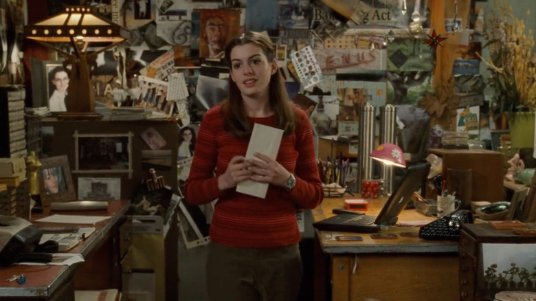
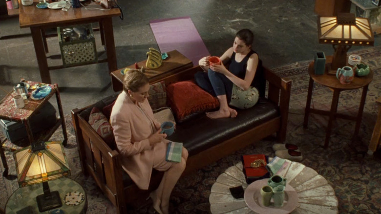
The cluttered spaces seen in Mia's loft have fallen out of favor in recent years. Anti-clutter and minimalism have been all the rage. However, there's some good news for those who love the maximalist firehouse loft in "The Princess Diaries."
According to Southern Living, cluttercore is a new style picking up steam online and off. In true Mia style, it's not just about having stuff. It's about genuinely loving your things and celebrating them. Decorating in this style means filling your walls with family photographs instead of hanging up a single print. It involves putting out all your dishes, milk glass, and other collectibles rather than storing them in a cabinet for special occasions. Jennifer Howard, the author of "Clutter: An Untidy History," also uses the phrase curated clutter and says the pandemic may be to blame for its rising appeal (via Jennifer Howard). Filling our homes with the things we love helps us feel safe, and that is something we've sought out in the past few years.
Embrace your inner artist
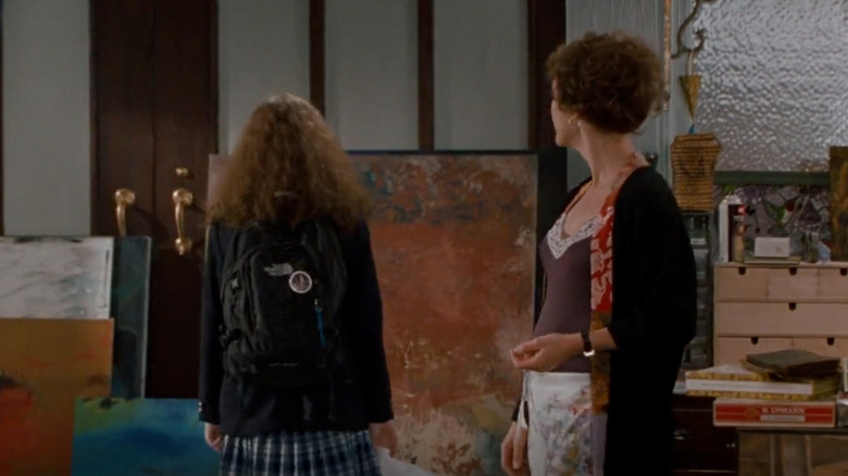
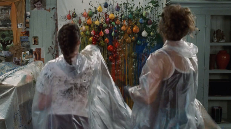
Mia's mother, Helen, was an artist whose own work decorated the loft. While we can't all be professional artists with enough talent to decorate a living, anyone can create their own home decorations and wall art. According to The Zoe Report, the quarantine was responsible for starting this trend. Even without a lockdown, it's still a great way to spend the weekend.
Start by selecting a couple of colors from your current decor and begin your work with dots and streaks. In addition to considering the colors already in your room, think about the mood you are trying to create. The best medium to start with is acrylic, which works best on canvas. The best thing about using this type of paint is that you can paint over unwanted results with white acrylic. As your creativity and talent grow, you can experiment more. Watercolors are beautiful, but they can be finicky. However, you never know. You might discover you're a professional artist after all.
Choose dark wood for furniture and stairs
Much of Mia's living room furniture features dark wood and cushions. Even the stairwell is dark wood. This look can be tricky to pull off. If you don't do it right, your room can look as dark and gloomy as your finishes. According to Houzz, it's best to add bright and colorful accent pieces near your dark wood. Chairs at your dark wood table, perhaps, or a brightly colored lamp on a dark sideboard. Colorful art also works well. Maybe you could use one of those art pieces you created yourself the previous weekend.
House & Garden points out that light or neutral colors on the wall also work well to break up the darkness. Accent furniture in light colors or stripes can punctuate antique and dark-toned pieces. If neither of those is your style, you could try wallpaper. There are some eclectic designs out there. As long as you stick with a light-colored background, you can get Mia's eclectic firehouse without all that dark wood making things look dull and listless.
Select vintage lamps and shades
Tiffany lamps like the ones in Mia's living room were all the rage back in 1895, according to Realtor.com. Though they fell out of fashion in the early 1900s, they had a resurgence in the 1950s. They are now becoming trendy again in the "grandmillennial" style. This decorating style favors the things you were likely to find in your grandparents' house — wallpaper, wicker furniture, embroidery, and florals. Since Tiffany lamps are typically made of brass and contain lampshades made of mosaic glass pieces, they easily fit into this decor scheme. The colors mean they will partner well with your dark wood. Since they don't offer much light, you shouldn't rely on them for room lighting. They are more decorative than practical.
You can put these lamps at eye level to appreciate the intricate artwork (via SFGate). Placing them near windows helps to make a decorative statement. This arrangement will also allow sunlight coming through the window to reflect off the colored glass and brighten the entire room.
Go for retro appliances
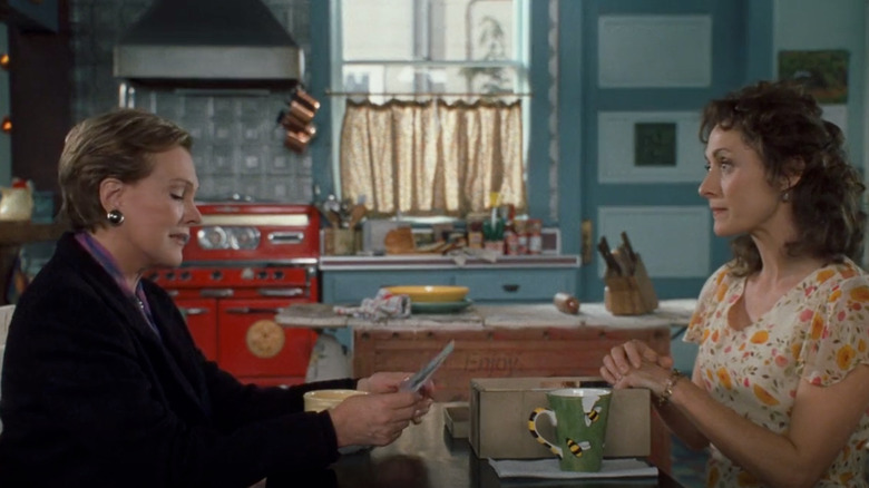
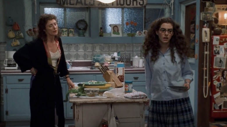
Everything old is new again. This decor tip is good news if you're trying to recreate Mia's kitchen. That gorgeous red fridge and stove? It's easy to find from modern-day brands like Big Chill. The company produces high-quality appliances that have a look and style you — or maybe your parents — loved back in the sixties and seventies. Big Chill offers multiple sizes for their products, meaning you can get their retro style no matter how small your living space is. There's even a slimline version of the refrigerator. According to Atomic Ranch, Big Chill even makes microwaves, which weren't around when colorful appliances were last in vogue.
However, Big Chill is not the only maker of retro appliances (via Cottages & Bungalows). Smeg also designs quality appliances, while Daewoo makes small refrigerators perfect for man caves and she sheds. Aga is a brand specializing in upscale cast iron stoves for the true gourmet and professional chef.
Panel your kitchen walls with tin
Another fabulous retro find in Mia's loft is the tin backsplash in the kitchen. These nostalgic tiles are stamped but unfinished tin. According to Hunker, tin tiles were all the rage in Victorian times and can still make a unique decorative statement in any home. There are a variety of finish options available. If the traditional type isn't your style, there are panels in burnished copper, metallic brass, and paints in different colors.
You can paint your own tin tiles and use them as a backsplash, but this is a big project (via Countertop Specialists). There are powder-coated versions in white, blue, brick red, or seafoam green. These could be ideal if you have retro appliances in your kitchen. However, there are pros and cons to using tin tiles in your kitchen. If you like the style in Mia's loft and are looking to recreate it, this option is inexpensive and easy to complete. Tin is easy to clean, non-flammable, and eco-friendly. However, it can dent easily and be too busy for some kitchens.
Choose bright, eclectic colors
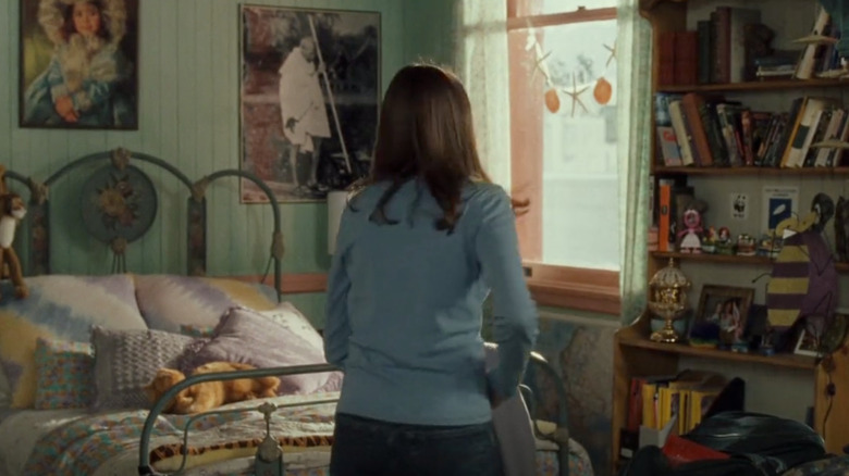
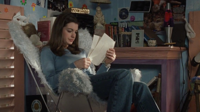
Most of the bright colors in Mia's loft are in her bedroom. Her room features a bold and eclectic look, to be sure. It takes a particular style and daring to pull this off. However, if you want to try it out, keep a few things in mind. Select neutral-colored furniture and determine a focal point. According to Better Homes & Gardens, you should first consider which neutral to use as your backdrop. This tip doesn't just mean the neutral color you select, but also which items you keep neutral. For example, if you want to go bold with your walls, keep your furniture neutral. And vice versa, of course.
This tip is essential for choosing a focal point. You don't want your eyes distracted by looking at too many bright colors or clashing patterns. Pick one color or item that you wish to serve as the focus, and limit your color choices to no more than two or three. This style, also known as eclectic, follows some familiar trends. Like cluttercore, eclectic-inspired decor is about showing your true personality (via Apartment List). This design style favors bold colors and unique choices. It makes an excellent choice for those who love to travel and pick up beautiful items from each destination.
Add a fireman's pole
This last tip is a little out of the ordinary. According to Houzz, we are never too old to have a little fun, especially inside our homes. Add some fun to your living space with chutes, ladders, or fireman's poles. Slides are, for obvious reasons, best suited to children's rooms, but they don't have to stay there. Think about dropping one from your bedroom down to the living room. Imagine the tales your guests will tell once they've visited your home.
Another tip is to install a fire pole, just like the one Mia used in the loft each morning. Adding one as a decorative accent speaks to your character and personality. If you plan on using your fire pole, mudrooms and entryways make ideal locations. McIntire Brassworks is the only manufacturer of fire poles in the nation. It sells most of its products to active firehouses, but it also has a few residential customers. How extravagant you go depends on your tastes and, of course, your budget.
There is reportedly a buyer who spent $30,000 to add a firepole to his garage and land squarely between his two Ferraris (via JLC Construction). For most of us, refurbished poles might be a more practical option. These cost around $2,000. Imagine all the personality and vivacity you'll be adding to your home with a real fireman's pole.

