Take A Look Inside Nate Berkus And Jeremiah Brent's Home
Interior designers Nate Berkus and Jeremiah Brent have over 20 years of experience between them. Fans may recognize Berkus from his days collaborating with Oprah during the early 2000s or one of his many big-box decor lines, like his Target or HSN, as per Oprah. As for Brent, many know him from his career with Rachel Zoe or from one of his Emmy Award-winning shows, like "Home Made Simple" or "Nate & Jeremiah By Design" (via Jeremiah Brent). Brent also had a successful Pottery Barn Kids line, inspired by his own family.
The couple is known for transforming homes of well-deserving families on TLC and their own gorgeous homes in L.A. and New York. Their west village penthouse is no exception. In 2020, the designer duo downsized from their 9,000-square-foot Spanish colonial mansion in Los Angeles, into a 3,400-square-foot 19th-century New York City townhouse (via Architectural Digest). Here is a peek inside its stylish confines.
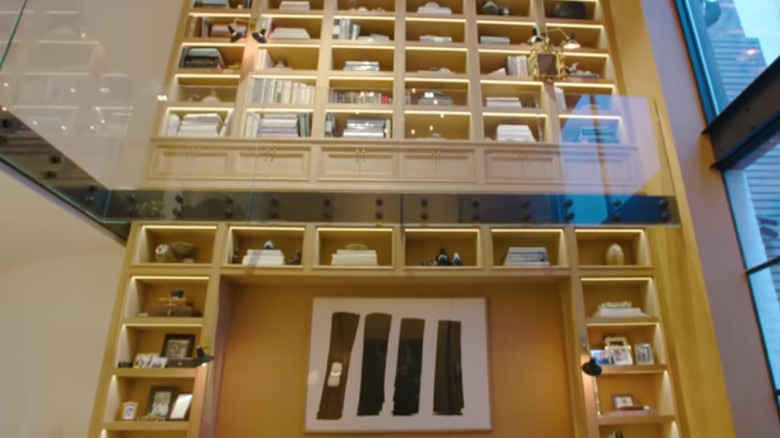
They have a two-story white oak bookshelf
When the couple walked into the 3,400-square-foot townhouse, it recently underwent a complete gut renovation, including the bathrooms, wiring, and plumbing. During their home tour, Brent explained to Architectural Digest that their job as designers was "to give it some soul again." This resulted in Brent immediately designing an eye-catching two-story wall-to-wall bookshelf cast in white oak.
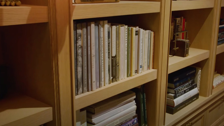
Because the home has an industrial feel and a clear railing, adding a natural bookcase was the couple's way of warming up the central living room while also providing a space for their cherished trinkets. Both Brent and Berkus have an extensive collection of design books showcased on the warm oak shelves. Brent tells Marie Claire the books are special to him because he and Berkus stayed up until four in the morning on one of their first dates talking about them. The 30-foot bookcase also holds a variety of pictures, which Berkus told Architectural Digest are equally as near-and-dear to them. "I didn't want to live without those picture frames — they've been in every home I've lived in for the past 15 years."
Collectables from throughout the years
Berkus is a self-proclaimed avid collector. In all his homes, he has kept trinkets from his travels, picture frames and family photos, and collectible prints from his former partner Fernando Bengoechea. On his Instagram, Berkus poses in front of his bookcase and tells fans, "Your home should tell your story, and the way you do that is through the things you choose to live with. You want to be reminded of the people, places, and things that you love when you look around your home. Why worry what your friends or your neighbor or your mother thinks of your home ...The best interiors are always the ones that you make deeply personal."
Brent has a similar design philosophy, telling Living Spaces when it comes to designing a bookshelf, "It's important to honor the past, acknowledge the present, and leave space for the future." The designer encourages fans to play with nature to give an organic shape to the vertical elements or use books and textures as sculptural pieces that draw the eye in.
They have a glass parlor
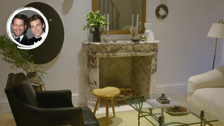
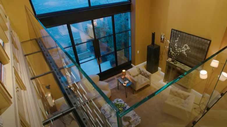
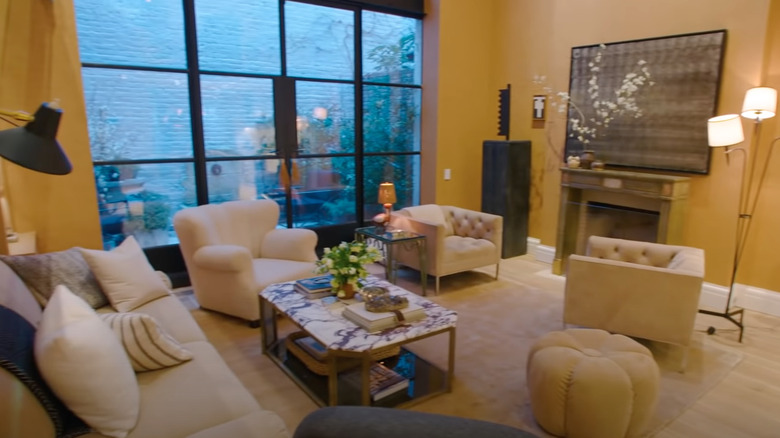
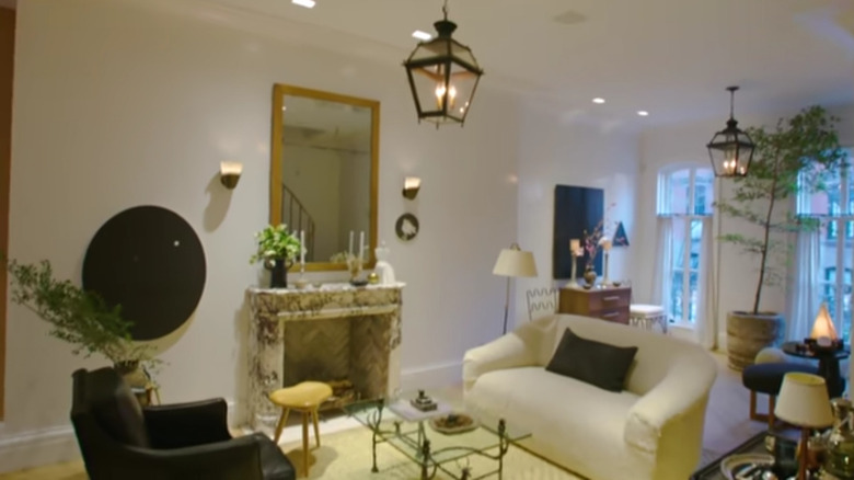
The designers' NYC penthouse opens up into a glass parlor that features a glass railing. Initially, neither Berkus nor Brent knew how to use the space and called it a design disaster because it had three entry points and many possible focal points. The couple decided to use the marble slab fireplace as their focal point and decorate around that and their multiple-story bookshelf. As per Architectural Digest, fans of the designers may recognize that they also had a marble fireplace in their previous Los Angeles house, making it one of their go-to design moves.
Also in the parlor is a 1940's armchair and shearling-covered sofa surrounding a 1960s cocktail table by Diego Giacometti and a painting by James HD Brown (via Architectural Digest). If fans want to replicate the look in their own space, they can utilize a jute rug, which brings warm tones into the industrial glass finish of Burkus and Brent's home. The designers also hang mirrors of various shapes and styles at different heights, which not only reflect light and make the space feel cozy, but also add an artistic element.
The kitchen has gold and brass details
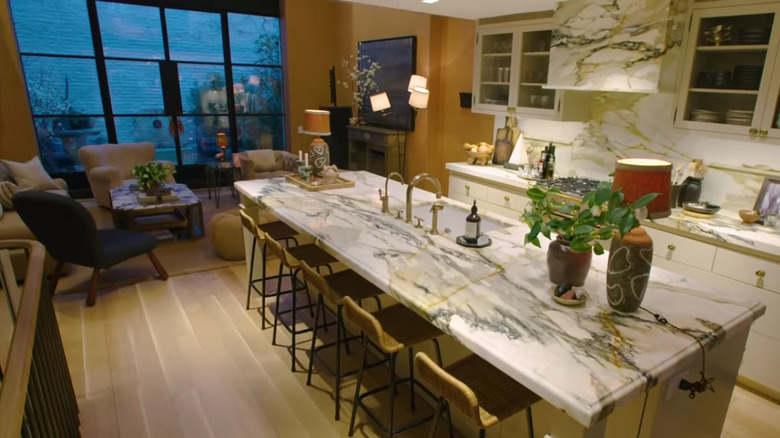
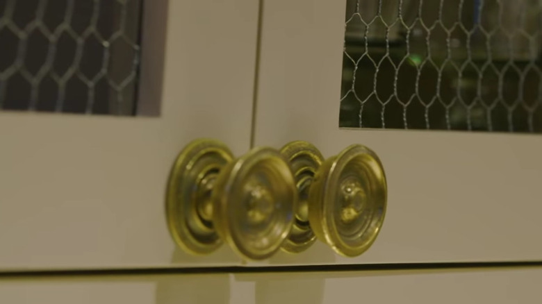
Avid fans of the designers may know that the couple likes to work with metal details throughout their projects. Their personal homes are no exception. Throughout their Manhattan apartment, the couple has incorporated gold and brass details. For example, you can find custom-built brass faucets in the kitchen and bathroom. You can also find brass cabinet knobs and brass stove features in the kitchen.
According to Watermark Designs, if fans want to mimic Berkus and Brent's design, they have a wide variety of options that can be applied in their own spaces. Brass is known for being incredibly timeless and can look great in glam, retro, or traditional spaces based on the finish homeowners pick. Similarly to the designers' home, Watermark Designs suggests pairing brass with light wood, claiming it helps warm up the space and create a cozier aesthetic.
They have a marble kitchen
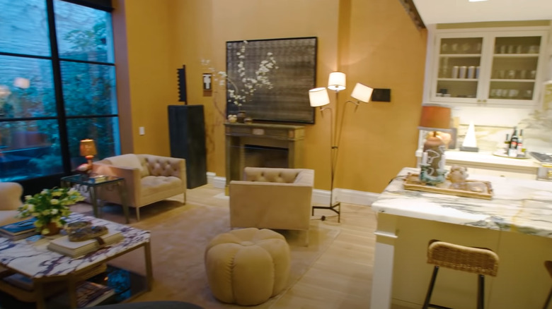
Mimicking their Los Angeles home, which per Architectural Digest had black marble with gold finishes, the duo's New York townhouse is centered around a white Calacatta marble backsplash, custom hood, and countertops with brass finishes.
Calacatta is known for its white background and unusually thick veining, often used to add a bold design element to a kitchen or bathroom. This type of marble is so rare it's only available from one quarry in the entire world, located in Carrara, Italy (via MSI Surfaces). As you can imagine, its limited supply makes it quite expensive, but the price tag is worth it to some people. Mary Kathryn Timoney, an Atlanta kitchen designer, tells Homes & Gardens, "Marble is a luxury item, and you have to take better care of luxury items. You're going to pay more to buy a beautiful dress, and then you are going to pay to dry-clean it every week, but you'll feel beautiful every time you put it on. Now consider how marble takes your breath away when you first see it. Do you want that feeling for the next 15-20 years? Because that's how long people keep their kitchens."
They use a mix of time periods
Berkus and Brent are known in the design community for their love of vintage and curated pieces. Throughout all their homes, the designers have brought a multi-century vibe and showcased their collection of vintage knick-knacks. Their New York penthouse features many different elements from different style points of history. The furniture throughout their home is largely curated with pieces from the 1940s, 1950s, 1960s, and 1970s.
According to The Spruce, mixing different time periods is easier than homeowners might think. The key is to keep the color palette limited throughout the house and to choose a unifying pattern or shape, like the curve of a sofa or chair. Additionally, homeowners will find it easier to mix time periods by matching wood types or keeping shades similar. They can do this by thrifting pieces and applying gel stains to give all the furniture a concise look (via Simply Refinished).
They love decorating with mirrors
Mirrors are a central design point found throughout the home. While mirrors bounce light and add an artistic flair, they're also a great way to warm up an industrial or cold space. The couple used mirrors all over their house as eye-catching design points, such as this art deco mirror that sits over the fireplace in their bedroom sitting room.
According to The Spruce, if homeowners want to decorate with mirrors, they should take a few factors into account, such as the placement of the mirror, what is hanging opposite of it, and if they want the mirrors to act as a focal point. Designers suggest hanging sconces on either side of a mirror, creating a well-lit focal point that complements almost any decor. You can also place it near a window, fireplace, or candles to help amplify the light in the room.
They let their children take control of their rooms
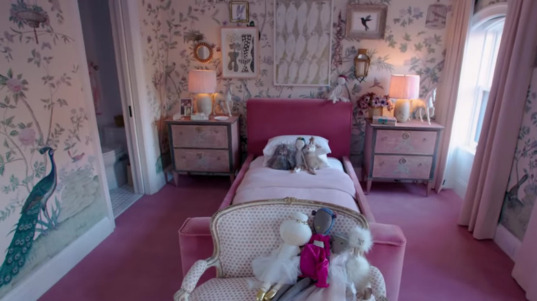
In their children's rooms, the designer couple plays with colorful wallpaper that mimics natural elements and bold colors. Their oldest daughter, Poppy, had complete design direction in her space, from colors to wallpaper. Poppy's room features a bold pink headboard, carpet, and pastel pink drapery. Additionally, she selected a floral wallpaper inspired by Hollywood regency hand-painted floral wallpapers. Poppy also selected some decor elements, including a Hunt Slonem and Geraldine Neurwirh painting that held a special meaning to her since they're family friends.
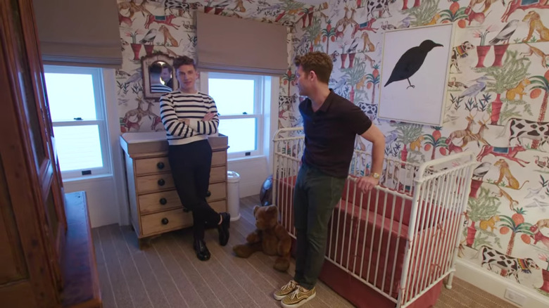
However, the couple's son Oskar's room is decorated with a similarly inspired wallpaper and takes inspiration from retro red tones. "Both of us don't believe in buying nursery furniture," Berkus said during the home tour, which led them to find more unique pieces for the little one's room. For example, rather than buying him a child-size dresser, they instead had rods put inside an existing armoire to match the size of his clothes. The room is also filled with gifts from their friends, like a painting painted by Michael Hainey and Fernando's photographs.
The rooms hold sentimental photographs and artwork
Throughout all their homes, Berkus has kept and preserved photographs that meant a lot to him and have incorporated them into the decor of every space the couple has lived. In Oskar's nursery, Berkus hung a photograph by Fernando Bengoechea, his former partner who was killed in a tsunami in 2004. The piece is important to Berkus because his son Oskar is named after Fernando.
The couple also likes to decorate with paintings and sculptures from their friends and their travels throughout the years, many of which are found on their bookshelves, bedrooms, or living room space. Berkus told his fans on Instagram that all of the pieces in Poppy's room were given as gifts from close family friends when she was born. Nate continues to say, "When you look around your home, you're reminded constantly of the people and the places and the things that you love and the experiences that you've had cumulatively. 'It's so intensely personal. It really represents, for me, a life very well-traveled and aspirationally, a life very well-lived."
They included elements from their former homes
During their home tour, the couple revealed that they had to downsize their Los Angeles home before moving into their New York townhouse but ensured they took important pieces and decor with them. These important and nostalgic pieces now decorate the entire house.
Oskar's nursery is filled with pieces he inherited from his older sister Poppy and existing pieces the couple altered to fit the needs of a toddler. Additionally, Poppy's bedroom set came with her from their Los Angeles home and was just reupholstered to match her current decor. They also recreated elements they loved in their Los Angeles mansion in their New York townhouse, like a marble fireplace, brass hardware and fixtures, and a marble kitchen countertop and backsplash. Berkus told Architectural Digest in 2017, "We go for a very clean, masculine look. We don't like to live with a lot of color." He also mentioned that they prefer vintage pieces that look worn because "when you live with a small child, you don't want to feel beholden to your possessions."
They have sconces and retro inspired lighting
Brent has never been shy about playing with fun lighting in any of his designs, including his own home. The couple has vintage lanterns, matte black sconces, and 1950 pendant lights throughout their home. Domino claims Brent swears by braided straw pendants he found on Etsy, saying he uses them in their home, both indoors and outdoor.
With so many lighting options, it can be intimidating for people to pick the best one for their spaces. According to MyMove, people's biggest mistake is assuming overhead lighting is their only option to put a room together. While interior designers will tell you that lighting is best when done in layers. It's essential to have an ambient or general light, an accent light, and task lighting, which is used when completing a particular task, such as a desk lamp. This will create different light levels, creating a cozier aesthetic.
They have an open floor layout centering around their kitchen
Even though the designer couple's space isn't very large, they make use of their open floor plan to provide plenty of seating for friends and family to gather. It was important to Brent that the kitchen was the focal point of the entire house. According to him, it's the heart of the home and the place where his kids and friends like to gather the most.
If fans want to incorporate similar ideas into their own design, Polished Habitat says it doesn't have to be as intimidating as it looks. While Brent and Berkus have their home centered around their kitchen, not many people have the luxury of building their space from the ground up. However, many tricks can still be used to make a space feel seamless, no matter the focal point. To create a concise space, people must repeat colors throughout their design and wall paint. Colors can be carried from the front door to a kitchen counter or pillows. People can also define spaces with area rugs, which act as a natural visual border between rooms.
Chicken wire open shelf cabinets
Because their space is so small, the designers added chicken wire to the doors of their top cabinets, revealing their organized dishes and housewares. If fans want to mimic the designers' look, chicken wire cabinet doors are an inexpensive and trendy update. According to SFGate, all people have to do is cut out their cabinet door leaving the frame exposed, and attach a strong galvanized wire. Galvanized wire is found in different shapes, finishes, and durability, so people can customize it as they see fit.
However, if people want to avoid the rustic look, they can build open shelving themselves pretty inexpensively. According to HGTV, all they need to do is create a standard shelf unit and round the edges of the unit. You can also take down the doors from your existing cabinets for an even easier DIY, leaving builder-grade frames. From there, you can customize the backing with wallpaper, paint, or jute fabric.
They have a primary dressing room
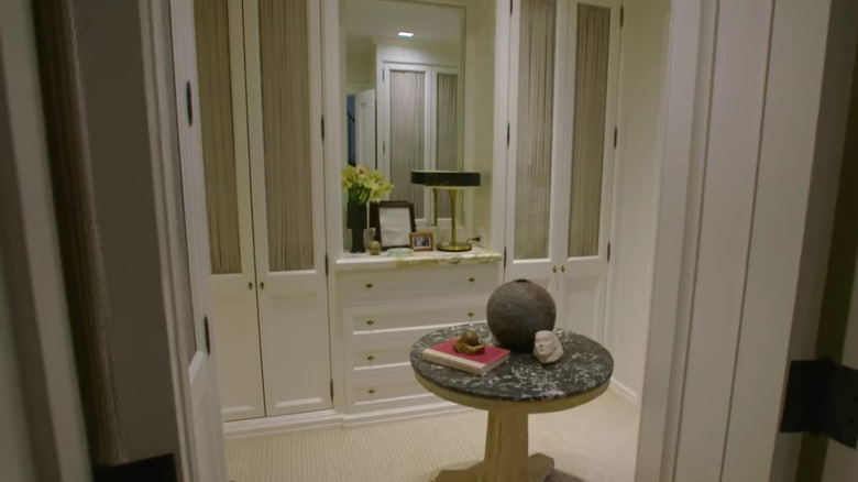
Berkus and Brent have built beautiful closets worthy of the title dressing room in all of their homes. In their New York townhouse, the couple had custom white cabinetry constructed to create a closet big enough for both of them. In an earlier video with Architectural Digest highlighting their previous Manhattan house, Brent comments on how he adapted to Berkus' tidy organization style and has loved doing it.
For people that want to mimic Berkus and Brent's dressing room, they don't need a very large space. According to Homes & Gardens, people can think outside of the box when creating their dressing rooms, such as flipping existing hallways to install floor-to-ceiling cabinets and lacquering them so they pop. Additionally, people can opt for open shelving and doorless wardrobes to modernize a closet and make use of narrow spaces. They can also decorate open shelving to match their decor style or create visual interest. Nicholas Cox, an interior designer at Ham Interiors, told Homes & Gardens, "We love lining wardrobes and particularly open dressing room joinery in fabric to add interest and softness to what can be a large mass of cabinetry. We often go for a simple stripe or small scale simple pattern fabric in complementary tones to the rest of the bedroom scheme."
