10 Before And After Attic Transformations
When it comes to trying to increase the functional space in a house, many folks tend to remodel their basement or attic. While a basement can certainly give you more room, there are some associated issues, such as floor moisture. Renovating an attic is easier as this room already has a solid foundation that shouldn't cause any trouble. While the idea of extending and renovating a part of your home sounds like a fun project, it can definitely be costly. UpNest claims that it can cost up to $80,000 to remodel your attic.
There are many things to consider when embarking on a huge project such as this one, which include insulation, cooling, electricity, plumbing, attic access, and more. Some folks think they can handle it on their own, but at some point, many will need to call a professional to help them in a specific department. It can take weeks, sometimes months to fully renovate your attic, but having a well-thought-out plan from the start can make everything run smoothly. Check out these 10 attic renovations that will make you do a double take.
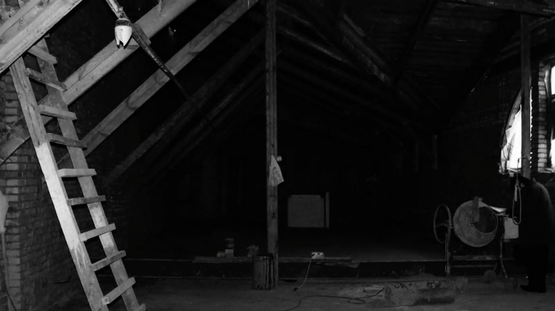
1. Before: Cold and Spooky
Even though the photo is in black and white, even a splash of color wouldn't help the stone-cold look of this attic. The rusty flooring needs some updating, along with the cracked brick walls. A new ceiling would help to cover up the exposed wood and make the attic look put together.
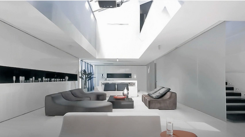
2. After: Bright and Simple
This is a completely redesigned attic with a white solid interior. The skylight is definitely the highlight of this masterpiece, filling the space with every inch of light it can get. The modern furniture looks cozy enough to make it the perfect lounging room.
3. Before: Low and Crowded
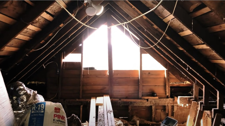
While this attic is in the process of being renovated, it definitely could use a ceiling just a few inches taller. The tiny window only filters in a small amount of light for the space.
4. After: Spacious and Airy
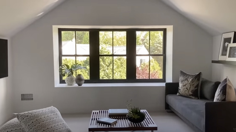
A complete turnaround occurred in this space — the window was expanded into three sections, which provides adequate lighting. The black furniture pops out against the white walls and the television is at the perfect eye level for those sitting on the couch.
5. Before: Cluttered
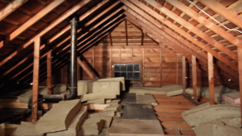
This space could definitely use some help. Although it has a great window for natural light, the small light bulbs could be switched out for new hanging light fixtures. Decluttering the area, installing some new walls, and fixing the flooring will give the attic a cleaner look.
6. After: Dim and Intimate
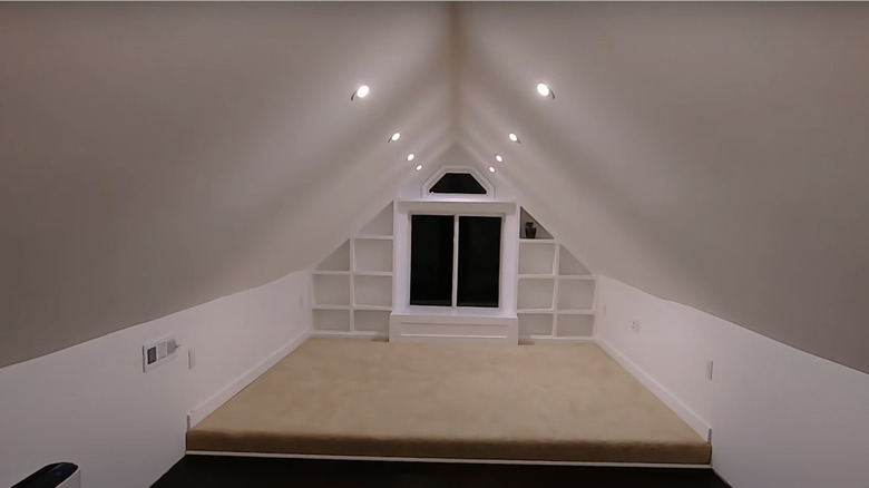
This newly renovated space has a completely redesigned window sill with beautiful built-in cubbies for extra storage. The ceiling and walls have been redone to get rid of the wooden board look, and the beige carpeting adds color to the space.
7. Before: Dark and Unstable
This attic has a gorgeous, sturdy foundation, but the flooring looks unsteady like you could fall right through it. The wooden poles make the space look small and crowded despite the high-vaulted ceiling.
8. After: Sleek and Modern
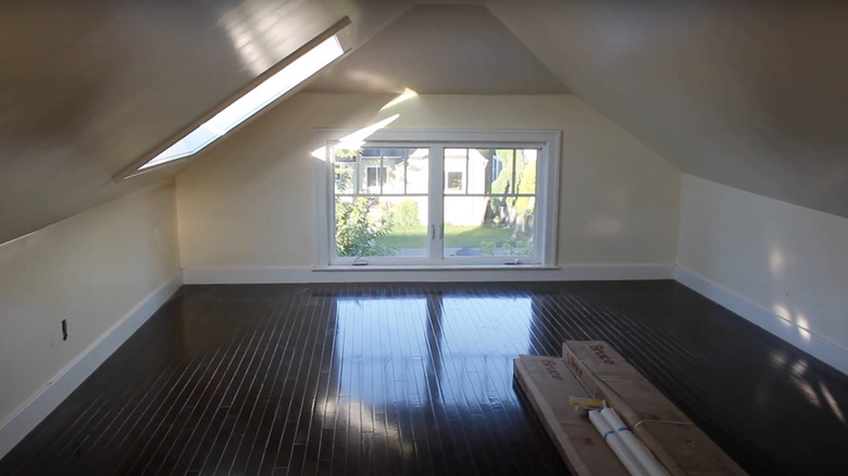
The upgraded wood flooring makes the attic seem as though it's part of the main floor of the home; it doesn't feel like you're looking at an attic. The installed skylight is a great addition to the original window at the front of the attic overlooking the yard.
9. Before: Crowded
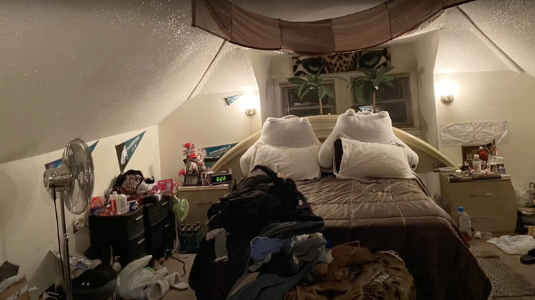
Even though this attic has already been turned into a functional space, there's definitely room for improvement. For starters, it lacks proper storage for clothes and belongings. Additionally, the window is hidden behind the headboard of the bed, which blocks out most of the light that enters throughout the day.
10. After: Homey and Cozy
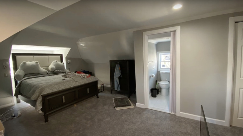
This fresh, updated space looks decluttered and feels roomy. The frame of the bed was switched out, and although the headboard still covers the entire window, there is still room for light to shine through. A storage unit was added to house the clothes while a new, clean carpet matches the gray walls.
11. Before: Claustrophobic
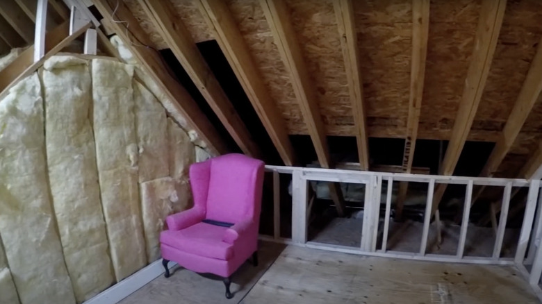
This is possibly the weirdest before picture of an attic due to the random hot pink armchair being the only item in the room. It feels overwhelming and claustrophobic in the small space. The white railing makes the room appear even smaller by dividing it in half.
12. After: Breathable
Removing the railing and putting up walls to cover the wooden framing completely changed the look of this attic. The ceiling is fairly high and symmetrical, which allows for more breathing room and comfort.
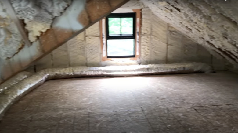
13. Before: Bland
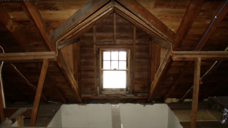
This small section of the attic reveals plenty of exposed wood and insulation that need to be covered up. The space appears cramped as well. However, the light-colored flooring makes the room look brighter and shows promise.
14. After: Stunning
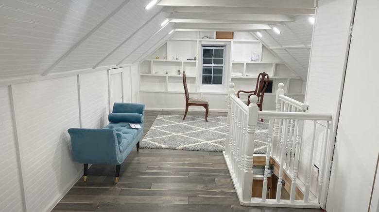
The aftermath is striking — the pearl white interior and ebony wood flooring give balance to the space. The gorgeous, teal sofa provides a pop of color and makes the room feel cozier.
15. Before: Rundown
This attic is filled with one too many wooden boards that make the space look messy and rundown. The old wood needs to be replaced, while some pieces should be completely removed to make more room.
16. After: Green Aesthetic
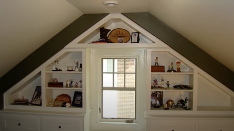
With the wooden boards removed, the wall is flat and spacious while the updated window brings in direct sunlight. Additionally, the olive-green accent color behind the white built-ins makes the room more luxurious. By the looks of the décor in the cubbies, it seems that this attic has become a playroom.
17. Before: In Ruins
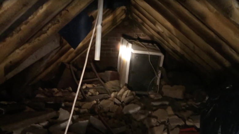
This attic has clearly been neglected, as evidenced by the cement blocks, trash, and unwanted appliances covering the floor. It's in need of a complete makeover to bring in more light through the window. It could also use some freshly painted walls.
18. After: New and Improved
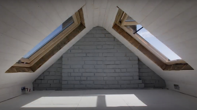
The completely redesigned attic has built-in skylights to make the space look brighter and cleaner. The brick wall received a fresh coat of gray paint, which adds texture and muted color to the space.
19. Before: Old and Dilapidated
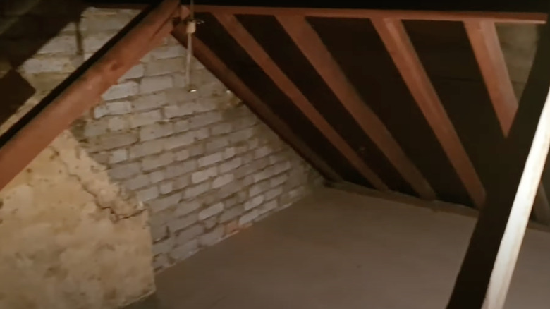
This small section of the attic hints at a generally rundown space. The brick wall is cracked and in need of a good paint job, while part of the chimney has been removed and needs to be replaced. Even though the floors look sturdy, they could use some updating as well.
20. After: Modern
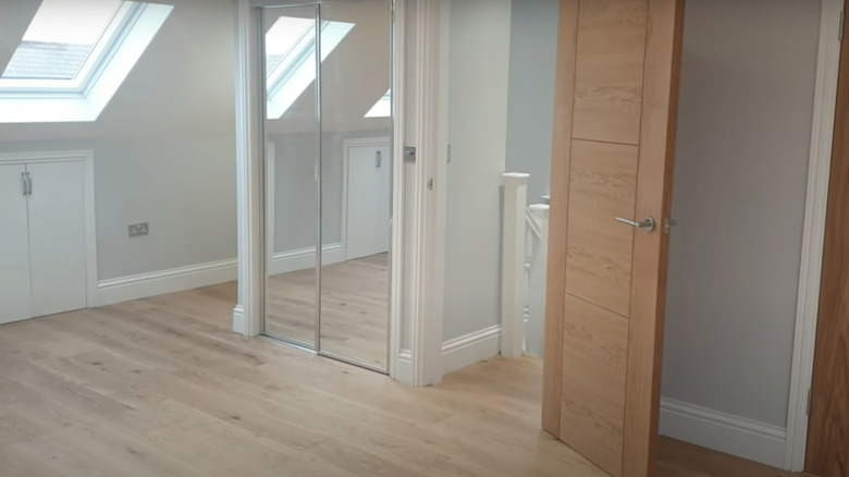
It's hard to believe that this is the same attic. The gorgeous lighting and sleek white interior bring attention to the wood floors. Additionally, the mirrored sliding door on the closet makes the room appear larger.
