20 Amazing Bathroom Remodel Before And After Photos
Regardless of size, all bathrooms deserve an equal amount of attention when it comes to design. The occupants of a master, guest, or half-bath should all feel as if they're retreating to an oasis whenever they enter. Unfortunately, certain older bathroom styles don't exactly convey luxury. Cookie-cutter fixtures, bland walls, and clunky toilets and bathtubs make too many bathrooms look dated and uninspired. Thankfully, a room can be transformed with either major or minor effort, and often somewhere in-between.
Deciding on the scope of a bathroom remodel is the first step to knowing how big an investment it will be, and how great an impact you can achieve. According to The Spruce, making small, cosmetic changes is an acceptable option, and the least costly approach. From there, you can consider a total gut renovation, altering the layout of the room, or expanding it altogether. While extensive changes will mean more dollars up front, the potential payoff in increasing the value of your home is enticing. At the very least, the following 20 before-and-after bathroom makeover photos might convince you to tackle one in your own home soon.
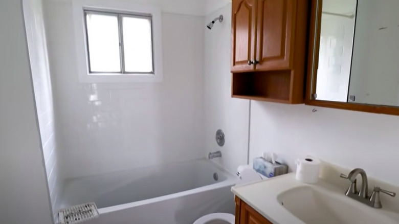
Before: Uninspiring
This bathroom is as basic as one can be. The generic white tiling, brushed-nickel fixtures, and brown cabinets are uninspiring in this small space.
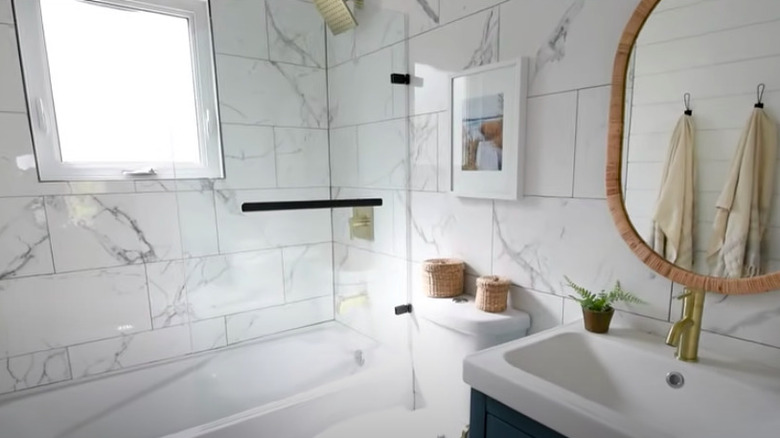
After: Sweet retreat
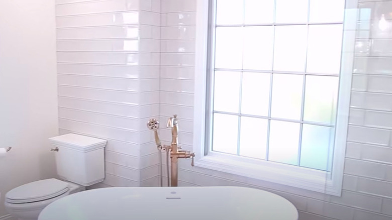
While the layout remains the same, this bathroom now resembles a whole new space. Marble tiling mixed with shiplap walls, gold fixtures, and earthy elements creates a zen look and feel.
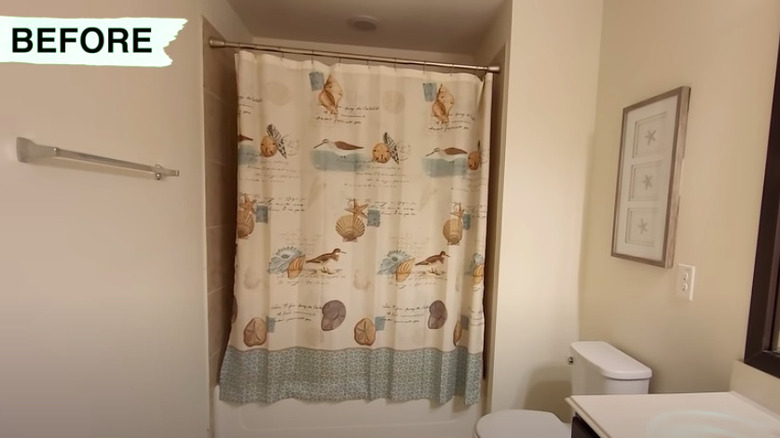
Before: So-so
Nothing particularly stands out in this bathroom. The fixtures are not necessarily dated, but there's little style or personality present. Unless, of course, you consider the busy seashell shower curtain.
After: Stunning
The glass shower door is clearly the main star of this new space. The gold fixtures and marble tiling communicate luxury, while the new toilet and replacement vanity countertop add sleek style to the functional elements.
Before: In need of TLC
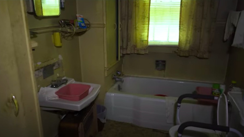
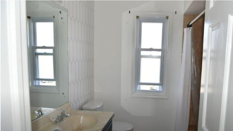
Looking unfinished and worn-out, this bathroom is in desperate need of renovation. From the dark and dingy walls to the outdated fixtures, it's a depressing space, to say the least.
After: Unrecognizable
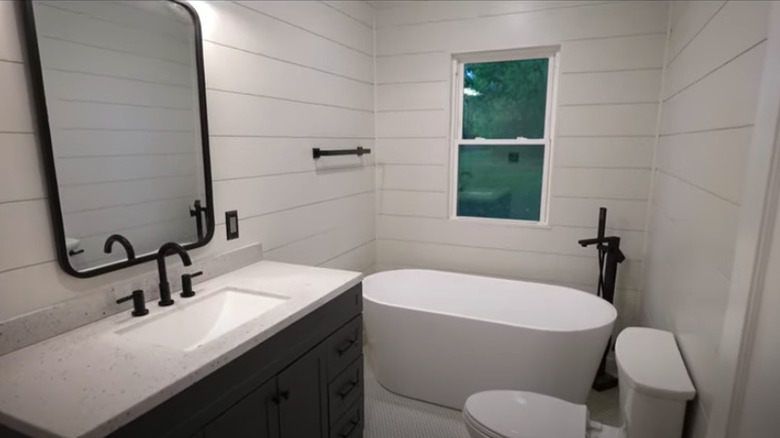
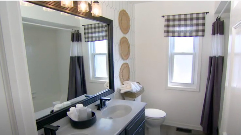
This remodeled bathroom is indistinguishable from its prior state — and that's definitely a good thing. The white shiplap walls with black accents give it a modern, clean aesthetic. The now-uncovered window lets in some much-needed natural light.
Before: Plain
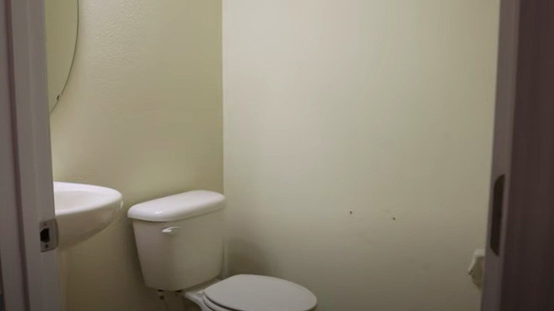
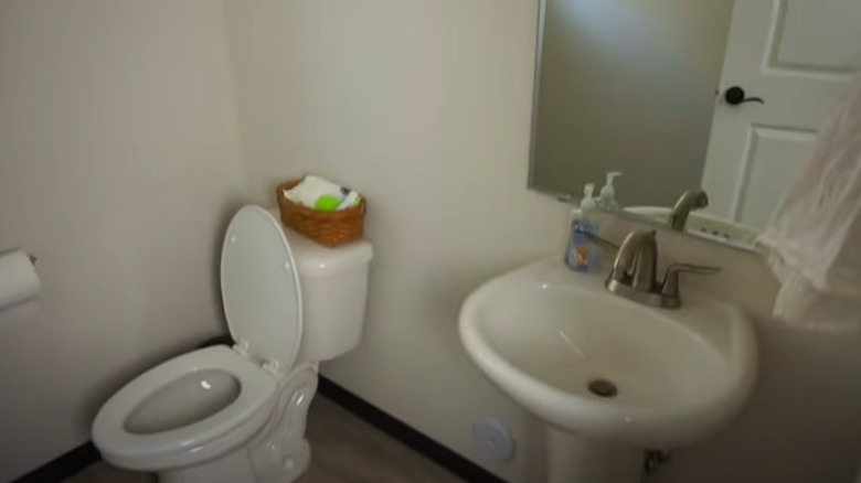
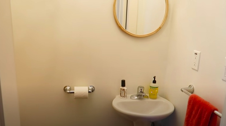
Half-baths are sometimes overlooked in the grand scheme of things, and this one is a clear example of that. The dull walls and generic fixtures are as plain as it gets.
After: Charming
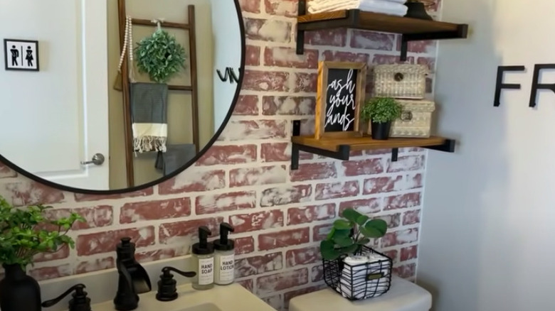
This after photo proves that a small space can still pack a serious style punch. The faux-brick wallpaper mixed with the natural wood, black accents, and greenery make it feel lively and inviting.
Before: Beyond boring
This is an example of yet another guest bathroom that's lacking any style or character. There's nothing that stands out among the plain white walls and basic fixtures.
After: Farmhouse chic
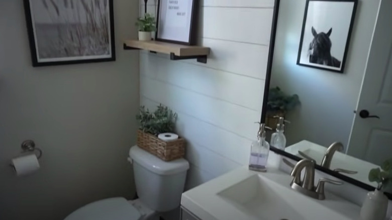
The accent shiplap wall decorated with black and white artwork adds texture and lends a farmhouse vibe to the space. Natural accents, such as the hyacinth basket and plants, make it feel cozy.
Before: Beige and bland
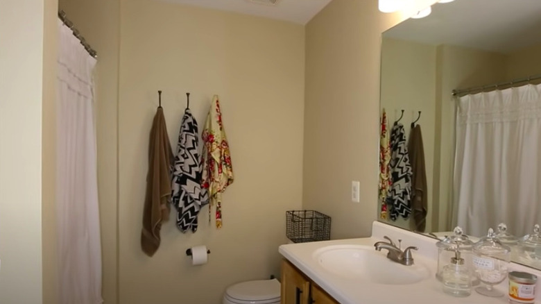
Despite its larger size and good layout, this bathroom feels closed-off and stuffy. The colors of the walls, fixtures, and shower curtain all blend into one another in an uninspiring way.
After: Black, white, and bold
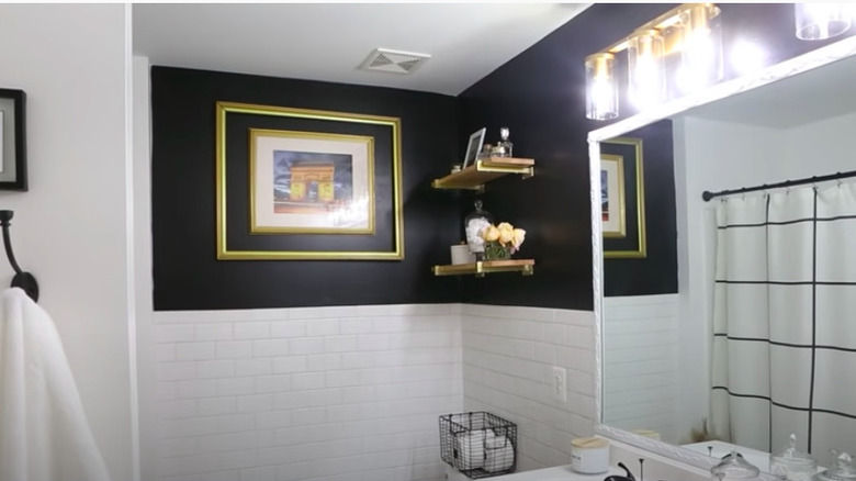
The black painted walls pop against the white subway tiles with perfect balance. New floating shelves, artwork, lighting fixtures, and patterned shower curtain all contribute to the luxe look in this remodeled bathroom.
Before: Gawky
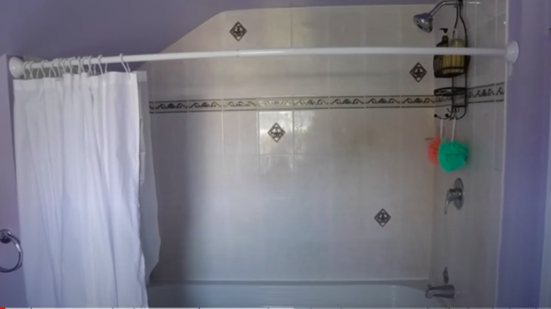
Oddly-placed tile patterns, purple-painted walls, and outdated fixtures create a bit of an awkward look in this bathroom.
After: Gorgeous
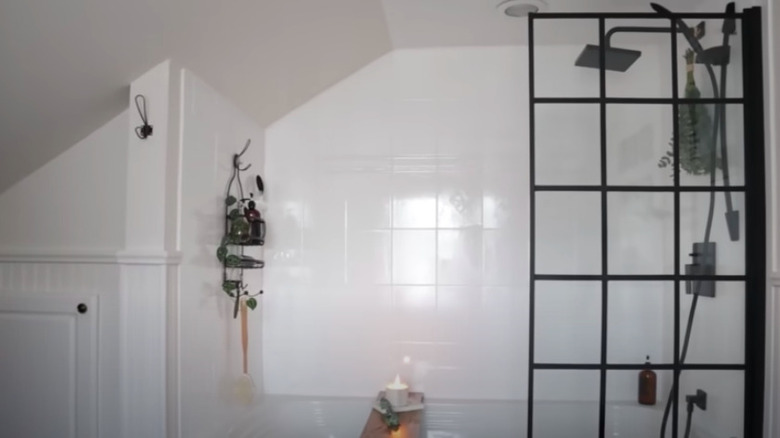
The uniform white shower tiles mix well with the wainscot trim and black accents. The rainfall shower head with eucalyptus leaves and a windowpane design glass door create a modern, yet spa-like, atmosphere.
Before: Retro
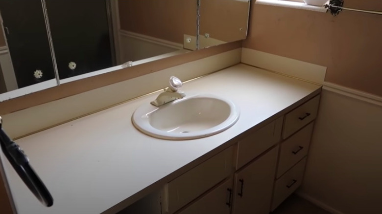
Everything from the pink walls and carpeted floors to the laminate countertop and acrylic faucet keep this bathroom firmly rooted in the past.
After: Modernized
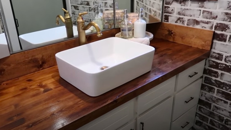
This low-cost remodel made use of the original vanity, but the new wood countertop, vessel sink, and brass faucet help to up to date. The brick-patterned wallpaper adds some additional character to the space.
Before: Mellow yellow
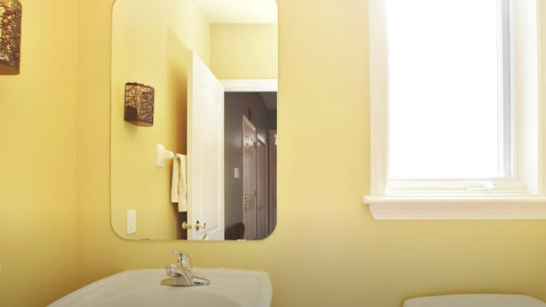
Bare walls with basic white and chrome fixtures prevent this guest bathroom from shining as bright as it could, despite its sunny, yellow aesthetic.
After: Glam slam
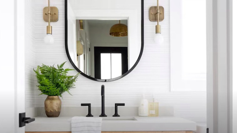
The light, subtly patterned wallpaper completely adds texture and brightens up the space. A sleek concrete counter paired with modern black and brass accents gives the room a glamorous ambiance.
Before: Closed-off and cramped
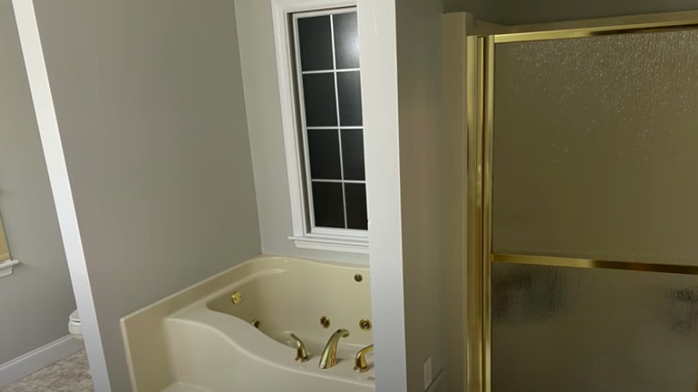
Despite the ample amount of space this master bathroom has, it feels much smaller thanks to the partitions between fixtures. Shiny brass fixtures and frosted glass details also date the interior space.
After: Free and clear
As if removing the wall partitions wasn't enough to open up the room, white paints and ceramic subway tiles illuminate it even further. A clear, glass shower door and flat bottom bathtub help to create a modern, luxury environment.
Before: Lacking personality
In spite of the visual interest of the uniquely patterned walls, this bathroom feels confused and mismatched. The colors of the outdated vanity completely clash with the shower tiles.
After: Looking cute
This remodel successfully creates a cohesive design scheme to complement the existing wall tile and modernize the entire space.
Before: Ordinary
Beige walls, a pedestal sink, and basic chrome fixtures keep this guest bathroom from making any sort of notable décor statement.
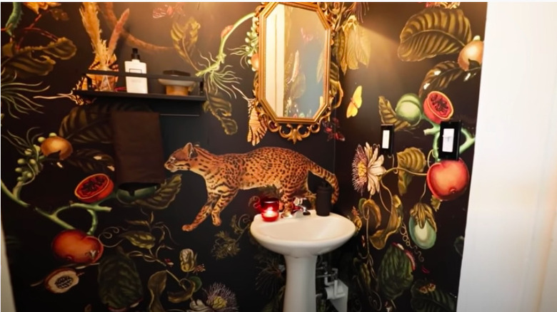
After: Exotic
The simple addition of jungle-themed wallpaper throughout the entire bathroom is enough to transform this room into a whole new space. The ornate gold mirror and black accents such as the floating shelf are uncomplicated, yet effective, touches.
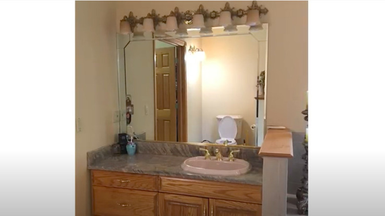
Before: Out of touch
Elements such as the polished brass fixtures and hardware, along with the honey-colored oak wood vanity, transport us back a few decades by aging this bathroom.
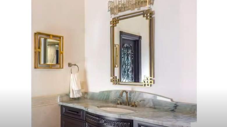
After: On-trend
This bathroom stays true to its vintage vibe with art deco-style mirrors and vanity lighting, as well as ornate details on the cabinet and door. However, the updated matte gold fixtures, sleek marble countertop, and darker wood help bring it into the modern-day.
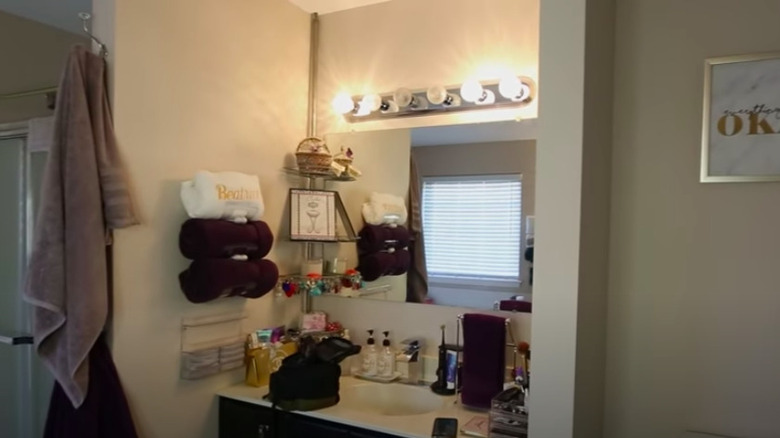
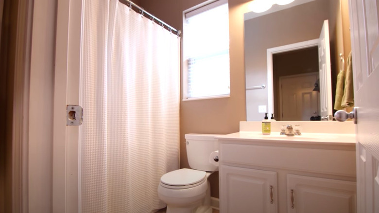
Before: Stale
The beige walls, frameless mirror, and frosted glass shower door create an atmosphere that feels far from modern. The excessive clutter atop the vanity and surrounding wall space hinders any sense of simplicity or relaxation.
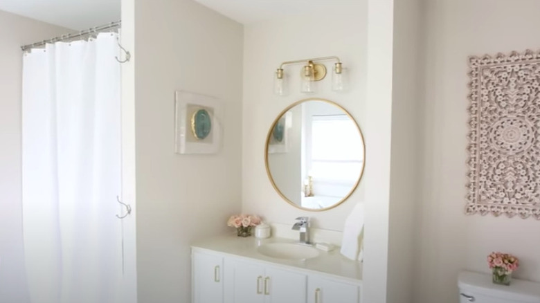
After: Fresh
This bathroom is like a breath of fresh air compared to its prior state. Brighter walls, a taller white shower curtain, a round-framed mirror, and modern light fixtures all help refresh the space. Best of all, the visual clutter is no more.
Before: Monochromatic
This bathroom has been seen so many times before. Basic, white fixtures paired with a neutral color on the wall create a monochrome look that's anything but remarkable.
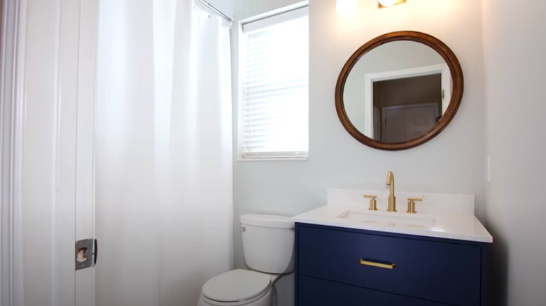
After: Bold in blue
Only minor changes were needed to completely makeover this bathroom. A coat of white paint, updated lighting fixture, trendy round mirror with a dark brown frame, and navy blue vanity with gold accents give the room a whole new air.
Before: Mismatched
There's something about the combination of white square tiles, bulky fixtures, dark wood vanity, and framed abstract wall art that feels rather mismatched in this nicely-sized master bathroom.
After: High-class
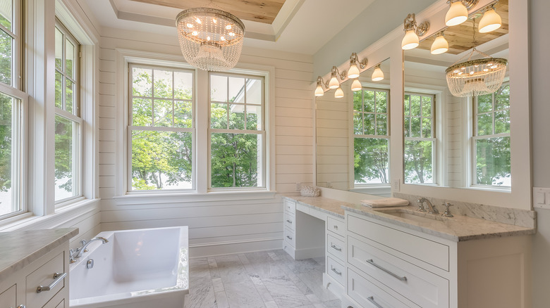
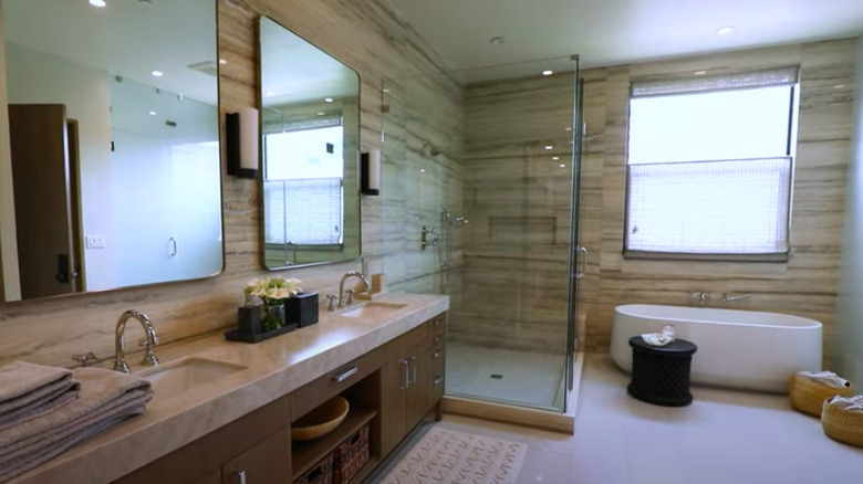
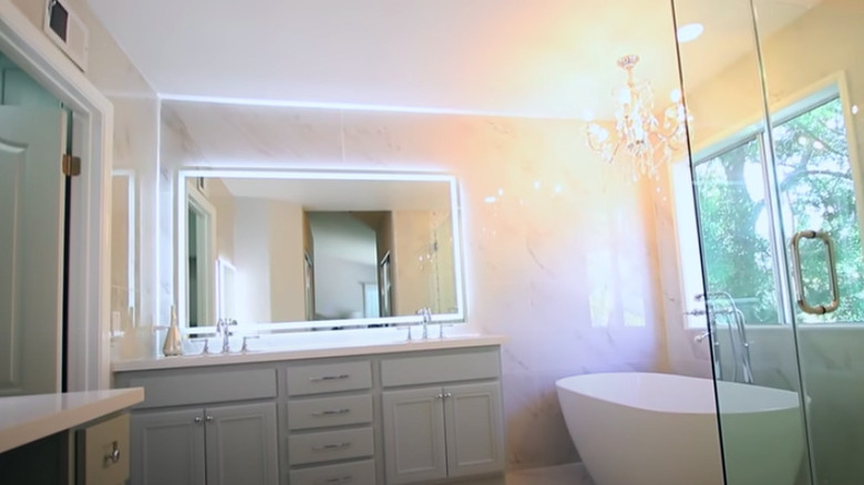
The floor-to-ceiling marble tiles, a chandelier over a rounded bathtub, and a backlit mirror come together to create an elegant, spa-like atmosphere in this now completely unrecognizable, remodeled bathroom.
Before: Spacious yet dated
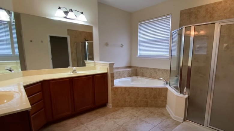
While its expansive size is a benefit, the aesthetic of this bathroom leaves much to be desired. The chrome-framed shower door, cornered jacuzzi tub, and dark wood cabinets are basic and out of style.
After: Spacious and stylish
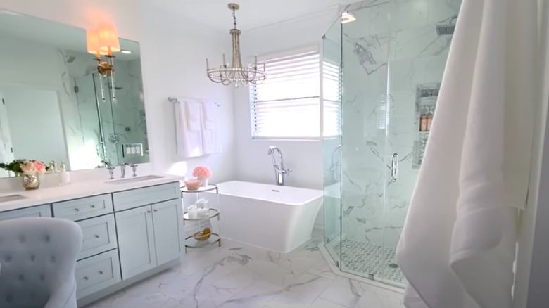
Though they kept the large layout, this bathroom was completely gutted to create a modern, luxurious atmosphere. Marble flooring that extends up the walls within the shower, and elegant accents such as the chandelier create cohesion and feel more on-trend.
Before: An awkward space
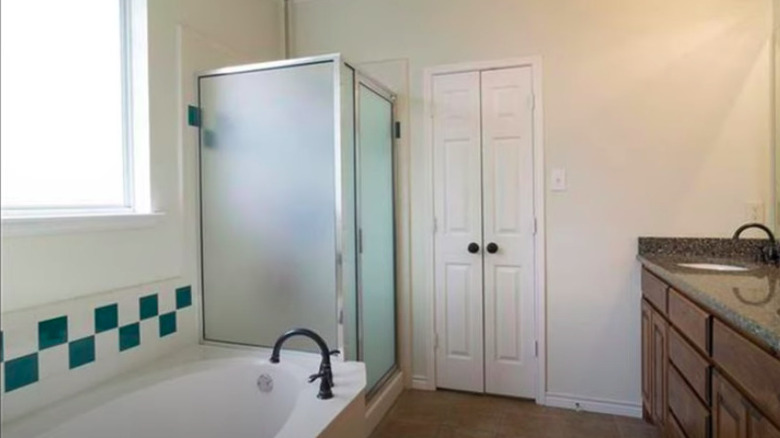
There's something about the sharp edges in this bathroom — from the green and white checkered tile to the shower door frame — that creates a sense of awkwardness. The contrasting countertop, vanity, and flooring clash with each other, and the rest of the room.
After: A calm oasis
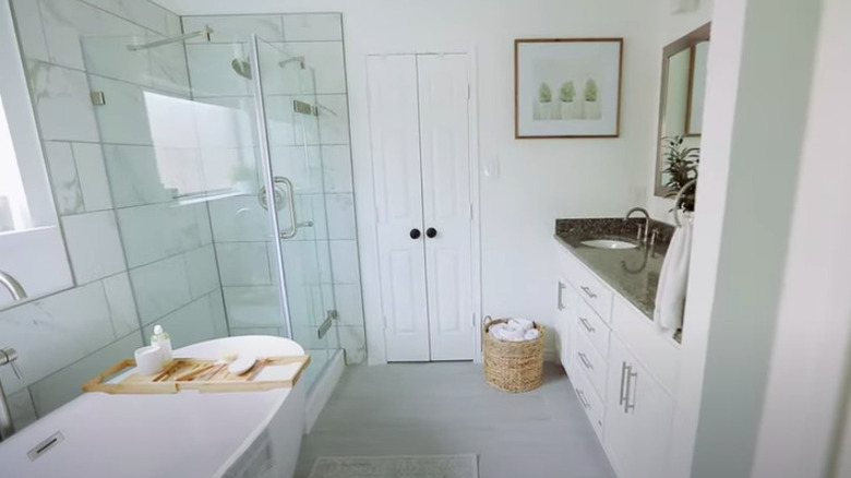
This amazing makeover kept both the original layout and double vanity, now updated with a fresh coat of white paint. Light gray flooring was installed along with marble-tiled walls, a flat bottom bathtub, and a new glass shower door. The overall aesthetic serves as an inviting haven.
Before: Fine as-is
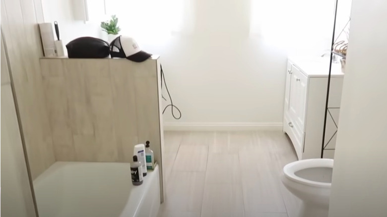
Light and bright, there's nothing particularly offensive about this bathroom. The color scheme, however, is rather bland, and there's no sense of style throughout the space.
After: Rustic retreat
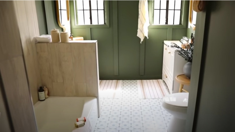
While the new, patterned floor tiles and olive green walls are both beautiful additions to this bathroom, the new décor pieces are what truly elevates the space. Natural wood accents and soft textures bring depth and coziness into the room.
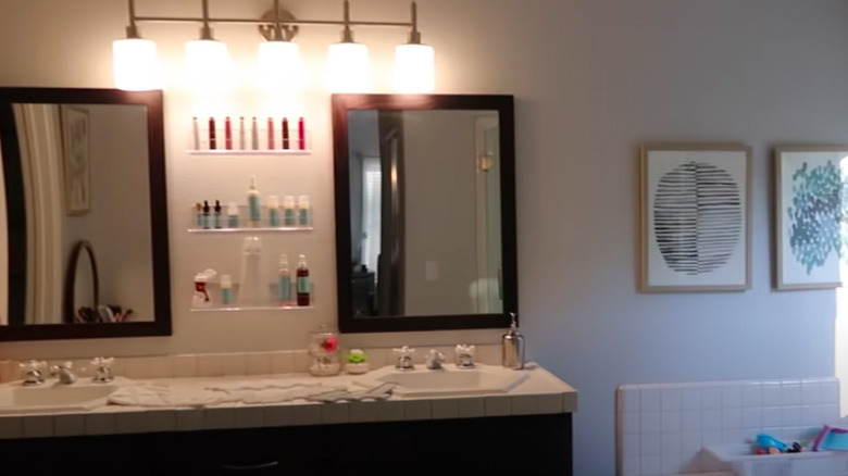
Before: Unimpressive
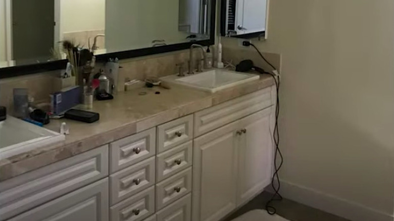
While the double vanity is nice to have, this countertop still feels cluttered and small. There's also not much that stands out between the color choices and style of cabinets.
After: Stunning
After a top to bottom remodel, this bathroom is now a striking sight to be seen. The most obvious difference is the removal of the interior wall, which created space for a roomy glass shower. The stone topping the vanity and running up the walls makes the space feel even grander.
