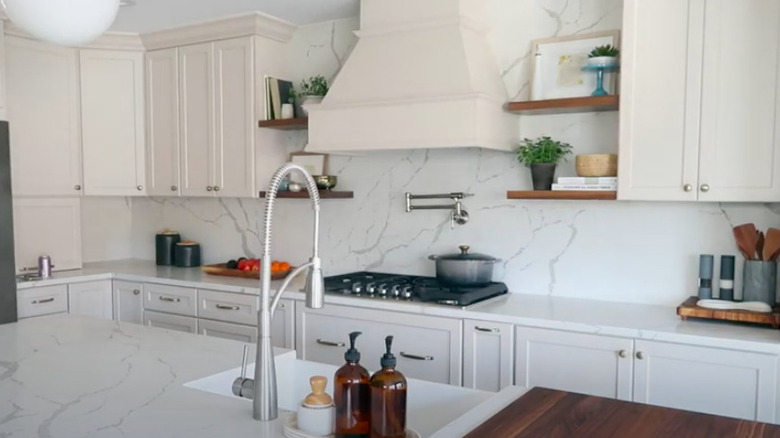
40 Best Kitchen Makeovers You Just Have To See
A renovated kitchen is truly a thing of beauty and often looks nothing like its former self. The amount of time and investment that goes into it, however, is something to consider before deciding to do a gut renovation. Kitchen remodels are most likely going to be the costliest changes that you can make in your home. According to This Old House, a full gut job can run up to $50,000.
There are smaller changes you can make for much less. For example, opting to paint the current cabinets rather than totally replacing them is one option. It's all a matter of your preference, budget, and factors such as how long you plan to stay in the house before selling or the average kitchen in your neighborhood.
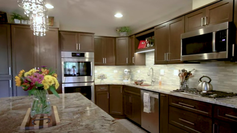
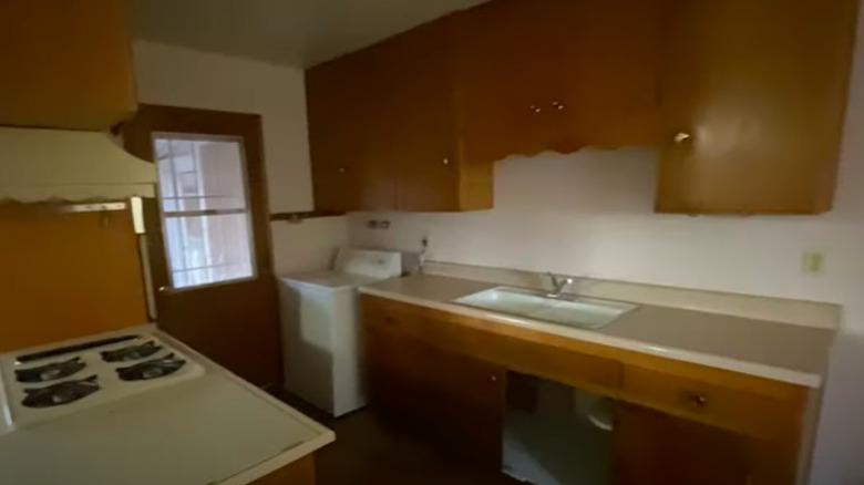
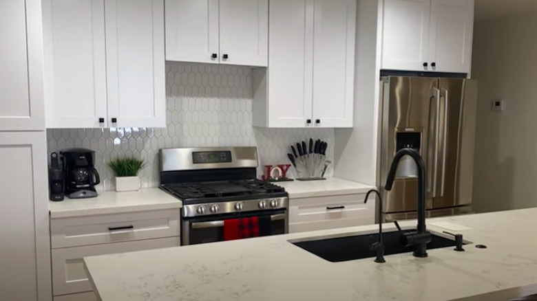
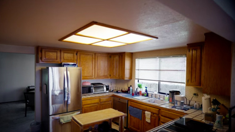
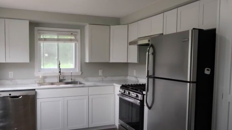
Ahead, you'll see 40 amazing makeovers that consist of total renovations, cosmetic upgrades, and everything in between to inspire you if kitchen remodeling has been on your mind lately.
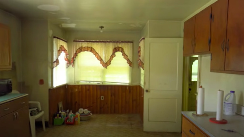
1. Before: Dark and dingy
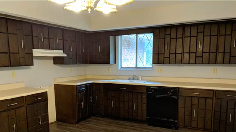
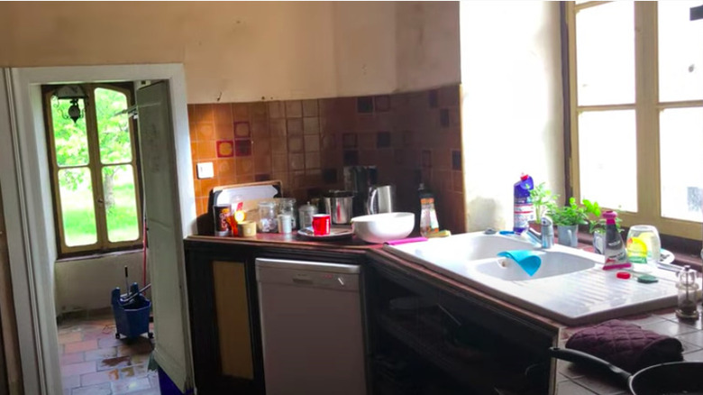
Between the dark, outdated cabinets, dingy flooring, and shabby window treatments, this kitchen is crying out for a major makeover.
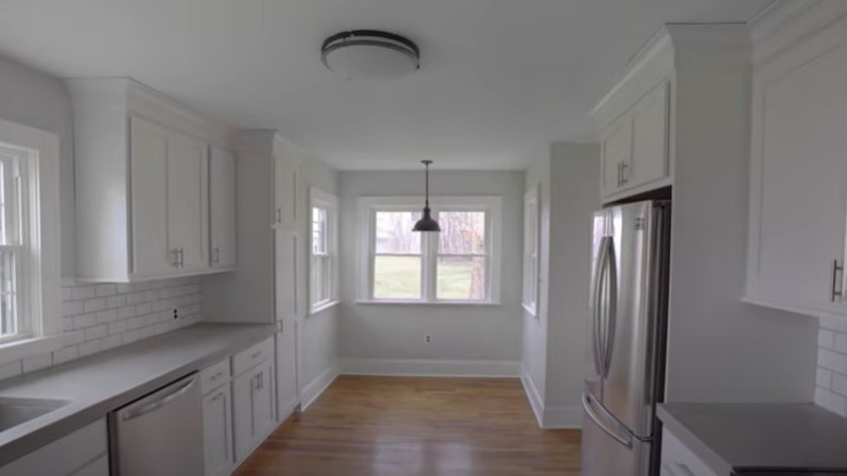
2. After: Bright and airy
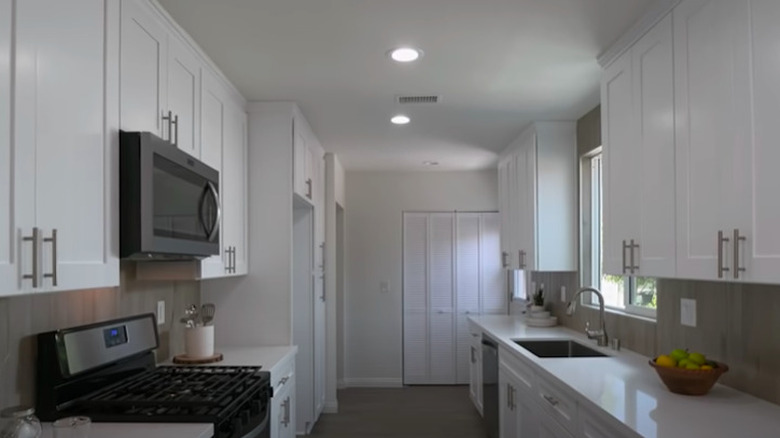
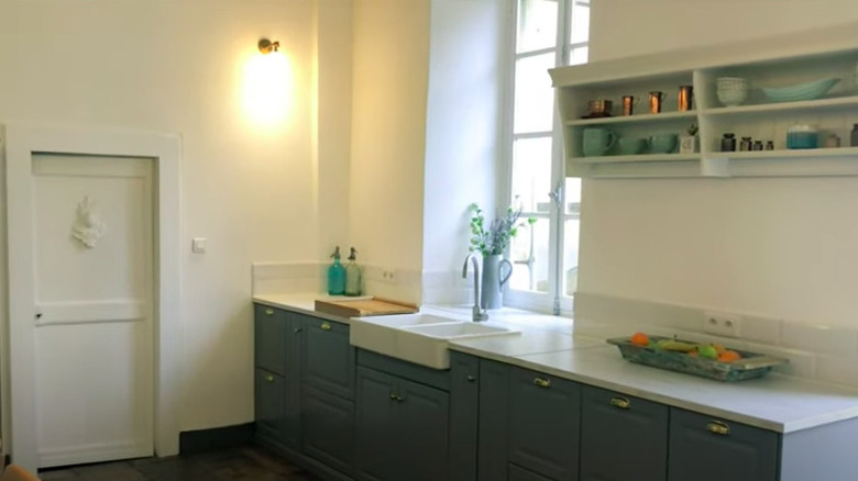
The before and after of this kitchen is like night and day. While the layout remained the same, there are new cabinets, countertops, appliances, backsplash, and flooring. The white cabinets and paint color make it feel much brighter.
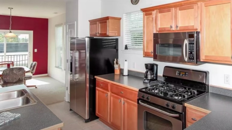
3. Before: Mismatched and dated
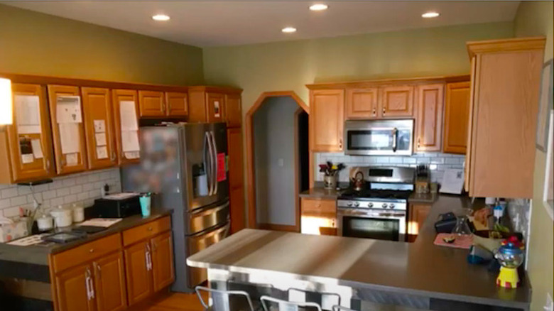
The medium brown cabinets and dark gray countertops clash, especially with the red dining room walls nearby. Despite it being a large, open space, it somehow feels confined.
4. After: Seamless and modern
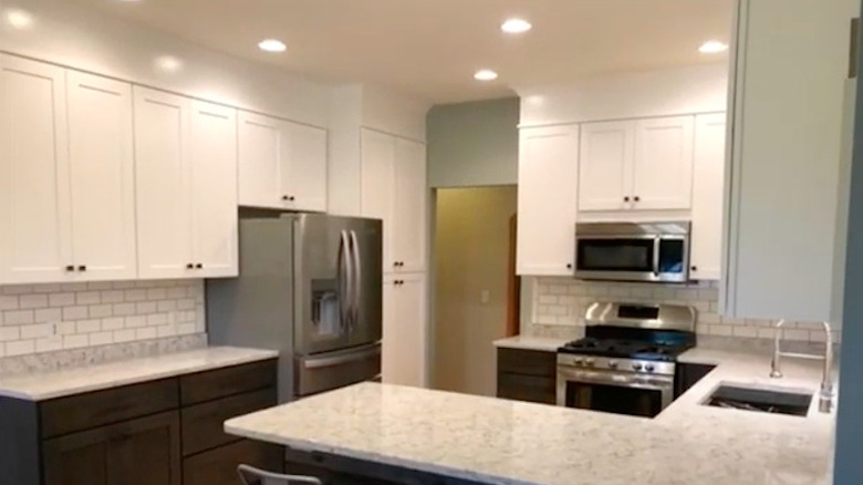
By opening up the L-shaped countertop and replacing some cabinets with shelving, the room feels much more spacious than before. All white counters, cabinets, and backsplash lighten the whole kitchen up.
5. Before: Spacious yet so-so
There's clearly a decent amount of storage space and room to prep food in this kitchen. The cabinetry and island leave something to be desired, however.
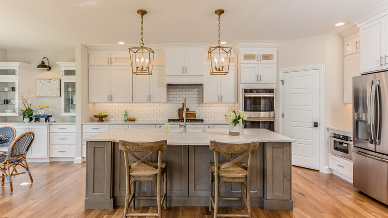
6. After: Large and luxurious
Not a whole lot was changed to the layout of this kitchen but it's safe to say that it looks like a completely different room. White cabinets, counters, and paint brighten it while marble backsplash and a chimney range hood give it a luxury look.
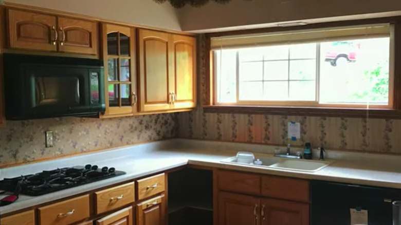
7. Before: Old school style
The wallpaper and the cabinetry details do nothing to hide the age of this kitchen. To add to it, the medium brown color of the cabinets doesn't mix well with the black appliances.
8. After: Sleek and current
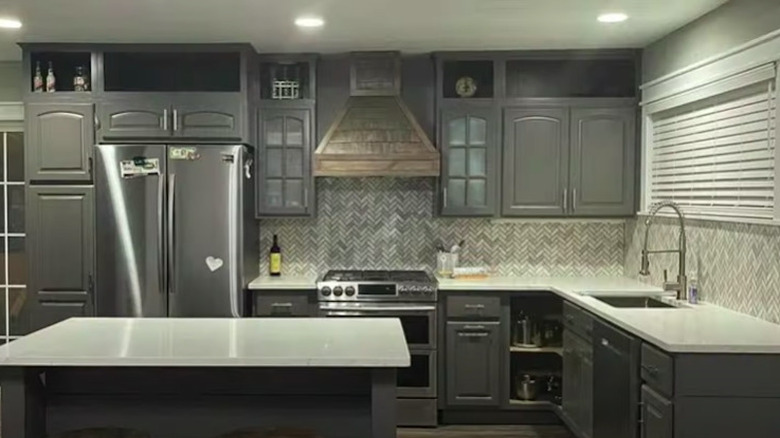
The gray cabinets blend well with the new, stainless steel appliances. Herringbone backsplash and a unique range hood add some serious style to the space.
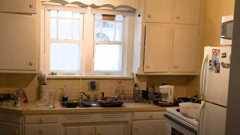
9. Before: Functional but out of fashion
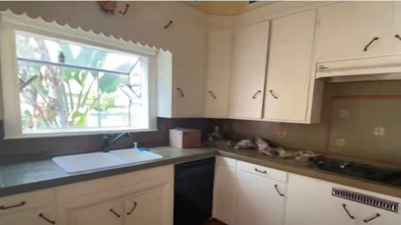
While open and spacious, this kitchen does nothing to hide its age from the cabinets and their hardware to the backsplash and the scalloped window frame.
10. After: Fresh and clean
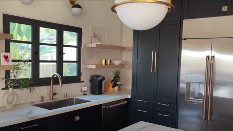
Updated appliances, cabinets, and window frames make all the difference in the space. Open shelving, a unique lighting fixture, and marble countertops lend some sophistication to the overall look.
11. Before: Bland and cluttered
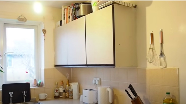
The beige walls and backsplash make this kitchen feel bland and a lack of cabinets creates clutter on the top of them, as well as on the counters.
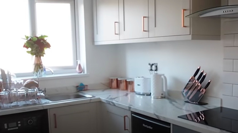
12. After: Beautiful and coordinated
The layout is about the only thing that remains the same. Marble countertops, subway tile backsplash, and modern appliances create a beautiful aesthetic. The rose gold hardware on the new, larger cabinets match some of the items on the counter, making it look intentional and cohesive.
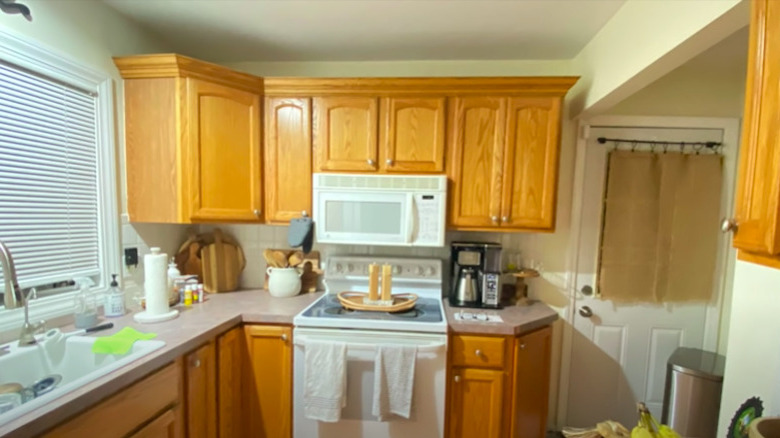
13. Before: Homely
This small kitchen is lacking any sort of style and the space that it does have can most definitely be utilized better.
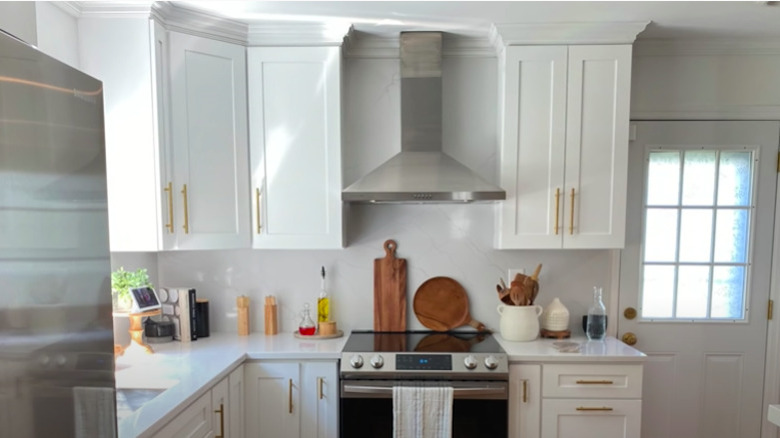
14. After: Stunning
Even with the same layout, this now all-white kitchen simply feels more open. Cabinets that reach to the ceiling and a wall-mounted range hood create a streamlined and airy look. The gold hardware is a unique, yet classy, touch.
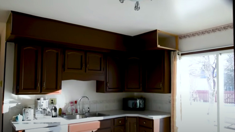
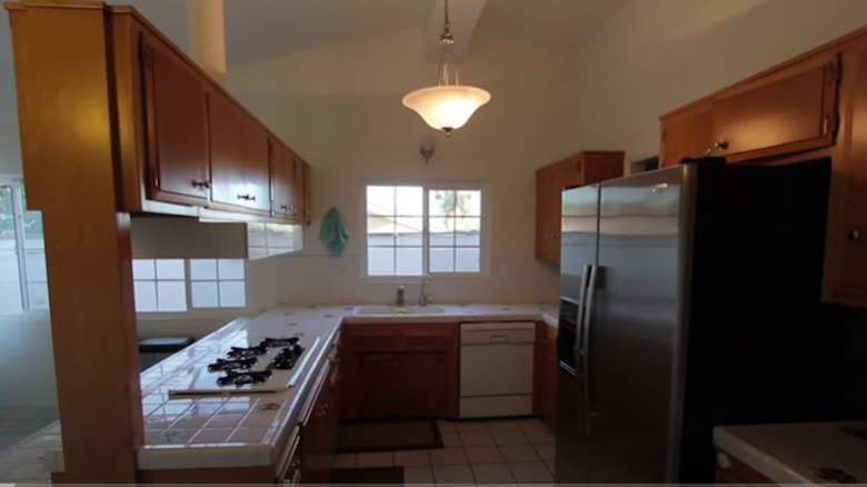
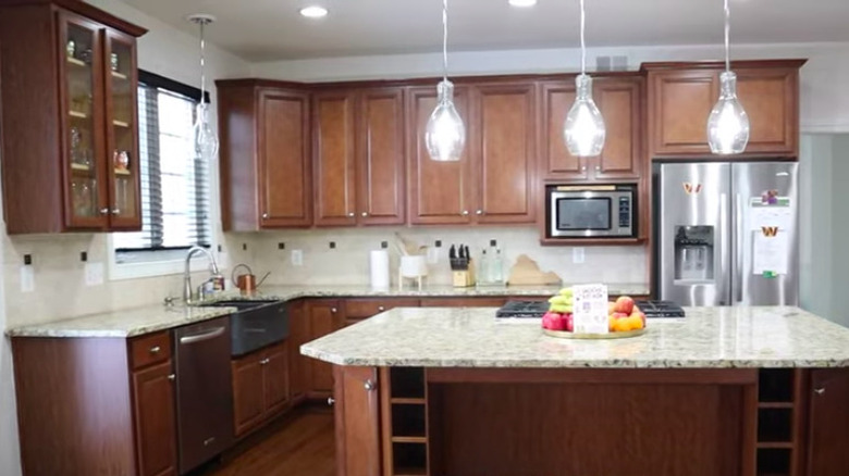
15. Before: Dark and depressing
Despite the natural light coming in from the nearby sliding doors, this kitchen feels downright gloomy. The upper cabinets are stunted due to the bulkhead which, on one end, isn't even finished and is an eyesore.
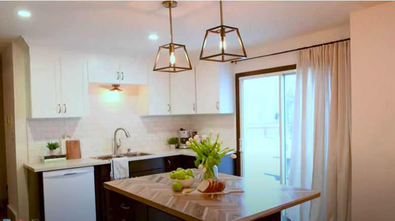
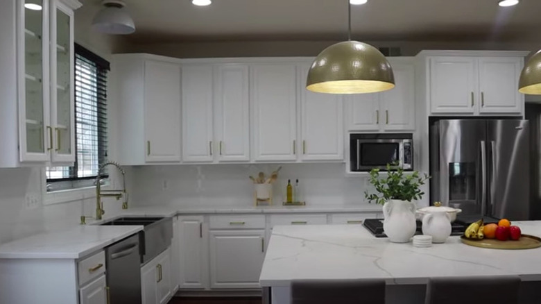
16. After: Bright and cheerful
Minimal changes were made to the kitchen and yet they created a whole new space. The biggest adjustment is the upper cabinets being replaced to maximize the storage space and brighten the room. New window treatments, hanging pendant lights, and a herringbone style island top bring it up to date.
17. Before: Closed in
There's a lot of unused storage space in this outdated, closed off kitchen. The existing cabinets are small and not easy to reach.
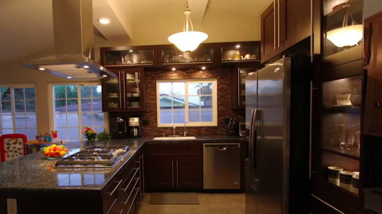
18. After: Cozy
Despite an entire row of cabinets being removed, there is more storage space available. The glass cabinet doors and more open layout make the kitchen feel bigger even without drastically changing the structure and opting for a dark brown aesthetic.
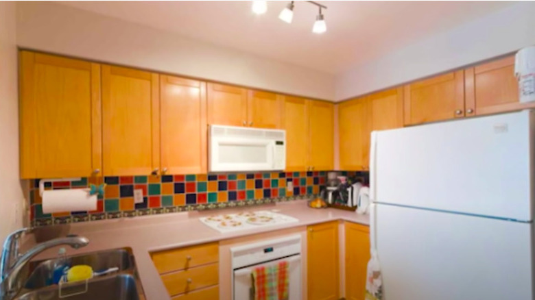
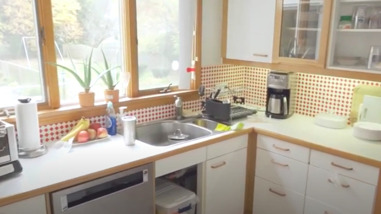
19. Before: Basic
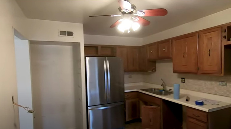
Even with a colorful, checkered backsplash, this kitchen begs for style. The light wood cabinets and laminate countertops are as basic as can be.
20. After: Bold
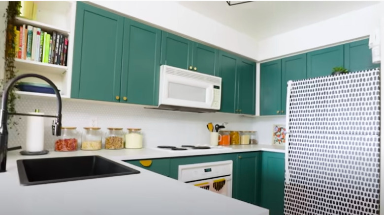
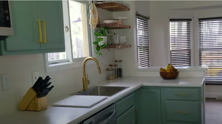
While the appliances remained the same, the matte black sink and black and white patterned refrigerator decal modernize the space. The choice of green cabinets and gold hardware make the kitchen standout and look one of a kind.
21. Before: Closed off and dim
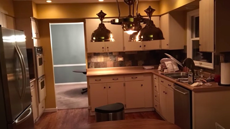
Despite the updated stainless steel appliances, this kitchen overall feels dated. The choice of paint and backsplash give a darkness to the space.
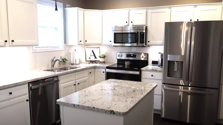
22. After: Open layout and light
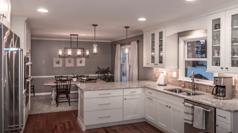
Opening the kitchen out to the dining room drastically increases the space and openness. Brand new white cabinets with glass doors and granite countertops make it feel bright and glam.
23. Before: Underutilized
This kitchen, clearly ready for its overdue makeover, is not being utilized to its max capacity. The cabinets are short and small and the countertop space is minimal.
24. After: Expanded
An opened up wall drastically helped to increase the size of the kitchen. New, larger cabinets were added including floor-to-ceiling pantries. An island gives way to more countertop space.
25. Before: Cramped and dated
A galley style in this old kitchen creates a cramped feeling and its age is shown via the cabinets, countertop finish, and appliances.
26. After: Clear and fresh
An island replacing the former view through greatly open up the whole room. Brand new white cabinets and marble countertops lighten things up while the matte black accents and vertical backsplash tile give a contemporary feel.
27. Before: Small scale
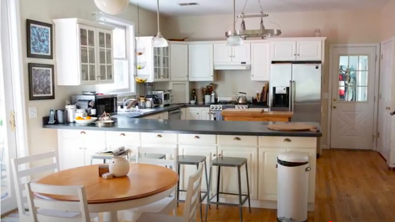
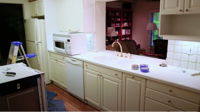
While it's not tiny by any means, this kitchen still has a cramped and cluttered look to it. The style of cabinets, tiled countertops, and lighting fixture make it outdated.
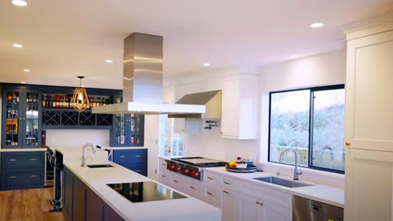
28. After: Twice the size
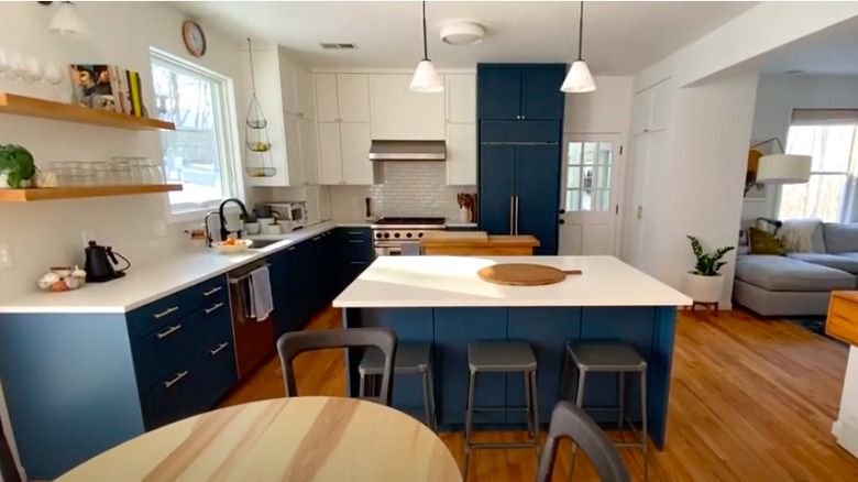
Opening up the wall dividing the original kitchen from the dining area led to doubling the space in size and creating space for a large bar area. A mix of white and navy blue cabinets with gold hardware create a luxe look.
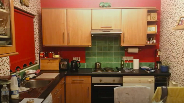
29. Before: Eclectic
The colors of this kitchen clearly clash in all of the wrong ways. Everything from the busy patterned wallpaper, the dark red paint and window treatment, the brown cabinets, black countertops, green backsplash, and mismatched appliances create a cluttered and undefined look.
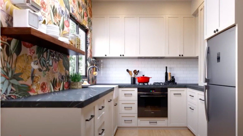
30. After: Charming
A floral wallpapered accent wall with open shelving is a welcome addition to the now mostly white kitchen. It gives a charming characteristic without overpowering the space. The room has also been slightly expanded to accommodate more storage and the appliances have been updated.
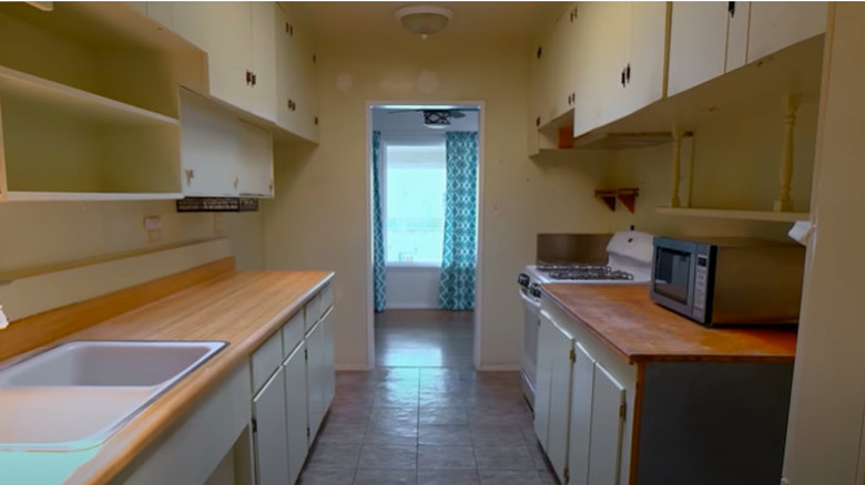
31. Before: Antiquated
The very antiquated cabinets and appliances show this kitchen's age and the different hardware and floor tiling from one room to the next looks awkward.
32. After: Up-to-date
The entrance to the kitchen was opened up to produce more walk space and a window was added to bring in natural light. Brand new white cabinets and hardwood flooring create a cohesiveness.
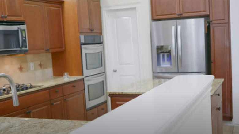
33. Before: Unnecessarily dark
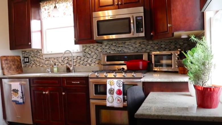
With updated appliances and nicely finished features, this particular kitchen isn't a sore sight by any means. However, even with the amount of light coming in, it has a darkness to it due to the cherry wood cabinets.
34. After: Lightened up
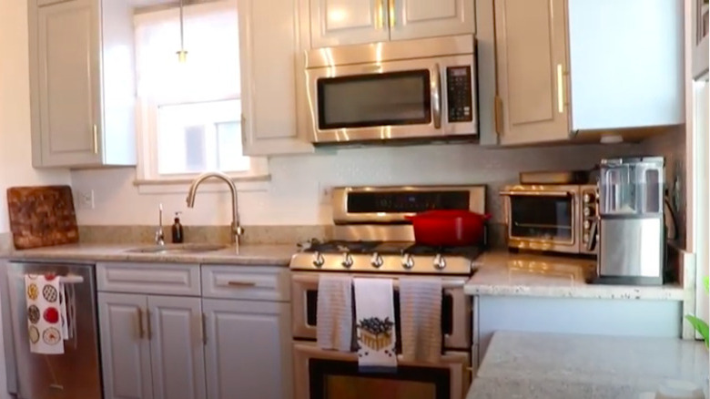
Although little was done to makeover this kitchen, the results are extraordinary. The cabinets were simply painted a light gray and their hardware was replaced with something more contemporary. The tiled backsplash was removed and what remains is simple white walls. All in all, the space looks and feels infinitely brighter.
35. Before: Large but uninviting
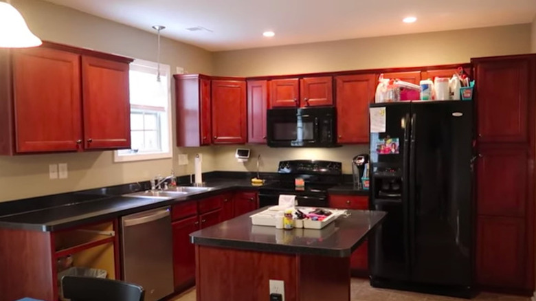
Similar to the last example, there's nothing inherently wrong with this kitchen. It's open layout and more current appliances are functional and there's plenty of cabinet space. Although, the dark cherry wood and black countertops give the room an uninviting feel.
36. After: Polished and welcoming
Although the layout remained the same, this kitchen has a completely different look to it. The cabinets, now painted white, and light gray marble countertops lighten up the whole room. New stainless steel appliances creates a polished finish.
37. Before: Aged and dull
This all beige kitchen is seriously outdated with its wooden cabinets and their matching knob handles, laminate countertops, older appliances, and window frame. It also is cluttered, most likely due to the lack of storage space inside of the cabinets.
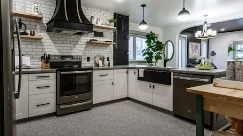
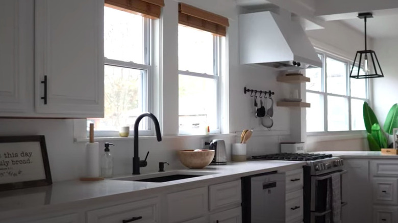
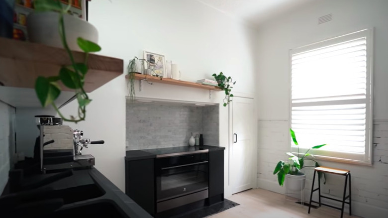
38. After: New and exciting
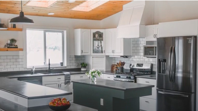
A complete gut renovation later and this kitchen is an entirely brand new space. The white cabinets and subway tiled walls create a perfect canvas for the black accents such as the farmhouse sink and custom chimney range hood. Open shelving makes it feel larger and new appliances modernize it.
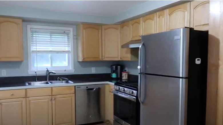
39. Before: Careless color concept
The light wood cabinetry, black countertops, and pale blue walls don't mesh well and make it hard to create an aesthetic in this kitchen.
40. After: Clean slate
Leaving the layout and appliances alone, simple changes were made to bring more balance to the kitchen and make it easier to decorate. The cabinets were swapped for polished ones in white, the countertops were replaced with light marble, and the walls were painted a neutral light gray.
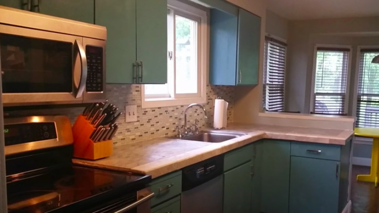
41. Before: A bit busy
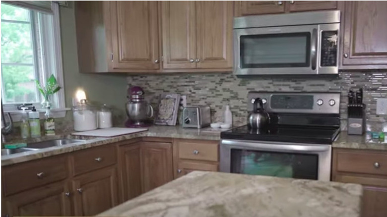
The brown marble countertops and multicolored linear backsplash tile may have been the trend at the time this kitchen was built or last remodeled. But it gives off a busyness and detracts from its potential.
42. After: Simplified
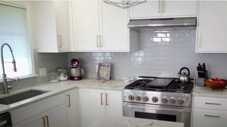
New, white cabinets with gold hardware, white marble countertops, and plain subway tile backsplash create a beautiful simplicity in this kitchen.
43. Before: Past its prime
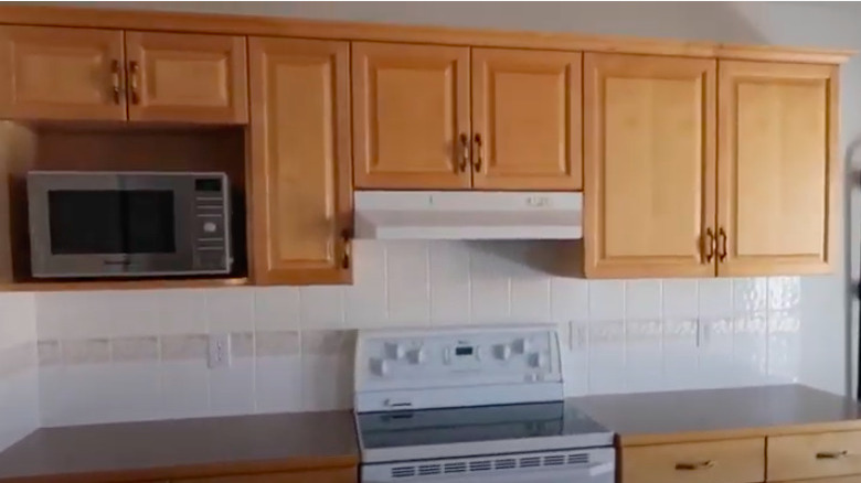
The honey colored oak wood cabinets are a thing of the past. Mix them with the differing white and black appliances and you have a kitchen that's most definitely outdated.
44. After: Subtle upgrade
A simple swipe of white paint and swap of hardware and the existing cabinets are instantly modernized. New countertops, stainless steel appliances, and a pop of blue tiled backsplash add to the overall makeover.
45. Before: Out of style
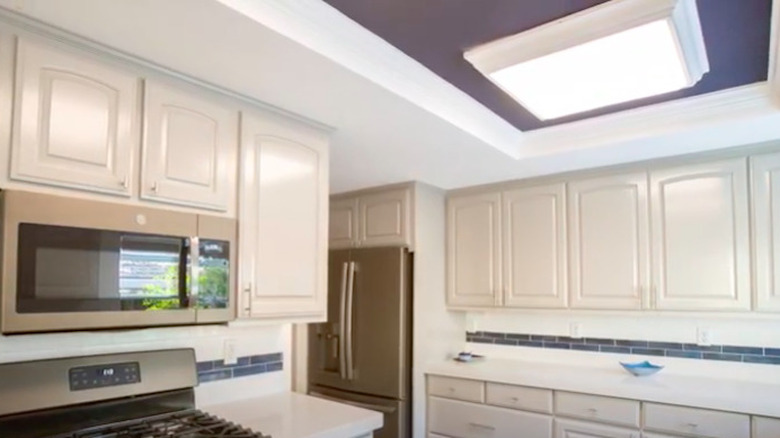
Despite the open layout and updated appliances, the medium wood tone cabinets with a matching door frame make this kitchen feel overwhelmingly out of style.
46. After: Two-toned and trendy
Despite leaving the layout, backsplash, and appliances as is, this kitchen now looks like an entirely new room. The door frame was cut to a more modern style and lost its wood trim. The countertops were replaced with a light quartz, and the two-toned cabinets bring in a popular trend.
47. Before: A specific taste
The criss-crossed window panes could be fine on their own, but add in the overdone paneling on the cabinetry plus the oddly placed hardware and it's decidedly distracting. In addition, the wood in the flooring conflicts with the wood tone in the cabinets.
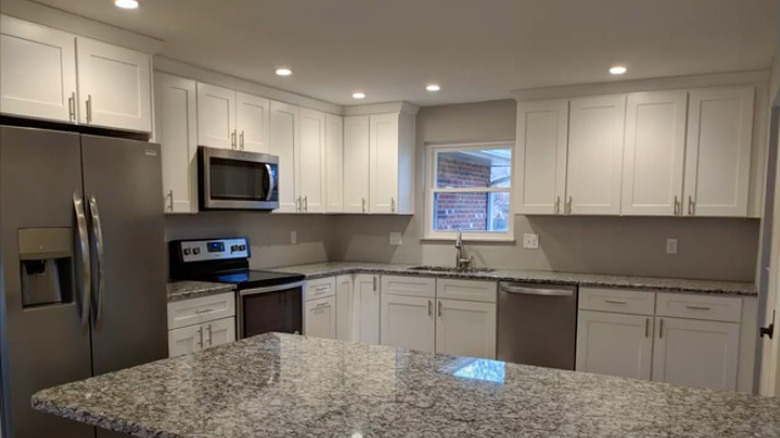
48. After: Universally appealing
New, white shaker style cabinets, granite countertops, and stainless steel appliances not only bring this kitchen up-to-date, but also appeal to a wider décor style. A new island increases the surface space to prepare meals.
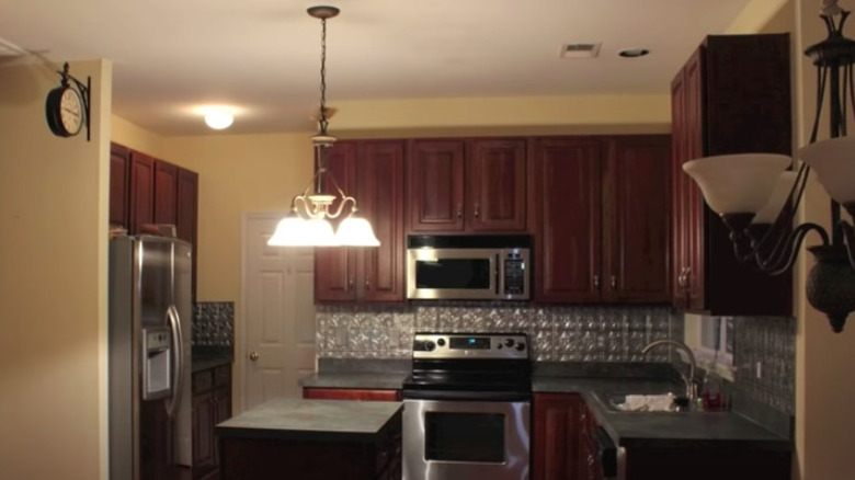
49. Before: Somber
The dark cherry wood, bronze pendant lights, and tin backsplash not only ages this kitchen, but it also gives it an overall dark mood.
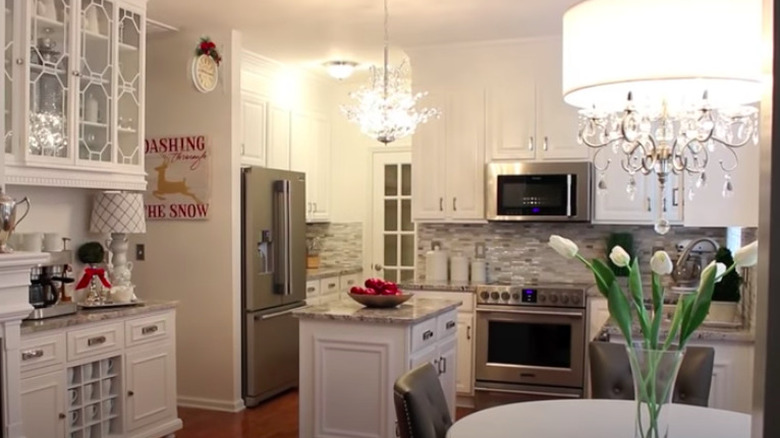
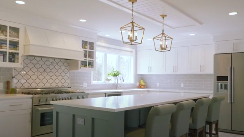
50. After: Sparkling
Cosmetic changes were all that was needed to completely transform the room. The now white cabinets blend beautifully with the gray marble countertops and linear glass tile. A couple of chandelier style lighting fixtures and glass doors make the kitchen feel bright and elegant.
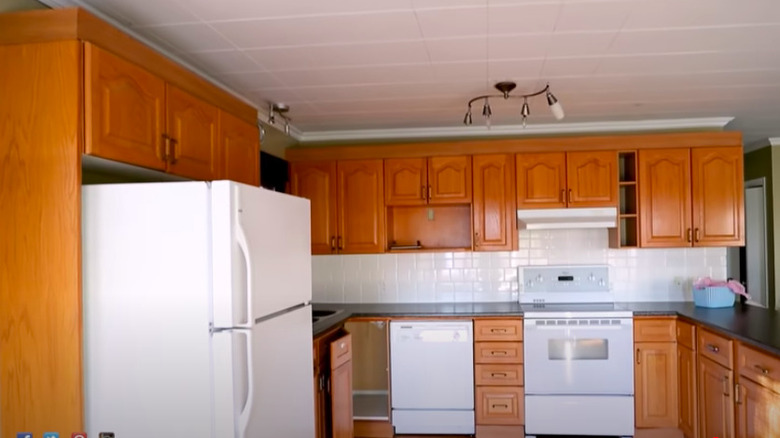
51. Before: Basic concept
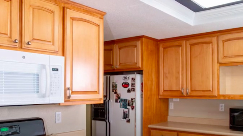
From the white appliances and the medium wood traditional cabinets to the tiled ceiling to the track lighting, this kitchen is as unoriginal as they come.
52. After: Boho chic
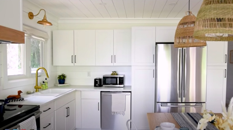
The former U-shaped kitchen is now more open with an island installed to retain counter space. White Shaker style cabinets and the shiplap ceiling along with natural and wood accents modernize the space and give it some personality.
53. Before: Drab
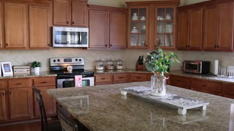
There's nothing particularly standout about this kitchen with the brown cabinetry and flooring blending in with the tan tiled backsplash and granite countertops.
54. After: Fab
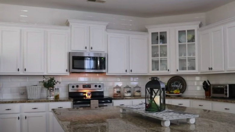
Simply painting the cabinets and installing subway tile from counter to ceiling makes all the difference in this kitchen, giving it a dazzling aesthetic.
55. Before: Boxed in
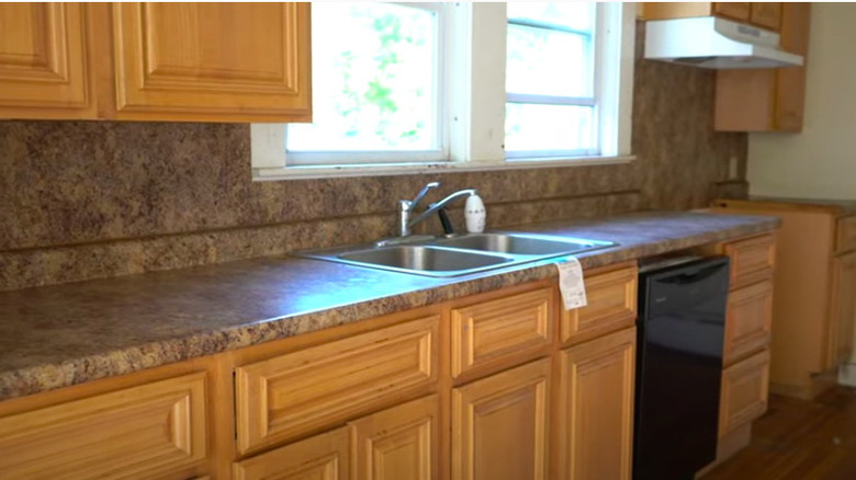
Not only does this kitchen feel closed off, the mismatched fixtures, outdated cabinets, and laminate countertops that blend into the backsplash look like it was designed carelessly.
56. After: Breathable
By opening up a wall and opting for a white aesthetic, the kitchen is so much brighter and cheerful. Touches of black and tan, along with updated appliances, make the space feel contemporary.
57. Before: Lackluster
While the kitchen is a nice size and has updated features such as stainless steel appliances and a farmhouse style sink, the dark brown cabinets, flooring, and accent on the backsplash make it feel dull.
58. After: Lively
White paint and new hardware transform the cabinets and blend in well with the marble countertops and glass backsplash. Modern pendant lights bring the kitchen to life.
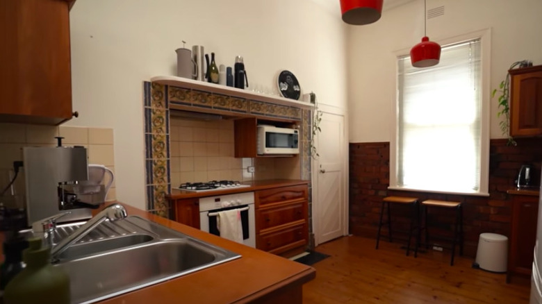
59. Before: Old fashioned
The exposed brick and high ceilings give this kitchen a one-of-a-kind look. However, the older appliances, cabinetry, and mosaic tile contribute to its age.
60. After: Contemporary
Without sacrificing its original unique style, this kitchen is now updated with sleek appliances and backsplash. White paint and open, natural shelving lightens up the whole space.
61. Before: Low maintenance
This clearly dated kitchen lacks style, yet still feels cluttered with the patterned backsplash, two-toned cabinets, and items piled up on the countertop.
62. After: Luxury living
After an extreme makeover, this kitchen bears no resemblance to its original. In addition to being expanded, brand new appliances, cabinetry, countertops, and a large island were installed. Mostly white cabinets and subway tiles are the perfect background to the accent color in the island and the custom backsplash above the stovetop.
63. Before: Seemingly fine
At first glance, there's nothing inherently wrong with this kitchen. It's small but the appliances are up-to-date and the backsplash and cabinets nicely complement each other.
64. After: Surprisingly sophisticated
Simple, slight adjustments took the previous kitchen and refined it into this one. A more muted countertop was installed, open shelving replaced a cabinet, and chrome accents were swapped for a trendier gold finish.
65. Before: U-shaped
Although this kitchen is bright and the colors are easy on the eye, the space feels cramped. The countertops also look cluttered with all of the appliances and dishware.
66. After: Walk through
Opening the space up to be able to walk through is just one improvement to this kitchen. While space may have been lost due to replacing some cabinets with floating shelves, it was regained by bringing the new ones to the ceiling. Mixing white with navy keeps the room bright but also lends charm.
67. Before: Lacking potential
The square ceramic tiled backsplash and off white cabinets with wood trim aren't doing this kitchen any favors in the style department.
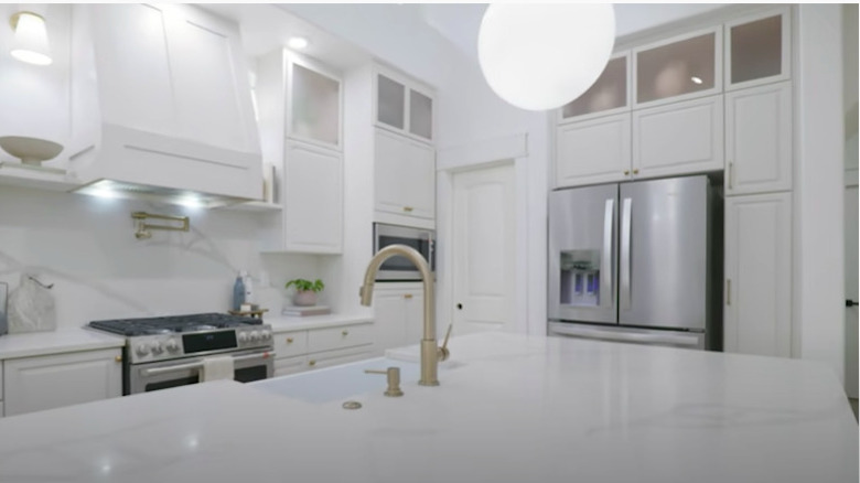
68. After: Living up to it
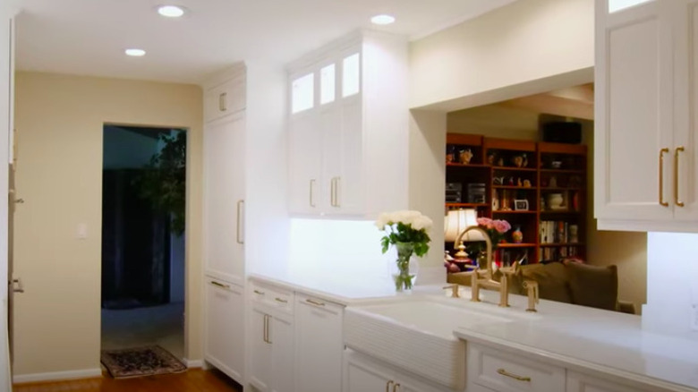
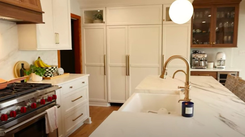
Even with the layout remaining the same, this kitchen looks like a new space. Updated cabinets extend to the ceiling, have an illuminating glass accent to them, and even hide the refrigerator. The choice of installing a farmhouse sink and gold accents further brings it up to date.
69. Before: Dowdy
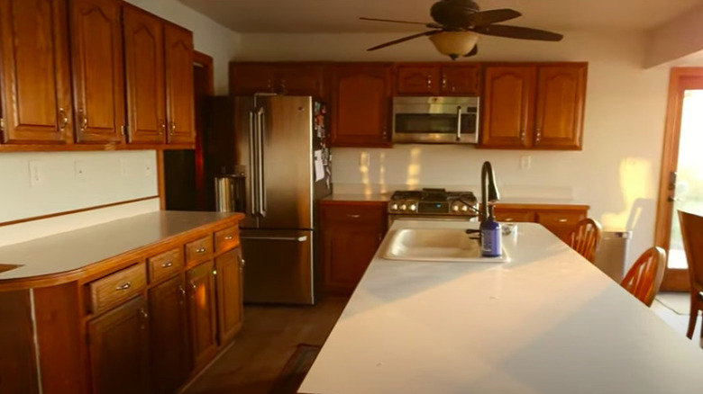
The new stainless steel appliances aren't doing much to help this kitchen look or feel updated. The antiquated wood cabinets and laminate countertops keep it in the past.
70. After: Classy
Floor-to-ceiling white cabinets, including a panel-ready refrigerator, modernize the space while the marble countertop and wood accents create a classy design style.
71. Before: Stuck in the past
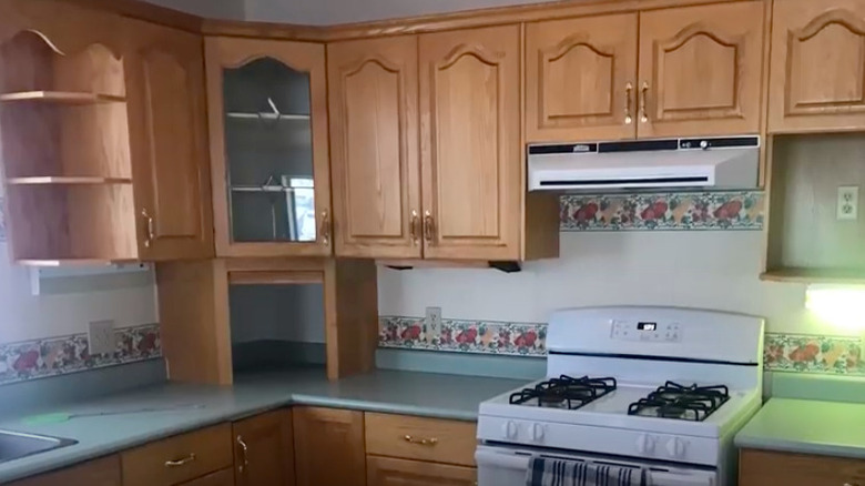
Practically every detail in this kitchen reveals its age, from the floral wallpaper border to the medium brown cabinets, and from the laminate countertop to the outdated oven.
72. After: State-of-the-art
Despite retaining many of the original cabinets, it's hard to believe this is the same kitchen as before. The white paint and subway tile make the gray granite countertops and stainless steel appliances pop. The wood ceiling and floating shelving bring some warmth to the space.
73. Before: Messy
This kitchen leaves much to be desired between it's odd layout, clutter, and drab features such as the backsplash tile.
74. After: Uncomplicated
The white walls, farmhouse sink, and upper shelving keep the kitchen looking clean while the darker blue lower cabinets add a nice touch of color.
75. Before: White, tan, and bland
This kitchen lacks any and all sense of style with its tan colored, unoriginal cabinets and white, ceramic squared backsplash tile.
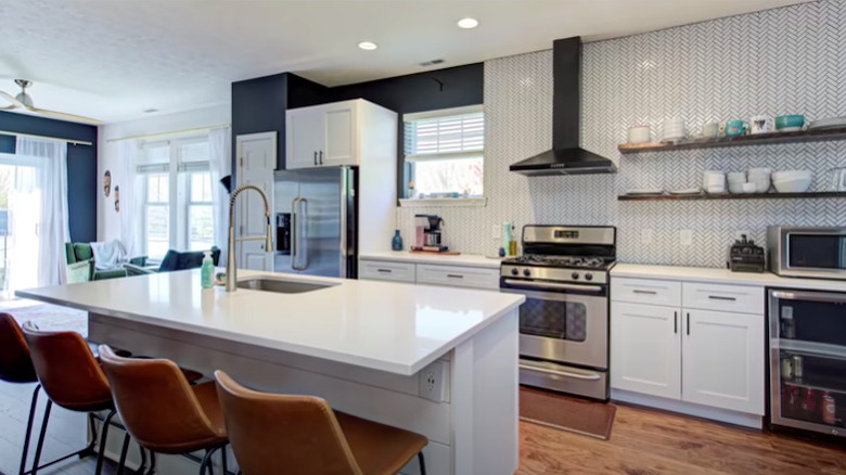
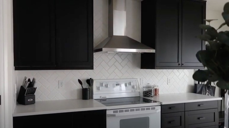
76. After: Black and white perfection
The stark black cabinets stand out amongst the white countertops and herringbone patterned backsplash. Even with the original stove in place, the wall-mounted stainless steel range hood brings the kitchen up-to-date.
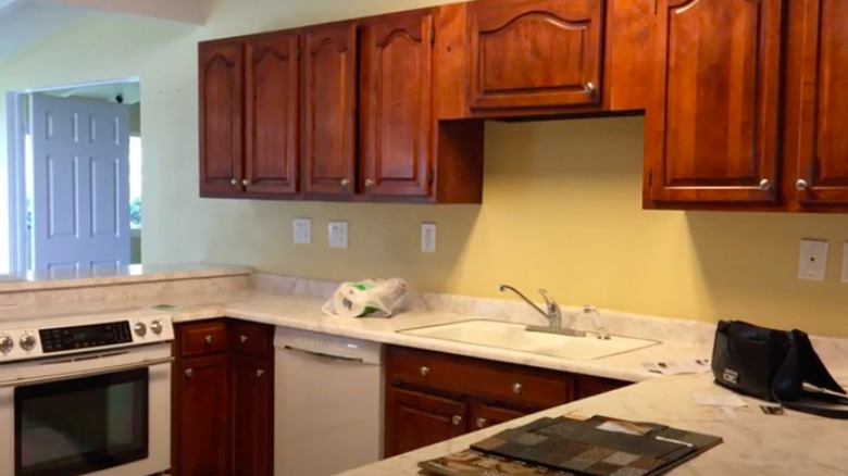
77. Before: Unremarkable
Nothing in particular stands out about this kitchen — except for the fact that the dark cherry wood cabinets, yellow walls, and marble patterned countertops aren't necessarily compatible.
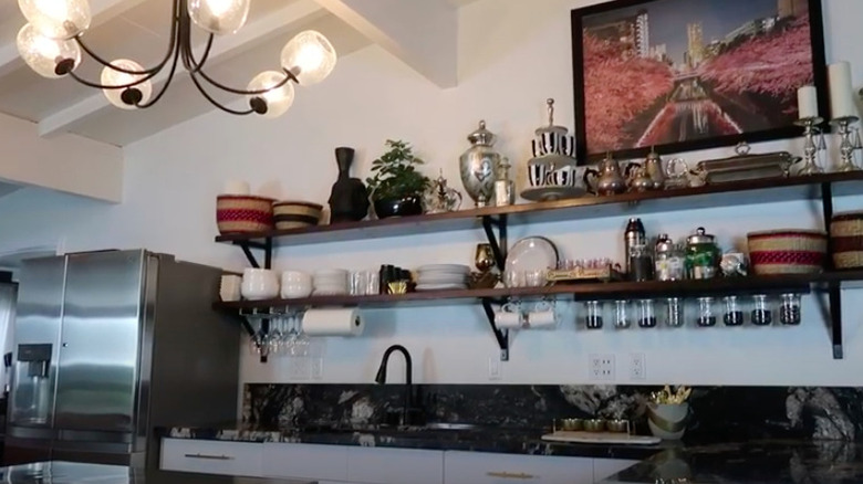
78. After: Extraordinary
Removing the cabinets entirely and using long, floating shelves to store unique items brings out the personality of this kitchen. The dark gray marble countertops mix well with the lighting fixture, black faucet, and stainless steel appliances.
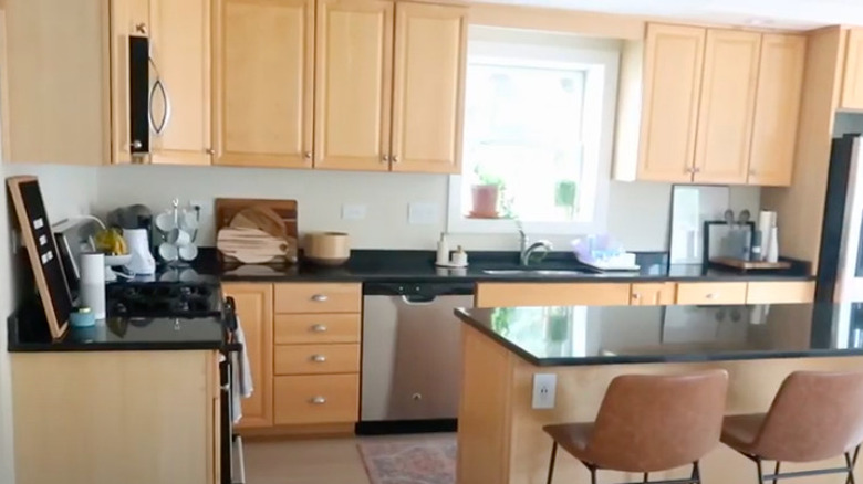
79. Before: Mundane
The layout, amount of storage space, and updated appliances are all benefits of the kitchen. On the other hand, the pale wood cabinets and black countertops aren't doing it any favors in the style department.
80. After: Simple elegance
While it sacrificed a window for a second refrigerator, there is still plenty of natural light thanks to the mostly white aesthetic. The marble countertop that extends to the backsplash, classic chimney range hood, and beautifully decorated open shelves help to create an elegant new space.
