Bad Home Advice Dished Out On Trading Spaces
The original "Trading Spaces" premiered in 2000 on TLC. It was one of the first home shows to catch the DIY-craze wave. The show invited two sets of neighbors to pair up and redecorate each other's homes over two days with a tiny budget of just $1,000. When the show ended its original run in 2008, one thing became evident: It's the show many online fans love to hate and hate to love. According to Apartment Therapy, fans went wild when "Trading Spaces" announced its 2018 return.
The immediate concerns were over the sometimes outright wild decorating choices made by the show's designers, particularly Hildi Santo-Tomas, known for final products that many might consider camp. Fans expressed that it's a show you watch not so much for design advice but to see how bad things can get. There have been many design bloopers over the years on "Trading Space," so just in case you were watching the show for inspiration, here is some bad home advice from the series to avoid.
Let your neighbors renovate your house
Some of the worst home advice from "Trading Spaces" is letting your neighbors renovate your house. It doesn't matter if you are great friends and have known each other for years. If we learned anything from the show, it's that the process ends in disaster more often than not. This is because home renovation and redecorating is a highly personal process.The one or two brief conversations contestants have about their desire for their home's new look just don't cut it.
Instead, if you choose to call in reinforcements from the neighborhood during your construction process, ask your neighbors to support you instead of striking out on their own. According to This Old House, small DIY decorating options that are difficult to mess up are things like hanging mirrors in each room of your home to make them feel larger and more open, decluttering spaces for a sleeker feel, and using rugs to anchor a room. These are all things that friends and family could easily help you do but not cause any design damage.
Go overboard with textures
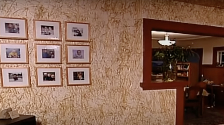
On a now-famous episode of "Trading Spaces," a homeowner was in near tears when she saw the room her neighbors had spent the weekend transforming for her. And when you see it, it won't take you long to understand why: The walls were completely covered in straw. The designers glued loose bits of straw everywhere to give the room a fun, Western look. Of course, she hated it because the design team didn't understand a key design element: Don't go overboard with textures.
According to House Beautiful, it's a great idea to use different textures throughout a room to create more interesting visuals and a warmer feeling space. However, using textures is only a great idea if you use them correctly. To avoid a faux pas, take things slowly. Good texturing comes in layers, so as you live in the space, you will begin to sense where a little something else might be needed. This can come in the form of a textured rug, a funky lamp, or a fun blanket. But, if you'd like to have fun textures right from the start, remember that accent pieces aren't the only things with potential. You can use major furniture pieces and even wallpaper to add texture to the room. Just remember: Don't use straw.
You don't need any accent colors
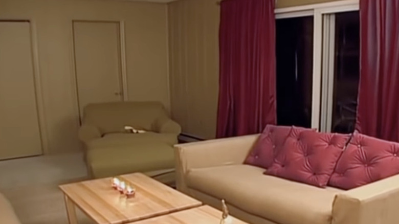
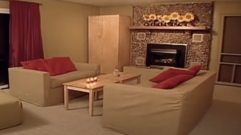
When redecorating your home, there's a right and wrong way to do monochromatic color schemes. This is why one homeowner on "Trading Spaces" was overwhelmed (in a bad way, of course) by the amount of beige in her new living room. The space looked terribly bland, and we think she started planning another redesign as soon as the cameras left. According to Homes & Gardens, if you want to avoid this problem in your space, the best way to decorate a monochromatic room is to use different shades of the same color in different mediums. If you choose blue, for example, you might select cerulean paint for the walls, navy bed linens, and azure curtains.
The Spruce also recommends incorporating different patterns and textures into the space so it doesn't feel flat, which was the main struggle of the room on "Trading Spaces." A room filled with neutral tones doesn't have to be boring. If decorated correctly, it can still feel warm and lively.
Using fake flowers as wallpaper looks great
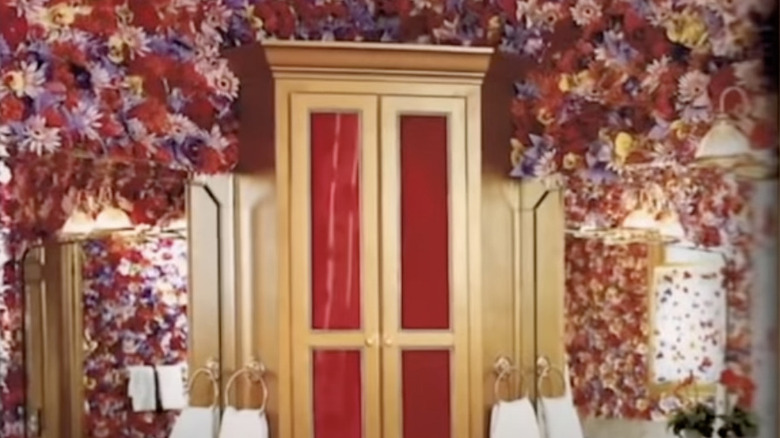
When decorating your home, it's a great idea to be generous with floral elements, as they can make a space feel fresh and connected to nature. However, keep in mind that there is definitely such a thing as being too generous, and you should not go overboard. One episode of "Trading Spaces" showed a bathroom wall plastered in fake flowers, shocking and upsetting the homeowners. If you plan to use floral elements in your home, there is a better way to go about this.
According to Studio Wellington, the best way to incorporate blooms into formal spaces like a dining room is to stick with flowers of a similar color palette. You can still create visual interest in the arrangement by incorporating different heights and levels of fullness. In addition, a fun way to make flowers look fresh is by using unconventional vases instead of traditional ones. Third & Wall adds that floral imagery is also a great way to add interest to your room if you don't want to be tending to fresh flowers constantly. You can use it as a statement piece through wallpaper or furniture upholstery, and complement it with more solid accents.
You can DIY all parts of home renovation
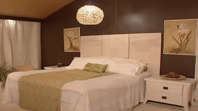
Not everything can be DIY; some projects really do require an expert's touch. Case in point: An episode of the show's reboot depicts a contestant trying to make a woven light fixture out of an exercise ball. While the expert's final product turns out okay, hers looks horrible. So, if you want to incorporate woven decor into your home, there are some things you should buy rather than DIY.
According to Picky Stitch, woven light fixtures are known to cast interesting shadows across your home, adding another layer to your decor. You can also easily complement them with woven planter baskets, placemats, and even rugs and wall decorations. If you decide to veer away from a woven theme, MyDomaine says that you can still play with shape, color, and texture when selecting lighting and other elements for your home. Just remember: You don't have to build everything yourself, and it's okay to buy it.
Adults still love themed rooms
When you were a child, you might have imagined having a room that looked like a castle or sleeping in a race car bed. While some adults might still prefer this type of decor, "Trading Spaces" definitely makes it seem like it's still the norm, which it isn't. Designer Hildi Santo-Tomas in particular is a big fan of putting together themed rooms, which is some of the worst home advice on the show. Instead, avoid them. According to MyDomaine, it's one of the easiest ways to make your home seem dated in a hurry.
While loving Disney, the beach, or traveling can make up a large part of our interests, it's better to incorporate our interests through our decor, rather than just installing a beach inside, as seen on one episode. According to We Three Shanes, the best way to decorate a themed room is to focus on subtle charm instead of garish camp. To do this, you should focus more on how you want a room to feel rather than look. Then, mix in plenty of items and accents that have nothing to do with the theme to balance things out.
Forget about scale when selecting furniture
The original episodes of "Trading Spaces" feature plenty of furniture that overpowers everything else in the room. To avoid this when decorating your own home, keep an eye on scale when choosing furniture. It can easily ruin both the style and functionality of a space if your couch is too large or there isn't enough room to walk around.
According to Apartment Therapy, planning ahead is the best way to avoid trouble. Plenty of apps on the market let you snap photos of your furniture and your space and virtually arrange it to ensure it all fits. In addition, if you're more of a spatial thinker, you can also make miniatures of your room and potential furniture, possibly at a scale of 1 foot to 1 inch, to get a better feel of things. Finally, if everything won't fit, consider how you can double up. You can do this by ensuring your coffee table has plenty of storage underneath or your couch pulls out into a bed.
Sheer curtains should be used alone
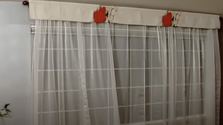
While sheer curtains look great when paired with a more opaque option, you should avoid them as a standalone. This is because sheer curtains don't keep out light or noise, nor do they provide any privacy. So, if used without anything else, as they often are on "Trading Spaces," they won't really be functional. According to HomeQuestionsAnswered, another big advantage of sheer curtains is their lower price point. Because they are typically purely decorative, they won't cost as much as blackout curtains, for example. They also can provide a room with a great multilayered look when paired with fabrics of different materials.
Magazines Weekly also reports that while sheer curtains don't provide much insulation, they can be paired with window blinders, window films, or standard curtains. If you're looking to pair them with heavier curtains, it's best to choose a neutral color like white or gray for the sheer curtains, and then choose a color that ties in with the rest of the room for the opaque option.
Tiled walls are perfect for the living room
In areas of high water use, tiling walls can be a great asset to the space. According to The Spruce, tiling walls in places like the kitchen or the bathroom can create great visual symmetry within a room. Tiling can also help prevent water damage to sheetrock and save you from costly repairs. It's also easier to clean, so tile is way more forgiving if you splash sauce while cooking or your child decides to color on the wall.
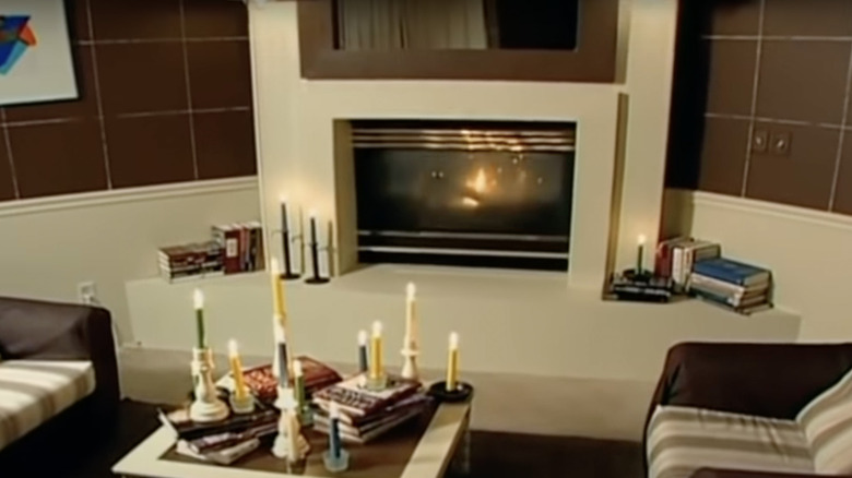
However, the designers on "Trading Spaces" decided to tile the homeowner's living room walls, leaving them with a sterile feeling community space. According to The Tile Shop, the only reason you might choose to use tile outside of a water-use area is when selecting a design that mimics other material. That can include tiles stained to look like panels of wood around a TV or a tiled fireplace hearth meant to look like stone.
Concrete flooring is perfect for everyday living
Be wary of concrete flooring in the interior of your home. While exposed concrete was a popular design choice on "Trading Spaces," it's not always the best choice for everyday designers. According to HGTV, concrete is a durable flooring choice for high-traffic areas. After all, we use it outside for roads and patios, so it must be. But, while an interior room with concrete floors might gain all that durability, it still loses a few things, too.
Concrete is hard and unforgiving, so you might choose it to protect your flooring from rowdy kids, but then you have to consider how to protect your rowdy kids from the floors. While you can put down rugs, it still leaves more room for injuries to both children and older household members. Concrete is also porous and can be particularly susceptible to moisture damage, which is something to consider if you plan on painting it. The moisture can easily cause the paint to bubble up and tear.
Wallpapered ceilings look great
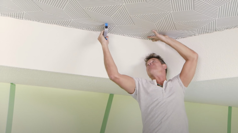
According to former "This Old House" host Bob Vila, there are very select circumstances in which adding wallpaper to a room's ceiling is a good idea. Before you proceed, you'll need to ensure that your ceiling is smooth and not prone to any cracking or leakage, which would ruin things before you even get started. Next, consider how long you'll want it up there. Most quality wallpapers have a life of about 15 years, give or take, but keep in mind that if you select something too trendy, you might want it down a lot earlier.
Such is the case on one infamous episode of "Trading Spaces," when Ty Pennington decided to cover the room's ceiling with a funky geometric pattern without asking his teammates their opinion. This left them distressed, as they weren't too convinced their neighbors would like the look. In the end, Ty decided to leave it up because he'd already invested too much time installing it. Don't let this happen to you.
Don't bother cleaning items before restoring them
If you decide to incorporate vintage or antique items into your remodel, make sure you thoroughly clean each piece as a part of your restoration work. In one episode of "Trading Spaces," viewers watched in horror as a designer did the exact opposite of this. He planned to make a coffee table with motorcycle tires as the base. While this might be a good idea, he didn't execute it well at all. When bringing the tires inside, it's clear he hadn't cleaned them off. And, as the episode progresses, no one else ever cleans them, either.
While some might say it adds to the overall grit of using a restored item, most people want their things clean. And there are plenty of ways to clean vintage pieces. According to HGTV, dried wood can be rehydrated with a special mixture, glass bottles should be scrubbed out, and white linens can be boiled to reverse discoloration. While old motorcycle tires don't show up on the list, we can also assume it's also a better idea to give them a good scrub before bringing them inside, rather than tracking in heaps of dirt and debris.
Go ahead and paint with a color you're not sure about
If you don't like the paint color in the can, then it's fairly certain that you won't like the way it looks once it's up on the walls, either. The designers of "Trading Spaces" seem to be all about convincing wary neighbors that the color will look way better once the walls have been primed, painted, and given time to dry. However, in real life, if you don't like the color before it's even up, do not proceed.
According to The Family Handyman, you can start with color swatches to get an idea of what you might like. When you have it more narrowed down, it's time to start painting ... just not the entire wall. Consider buying a smaller amount of your favorite colors and painting a small section of the wall with each. Be sure to let it dry and paint another coat. Examine the colors at different times of day and in various natural and artificial lights. Only then, after your extremely thorough test run, should you commit to painting the entire room.
Always listen to the experts
Whether you are redecorating one room in your house or completely renovating, the most important thing you can remember is always to follow your personal design interests, not the trite advice of online experts who have never seen your home. In a YouTube interview, Ty Pennington advises viewers to "let their rooms breathe" by not overdoing it with color, patterns, items, etc. However, rooms can be "over the top" and still tasteful.
According to Architectural Digest, many people in the design sphere love combining unconventional colors and textures, like architect and interior designer Sig Bergamin and his partner, architect Murilo Lomas. These professionals have nearly the opposite opinion as Pennington, as evidenced by their colorful homes. That is to say, no matter what design choices you make, there will always be plenty of professional voices both for and against the idea. In the end, you really have to go with your gut.


