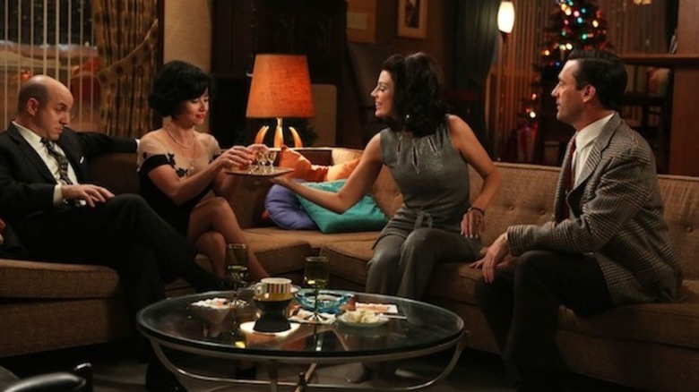
What's Wrong With Don Draper's Apartment In Mad Men, According To Designers
AMC's award winning drama "Mad Men" captivated audiences for seven seasons, accumulating multiple Golden Globes and Emmy awards, among other prestigious accolades. Concluding in 2015, the show followed the life of Don Draper, who was a man in the 1960s working at an advertising firm. Many loved "Mad Men" for its dedication to its time period's aesthetic — nostalgic for some, and informative for others. Additionally, the costuming and set design teams received many Emmy nominations and several awards for their replication of bustling 1960s life in Los Angeles. One iconic set design is Draper's swanky apartment, decorated in all its mid-century modern authenticity.
According to the Los Angeles Times, set decorator Claudette Didul took inspiration from 1960s interior designer Betty Pepis, as well as Jose Wilson and Arthur Leaman's 1965 book "Decoration U.S.A." "The colors of the rooms and furnishings are so vibrant in those books they almost make your teeth rattle," Didul told the newspaper.
Don Draper's mid-century modern apartment
While Don Draper's apartment on "Mad Men" is quite literally award winning, as well as a great representation of an authentic 1960s mid-century modern lifestyle, that doesn't mean there isn't room for improvement. Insider asked an array of interior designers to critique various television apartments, "Mad Men" included.
Award-winning Los Angeles based interior designer Lonni Paul says Draper's apartment "is masculine and perfect for a type-A personality. It's organized and nothing feels out of place," and that it is a great example of a set reflecting a character's personality — manly, streamlined, trendy. This is not an isolated observation, as Didul told the Los Angeles Times that Draper's apartment was intentionally masculine, sleek, and modern. However, Paul says the apartment could benefit from the addition of a patterned rug.
Alec Holland, a New York City-based interior designer and television writer with a proclivity for mid-century modern design, per his website, only suggests a "more festive fabric on the sofa." Ultimately, however, sees nothing wrong with the apartment. "[T]hose stools are perfection. The hanging light and wood features are also all a big 'yes' for me," he revealed.

