How To Decorate Your Home Like Christina Haack
HGTV design pro Christina Haack, star of "Flip or Flop" and "Christina on the Coast," gave fans two opportunities to see how she styles her homes. Following her 2021 divorce from TV personality Ant Anstead, Haack purchased a $10.3 mansion on California's coast as well as a $2.5 million Nashville-area getaway. Both homes take her style chops to the limit for plenty of reader inspiration. Luxury runs through the veins of the guard-gated-community mansion in Dana Point, California, with exterior and interior designs reflecting views of the Pacific Coast and mountains, says Taste of Country. For resort-style living at home, there's a rooftop deck with a fireplace, inground pool, and spa, according to The New York Post. The 6,081-square-foot house capitalizes on the panoramic view at every junction — this is the beach, after all. The open floor plan not only unites the formal dining room, double-island kitchen, and great room, it merges with the outdoors like one big room. And when Haack and gang tire of the beach, the good times can continue indoors with a purple theater and a game room. Sleek contemporary style marries rustic and wood elements for contrast.
In a Nashville suburb, the 5,000-square-foot farmhouse (six bedrooms, 5.5 baths) features more of this juxtaposition,n but also digs into its country roots with barn doors, wagon-wheel chandelier, and brick kitchen backsplash says Taste of Country. Do you love the look of these homes? Here is how to decorate your space just like Haack.
1. Bring out your home's unique character
Christina Haack's new Pacific Coast mansion is not a carbon copy of her farmhouse-style vacation house in the suburbs of Nashville. Both homes have a rustic touch, but her chief residence in California has contemporary elements that fit the design of the beach house. Meanwhile, the Tennessee home accentuates its farmhouse quality by featuring not only a brick kitchen backsplash and fireplace, but several barn doors and country chandeliers with antlers and wagon wheels.
While it is not a hard-and-fast rule that interior design must match a home's architectural style, harmony certainly doesn't hurt. To achieve Haack's style, copy her harmony tip. Decorilla suggests certain interior styles work hand in hand with specific architectural designs. For example, the perfect complement for a beach house might be contemporary decor, especially if you want to be playful. Coastal decor can also work, which is an earthy aesthetic that uses natural textures for a soothing sense of beauty. And for a small home, one might accomplish big things with Scandinavian design (known for slim lines) or a mid-century modern aesthetic (a compact style). However, if you like contrasts, feel free to play with juxtaposition. MyMove introduces just the right modern elements into a Victorian home for a well-meshed design. Picture pairing clear acrylic chairs with an antique wood table in your Victorian mansion.
2. Let the scenery do the talking
The Pacific Ocean and mountain vistas are too awe-inspiring to enjoy only when being outside. According to Taste of Country, Haack designed her California living room with a retractable wall to blur the line between indoors and out. Better than a painted masterpiece, the view takes center stage in the dining room, and a balcony in the owner's suite makes sure each day starts in sync with nature's glory. Plus, the open floor plan maximizes the vantage points, allowing one to see the view from multiple corners of the house.
From furniture placement to the color scheme, Mansion Global says there are many ways to highlight views in your own house— whether that's a natural setting like a pristine lake or a backyard garden. "I always look to the environment first for inspiration — the natural surroundings, landscaping, and architecture. From there, I develop a color palette and build the design around that," Laura Brophy, a California-based designer, told Mansion Global. That design can include floor-to-ceiling windows or the placement and scale of furniture to complement the scene. The Anderson Studio in South Carolina recommends being intentional about windows if you're renovating. The design firm recommends selecting panoramic, bay, or bow windows to really make the most of your setting.
3. Imitate Haack and run wild with natural elements.
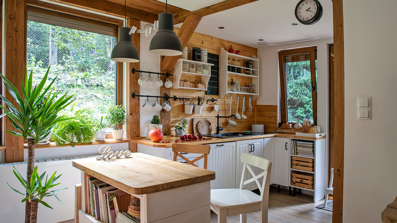
With a wealth of organic accents like marble, wood, and house plants, this HGTV designer goes beyond a drop-dead landscaping view to create another connection with nature. But you don't need a marble fireplace in the bedroom or a live edge dining table (which are all standouts in Haack's beach house) to introduce organic decor to your space. Anyone can feature natural elements in their design. You can do it on a small scale by adding rattan furniture and rugs made from natural fabrics, or you can go completely organic by adding bamboo floors or an indoor treehouse for a kid's room.
According to Homedit, the leading way to introduce nature to your home is through plants or trees. In the market for a spa-like bathroom? Plants can create that ambiance. For a trendy move, vertical gardens are nature's solution to an accent wall. As per MyDomaine, another simple tie-in to nature indoors is decorating with things you might find on a hike, such as stones, pinecones, and shells. Just how far should you go with organic décor? MyDomaine suggests targeting a bathroom and then proceeding from there if you dare.
4. Make an open floor plan cozy with a unifying color palette
An open floor plan can seem daunting. But Haack was able to draw from years of experience — at least a decade on HGTV — to do a masterful job in both her primary California home and woodland getaway. "Open spaces can pose a multitude of design challenges, but it doesn't have to be intimidating," Memphis designer Sean Anderson told Southern Living. One hack is to use a color palette that creates a sense of harmony. This typically means neutral shades like white, grays, and blues. As Dallas designer Jean Liu told Southern Living, one might liven a consistent palette with various fabrics and textures to coincide with yet another hack: large furniture groupings to cozy up the space. Color is not only powerful but multi-functional, says Nashville designer Roger Higgins. He suggests breaking up the room with a contrasting hue on the doors, woodwork, or ceiling.
MyMove suggested turning this contrasting color loose on an accent wall to give the space depth. You can also float furniture away from the walls and repeat elements as you did the colors. An example in Haack's Tennessee retreat is the bricks that repeat in the fireplace and stove areas for down-home country charm.
5. Mix rustic and modern decor
Rustic elements play heavily into the design of both of Haack's homes, even though the California mansion has a more contemporary flair. If done correctly, mixing modern and rustic elements provides contrast and breaks up monotony. But if done haphazardly, the effect can be jarring. A tip from D.C.-area designers at Hudson & Crane is that contrasting elements should not compete in a way that detracts from a room's overall harmony. Ideally, they should emphasize each other. Mixing materials is a great way to get this look, such as combining stone with metals. You can see this in action in Haack's Tenessee farmhouse, where natural wood floors and stone walls contrast beautifully with metal light fixtures. Hudson & Crane also suggests experimenting with textures of varying visual weights — like how Haack contrasted a marble fireplace with wood ceiling beams in her California bedroom suite.
According to Michael Helwig Interiors, modern and rustic designs are not as unlikely partners as one might think. Rustic elements have a way of softening contemporary design's cool edge, giving it balance. While rustic on its own is dark and heavy, House Beautiful says contemporary rustic is airier and feels more modern. That just shows that combining the two helps strike a beautiful balance.
6. Punch up the purple in your room design
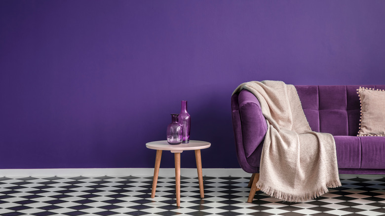
Anyone who grew up with Barney, the bright purple dinosaur, bouncing across their screen knows that this can be a joyous color. Seldom seen in nature, purple was long reserved for royalty, but today it lifts spirits in any room. According to Dirt, Haack chose purple cushions for the seating in her California mansion's dual-level movie theater. This departure from her home's neutral color scheme worked because the movie theater is not part of the open floor plan.
Do you prefer a quieter palette? Purple still may be a perfect choice. HGTV explains that different shades of purple trigger different emotions, since the color is a combination of tranquil blue and volatile red. At the lighter side of the spectrum, lavender makes the ideal girl's bedroom or powder room, but bolder tones like plum can elevate a living room. Since purple is such a powerhouse, a little can go a long way. You can even use it as an accent shade. As per Treehouse, purple did not go out with that dinosaur. Instead, it has gained popularity and works especially well with modern or glam designs. Go purple!
7. Tame an open floor plan with area rugs
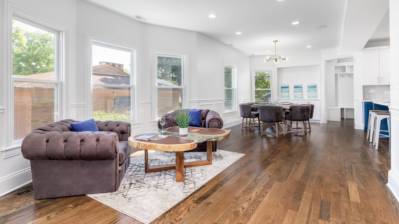
Perhaps the number one fix to tone down the sheer immensity of an open floor plan is to place area rugs cleverly. Haack demonstrates this throughout her Pacific Coast mansion. If left as one vast room, the open floor plan will seem cold and uninviting. The trick, as Room for Tuesday recommends, is using area rugs to create clearly defined areas within the larger room. Nest a seating or dining area atop a rug, and the rug will act as a horizontal boundary. The result is a cohesive room, especially if the rug colors and styles are not identical but complementary.
As per Martha Stewart, rugs can be used to divide up conversation areas in a big room, giving each their own sense of identity. It's better to have more rugs than to have furniture sitting on bare flooring. "These pieces don't have to match, but they should be neutral or tied together by color or pattern," Donna Isralsky, vice president of home merchandising and operation for Resident, told Martha Stewart.
8. Mansion or not, choose your rooms wisely
With 6,000-plus square feet to play around in, what kind of rooms did Haack include in her California mansion? She went with an office, a formal dining room (great for special occasions,) and a game room/billiards room. When choosing what kind of rooms to create in your own home, consider your family's needs and how accessory rooms can fill them. Nowadays, more and more Americans realize they need an office and dining room in their home. Since the pandemic, home offices have served a vital role, especially when designed for more than casual use. According to Entrepreneur, offices should be separate from other rooms and set up to mean business. Haack does this by putting her desk in the center of the room and adding plenty of dark wood shelving (via New York Post).
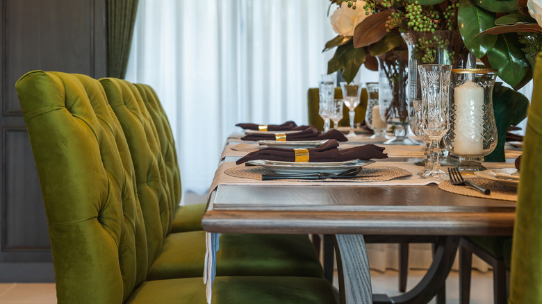
According to True Fashionistas, formal dining rooms are back in vogue and can become the house's focal point. Consider adding glam to your modern design by choosing unique lighting, like a chandelier with unusual details. As for Haack's game room, a standout feature is the glass walls used to separate the pool table from the rest of the room. Archaeological Digest agrees pool tables should not be banished to a corner of the basement, so show your spirit if billiards is your hobby.
9. Mixing metals can create a powerful design aesthetic
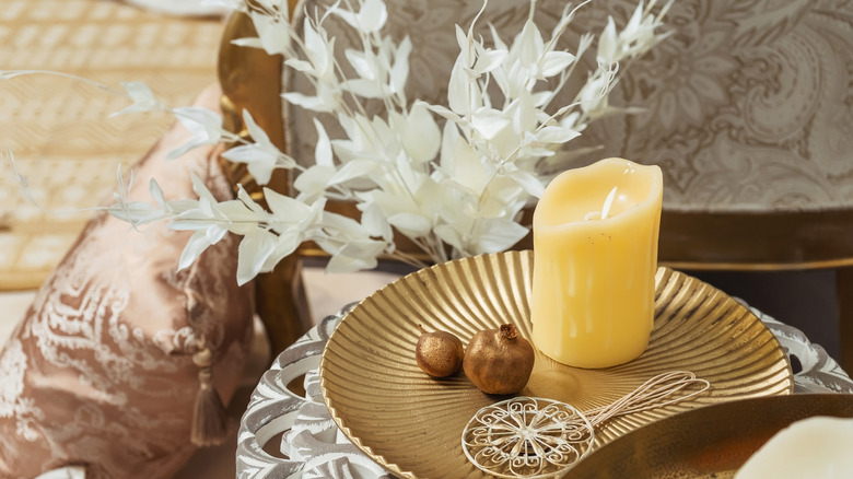
Haack seizes many opportunities in both of her homes to introduce metals, often with intriguing light fixtures. Anyone can use a variety of metals to add interest to their home design, but there are tricks to avoid metal mania. This typically means limiting your metals to one dominant finish and one subordinate finish as an accent. According to Kathy Kuo, the goal is to create contrast by combining warm metals (gold and brass) with cool metals (like silver and chrome). Your color palette will also decide which metals to choose. As Kuo explains, cool metals pair with cool colors like blue or gray, and warm metals with warm colors such as white or brown. The design works best if the contrast is subtle and intentional. Don't just throw metals out there to say you did. Also, don't be afraid of mixing textures in the form of polished, matte, or hammered metal.
As per Invaluable, it's no longer taboo to mix gold and silver. Just choose your dominant metal according to the warmth or coolness of your color palette and give the other metal a supporting role. A trap beginners might fall into is grouping all the metals together. Instead, spread them across the room for a cohesive look.
10. Add brick to your kitchen
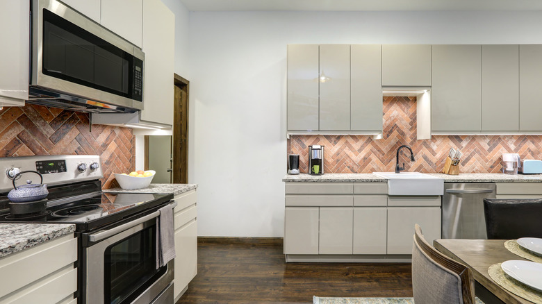
Haack is a fan of brick, and it's a hot option for a kitchen backsplash. It contributes both strength and durability, which is important in a place like a kitchen. Specifically, Haack used bricks to decorate her farmhouse-style retreat in Tennessee. Bricks play a starring role in the décor, rising in an archway over her stove and accenting her living room fireplace. In a tribute to organic decor, both wood and stone accentuate the walls in the country getaway. This matches the down-home elements in the house, like the wagon-wheel chandelier. But real bricks could break the budget for most people. So, Bob Vila suggests using a brick veneer to make this option more affordable. No, brick veneer is not imitation stone. It draws its aged charm from thin authentic brick panels that interlock decoratively. One could cut costs even further with plastic or porcelain imitation brick, but that might compromise the stone look.
According to Backsplash.com, brick backsplashes match various aesthetics, from farmhouse to modern. And bricks are not limited to the red variety: Gray bricks bring a sleek touch to a modern farmhouse kitchen with a wood-based island. Three cheers for bricks!
11. Generate warmth with wood
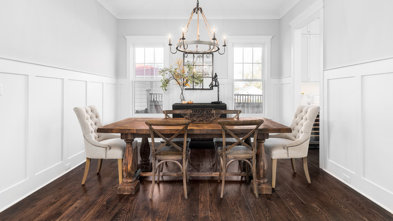
Wood is an element that contributes warmth, especially when it juxtaposes cool contemporary features. Some great Haack hacks to turn up the heat on modern design include using exposed wood ceiling beams, wooden mirrors, and live edge furniture. According to The Seattle Times, wood can introduce the unexpected in any room. It's a unique touch because each board is different in pattern and grain, and even a singular piece can deliver a big impact. Haack knew the power of wood as she introduced a long wooden table into her modern mansion dining room, which looked like a tree split in two.
Some might worry that different natural woods in the same room may clash, but mixing won't subtract from the woodland charm. Of course, coordinating the types of wood is ideal. Ocean Home suggests tinkering with different ways to introduce wood into your space, such as whitewashing wood panels for a vintage effect. Not ready to plunge into the wonders of wood? Slowly build confidence with wood accessories.
12. The more fireplaces the merrier
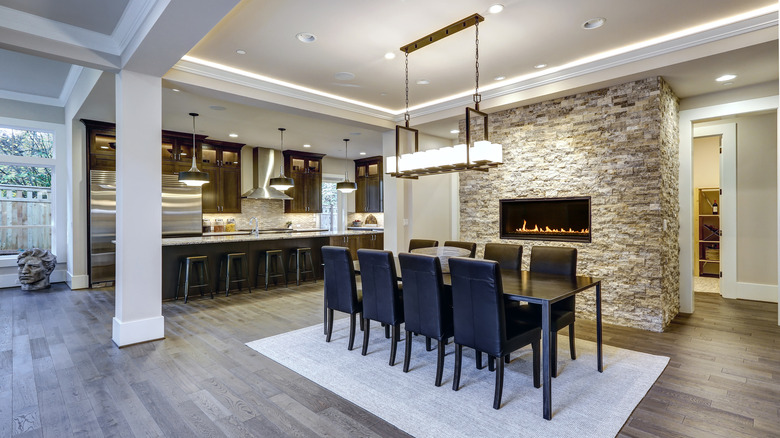
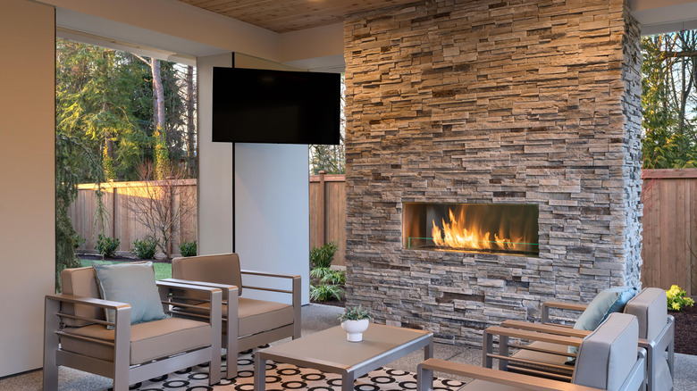
Fireplaces today are no longer a necessity for heat, but that doesn't mean they don't have a place in just about every room. Haack can't seem to get enough fireplaces in her California mansion. In her living room, her fireplace is nestled into a wall made out of stone, bringing an earthy element into the space. While stone feels right at home in the great room amidst the natural wood accents, her bedroom took an equally dramatic approach with a heavily veined marble fireplace. On nippy nights, her rooftop deck is equipped to handle the chill with yet another fireplace.
Elle Décor demonstrates that fireplace style is limited only by one's imagination. No home need be left in the cold, as design runs the gamut from traditional to ultra-modern. Imagine white bricks with a brass cage front for a white-and-black-contrast sitting room, a glass-enclosed two-way fireplace to define an open floor plan, or a mirrored fireplace for a dramatic reading room. For those fearful of the cost of a new fireplace, HGTV suggests wallpapering above the mantel as a budget-friendly alternative to tile.

