HGTV Home Design Trends That Should Stay In The Past
Everyone loves binge-watching their favorite shows on HGTV. From "Fixer Upper" to "Property Brothers," the network features plenty of great comfort television for lazy Sunday mornings and beyond. In the span of just one hour, you can watch inspiring design hosts complete a home renovation process or happy house hunters purchase a new home. However, there have been some design trends popularized on the channel that frankly we're over — we're looking at your shiplap walls, Joanna Gaines.
What may look amazing on television sometimes simply doesn't translate into everyday life, and there's nothing worse than spending a lot of time and money on renovations only to realize that your new home is unlivable. The history of design is filled with wildly popular, yet regrettable trends that are either impractical, impossible to clean, or downright ugly. Whether it's questionable DIY artwork or open floor plans, here are 13 design trends from HGTV that are better left in the past.
Shiplap seen on Fixer Upper
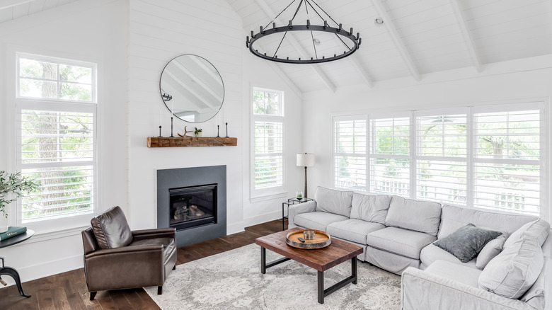
Joanna Gaines from HGTV's "Fixer Upper" might love shiplap, but this wooden wall siding trend is on its way out, according to Apartment Therapy. Originally used to waterproof boats, the trend rose in popularity along with the modern farmhouse style during the 2010s. After "Fixer Upper" started airing, suddenly everyone wanted to cover their walls with white-toned wood paneling.
While shiplap might look like mere wooden planks, there is actually a special rabbet cut on the top and bottom so that they fit together easily, like a puzzle. Effective against wind and other elements, the material began being used as a siding for homes. However, the overused trend is quickly falling out of fashion despite the popularity of "Fixer Upper." In a survey conducted by Sherwin-Williams, nearly 15% of professionals chose shiplap wall treatments as a trend they believe will be left behinds. Alternative wall treatments such as nickel gap are expected to rise to the forefront and take its place.
Shades of gray from Property Brothers
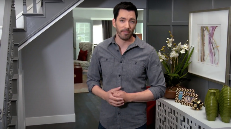
According to the Sherwin-Williams Designer Panel (via Apartment Therapy), which conducted interviews with 250 top interior designers and decorators, it's time to say bye bye to the gray-on-gray look. Popularized by HGTV shows such as "Property Brothers," the neutral gray color palette trend is everywhere these days. "Property Brothers" star Jonathan Scott stated in an interview with SheKnows that his favorite color is gray because it creates a crisp, fresh, and clean effect. While Scott notes that gray is great because it's easy to match and combine with different trends, the homogenous design is starting to feel a bit drab.
Fans in an article from Country Living express the wish for HGTV to mix it up more and break away from using excessive amounts of gray in all of their home renovations. Those who hate on the color gray say that it is boring, depressing, and too safe. Following the pandemic, designers and homeowners alike are gravitating toward bright and fun colors, which indicates it might be time to take a break from shades of gray.
Granite countertops featured on Christina on the Coast
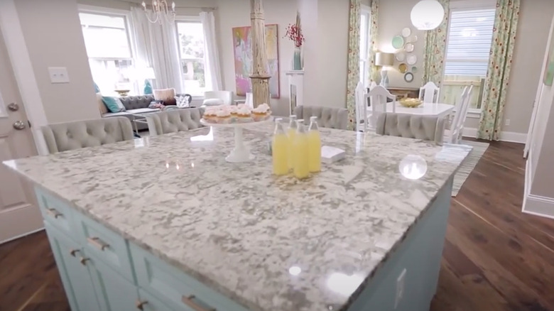
Contrary to what HGTV would have you believe, not everyone is a fan of granite countertops. Granite, a durable stone material, first became popular as a symbol of home luxury in 1986 when designer Deborah Sussman installed it in her kitchen. From there, the long-standing favorite rose in popularity throughout the 2000s, appearing in more entry-level and mid-level homes (and HGTV shows like "Christina on the Coast") since it offered durability and stain resistance.
While this natural stone material has been popular for decades, other natural materials and solid-surfaces are recently emerging as popular alternatives. According to a Home Light real estate agent, buyers are falling out of love with granite. Out of 30 homes in the Phoenix, Arizona area, 95% had quartz countertops while the other 5% had marble. Thanks to its many attractive benefits, including eco-friendliness, low maintenance needs, and consistency, quartz might just be the new king of the kitchen.
Stainless steel appliances from Christina on the Coast
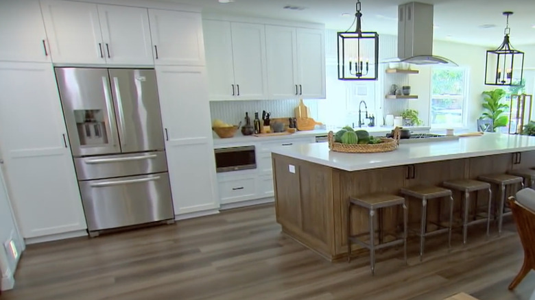
In HGTV shows like "Christina on the Coast," it seems like no home renovation these days is complete without a sleek set of stainless steel appliances. These appliances have been in demand since the early 2000s, when stainless steel became a status symbol representing modern, futuristic luxury. As the equipment of choice for professional chefs and commercial kitchens, stainless steel also shows that one is serious about cooking. However, sources like Forbes say this design trend is past its prime. These surfaces tend to get streaky, cloudy, and covered with fingerprints very easily, and therefore effort is needed to keep them looking clean.
Additionally, the material is not eco-friendly, requiring the mining of raw minerals such as chromium. Interior design experts say that the gray look is outdated and custom color choices are the new trend to watch out for. Tones like cherry red have the potential to make a much bigger impact than stainless steel while reflecting the unique personality of the homeowner.
DIY art seen on Fixer Upper
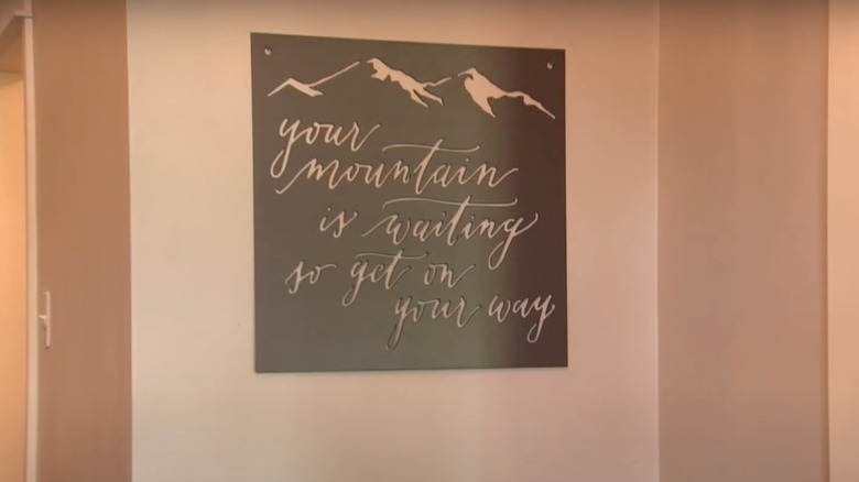
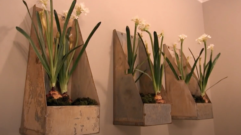
Designers on popular HGTV shows make it seem like just about anything can be art. Whether it's old coasters pinned to a wall or cutout birds hung on painted boards, amateur artwork is all the rage on the network. Joanna Gaines from "Fixer Upper" is particularly fond of the DIY artwork trend, often including typography or painted farmhouse signs in her home renovation projects. Since designers on HGTV are often under strict budget and time constraints, it makes sense that they might have to turn random objects into art and decorations. However, it's often better to collect or create meaningful art for your walls to create a more polished and classic finish.
Too much DIY can tank your home value, according to Apartment Therapy. Adding self-made artwork and projects carries risk and can even deter potential buyers when it comes time to sell your home. While this trend often looks great on HGTV, it doesn't always translate to the real world and is ultimately best left in the past.
Indoor firewood storage featured on Fixer Upper
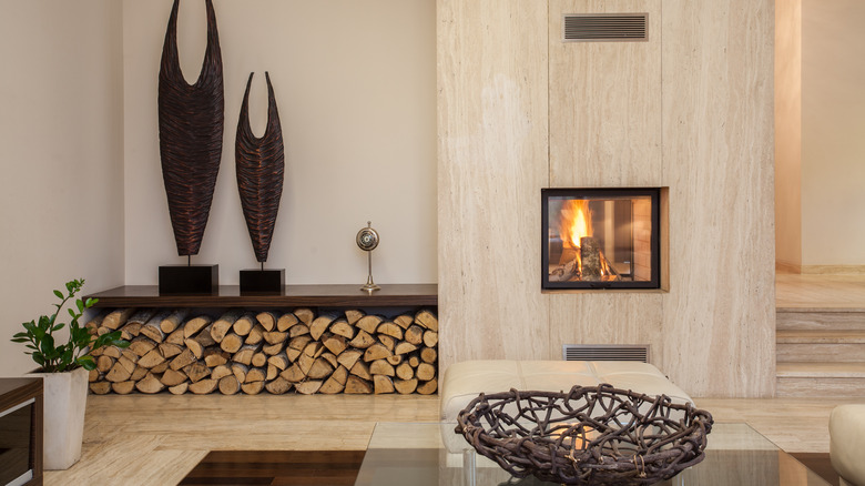
Perhaps one of the most impractical design tips featured on HGTV's "Fixer Upper" is storing large amounts of firewood inside the home. While Joanna and Chip Gaines often include a statement pile of firewood next to beautiful fireplaces, this design element is simply a bad idea. In the modern home Joanna designed for Dean and Brittany Wixsom, she included a slanted cutout for stacked firewood next to the faux concrete fireplace. But even if you live in areas with really cold winters, firewood is best kept out of your home.
According to The Spruce, storing wood anywhere inside your home can lead to unwanted house guests such as insects or rodents. Keep pests at bay by storing firewood outside and remembering to always inspect it before bringing indoors. Look over the logs, shake them, and knock them together to get rid of any pests that are on the surface or starting to emerge. Firewood should ideally be stored outside, off the ground, away from trees and buildings, and sourced locally.
Too much tiling seen on Flip or Flop
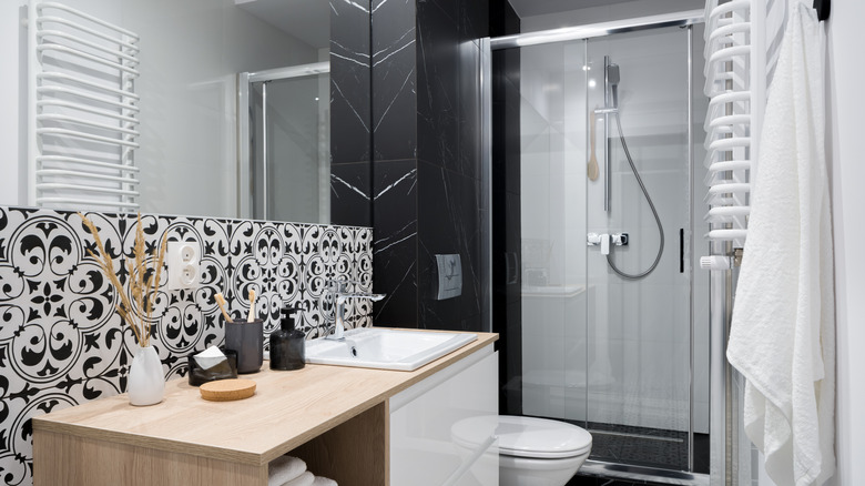
From the bathroom to the kitchen, there are plenty of places to utilize tile within a home. However, sometimes HGTV goes overboard and proves there is such a thing as too much tile. Countless bathroom renovations from shows like "Flip or Flop" use floor to ceiling tile, often using different tile patterns in one room. HGTV designers love using a bold, graphic tile throughout the home.
While tile has the potential to add visual interest, there are also downsides to keep in mind with this trend. According to Insider, tile has a porous surface, which means bacteria can breed extremely fast, especially in high-humidity environments like bathrooms and kitchens. Tile is also extremely prone to staining and cracking, and it can be difficult to keep grouting clean. From a practical point of view, tile is cold to touch and walk on and conducts more heat energy out of your feet at a rate faster than other materials.
Open shelving in the kitchen as on Fixer Upper
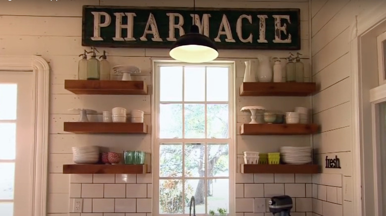
Another trend regularly featured on "Fixer Upper" is open shelving. Devotees of this look either install open shelves in a couple key locations or do away with their cabinets completely. While this look might work for minimalists or people who only own four dinner plates, most of us have too much stuff lying around for it to be a practical option. From cookbooks to Tupperware and other kitchen gadgets, open shelving lets it all hang out and quickly turns into an eyesore for the average homeowner, per Realtor.
At the end of the day, the time it takes to keep these shelves looking neat is simply not worth it. Another problem to keep in mind before trying this trend for yourself is that when it comes time to take dishes down from the shelves, you will have to wash off the dust that has collected. In the long run, this means double the washing. Overall, standard closed cabinets will help keep your kitchen looking more neat and clean.
Open floor plans from Flip or Flop
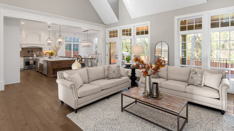
From "Property Brothers" to "Flip or Flop," open floor plans are a staple on the HGTV network. Referring to homes in which two or more traditional rooms (for example the kitchen, living room, or dining room) are combined to create a large, open space, open concept floor plans originally gained popularity in the 1990s due in part to their increased natural light and easier traffic flow. According to Veranda, you can see a distinct correlation between the ubiquity of open floor plans and the popularity of HGTV. However, the pandemic might just have brought an end to this trend.
As we spent more time at home than ever before, the weaknesses of the open floor plan became apparent. From the lack of privacy to poor sound control, having fewer walls has its drawbacks. Forbes notes that more flexible and closed layouts will eventually replace open concept plans as homeowners seek to add more privacy to their living space.
Mid-century modern aesthetic seen on Christina on the Coast
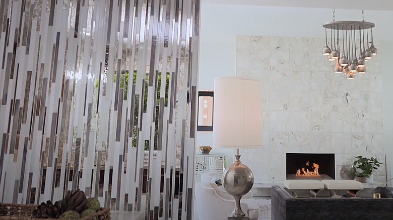
The mid-century modern trend came roaring back from the 1920s and into our living rooms. The aesthetic, which is characterized by sleek lines, ornamentation, organic shapes, and a retro feel emerged in the years following World War II. While it fell out of fashion by the 1960s, mid-century modern made a comeback by the mid-1990s. The design aesthetic makes regular appearances on HGTV, such as in the pictured home renovations from "Christina by the Coast." However, Forbes notes that this is a fading trend moving aside for warmer, more eclectic pieces.
Although certain elements might stick around, living spaces plucked from an episode of "Mad Men" are decreasing in popularity as younger generations move away from trends favored by their parents. While overdone mid-century modern design is best left in the past, a softer and more minimal version, dubbed "mid-century boho" by Apartment Therapy, is sticking around. To get the look for yourself, add lots of houseplants to your shelves, opt for natural textures, and go for worldly patterns to mix it up.
Artificial plants featured on Fixer Upper
Many HGTV stars are strong advocates for fake flowers and greenery in the home. Designers such as Joanna Gaines from "Fixer Upper" love the faux flora trend because it is extremely low-maintenance, lets you work with off-season blooms, and there's no need to worry about watering or wilting. Joanna's Target line even includes plenty of artificial plants and wreaths as home décor. However, experts say that going forward we will see less plastic and human-made materials, according to Forbes.
The topic of sustainability is at the forefront of conversation and people are expected to opt for natural materials, such as stones, natural dyes, and wood for use in their homes and interior living spaces. While fake flower technology has come a long way from those frilly, dusty arrangements, nothing competes with the fragrance and beauty of fresh flowers; counterfeit blooms simply look tacky in comparison. For those who can't stand taking care of plants, there's always dried flowers.
Barn doors from Property Brothers
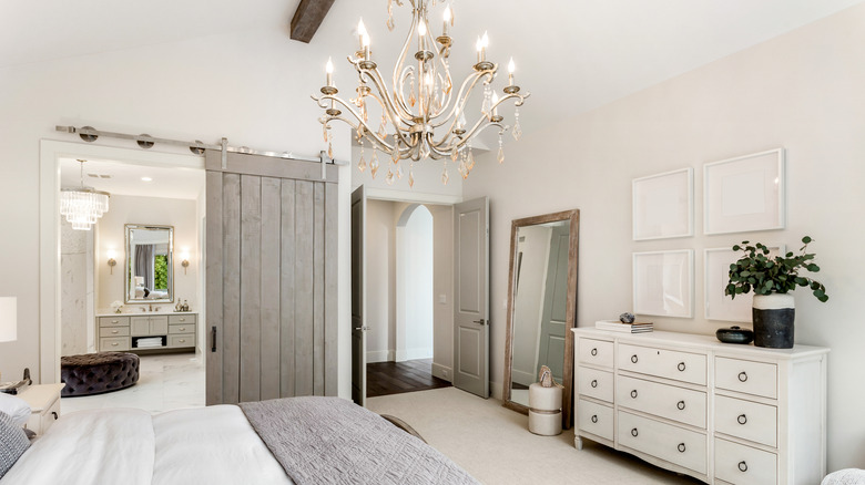
With the rise of modern farmhouse design, barn doors became all the rage. It's almost impossible to tune in for an episode of "Fixer Upper" or "Property Brothers" without falling under the spell of these rustic sliding doors. Not only charming and decorative, there are also practical reasons for the barn door craze. Not every room or hallway has enough space for a traditional swinging door and they are cheaper than traditional pocket doors. However, Realtor reports that designers say that people are moving away from this once-popular trend, as what was once cute and trendy is now tacky and overdone. While the look might work if you actually live on a farm, in most cases it will look too contrived.
Apart from aesthetics, barn doors do not create any seal between the wall and door. This means they have poor sound control and will not block out light or odors. If you still love the look of these doors, follow your interior design dreams. Just keep in mind that most potential homebuyers will consider the trend as an eyesore.
Subway tiles seen on Fixer Upper
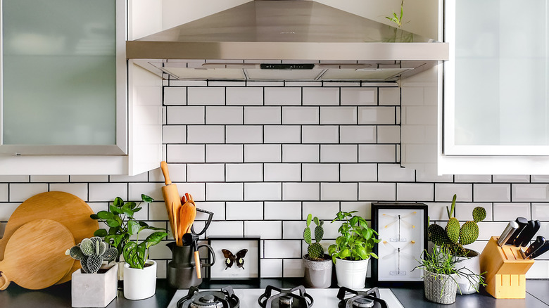
Let's talk tile, specifically subway tile. In the late 2010s and the early 2020s, everyone started using subway tile, which gets its name from the style used in the New York City subway system. These rectangular, low-fired, glazed ceramic tiles are all the rage on HGTV shows and can be frequently spotted in "Fixer Upper" home renovations. They neatly cover bathroom walls and kitchen backsplashes, and offer durable surfaces that are easy to keep clean. Remodelista even calls them the equivalent of a good pair of jeans.
White subway tile might be a staple on HGTV, but it's sheer popularity (over 214,000 Instagram hashtags, notes The New York Times) is beginning to make it feel boring and dated. House Beautiful named subway tile one of the worst design trends in recent years and notes a shift towards larger format tile and slab-sized porcelain sheets. If you want to include subway tile in your home without having it feel dated or trendy, consider adding a unique border with a different material like marble or break up the field of white with color-blocking.
