Modern Home Decor Trends That Won't Age Well
Ever feel at the mercy of constantly evolving trends that threaten the longevity of your modern home décor? Let's face it: Home renovation is expensive and too much work to be repeated every few years. If only a homeowner could know the trends likely to become outdated tomorrow and steer clear of them.
Modern home design trends can be hard to predict. Beaded room dividers, inflatable furniture — most would steer clear of these fads in today's design, as noted by House Beautiful. But back in the day, they were hot. And how about the war against wallpaper that dominated the home scene in recent years, but retreated in 2021 with the introduction of many bold colors and dynamic patterns? If you ripped out all your wallpaper, let's hope it needed a refresh.
Since no one can tell the future face of home design, how does one avoid investing in a passing fad? Before starting on your next project, let's consider what experts have to say about home design trends that won't age well. Some of those fading fast may surprise you.
The Millennial Pink trend is over
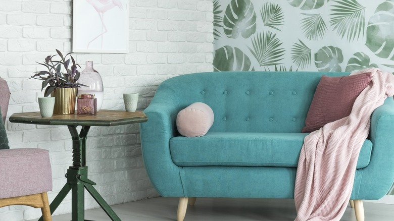
Imagine wearing the same color day after day. Even powerhouse purple or hot pink would become — dare we say — boring. Ditto for your home when a vibrant hue dominates the décor. To that end, there's no question Millennial Pink has fans — those who will try to fit it into the decor somewhere. (Even fuchsia rose became Pantone's color of the year in 2001.) But that may be a hard sell on the real-estate market, so Elle Décor calls for retiring Millennial Pink once and for all because "it's no longer on trend." A good alternative would be yellows or muted green tones that marry with a wide range of styles. Living Spaces also suggests it's time to drop that paintbrush and let "everyone's favorite color" ride off into a similarly hued sunset. Pink is powerful, but a little too powerful to have much of a role in home décor.
To harmonize with 2021's crayon box, Living Spaces suggests red earth tones and other rich, warm hues. For example, it's okay to tread lightly with terracotta, perhaps sprinkling it in as an accent. In need of inspiration? The color palette for 2021 offers jewel tones like sapphire blue, ruby red, amethyst purple, citrine yellow and emerald green as well as neutral and earth tones. For those still holding onto their pink, there's a compromise: a dusty pink, pale enough to be a neutral. Who knew?
Granite: Will it date a kitchen or remain timeless?
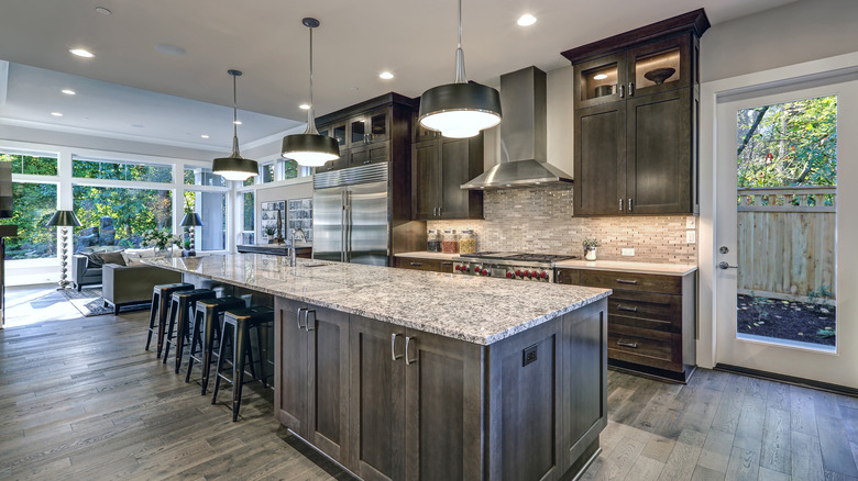
Don't take for granted that granite will always be a surefire hit. A natural stone popularized by home-improvement shows, granite has reigned as style king for kitchen countertops for decades. But nothing lasts forever in television land, and granite seems to have lost the ratings war — a phenomenon noticed by real-estate agents in Apartment Therapy. "Joanna Gaines has changed the preferred look to white quartz or quartzite countertops," says sales agent Maggie Richter of Baird & Warner. "The various granites that were hot in the early 2000s definitely date a home now." Living Spaces had another gloom-and-doom prediction for granite, with interior designer Brynna Evans describing it as a played-out trend.
Many of us grew up with some version of granite and — ho-hum — it's time to switch it up. Like Gaines, Evans is pointing to quartz, and says it's a better companion to accessories you want to show off that may get lost in a sea of busy granite. Those leading the quartz fan club envision easier maintenance, but then again, granite was never as demanding as marble.
Still, is granite getting a bum rap? Industry professionals anticipate rising sales for this and other natural stones based on economists. True, marble and quartz countertops are growing in popularity, but granite is likely to hold its own, they say. Whatever you decide — it is your house after all — it may be wise to look at granite with caution.
Shiplap: rustic and versatile, but far from timeless
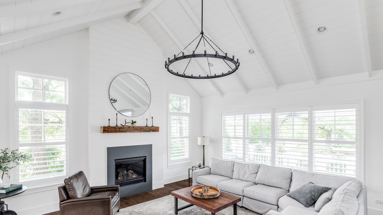
With so many ways to give a home character, shiplap is a trend that's lost its edge. Shiplap is literally the stuff boats are made of — a grooved wooden board laid horizontally in an overlapping pattern. In a home, shiplap proved to be the versatile solution for everything from coastal décor to mudrooms and ceilings, so much so that it became the staple of TV home-reno shows in the 2010s.
But can there be too much of a good thing? Today, shiplap is getting pushed back to the boatyard, making way for all kinds of unique textural elements. "Shiplap appears in nearly every TV home-makeover show, but there are so many other emerging ways of bringing texture into a space," designer Rachel Street, of DIY Network's "Philly Revival," told Insider. Think plaster, rattan, tile, and even garden walls with living plants, she says.
Want shiplap with its rustic charm to still have a moment in your house? There's one big drawback: Switching it up when the look gets dull is a hassle. "These wide wood plank walls are a magnet for dust between the slats, and they create hundreds of holes in your drywall that will need to be patched when you get tired of the look," says DIY blogger Vineta Jackson to Bob Vila.
Warmer shades are invading white and gray territory
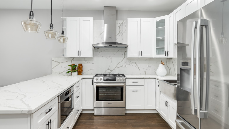
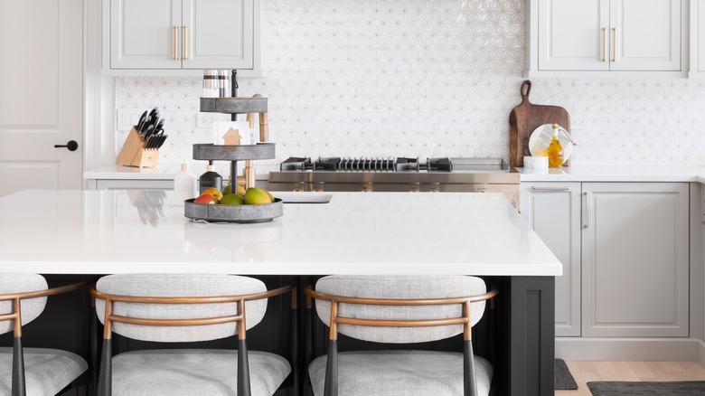
We've seen white and gray dominate kitchens and other rooms as well, but now variety is having its day. Designers are predicting bolder alternatives to cool gray kitchens and an end to the minimalism of completely white kitchens. "Kitchens are leaning toward a warmer feel, and people aren't afraid of color right now," Jesse DeSanti, creative director at Jette Creative, told MyDomaine. For those hooked on white, the look can be salvaged with warm elements like natural wood hardware instead of brass, says DeSanti.
As the minimalistic look of white begins to fade, other options to update a kitchen are varied light-colored shades in textures and patterns, says Insider. Designers don't expect that Carrara marble countertops will fade out with white kitchens, but many are substituting quartzite and other stones that mimic marble, says Forbes.
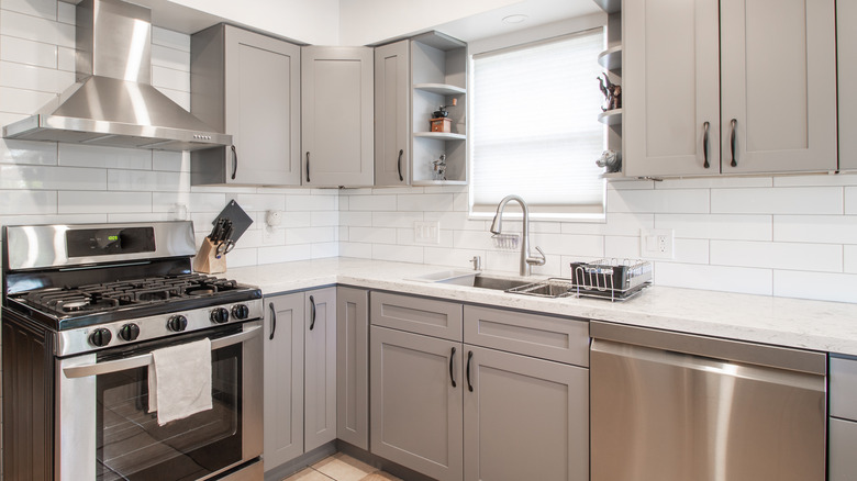
Just like white, gray can give a kitchen the big chill when allowed to dominate cabinets and walls. "Gray kitchen interiors can look cold and lack distinction," says Dennese Guadeloupe Rojas of Interiors by Design. "Instead, I foresee bolder colors gaining popularity." Navy blue anyone?
Edison bulbs are losing their luster as a home trend
The glare of exposed Edison bulbs may not fade anytime soon, but the sun has set on their popularity, designers say. Edison bulbs are a throwback to Thomas Edison's invention over 100 years ago and became the natural choice for just a touch of vintage in many designs. The antique look of exposed filament in traditional glass was a unique detail that enhanced almost everywhere, from homes to restaurants. Vintage bulbs reigned with versatility, as the perfect accent for antique furniture and modern aesthetics just the same. Could it be that Edison bulbs worked a little too well and now some designers would like to stick them back in a museum?
While the antique touch may fit just right with some décor, the Edison bulb has two cons to consider: their cost and fragility, which may not suit homes with kids and pets, says DIY Network. When it comes to cost, conventional Edison bulbs just aren't as energy efficient as the LED versions, which in turn, don't do the job of regular LED bulbs.
Cover your ears, Thomas. These once-fashionable bulbs are named about the most outdated home décor styles in Elle Decor. Instead, try a chandelier for real statement lighting.
Modern farmhouse is fading, especially in city settings
Designers are getting away from the modern farmhouse look for suburban homes altogether, says Forbes, but others hold out hope that a hybrid of modern farmhouse will let fans have their style kicks. Yet another trend popularized by Chip and Joanna Gaines of "Fixer Upper" in the 1990s and early 2000s, modern farmhouse evolved as a fresh take on country life with rustic elements like barn doors and shiplap walls. Some loved modern farmhouse so much, the style made an unlikely journey far from the cornfield to city apartment buildings. Now homeowners are advised to consider their setting; for a farmhouse yes, but a high-rise — that's a stretch.
"Shiplap wall treatments, barn doors and other hallmarks of the modern farmhouse style are still beautiful but look clearly out of place in city apartments and suburban homes," Kelley Mason, manager of creative and content at Lulu and Georgia, told Forbes.
While not totally out of style, the modern farmhouse look is morphing into industrial farmhouse, which tones down the white and shiny surfaces. With industrial farmhouse, expect to see darker mixed metals, natural edges, wooden elements, and burnished finishes (the luster effect on concrete), says Realtor. Other hallmarks of industrial farmhouse are tin tile, concrete sinks, geometric lighting, and matte black.
Open shelving: If it is on trend, it may not be for long.
There's nothing like open shelving in a kitchen to give accent pieces center stage, but in the real world, they can also draw clutter and dust. Real estate professionals say this is a case in which aesthetics often conflict with reality. Indeed, this home style that's making waves right now has an impractical side that pros predict will be its demise. "Many homeowners that see it in new construction question how to use it long-term," Arlene Quirk, a sales agent for Keller Williams told Apartment Therapy. "Cabinets with doors hide a multitude of sins!"
Of course, the shelves are meant to showcase carefully curated objects that enhance your design. However, the temptation will always be there to fill them with clutter — maybe even toasters and the like if space is tight. Then there is the maintenance nightmare, described by Realtor, which leads homeowners to soaking their decorative dishes and vases in hot vinegar to remove accumulated grease. So, examine your habits before making open shelving part of your new kitchen design.
It's back to the farm for barn doors
The barn door is a trend that's seen its day. Since barn doors are a rustic touch closely connected to modern farmhouse, here's one fading style you might have anticipated. Also inspired by "Fixer Upper," the barn door was quite a conversation piece at gatherings but has its drawbacks. "They can look great in the right setting, but they can also be tedious and noisy to slide open and shut every time," Tina Huffman, blogger for Greenhouse Studio, told Family Handyman.
The primary drawback, according to Huffman, is that barn doors don't close tight like a traditional door. In a private setting, like a bathroom, it can make for some embarrassing moments. So as the barn door goes out to pasture, designers offer a few standout alternatives: French doors, a classic look with panes of glass; and pocket doors, which tuck away into a wall, according to Insider.
Accent walls: not the wow they once were
We've gotten used to wowing over rooms with accent walls — and perhaps that's the trouble, as they're no longer cutting edge. Born to be a room's focal point with stand-out wallpaper, paint, or other creative element, accent walls put a lot of pressure on the inner muse. Now, instead of contributing to the character of a living space, accent walls have become just a slightly different version of what the neighbor has next door.
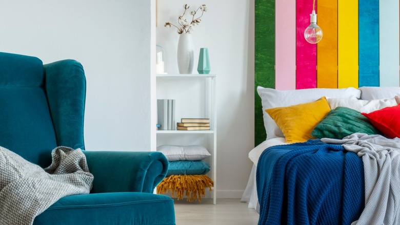
If not done right, accent walls also can take away from a room's overall décor, becoming tiresome when most people seek timeless. "Accent walls can look childish and be too distracting," Dennese Guadeloupe Rojas of Interiors by Design told Insider. "We'll hopefully be returning to monochromatic walls that blend seamlessly with the décor without the startling drama of an accent wall."
The Spruce reported a similar adieu to accent wells, a fading trend Rivka Davidowitz, founder of Organize It, says is "no longer the focal point." Instead, she suggests making an impact by with a winning combination of colorful décor or furnishings and mono-colored walls.
Furniture sets: too matchy-matchy to be on trend
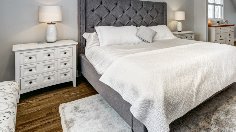
It's nice when things match, but can it become too much of a good thing? Absolutely, say designers, especially with bedroom and living-room sets, where each furniture piece mirrors the next without any attempt at imagination. While it's true complete bedroom sets had their moment, today they can make the room feel "downright impersonal and sterile," more a blah hotel room than a stylish home, says Apartment Therapy.
Some designers have identified those matchy-matchy sets as a trend on the brink of probable extinction. "Identical furniture and matching sets don't showcase personal style," Kobi Karp, principal designer at Kobi Karp Architecture and Interior Design, told Insider. "I believe matching sets will soon be seen as a design flaw."
A better option is buying individual pieces that complement each other and don't look like they came off the showroom floor. Pieces can be of different origin — perhaps a tufted headboard and a storage chest or bookshelf — but still find harmony through a common color or design. Talk to your inner muse and consider your goal: Is it a bedroom retreat with a spa-like feel? This is your space; make it so.
TV-centric home styles are coming to an end
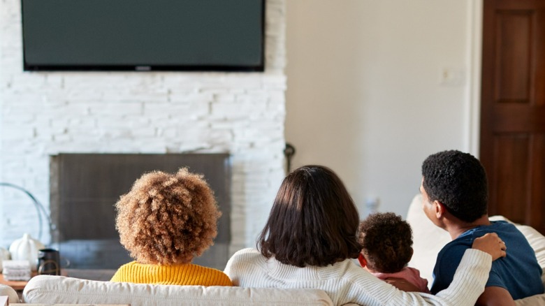
Americans may have finally had their fill of TV after so much binge watching during the pandemic, as noted by Architectural Digest — or at least they don't want to center their lives around it. The hope is that people will want to turn their attention to something other than the tube, and that instead of TV rooms, we'll have spaces designed for conversation. There's certainly a lot of catching up to do with family and friends kept at a distance during COVID-19.
The prediction: Home designs that revolve around the tube will become out of date. Perhaps folks will even hide the TV to look like artwork instead of what it is: the ultimate time-consumer. Additionally, flat-screens are an obvious eyesore, so designers have been crafty about not letting them spoil the décor. To that end, House Beautiful suggests putting the TV in its place behind cabinet doors, hiding it inside a bi-fold panel painting, or camouflaging it on a gallery wall. Samsung Frame TVs also displays art images that are perfect for the latter. Let the conversations begin.
Home décor that's not earth-friendly
For many, it's just as important to have a timeless home as it is to avoid trashing the earth in its design. For that reason, designers predict that homeowners will explore the origins of their style elements, seeking sustainable products and those made from with ethical labor practices. Since many people don't have the time to research every company before adding products to their cart, the successful vendors will be those with transparency. "I think consumers should expect to know how things are made, who makes them, are they working in fair conditions, are the people selling it to you happy as well," Sara Berks, founder of MINNA, told Architectural Digest.
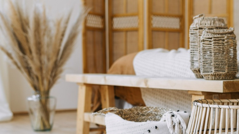
Sustainability is more than a trend, says Berks, but a shift in values is influencing home-shopping decisions, too. "We're seeing a softer, earthier look come out to play, filled with natural materials such as cane, jute, leather, ceramic, plants and other organic fibers," Alessandra Wood, vice president of style at Modsy, told Insider. "These spaces feel more tied to nature and have a calming effect with oodles of texture."
Disappointed to find your favorite style on the fading-fast list? Take comfort in what's at the root of all trends: a comeback spirit. Even barn doors may enjoy a new wave of popularity one day for those willing to wait. For those who dare to buck the trends, indulge a lot or a little with confidence that what's old will be new again.
Subway tiles are overdone
When asked about subway tiles, "Rock the Block" contestant Bryan Baeumler of "Renovation Island" told Realtor, "Get rid of them. We're over it! They're done." It looks like he won't be adding any during the competition! This is a strong reaction to a common design choice, but when you look at little deeper, the reason for his disdain becomes obvious. The real reason subway tiles are done is that they are overdone. The look gets its name from the styling of the New York subway system. A nod to the Victorian-era beginnings of the line, the easy-to-clean tiles have been used in kitchens and bathrooms for nearly a century. Yet they didn't reach mainstream levels of mania until Chip and Joanna Gaines started using them on "Fixer Upper," much like shiplap. These days, nearly every house flipper and their dog is reaching for subway tiles to make things pop.
"I think subway tile will always be here. But I think it's going to be a much more toned-down look. I do believe that the subway tile is such a classic look. I see it going on for a very long time," real estate agent Melanie Giglio told HomeLight. She has a point that the look has technically been around for over 100 years and will likely be seen in some version for years to come. What she doesn't touch on, and what Baeumler does, is that seeing subway tiles will easily date a space to the mid-2010s ... just as easily as formica countertops do to the 1970s.
Pure white marble countertops are passè
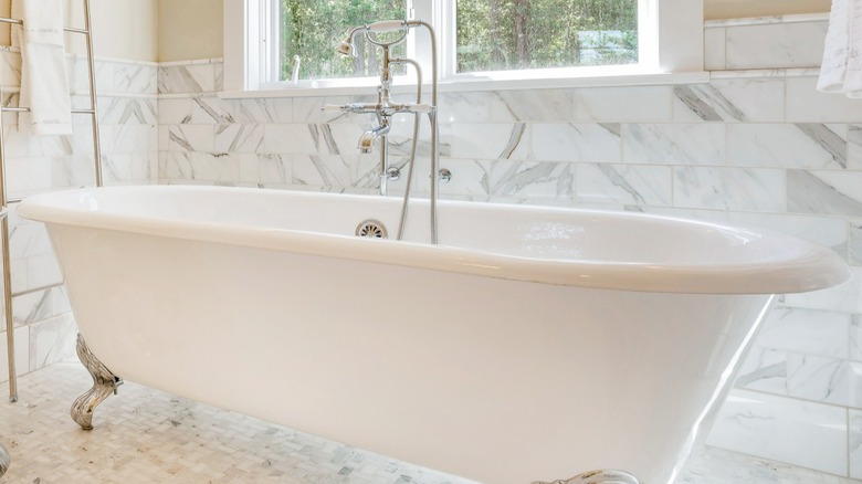
Marble is a durable countertop material that's been around for years, but stark white gets too messy in the kitchen. Instead, if you are considering installing marble countertops in your home, select a pattern with a few swirls of color to keep things timeless instead of dated. Classic options include black, gray, and even rose lines dancing throughout the stone. In addition, some marbles offer patterns that look more like veins rather than swirls in similar colors. In an interview with Realtor, Ty Pennington, the emcee and referee of "Rock the Block," stated that all-white countertops are "a little basic." At the same time, "Rock the Block" contestant Jonathan Knight of "Farmhouse Fixer" adds, "[they have] to be classic, not boring white." The classic he is referring to, we assume, is the famous swirled pattern which adds a touch of glamor to any space.
In addition, "Rock the Block" star Sarah Baeumler from "Renovation Island" is a big fan of marble, but only if it's styled correctly. "Marble is a beautiful and timeless feature that can be added to any room. This naturally occurring stone provides a sense of elegance and luxury, while also adding value to any space," she told HGTV. "It may be used in any stone application, including countertops, fireplaces, and tile." The key is avoiding pure white, as this is a 2020s look that will soon feel dated.
Stainless steel is too cold
Stainless steel appliances were once the gold standard for those who want our kitchens to confirm that we've "made it." Yet the silver look might soon be on its last legs. "Rock the Block" competitor Michel Smith Boyd from "Luxe for Less" said, "Ready to move on," when asked by reporters at Realtor about stainless steel appliances. Agreeing, "Rock the Block" rival Page Turner from "Fix My Flip" told the team that she only likes appliances in "black, white, [or] pink." Longtime fans of the star might be confused by her apparent change of heart, but she has a good reason for it. "I used to be a basic flipper. But now in the new world of acceptance and human life and character and color everywhere, I find ways to add that pop without it being too crazy," she told Showbiz Cheat Sheet. She likes adding color in any way she can, and fun appliances are the perfect way to do this. "Most of my flips, 99%, I do include ... higher-end appliances," she continued.
Other than stainless steel just being boring, another reason more and more designers are turning away from it is its tendency to show smears and fingerprints. White appliances, or fun-colored ones, are a bit more forgiving when it comes to spilled cereal or toddler smacks. This is especially handy if you don't want to add "wipe dishwasher" to your daily list of chores.
