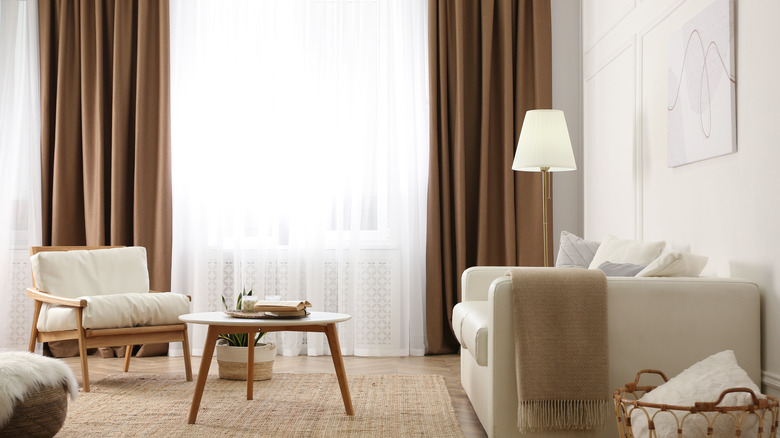
Common Mistakes People Make When Designing Their Living Room
While every area of your home has design challenges and issues that may need to be addressed, the living room can feel a bit overwhelming to some because, well, there are so many things to consider! You want the space to be beautiful and to look the way you want it to, but it also needs to be inviting and cozy, the kind of space where you can kick back after a long day and just relax. You need the right kind of seating options for curling up with a good book, or settling in to binge watch a few episodes of the latest show you're loving. You may need to consider practical needs, like where you might put a television so it doesn't overpower the room and take over the decor entirely. You also want the room to have the things you need, but don't want it to feel overcrowded or chaotic. And, to make things even more frustrating, it can be difficult to figure out exactly what design elements in your living room aren't working, per HGTV.
Luckily, there are a few common mistakes that many people make in their living room design in particular, and if you're aware of them, you can begin to address them in your own space. Here are just five mistakes that you may wish to consider if you're debating sprucing up your living room.
An area rug that's too small
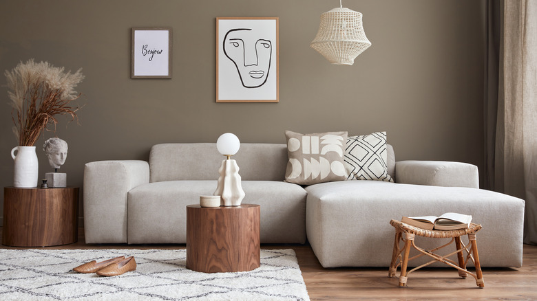
While buying rugs that are too small is a common mistake in home design across every room, living rooms in particular can be tricky because they often require a rug that is far larger than people initially think. Chances are you have a variety of seating in your living room, and as stylist Emily Henderson explains, a rug essentially grounds the whole seating area. Unless you have a very small living room, you likely shouldn't even be looking at common sizes like the 5x7 foot, or 6x9 foot area rug. Henderson suggests a size of 8x10 feet or 9x12 — it may seem absolutely huge in the store and when you're unrolling it at home, but it'll likely be just right. The larger size allows you to place at least the front two legs of all your furniture on the rug, adding some cohesion to the space.
There's no denying that area rugs are pricey, and typically the bigger you go, the more expensive they are. However, selecting a rug that's too small for the space is a design issue that can immediately make your space look cheaper, no matter how well-designed the rest of it is. It is a splurge, and may even be one of the more expensive purchases after key pieces like your sofa, but a properly-sized rug is worth it for how it can transform a space.
Making lighting an afterthought
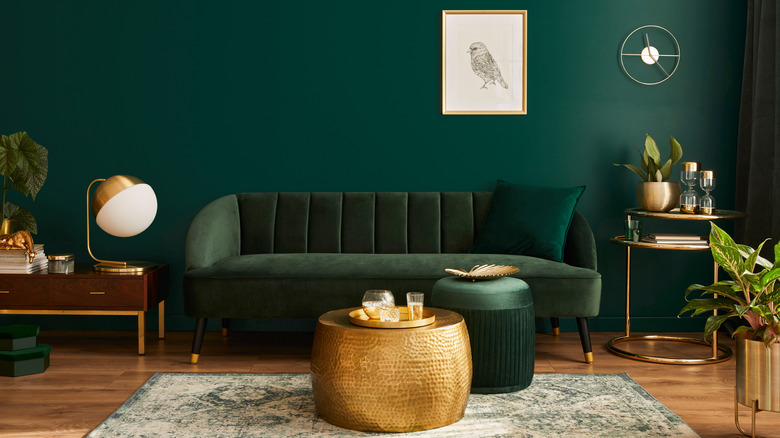
If you simply use the one overhead light hanging in the middle of your living room as the only source of light, you need to reconsider ASAP, according to Bright Side. If you have enough light that your space is adequately illuminated, you may be tempted to just call it a day, but lighting is actually a major factor in the overall look and feel of a space. As Romanza Interior Design explains, you want a mixture of types of lighting in order to create a layered, lush, and luxurious look. Sure, you can keep that overhead light for when you want to illuminate the whole room. However, you should also incorporate a few other light sources.
Task lighting, for example, could be placed near the armchair where you love to read or craft to ensure you're not left squinting. Accent lighting adds a ton of ambience and style to the room, and can be placed throughout the space to create a particular mood. Finally, don't ignore the power of natural lighting — if you're lucky enough to have large windows in your living room, you may want to consider blinds or curtains that allow some sunshine to come in during the daylight hours. Having a few different lamps and light fixtures throughout your living room will allow you to tailor your lighting to your needs.
Not having enough seating
One of the main functions of a living room is, well, living — it's the place where you watch your favorite shows, settle in with a book, or gather for great conversation that stretches into the wee hours of the morning. Seating is one of the most critical components of a good living room design, and it's one that's often overlooked. Many make the mistake of simply not having enough seating, as Apartment Therapy explains. After all, while you may be fine with just a loveseat when it's just you and your partner, the minute you have guests, you'll find everyone awkwardly trying to squeeze into that one tiny piece of furniture.
The amount of seating you can fit definitely depends on the overall size of your living room, as you don't want to cram armchairs into every corner to the point where you can't even navigate the space. However, it's a good idea to add a few options whenever possible — in addition to that sectional couch, toss in an ottoman or two that can be used as seating in a pinch, or add a piece like a chaise lounge that can seat multiple people if needed. The variety of seating options will look visually stunning, and the abundance of seating possibilities will give your living room a cozy, welcoming vibe.
Getting the layout wrong
There are times when the issue with your design isn't actually the pieces you have in the space — it's simply the way you've chosen to arrange them. Now, this mistake may be dependent on the space you're working with. In a small living room, for example, you may really only have one suitable location to place your couch or sectional. However, in most situations, you likely have a bit of flexibility and the ability to move things around a little.
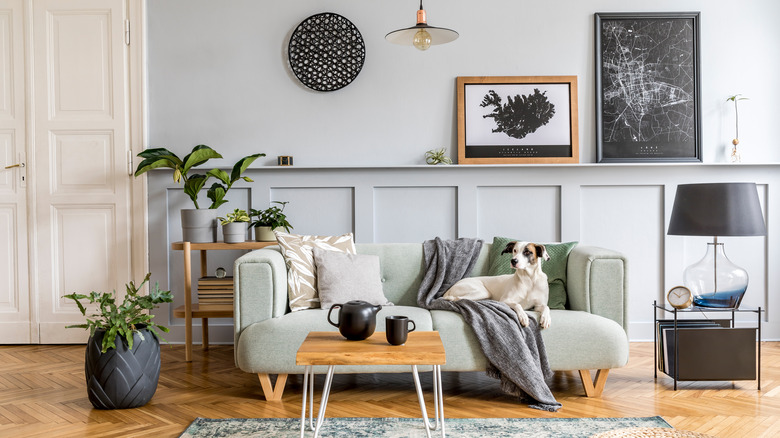
As My Domaine advises, resist the urge to simply push all your furniture against the walls in order to maximize space; it creates a bit of an awkward overall feel to the room. Instead, take a moment to study your living room and think about how you use it. One good tip for layout design is to create conversation groupings — pull those two lounge chairs out of the corner and bring them closer to your couch, for example. Or, as From House to Home recommends, bring that chaise lounge to the other side of the coffee table, opposite the couch, rather than beside it. This helps to encourage conversation in a living room (and it can always be moved back for movie-watching nights when you want everyone facing the television). Another tip is to include enough table options that everyone has a spot to rest a drink or book. Basically, you want the space to serve you and your guests.
Mounting your curtains too low
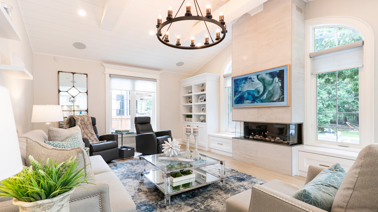
Where you mount your curtains matters in any room of your home, but often since living rooms tend to have larger windows, this common design mistake is most noticeable there. As Apartment Therapy advises, resist the urge to simply mount your curtain rod right above your window — instead, use your imagination and the power of illusion to elevate your space. It may seem strange to mount your curtain rod several inches above the window frame, with the rod just floating in mid-air. However, when you actually hang the curtains from the rod and the fabric cascades down, those inches of wall space will be covered by the curtains, and what will happen is that the eye will be drawn upwards.
This hack is incredibly simple (it just involves moving that curtain rod upwards a few inches!) and can have a major impact in your living room, making your ceilings seem taller and your window seem larger. The only thing to be aware of is the length of your curtains — if you're going to use this illusion, you need to ensure the curtains you've selected still manage to skim the floor, which may involve looking for a slightly longer than normal length for your curtains.
