How Home Improvement Stores Trick You Into Spending More Money
From your mailbox to the checkout line, home improvement stores are like every other retailer: They use many strategies to get you to spend. Many of their tricks are time-tested and based on science and human psychology. Did you think Home Depot chose orange for their logo, signs, and advertisements because it's a nice bright color? Were you under the impression candy stocked at checkout is there purely for your convenience? And what about those long aisles and the confusing layout? Were you blaming yourself for not being able to easily find the one item you came for?
None of this is random. The colors used, the width of the aisles, and the candy by the register are all well-thought-out strategies designed to get you to not only buy what you have on your list, but to spontaneously pick up extra items. You may think you're in control of your shopping and spending, but are you really?
Eric Siegel, a consultant and chairman of the Predictive Analytics World conference, told The New York Times, "We're living through a golden age of behavioral research. It's amazing how much we can figure out about how people think now." Called neuromarketing, this field uses scientific research to predict — and influence — how consumers behave and make decisions (per Harvard Business Review). Retailers use the data about customers' preferences and habits to fine-tune everything from marketing to sales strategies, thereby getting you to spend more. Here are some tricks home improvement stores use.
Home improvement stores entice you with commercials and advertisements
Before you leave your house, the marketing strategies of home improvement stores are influencing your buying decisions. Circulars arrive in the mail. TV commercials are ubiquitous. Sales promos pop up on digital feeds. Emails populate your inbox. They're persuading you to spend from a variety of angles. According to data released by Nielsen, 85% of households read the circulars, and 79% of customers use those available in stores (per Retail Wire). Print circulars, while thought to be passé, are actually influential marketing materials that lure shoppers in-store.
Some consider TV commercials to be Home Depot's most prominent sales tactic, but the company has created a diverse marketing strategy, which includes sponsoring sports teams, promoting the activities of its social responsibility programs, and targeting home improvement professionals (via Panmore). Aren't you pleased — and more eager to spend — when a company supports a beloved team or contributes to worthy causes?
Meanwhile, digital entities are experiencing a huge increase in customer use, making it easier for shoppers to find what they need (and often what they just want). About 75% of households shop store websites and depend on emails for information, while social media platforms are experiencing the strongest growth, with about 52% of customers using them to find details about products and in-store sales. One advantage to digital channels is that they represent real-time product availability across the entire chain (per My Total Retail). And what customer doesn't want convenience?
Home improvement stores set the shopping scene as you enter the store
Even before you enter the home improvement store, you will see displays of inviting products on promotion. In the summer, for instance, home improvement stores might place racks of hanging flowering plants intermixed with stacks of plastic chairs and maybe a barbecue grill. Of course, this is all to catch your eye.
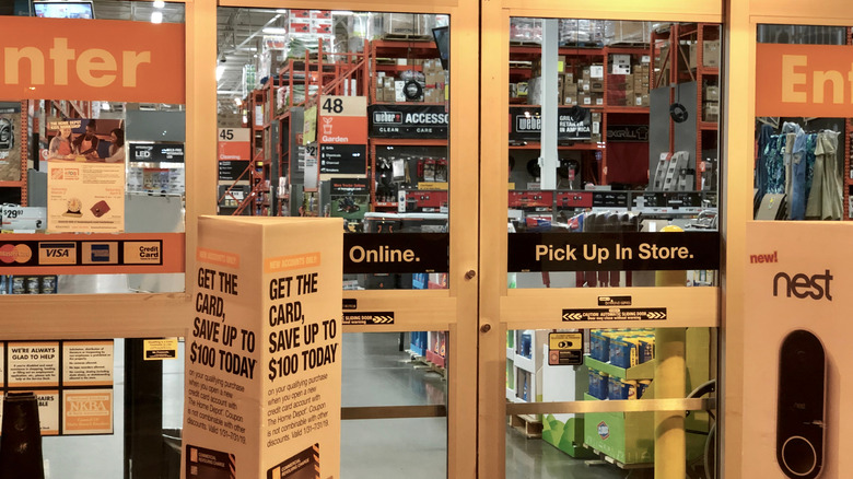
Once you cross the threshold to the inside, you've entered what's called the "decompression zone." This part of the store is designed to get you in the right state of mind for shopping — and spending (per Money Crashers). In home improvement stores, shelves of staples like cleaning supplies greet you as soon as you walk in. There may be signs posted with the current promotions, including large A-frames placed outside or just inside the entrance that show the store's best deals. There will likely be a rack of print circulars, too. Displays of products in this area aren't necessarily meant for you to take, but to give you the idea that there are many terrific deals to come throughout the store.
Home improvement stores use specific colors based on psychology
Retailers choose specific colors to represent their brand, and typically use them on signs, labels, packaging, doors, etc, notes CNN. Marketing researchers say customers not only subconsciously associate colors with certain characteristics, emotions, or social messages, but that 90% of their decision about whether or not to purchase an item is based on color. Retailers know that colors used for displays or product packaging are crucial for influencing the customer's decision, as noted by Money Crashers.
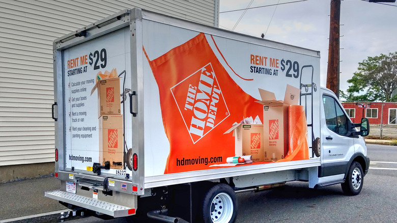
Lowe's uses midnight blue in its brand representation (per Scheme Color), perhaps because blue is a favorite color for many; it suggests trust, dependability, and security. Blue has also been shown to strengthen customer loyalty. Home Depot, meanwhile, has chosen orange for its brand. Orange represents fairness and affordability; Home Depot wants you to have the impression they offer good value. Menards has a logo that incorporates white letters outlined with black, and beneath the name is a brushstroke of yellow and orange, adding the impression of youth and optimism, according to 1000 Logos. Menards' logo is often positioned on a bright green background; green is associated with wealth and is considered the color easiest for the eye to process.
Research has shown that color attracts different kinds of customers. For instance, impulse buyers respond best to red and orange, while customers who have a budget are more drawn to colors like navy and teal. Green may be used to help customers relax (via Crobox).
Home improvement stores pipe in music that will make you buy more
The music a retailer chooses to play in its stores is extremely important, as the right music can "set the mood and control their customer's energy levels," Alexander Reichmann, CEO of iTestCash, tells GoBankingRates. Research has found that even random background noise at a moderate volume can trigger creativity and encourage customers to buy products that are innovative over more traditional products (per Money Crashers).
Choosing music isn't a simple decision for a retailer, as music has many characteristics that can influence shopping behavior, such as tempo, key, volume, familiarity to customers, the emotions it triggers, and genre, among others.
One study showed that slower music caused shoppers to walk more slowly than faster music, but they spent more, according to the American Psychological Association. As for music that customers recognize or not, researchers say that when well-known music is playing, shoppers feel like less time has passed, but they're more stimulated than if the music is obscure. In other research, shoppers who tended to be impulsive buyers spent even more ($32.89 on average) when music was playing (via the American Psychological Association). And another study concluded that happy and popular music, as opposed to sad or non-popular music, raised purchase intent (per the Independent Journal of Management and Production). Is it coincidental that Lowe's playlist includes pop hits — some uptempo, some not — by the Jonas Brothers, Ed Sheeran, and Demi Lovato? Of course not.
Home improvement stores set their shelves a certain way
Items are not placed on store shelves willy nilly at home improvement stores. Retailers use specific strategies to position their products, usually based on price. When you're walking down an aisle, your eyes are at a certain level — and that level is prime real estate when it comes to sales. Stores typically place higher-priced items at eye level, not only because they're most likely to be the first things you see (and possibly purchase), but also because brands pay a hefty fee for that premium spot (according to Money Crashers). Off-brands can't afford a pricey position on the shelf.
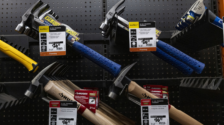
For instance, let's say you're looking for a hammer. According to Wirecutter, the brand Estwing was determined after testing to have the best 16-ounce, curved-claw, steel-handled hammer. It's likely positioned at eye level at the home improvement store not because it's the best hammer, but because it's about three times the price of the comparable store brand hammer. For your purposes, you may not need the "best" hammer, so resist the urge to grab the first one you see. Whatever you're buying, always be sure to check out higher and lower shelves, where you're likely to find much less expensive store brands.
Home improvement stores provide outsize shopping carts
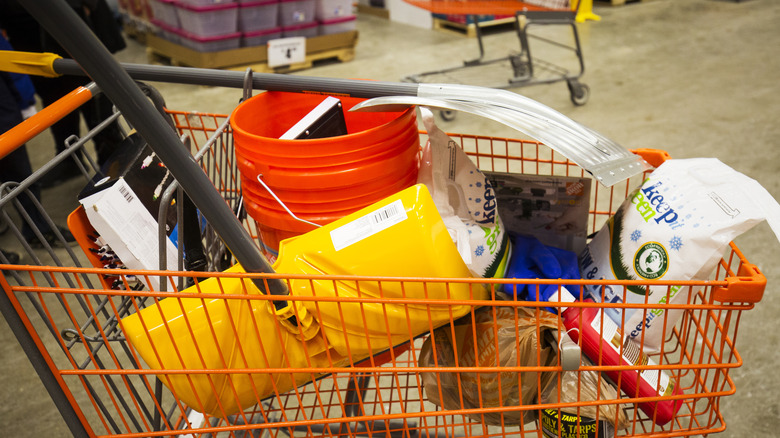
If you shopped back in 1975, and you're still shopping today, you may have noticed that the shopping cart has gotten way bigger — three times as big as a matter of fact (per Slate). But even if you weren't yet around to shop in 1975, you no doubt have noticed that shopping carts are just huge.
That's a good thing, right? Because in a home improvement store, you may have to put large items in it, like a pair of branch cutters or a microwave. The store is only thinking of your convenience when they provide these roomy carts — well, maybe, or maybe not.
Marketing consultant Martin Lindstrom conducted an experiment in which shopping carts were doubled in size. The finding? Shoppers bought 40% more, as noted by Today. Another study focusing on shopping in grocery stores found that customers using a cart walked through the store much more slowly than those who used a basket or nothing at all. They also covered a larger area of the store. What's most important, though, at least to the retailers, is that with a cart, the shoppers tended to purchase double what basket users did, and about 700% more than those with no basket or cart, according to the Journal of Business Research. It appears that the more room you have to carry stuff, the more you're going to fill it up. Consumer experts recommend you shop with nothing but your arms.
Prices are weird and random at home improvement stores
Ending prices with ".99" has been around for about a century, as a common and effective sales tactic (per Live Science). How exactly does it trick consumers into buying? Lee E. Hibbett, associate professor of marketing at Freed-Hardeman University tells Live Science that "ending a price in .99 is based on the theory that, because we read from left to right, the first digit of the price resonates with us the most." We also try to put less effort into decision-making, especially when buying lower-priced items, so we may just look at the dollar amount and ignore the rest. We're more likely to purchase an item costing $4.99 than $5.00.
Other pricing tricks are less well-known; a study published in the Journal of Consumer Research found some interesting psychological tidbits. When an item is given an even dollar price ($50), a customer is more likely to buy it if it's a purchase that's recreational, personal, or underscored by emotion, e.g., a handbag. The rounded price leads the customer away from reason, and considering whether or not the item is a good value.
Then there are prices that are non-rounded and appear random ($27.67). When applied to something that's practical or utilitarian, such as an appliance, this type of price makes a customer more likely to purchase it. An off-beat number gives the impression that the item is priced at its absolute minimum and encourages shoppers to buy it based on value.
They get you to spend more time in home improvement stores
Retailers use a variety of strategies to get you to slow your pace because the longer you're in the store, the more you'll spend. As soon as you walk in, you're being directed; research shows that as people enter a store, they tend to look left first, then move to the right and walk counterclockwise around the store, Brian Dyches, chief experience officer of retail branding firm Ikonic Tonic tells Entrepreneur. Home improvement retailers may use that natural proclivity to their advantage — maybe by placing an attractive display of new tools to the right — so customers feel comfortable in the store and, therefore, spend more time shopping.
Aisles are also carefully engineered in several ways to slow you down (per Money Crashers). First, their width: To make room for the huge carts, aisles need to be wide, but not so wide that you walk quickly. Narrow aisles, meanwhile, will slow you down, but if they're too narrow they'll easily clog with traffic and frustrate customers. Retailers have a "just right" width that allows traffic to flow slowly but steadily.
Stores also place "stopping points" in the form of displays, racks, or signs mid-aisle to get you to pause, and hopefully browse more of the merchandise — but they don't want you to stop and turn around. That's why the end of the aisle offers a tantalizing glimpse of something interesting being sold to lure you down.
The layout of home improvement stores is confusing and maze-like
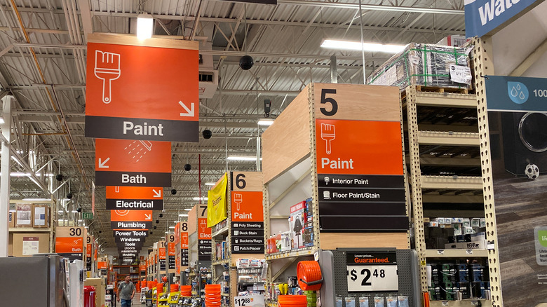
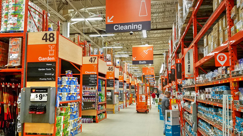
How often have you walked into a home improvement store and meandered up and down the aisles trying to find what you came in for? Probably more often than you'd like — and there's a reason for the confusing layout. "Retailers who want their customers to spend more know that the longer they keep them in the store, the more money they'll likely spend," Josh Elledge of SavingsAngel.com told GoBankingRates. Large, warehouse-like home improvement stores have the room to make their layouts less-than-easy to follow. Smaller stores that don't have the space to incorporate a maze-like effect may have to change their layouts instead if they want to keep customers wandering around.
In either case, don't waste time aimlessly walking up and down aisles (and risk throwing things you don't need in your cart). Instead, recommends Frugal Rules founder John Schmoll, immediately ask an employee to direct you to what you came in for. It's an effective counter-move to their deliberate strategy to keep you wandering the store.
Home improvement stores try to get you to think about your outside space too
When the pandemic was in full swing, people sought refuge from the misery and confinement by taking on home projects. In fact, people spent upwards of $84 billion dollars on improvement and repairs in 2020, according to home insurance group Hippo (via Forbes). Number one on the list for improvements was not the kitchen, home office, or home gym (numbers two through four, respectively), but the outdoor living space, a survey of 1,000 homeowners found. To bolster this trend, both Home Depot and Lowe's developed sales strategies to encourage customers who otherwise weren't interested to pay attention to their outdoor living space.
Home Depot uses its website to lure customers to its stores with the introduction of a special outdoor living section, which includes a variety of inspiration and buying guides, as well as instructions for DIY projects. Sarah Fishburne, Home Depot's director of trend and design, tells Forbes that the retailer expects its customers to be looking for items that can help them spend more time outdoors, such as nighttime lighting, mosquito netting, fire pits, and other heating appliances. Lowe's, meanwhile, souped up its inventory by introducing trampolines, tents, binoculars, and telescopes for some backyard excitement.
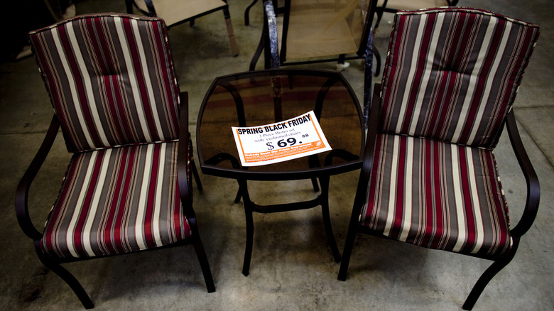
Both stores are encouraging the interest in outdoor living space by showing in-store displays of backyard living spaces, with patio furniture, umbrellas, rugs, and potted plants to inspire its customers and entice them to start outdoor projects.
Home improvement stores use apps to make it easier for you to spend
Among retailers in general, customer use of store apps has risen by over 20% since 2014, up to 56%, as noted by Retail Wire. And both major home improvement retailers know that their customers move easily between online and offline. To keep pace, they have mobile apps. The site Updweller says that Home Depot's app contributes to a better customer experience, as it provides a variety of features: in-store mapping that allows shoppers to find what they're looking for, a voice-activated product search capability, and an "augmented reality" feature that helps customers visualize how items will fit and look in their home before purchasing them (per Retail Dive).
Lowe's also has a store app and a secondary one called Measured by Lowe's, which allows customers to save measurements for their projects. In addition, Lowe's has a social media presence designed to appeal to Millennials with a Snapchat account that houses DIY videos. About 52% of customers now use social media to research product information and availability at stores.
By providing customers with up-to-date digital features on both their apps and websites, home improvement stores make it so much easier for DIYers to search for materials, determine their availability, and order what they need. Convenience is one sure way to increase sales.
Home improvement stores use gender-based sales strategies
About 45% of Home Depot and Lowe's customers are women, according to Floor Daily. That's pretty even, so how do retailers appeal to one gender without alienating the other? Men and women generally have different ways of shopping (although individuals do vary). Marti Barletta, coauthor of "Just Ask a Woman: Cracking the Code of What Women Want and How They Buy," tells Money Crashers, "Men would rather buy a workable product than continue to shop, while women would rather continue to shop in the hope of finding a perfect solution."
Women invest more time and energy into researching products, too. However, because they use both halves of the brain when problem-solving, they're more vulnerable to a sales strategy using emotion. Retailers are experts at arousing emotions by manipulating store design and color, product placement, sales personnel, and pricing to trigger impulsive buying. Conversely, men are likely to have a goal in mind and want to get in and out quickly. Home Depot marketed its app to men by focusing on its utility. The app has a barcode reader that allows customers to scan codes for more info, as researchers know men are less likely to seek out help from employees.
Retailers also use feel-good strategies to engender positive emotions, which hopefully, translate into spending. Home Depot hosts DIY workshops for women (per Updweller). And last year, Lowe's collaborated with three designers to style their runway sets for New York Fashion Week.
Home improvement stores don't give up even when you're on the checkout line
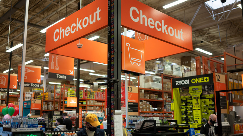
Do you think once you're checking out you're safe from the store's sales pitch? You're not. It's the retailer's last-ditch attempt to get you to buy more. They know that 62% of purchases are made impulsively (per New Neuro Marketing).
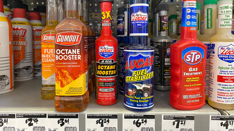
So what do stores do? They line the checkout with tempting items like candy and magazines that you can throw in without affecting the total cost too much. Home improvement stores also have these items, as well as more specific things like batteries and glue. Impulse add-ons are typically low-priced — customers aren't going to grab things that costs a lot without a second thought (per Shopify) — and are curated so as not to require too much consideration. Displaying a lot of options at the point-of-purchase, such as one item in a variety of colors, can "overwhelm customers and make them hesitate long enough to reconsider the impulse," according to Shopify. Retailers, therefore, are selective in which items they choose to include at checkout.
The length of the checkout line is also something retailers consider. Short lines might appeal to customers, but there's less of a chance they'll pick up something impulsively. With a long line, customers might eye the temptations as they wait — or they might start to have buyer's remorse, or become frustrated and leave without buying anything (per Money Crashers). Indeed, the length of line needs to be "just right."

