Interior Trends That Came From TV Shows
When it comes to researching home decor trends and seeking out interior design inspiration, there's a near-endless well of resources, especially these days. But one of the very best places to look for design inspo is often in other people's homes –- and yes, that includes the fictional homes of our favorite TV characters and their families. Watching how others live and use their space can be both inspirational and aspirational, and that's especially true when it comes to our beloved stars of the silver screen.
From the retro vibes of "The Brady Bunch" to mid-century modernism of the "Mad Men" era to the cool, coastal feel of "Big Little Lies," there's truly something for every taste and aesthetic. But we narrowed the list down to these 10 TV homes and production sets that have shaped our culture in countless ways, because they sparked interior trends that have already proven themselves to be timeless.
Mad Men: mid-century modern
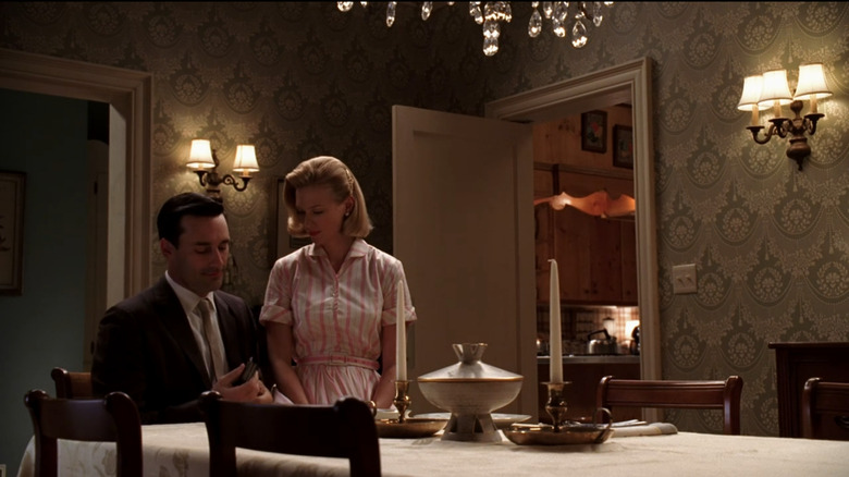
As the National Design Academy noted, set decorator Claudette Didul-Mann created a backdrop for "Mad Men" that acted "as a time capsule from the world of 1960's advertising in New York," and sparked a design trend called "the 'Mad Men' effect." While the show ended in 2015, this "Mad Men effect" led to a massive revival of mid-century interior design that continues to hold the spotlight today. Guided by the archives of furniture designer Herman Miller, Didul-Mann reintroduced iconic pieces like the Eames chair, along with mid-century style's sleek lines, geometric shapes, and bold colors.
Because "Mad Men" is ostensibly a workplace drama, Didul-Mann focused on the idea that the office was the workplace living room. Elegant bar carts adorned with whiskey-filled decanters became trendy as a result, and people swapped out their overstuffed couches in favor of clean, streamlined sofas. But outside of the office, the true appeal of the series comes from how it follows the personal lives of each character — often expressing their true desires through their appearances and their homes. As Ideal Home pointed out, Don Draper lives luxe but "with a dark edge," while Peggy Olson's home is "as quirky and charming as the woman herself." And Joan's home is, of course, "bold, sassy and glamorous," just like everyone's favorite secretary. Each set offered mid-century design inspiration, while still honoring its versatility.
Downton Abbey: English Edwardian-era
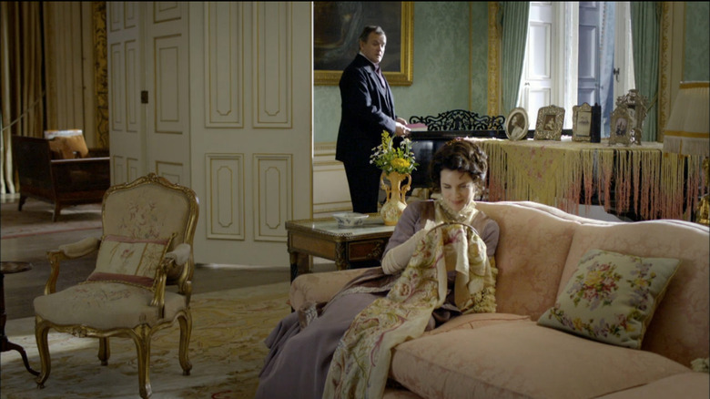
When "Downton Abbey" first aired, the interiors of the Grantham family's sprawling English estate were so coveted that according to House and Garden, the British paint company who created the set's color palette even launched a commercial line of paint for fans. But even more enticing than the bright, vibrant jewel tones of Lord Grantham's manor house weas the grandeur of the stately rooms themselves.
Floral wallpapers, crystal chandeliers, and always-roaring fireplaces became must-haves for a certain sect of interior influencers, and even today, home decor trends of "Grandmillennial" and "Maximalism" keep these looks alive. As this round-up from Better Homes & Gardens shows, stunning living rooms decorated in the style of a manor house's drawing room is a dramatic look that takes some commitment, but it can be done on a small-scale, too. And if you can pull it off, even the likes of the Dowager Countess is likely to be impressed.
The Brady Bunch: fun, funky, and family-friendly mid-century
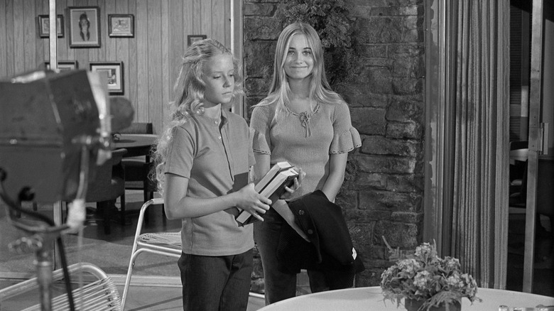
It sounds like a bold claim, but along with the eponymous theme song, "The Brady Bunch" home is arguably one of the most memorable things to ever appear on TV ... even today, decades after the show's finale aired. As the Los Angeles Times noted of the suburban split-level home in Los Angeles' Studio City, even the original architect, Harry M. Londelius, could never have dreamed just how iconic his design would become.
Sadly, Londelius passed away before "The Brady Bunch" premiered, and he was never able to see his design's success. But today, the set for the Brady kids' antics has come to signify a specific era of home design. "The Brady Bunch house became shorthand for crafty late Modernism redolent of Formica and chunky ceramic lamps," the Los Angeles Times explained. As a result, almost any home built in the mid-'60s style hits the same mark. As this article from House Beautiful proves, if a mid-century American home retains its original features –– think technicolor shag carpets, faux rock walls, and wood-paneling –– it immediately falls under the category of homes that Mike and Carol Brady would love to inhabit.
Friends: '90s boho
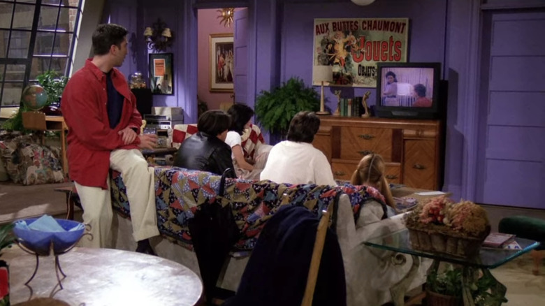
When you think of "Friends," your mind is likely to conjure up instant images of the six main characters in one of three settings: Rachel and Monica's impossibly huge West Village apartment, Joey and Chandler's homey bachelor pad across the hall, or nestled around the big orange sofa of their favorite cafe, Central Perk.
As this article on Sofa.com notes, that orange sofa is a cultural icon in and of itself. But there are so many other interior touchpoints from "Friends" that it's hard to pick one detail. There's Monica and Rachel's purple wall, oversized coffee mugs, and loungers that make you say, "ahhhh" when you recline. House Beautiful even shared a round-up of trends we saw in Monica's apartment and still see everywhere today. While open shelving, copper pots, and lots of greenery wasn't invented by "Friends," they are interior mainstays that still grace our Instagram feeds to this day, proving that the show is as timeless as New York itself.
Sex and the City: (somewhat) accessible glam
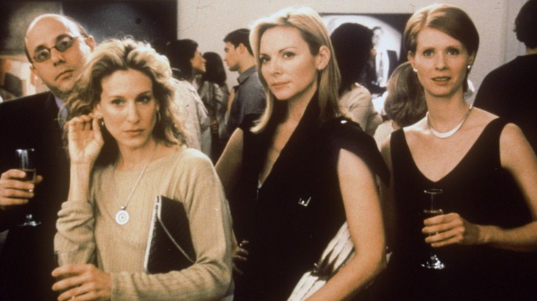
By the time the first "Sex and the City" movie came out, the idea that anything about the series ever felt accessible was borderline absurd. But Carrie's original apartment set the tone for walk-in closets everywhere –– probably because it wasn't a walk-in, it was a walk-through. Now, the closet Carrie gets as a housewarming present from Mr. Big in the film is enough to tell us that she lives in another realm, as the National Design Academy notes. But remember, when "Sex and the City" first began, Carrie was just a writer in a junior one bedroom apartment on the Upper East Side, with an enviable-yet-accessible closet to inspire the masses.
Along with Carrie, each of her best friends was meant to represent an archetype of a 30-something woman. Throughout the series, this was emphasized in all sorts of ways ... via boyfriends, fashion, and — you guessed it — interiors. Sure, the clothes always garnered most of the attention, but the interiors were just as much an extension of each woman's personality. Hooked on Houses took a trip down memory lane with a slideshow of images from the second film, and from one glance at each woman's abode, you can decide: are you a Carrie, Miranda, Charlotte, or Samantha?
Gossip Girl: the luxe NYC life
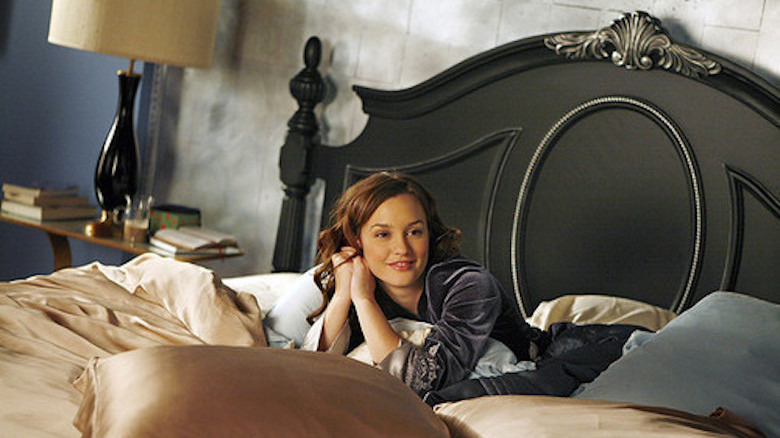
Hey, Upper East Siders. If "Sex and the City" attempted to create a look of accessible New York glamour, then "Gossip Girl" was designed for pure Manhattan luxury. The signature styles of Serena van der Woodsen and Blair Waldorf pulled viewers into two camps: sexy Serena versus preppy Blair. As the team at Brit + Co noted, Blair's Upper East Side townhouse was the epitome of her personal aesthetic: "flirty, classic, and vintage," just like her silk headbands and preppy blazers. The classic style of Blair's bedroom brought back a love of timeless, Audrey Hepburn-era New York, and her pale pink accents, love of silk, and blue walls created a feminine look copied by many. On the other hand, Serena van der Woodsen was always as sleek as her home. With a mom who prided herself in her art collection, the van der Woodsen home put art and fashion at the forefront, encouraging viewers to consider large-scale art for their own walls–such as the iconic Prada Marfa sign perfectly lit on their living room wall.
The show's interior designer, Christina Tonkin, approached each character's apartment in a way specific to their personalities. She described the show's version of NYC as "a fantastical playground for the young, rich, and upwardly mobile," creating coveted aesthetics that viewers were eager to emulate. As a result, each character's look was as iconic the show's signature sign-off. Xoxo, Gossip Girl
Emily in Paris: Parisian chic
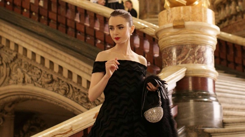
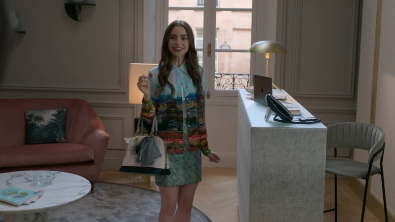
For a show that just premiered in 2020, Netflix's "Emily in Paris" pretty quickly entered the zeitgeist. Whether you loved the fluffy plot and quirky lead character of Emily or instantly gave the entire show a hard pass, one thing can't be denied: The show's French interiors are stunningly eye-catching and inspirational. As the Daily Mail notes, "'Emily In Paris' brilliantly showcases the 'less is more' sensibility innate to so many Parisians." Its sets feature a lush mix of textures, complete with marble tabletops, velvet sofas, and French linens, as well as warm, neutral walls and herringbone floors often found in traditional French homes.
In the same article, production designer Anne Seibel explained how she turned to the Parisian love for mixing "high and low, whether pairing a contemporary painting with a vintage sofa, or an antique mirror with an Ikea floor lamp." As a result, there's no shortage of 'get the look' pieces online, each inspired by Emily's favorite spaces to work, play, and sleep –– including this post from interiors site Ecora, offering easy tips to emulate Emily's office.
The Golden Girls: Miami nostalgia
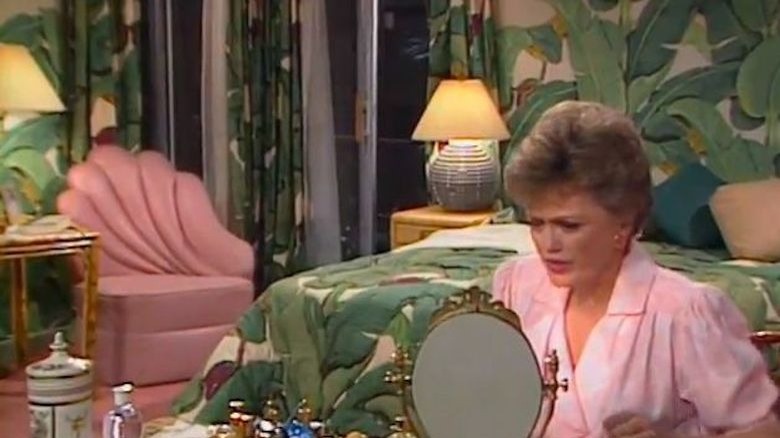
While they are undeniably iconic, you might not think of "The Golden Girls" as trendsetters. Their interiors are the picture of 1980s granny style. But in this piece from We Are the Mutants, the writer points out that, "the overall atmosphere of the set revels in an almost universal appeal that harkens back to a more personable interior design philosophy." At the time, it caused viewers to embrace their quirky, lived-in spaces and lean into the rattan and floral prints. To create this aesthetic, the show's production designer, Ed Stephenson, turned to Miami staples like bamboo furniture in bold-patterned fabrics, wooden kitchen cabinets, and bric-a-brac –– "a hallmark of interior design from the 1960s through the 1970s" that can still be seen today in new, updated forms, and was easily found during the show's heyday.
While the entire set is memorable, it's Blanche's bedroom that was the trendiest of the time. Complete with a "stylized banana leaf motif [in a pattern] called Martinique," this Hollywood regency-inspired room also featured pink carpet, a pink shell cocktail chair, and a feminine vanity. While it might sound dated, it's easy to see how these details could easily be recreated in a different scale that would keep it on-trend, even today — just as the team at Apartment Therapy proved.
The Fresh Prince of Bel-Air: '90s West Coast vibes
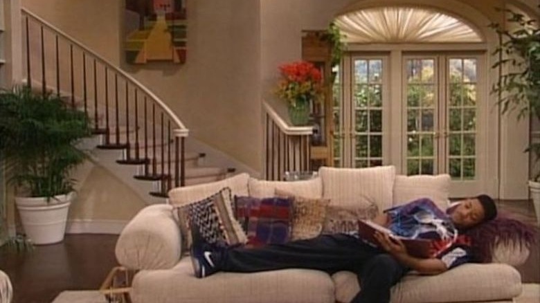
With its curved staircase and airy, open vibes, the stately mansion of Will's auntie and uncle on "The Fresh Prince of Bel-Air" is as iconic and recallable as Carlton's dance moves. But while the mansion itself was meant to seem out-of-reach, the show featured trends that viewers were eager to copy. In a blog post for Joybird, the interior company noted that the Bel-Air home was "styled with nods to traditional elegance, but plenty of modern comforts of the day," showing that Will's wealthy family had a style that viewers could easily recreate. While the sleek, classic design of the Banks family home was meant to offset Will's bright and bold East Coast aesthetic, it also appealed to viewers looking to bring bright and breezy California style into their own spaces.
Like the family's dynamic, the set of "The Fresh Prince of Bel-Air" itself evolved throughout the show's run, first appearing with heavy patterns and dark woods. But by the end, the set featured "clean lines, plenty of pillows, and a distinctly '90s-kind of neutral palette" that became signature in real-life homes of the time. The art, textiles, and decorative accessories are distinctly nineties, and were a sign of "streamlined sophistication" that served as the perfect backdrop for Will's efforts to loosen up his West Coast family –– while also appearing aspirational for viewers.
Big Little Lies: California coastal
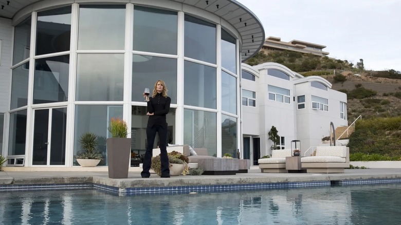
Both seasons of "Big Little Lies" offered an ensemble full of enviable homes and stunning interiors that left viewers excited to redecorate with this newfound inspiration. As Architectural Digest wrote, whenever each woman of the "Monterey Five" was shown in her own space, we learned just a little bit more about life on the California coast — and walked away with plenty of ideas for our own homes.
There was Renata, "in her modern mansion with its infinity pool high above the ocean," whose home is an inspiration for anyone with a love for sleek, contemporary minimalism. It was offset by Jane in her affordable one-bedroom apartment, full of flat-pack furniture and kid-inspired decor that offers the perfect motivation for tackling IKEA hacks. Celeste's home is stylish and cool, emphasized by a "glacial blue" color palette and sparking a newfound interest in retro California bungalows. Madeline's home is "beachfront" and "traditional-leaning," with the heart of her scenes almost always in the stunningly large kitchen (with an almost hilariously large island, as Curbed pointed out). Lastly, Bonnie is tucked away in a "tree-house-like sanctuary in the woods," inspiring a new wave of Boho-style love. Each home is aspirational and stunning in its own way, reflective of a California coastal vibe worth emulating no matter where you live.
