The Major Home Decorating Mistakes We're All Making
Sometimes, it can feel like home decorating is a constant obsession — and whether you're embarking on decorating for the first time, or a seasoned pro at re-designing and re-sprucing a space, you're not alone. According to People, a whopping 71% of Americans are planning on redecorating a space in their homes during 2021 — and if you're one of them, you might be gearing up to make a change.
But before you grab your paintbrushes and dive in head-first, it's important to remember that home decorating can take a significant amount of time and money. And without considering the potential pitfalls of choices that you make (and, unfortunately, there are many), you could be making some major décor mistakes that are not only super common but could set you back quite a bit.
We would hate for that to happen, and so we've put together a list of some major home decorating mistakes that everyone makes. That way, when you take your first step in your new decorating project, you can do so knowing that you're on the right track.
Not thinking about the bigger picture
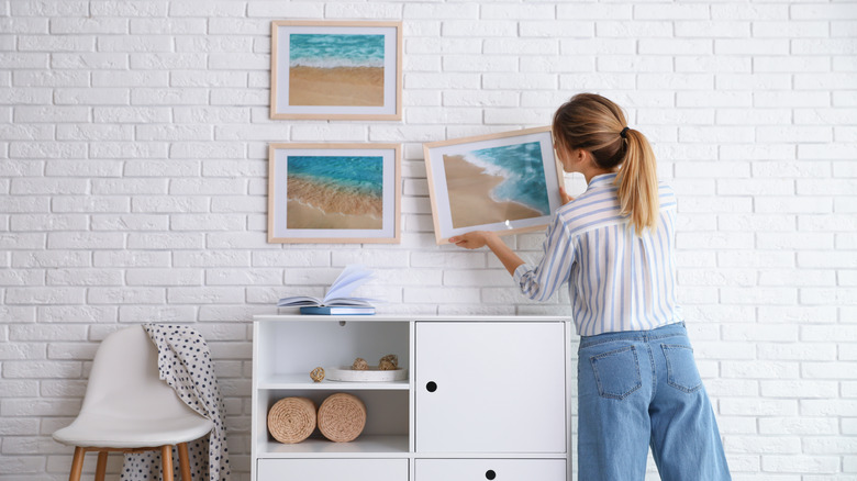
With design, it's easy to focus on details — the perfect lamp, the perfect shade of green for the walls. But focusing on certain aspects of a room can mean you lose sight of the bigger picture: how your rooms come together to make a cohesive whole.
According to Paloma Contreras, interior designer and blogger for La Dolce Vita, this is common amongst first-time decorators. Speaking to Apartment Therapy, she said: "A common mistake I see in a lot of first homes is that people have not considered a complete vision. They don't think about how one room will relate to the next, but instead they tackle the project room by room which can create a fragmented whole."
Remember that designing specific rooms has a knock-on impact for the rest of the house: logical movement through designed spaces and overarching style for spaces will keep your choices connected. As Contreras says: "It's important to think about what you want the end result to be and how each space will flow together. It's okay if you need to slowly decorate over time due to budget, but just always keep the whole picture in mind."
Not budgeting before you start
So, you've decided it's time to decorate a room. You're excited, your head is buzzing with ideas, and you're ready to order those pieces of furniture that you've just fallen in love with, right now.
Before you do that: pause, and check your bank balance. As an article on MyMove states, not having a budget in mind before you start to buy new pieces for your space is a crucial decorating mistake — and one that, if you act too hastily or impulsively, can not only leave you more out of pocket than you'd like but with the task of having to return cumbersome, heavy items.
Instead, as the article suggests, make sure you have an idea of what you can afford in mind before you start to design your space. Taking advantage of online tools that many showroom websites offer is also a great idea, so you can make sure that what you buy will work correctly in the room you're redecorating — and also, crucially, to save on any costs you might incur on returning items that might nudge your budget over what you're happy to spend.
Picking too much matching furniture
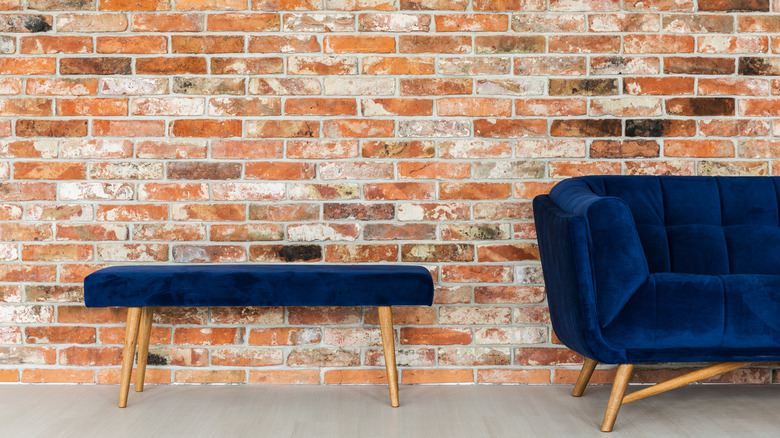
We all understand the appeal of having our furniture go together. However, the last thing you want is to unintentionally turn your living spaces into having a 'showroom' feel — and unfortunately, this is a mistake that a lot of people make, by choosing too much matching furniture.
By picking out matching sets for furniture, you're at risk of creating a space that feels too organized and drab — and frankly, one that feels too easily made. Lauren White, the owner and principal designer of Ellen W. Interior Concepts, agrees. In an interview with Insider, she says: "The easiest thing would be to purchase an entire set, but don't do it [...] A space that looks too 'matchy-matchy' isn't a good thing. Furniture sets are visually boring, but ending different pieces demonstrates that you took time to curate your space, which, in turn, elevates the style in your home."
So, instead of falling prey to this error, think about how you can balance different pieces of furniture with each other to make a visually appealing, dynamic space — without it feeling over-eclectic. Variety is the spice of life, after all.
Thinking that 'more is more' works every time
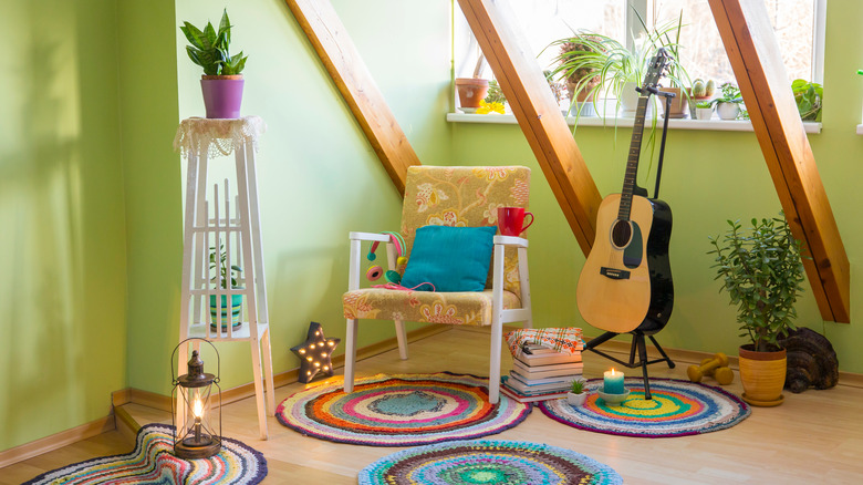
When it comes to decoration, there's a temptation to go all-out and to show everyone your bold design choices. And, indeed, there is a case to be made for opting for a maximalist style — which, according to The Spruce, includes overstuffing your walls and rooms with loud colors and lots of decorative objects. As MyMove discusses, decorating your home with maximalism with mind can be an excellent choice to create cheerful, vibrant spaces that pop with color, personality, and confidence, while maintaining a comfortable feel.
It's useful to remember, though, that this approach may not work every time. And opting for a "more-is-more" approach throughout your entire home is a mistake that leaves a lot of people with a house that feels cluttered and overwhelming. Not only that, but going full-throttle with your decorating should never be for the sake of it alone, and should always feel curated and err on the side of taste. As Richard Mishaan, owner of Richard Mishaan Design says in an Elle Decor article, "When you declare more is more, it better be more quality pieces, more collectible than otherwise, and more taste than money can buy."
Creating 'theme rooms'
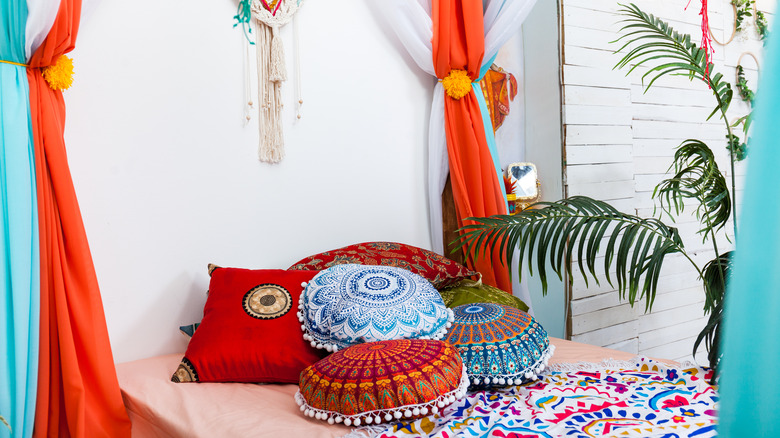
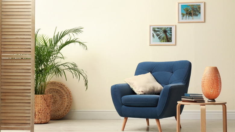
If you've always leaned towards a certain sense of style — '70s vintage looks, for example, or bold prints — it's natural to want to fill your home with statements that reflect this. Going too far, though, can mean that you risk entering the territory of the dreaded 'theme room' — and if you find yourself straying close to creating a theme in your house (or, indeed, are thinking of creating a 'theme room' in the first place), you might want to avoid this classic mistake.
Although a sense of cohesion around styles in rooms can be important, creating a full-on 'theme room' can leave you with a space that can get old fast. As My Domaine states, rooms built around just one theme, like Moroccan or Aztec concepts, can become quickly dated and may reflect a current trend instead of a classic look. Instead, try and create spaces that mix classic and contemporary influences to create timeless feels — and if in doubt, opt for neutral, flexible color themes as a base to work from. There's nothing wrong with a little themed décor, but going too far can become kitschy.
Pushing all your furniture against the walls
Look, we understand this one: it's natural to want to create as much space in your rooms as possible, right? This reason, as well as people wanting to hide the sometimes unsightly backs of their furniture, can frequently lead to spaces in which every piece of furniture is pushed against the wall. And although this seems logical, it's a common mistake that changes the way your space feels.
According to The Spruce, pulling your furniture away from the walls and more into the center of a space creates more of a sense of intimacy, which is particularly useful for family and living rooms. Pushing them against the walls, on the other hand, can leave you with a huge expanse in the middle of a space, which can leave you squinting, trying to make out your spouse, far away on the other side of the room.
Also, there's no need to place furniture against walls if it's well-made: a quality couch should be upholstered with design in mind all over it, so there shouldn't be any hiding necessary. Keep it intimate, and bring your furniture in for a cozy feel.
Opting for a rug that's too small
A rug is one of those objects that you sometimes only notice when it's gone — which is a testament to how seamlessly they can augment a room. One way you definitely will notice a rug, though, is by getting one that's too small, leading to a disproportionate sense of balance in your room — and for such an important aspect of a space, finding one which is big enough is hugely important.
Interior designer Roxi Zeeman agrees. Speaking in an article in Good Housekeeping, she says: "A great rug can really define the style of your space and ground the furniture beautifully, so it's really important to choose the right one. [...] Large area rugs can be expensive, and it can be scary to make that choice, but it's definitely one of the most important elements in your room so is worth investing in."
As such, avoid this common mistake by considering your rug's dimensions beforehand. As The Spruce suggests, laying down some easily-removable tape where your rug might go in your room, in the size and shape you're looking at, can help you ascertain whether it'll work before you buy.
Creating spaces that are too busy or overcrowded
If you're decorating for the first time — particularly if you're a first-time homeowner, and want to finally find a space for all of your belongings collected over the years — it's tempting to use home decoration as an opportunity to show off all your things.
However, there's a fine line between creating rooms that feel well-decorated, and rooms that feel too busy or overcrowded — and the latter is something that a huge amount of people do. According to Livingetc, a survey conducted in the UK that asked people about their biggest first-time decorating mistakes found that 75% of participants felt that they overcrowded their rooms, making them feel too cluttered.
So, if you feel you might be guilty of this, remember the golden adage of 'less is more': try to avoid impulse purchases of decorative aspects, and try to remember the bigger picture of how the whole room feels. Besides, as this Bustle article says, make sure to consider your color schemes in rooms to avoid a sense of busyness. As smaller rooms can get overwhelming fast, opting for a monochromatic scheme can help to create coherence and calmness.
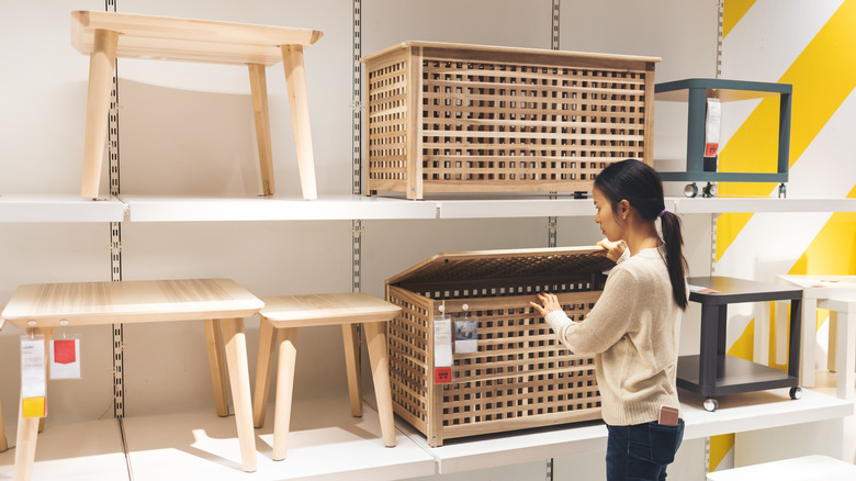
Shopping at just one store for your furniture
Decorating your home can be wonderful, but it can also be quite overwhelming. And with seemingly endless options out there, it can feel quite attractive to do all your shopping in one place and be done with it — particularly when certain stores out there seem to offer everything you need.
This, according to Jenny Norris, founder of Jenny J Norris Interiors, is a frequent occurrence, and can lead to a somewhat uniform feel. Speaking to Apartment Therapy, she says: "One common decorating mistake I've seen a lot in people's first homes has to do with shopping at the same store when furnishing a room or home. It's easy to get caught up in a single store's aesthetic, but do your best to add some variety to a space (pieces from other sources, vintage, etc.) so you're not living in a catalog!"
Remember, decorating your home is your opportunity to create unique, interesting spaces. So embrace the journey and cast your net far and wide. Scour vintage stores or online marketplaces for one-off pieces to go alongside your brand-new coffee table, and make your house one of a kind.
Opting for too much overhead lighting
Good lighting can make or break any room — too bright and it washes everything out, too low and you can barely see your furnishings. And one sure-fire way to miss the mark on your lighting is through an over-abundance of overhead sources.
According to Robert Gross, an architect at Lee H. Skolnick Architecture + Design who was interviewed for Good Housekeeping, this is a common mistake when decorating, which can lead to an unwanted effect. "Homeowners tend to light rooms like they're hosting a convention — too much overhead light [...] This doesn't add any warmth or character to a room."
To get around this mistake, lighting should come from a range of sources at different levels and in different locations — what the New York Times calls "layered illumination". Opt for a combination of overhead lighting, accent lighting (light sources or fixtures that light a particular area of a space), and task lights (used to illuminate certain areas to complete a task, like reading or sewing). A diverse range of light sources, without going too far, will make your space feel warm and well-illuminated.
Not asking for a second opinion
Decorating is a deeply personal activity, and one person's ideal space may be another person's worst nightmare. But going it entirely alone, without asking a friend or trusted source for a second opinion, could mean that you're missing blind spots in your design choices. As My Move says, this isn't just a problem that your average home decorators have: even a skilled interior designer can make mistakes, and the more time we spend working on a room, sometimes the less we can see any potential problems in it.
So, if you can afford (and want) interior design help when it comes to decorating, then great. But if not, asking a friend for their opinions on furniture and wall colors could not only help you garner a second opinion, but could save you money in the long run by helping you make sure you've made the right choice before spending any money on decoration. A second opinion when it comes to room arrangement can be very useful, too. Remember: no man is an island, and that's as true for decoration as it is for anything else!
Picking your paint color before the other aspects of your room
A good dose of paint can take a space from drab and dreary to feeling brand-new. Not only is it an affordable way to bring new life to a space, but it can also add significant value. According to an Opendoor article that discusses the results of the best DIY home improvements you can make for resale, it was found that interior painting can result in an astonishing 107% return on investment.
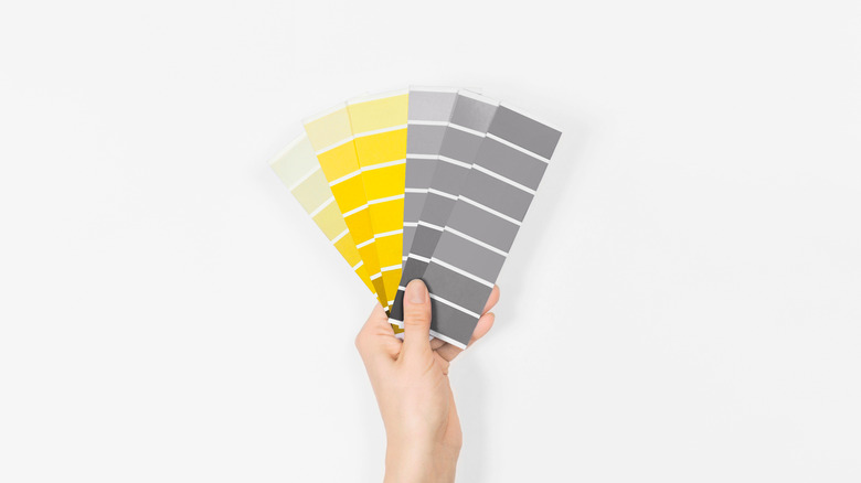
Whatever your reason for painting, though, before you rush to your brushes, make sure you think about the other aspects of the room you're working on — if you don't, you could end up with more work on your hands. As The Spruce indicates, painting is a relatively easy change to make, with a shade available that'll suit every space. However, other aspects of your room, like expensive and rare furniture or fabrics, will be much harder to replace if the color of the walls isn't right.
So to avoid this, grab some swatches, and spend an afternoon comparing them to other parts of your room to get the color just right before you commit.
Decorating for style instead of comfort
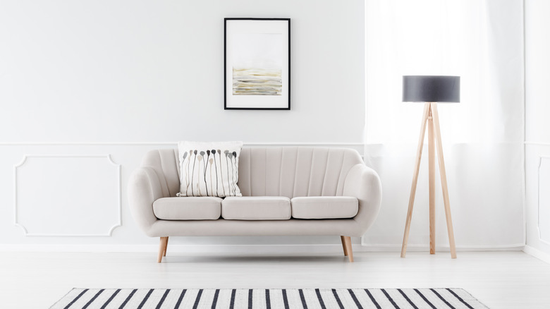
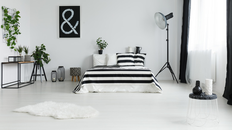
If you're a fan of minimalist or Nordic noir aesthetics, it's tempting to take an approach that honors the style of a space over the comfort of it. But let's face it: although staying in a hotel for a few nights is a lot of fun, no-one wants to live in a house that feels like a hotel. The risk is that, through opting for style instead of comfort, you create spaces that are not only anonymous but can feel a little cold.
Decorating with comfort in mind, on the other hand, means that you're creating warm, livable spaces first, with the scope to add stylistic flourishes along the way. This is particularly important when thinking about your living spaces — and it needn't be that expensive. Sonja Rasula, a former interior designer on HGTV's Home to Go and TLC's Trading Spaces, and the founder of Unique Markets in Los Angeles, explained her views on this to Insider. She said, "Comfortability is one of the biggest factors that make a living room [...] Even if you are balling on a budget, adding a cozy blanket or a few plush pillows will make all the difference."
Storage, storage, storage
Decorating a home to give it a whole new look can make your space visually stunning, but it's vital to include non-visual spaces too, to keep your living experience as functional as possible. Unfortunately, this can be frequently overlooked by decorators, who often focus on how their space looks, and then suddenly turn around and ask, "now where can I put all my stuff?"
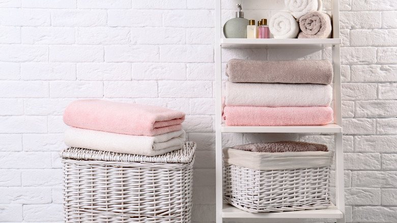
This is especially important when thinking about spaces that need to be practical, like your bathrooms. According to Insider, without functional storage, your bathroom can quickly become busy and cluttered, leading to a less than ideal experience and visual. But make sure you're considering your storage options for every room in your house, as there are some clever options out there, particularly for smaller spaces. As an article on Real Homes shows, making the most of alcoves, floating shelves, or coffee tables with enclosed space can add intelligent storage without taking up too much square footage.
