The 2021 Colors Of The Year Explained
Once upon a time, there was no Color of the Year — which might explain some of the unfortunate paint color trends of yesteryear, like 1970s avocado green and 1990s dusty mauve. Homeowners just didn't know what to do with their walls without firm guidance.
But that all changed in 2000 when Pantone released its first Color of the Year, Cerulean, declaring it to be the shade that would dominate fashion and design for the next 12 months. The color company explained that the calming blue hue was just the antidote to society's Y2K anxiety. Pantone continued color forecasting each year since, eventually releasing more than one Color of the Year per year. Pretty soon, other companies jumped on the bandwagon, particularly paint brands, pushing their own unique shades.
Now, every year brings a fresh new palette of paint colors — endorsed by and available to purchase from big brands — for homeowners to consider. Let's take a look at what's trending among colors in 2021.
The 2021 Colors of the Year offer plenty of inspiration
Let's start with the creator of the Color of the Year trend, Pantone. For 2021, the company has offered up two contrasting colors: Ultimate Gray and Illuminating. After such a dreary 2020, some are questioning why the company would choose gray as one of its picks. Pantone explains that the sunny yellow hue is a sign of optimism while the medium, cool-toned gray offers a tempering dose of practicality. OK, we get the message, Pantone.
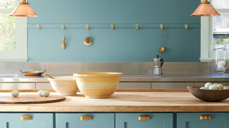
Paint company Benjamin Moore is going the serene route with Aegean Teal (pictured in a room above), a mid-tone blend of green, blue, and gray meant to be balanced and soothing. Meanwhile, Sherwin-Williams is embracing earth tones with Urbane Bronze, a dark grayish-brown inspired by natural materials like metal, stone, and wood. It's supposed to be grounding and meditative.
Instead of a single color, another paint company, PPG, has released a Palette of the Year: Transcend (mid-tone beige), Misty Aqua (muted turquoise), and Big Cypress (ginger orange). Together, these hues are meant to promote intention and mindfulness as well as comfort and nostalgia. Finally, Graham and Brown, which makes both paint and wallpaper, has named Epoch, an amethyst shade, its Color of the Year. This deep jewel tone is quite a dramatic departure from the other choices — and a refreshing change of pace.

