How To Create A Color Palette For Trendy Persimmon
Home design trends have made a clear shift lately — intentionally moving away from stark, muted styles, and leaning toward warmth and playfulness. As a result, rich, vibrant color palettes are making their way into spaces, adding a sense of rejuvenation to basic designs. But don't expect neon walls — think instead of thoughtful, energizing hues inspired by nature, like persimmon. While persimmon was named the 2024 Sherwin Williams Paint Color of the Year, its relevance has continued to hold rank as one of the trendiest interior design colors. Designers are loving this fresh, orange shade for its ability to sway from subtle to bold, allowing for more flexibility among different color schemes. When creating a color palette with persimmon, pros recommend pairing it with neutral, earthy shades and organic textures for a bright, yet balanced look.
As homeowners seek more ways to bring the outdoors in, it's no surprise that this trending color is quite literally rooted in nature. Incorporating this shade makes it easy to bring the natural beauty of persimmon fruit trees effortlessly into your space. With the right color palette, there are plenty of ways to bring a pop of persimmon into interiors for a stylish design refresh.
Pair persimmon with earthy hues
Persimmon's popularity is a wonderful example of how bright and playful paint colors are making their way back into home trends. After years of monotone, minimalist decor in the spotlight, the world is ready to welcome more exciting colors indoors. That said, vibrant colors should be introduced mindfully to avoid interiors that feel too visually overstimulating. Bright, bold colors like persimmon run the risk of veering toward the tacky side, so designers suggest pairing it with earthy, neutral tones for a more sophisticated design. Your color palette will influence the intensity of persimmon's shade — whether you want it to feel bold and impactful or soft and relaxed. Light neutrals like cream, pale grays, and soft taupes will create a calming appeal, while deep shades of brown, navy, or gray evoke a bolder contrast.
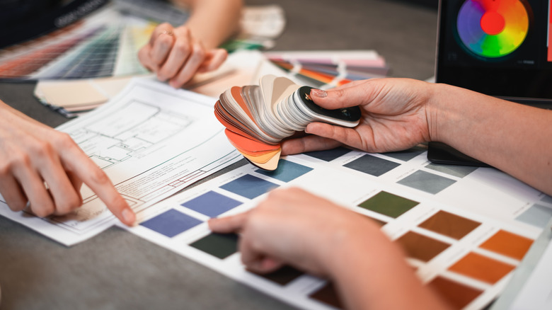
If you prefer a softer palette, but still want to add some stylish pops, consider adding complementary hints of color. In terms of the color wheel, persimmon's complementing shade is a cool, fresh sky blue that wonderfully balances out the warmer tones. Add supporting accents of sky blue throughout your design with artwork, small fixtures, or subtle linens. This allows you to maintain a serene look from the neutral palette, while enjoying an added touch of color that feels playful, rather than overpowering.
Incorporate natural textures
A great way to bring your color palette to life is through the use of textures in your design. While neutral, earthy shades may initially feel a bit bland, when conveyed through organic (rather than sterile or angular) elements, they offer a sense of depth and energy. This gives you a good opportunity to lead into another trend using the ultimate guide to biophilic interior decor. The biophilic trend helps bring comfort into spaces through the use of designs and textures found in nature, and pairs wonderfully with persimmon color palettes.
When looking for interiors, designers note that incorporating organic textures like rattan or wicker can emphasize a sense of serenity in your space. As for decor, surrounding persimmon with indoor plants, wooden accents, or jute rugs can build a stylish dimension. If you want a more modern look, consider fabrics with organic textures, from rich brown leathers to soft linens and boucle materials. To build visual interest in areas that feel flat, you can layer different textures for more depth. This color trend is all about embracing warmth and comfort in our designs, and the use of texture is a key way to make it happen.