The Color Rule That Automatically Makes Your Cabinets Look More Organized
We may receive a commission on purchases made from links.
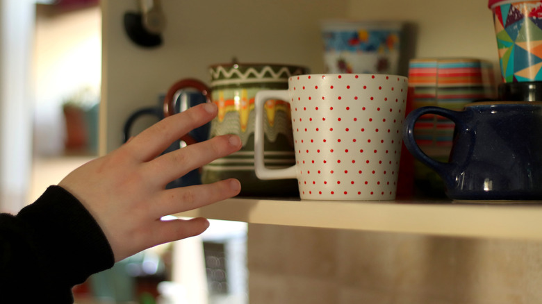
The human brain is constantly looking for patterns. It loves patterns so much that it looks for them even if they're not there because the order give the brain a sense of control. So what does this have to do with using colors to organize your cabinets? Pretty much everything, as it turns out. A cabinet that's filled with discombobulated piles of mismatched coffee mugs, one-off plates from the second-hand store, and fast-food takeout cups can register to the brain as chaos.
Replacing these items with cups and plates that are all the same color immediately reduces the chaotic look because the single color introduces a more cohesive pattern for the brain. And this isn't just true for your kitchen cabinets, it applies to the bathroom and linen cabinet, too. If you want the items in your cupboard to match, replace the mismatched pieces with sets of mugs, glasses, and plates of the same color. (Don't fret! Those beloved mismatched mugs are perfect candidates for a unique mug rack you DIY'd out of spoons.)
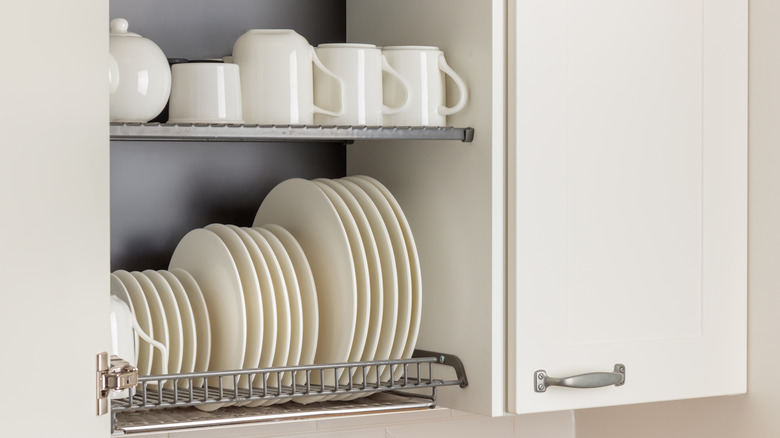
Additionally, it's best to make individual space for each type of item in the cupboard. For example, mugs with mugs, glasses with glasses, and so on. Ideally, when you open the cupboard, you'll see neat rows of mugs followed by glasses and possibly plates on the shelf below, or some variation thereof.
How to color-code your cupboard
While it's possible to do this with dinnerware that's from different sets, for the most uniform look, it's better to buy a match set of each item that you'll store in the cupboard. Ideally, you'll buy items that match the room's decor. This ensures that the new additions to your cupboard look like they belong in the room — a consideration that's important particularly if you have glass cabinet faces. In the kitchen, this means that all your dinnerware matches cabinet colors, decorative accents, and more. In other places, like the bathroom, this translates to towels and washcloths that match the room's walls.
For kitchen cupboards, it can be tempting to stack a bunch of dishware on top of each other. However, it's better to avoid this. Aside from looking cluttered, you run the risk of the items falling over, especially mugs as the handles make stacking them difficult. If you have so many dishes that you need to stack some, insert a small metal shelf divider, like Amazon Basics Stackable Metal Kitchen Storage Shelves. It is an in-cabinet solution that doubles your storage space.
Next, position any glasses you have next to the rows of mugs. After that, you'll need to find the best spot to store your dinner plates. They can be in the same cupboard if they fit, but having their own space is preferable. Regardless, if you want everything to look orderly, each category of dinnerware should get its own row. It's even better if each type of item matches the design style of all the other like-items standing next to it. This usually comes from using dinnerware from the same set.
Introducing additional colors to the mix
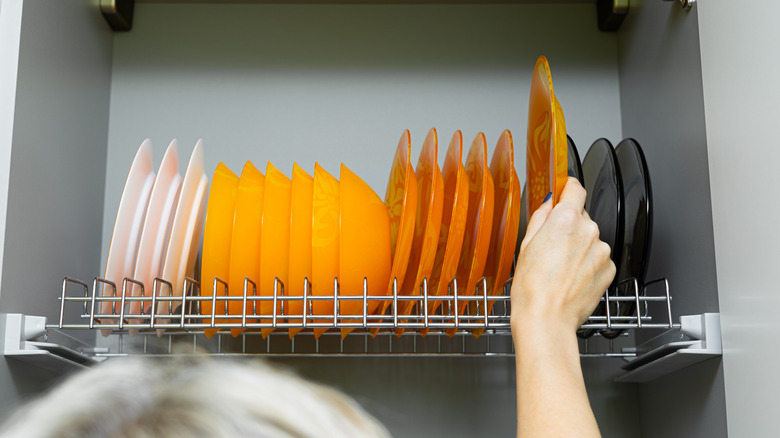
For the more eclectically inclined, having just a single color in the cupboard might feel too restrictive, (even after off-loading the mismatched mugs to a cup holder). In this case, you can still color code your items, but you'll need to be more strategic about it if introducing more than one color to the mix. In this scenario, you'll work with dishes in two or three colors, and organize them in the cupboard by hue.
Interior designers usually recommend organizing these types of color blocks in the order of the rainbow. In other words, if you had six plate colors, they'd be positioned red, orange, yellow, green, blue, and purple. The brain automatically recognizes this pattern, thanks to our familiarity with the colors of the rainbow. While you may not buy all six colors, you can still stick to this to a certain extent. For example, if you have red and orange glasses, red comes first, followed by orange. Finally, "in-between" colors, should be organized by a gradient scale — pink should come after red but before white to make things look neat and orderly.