The 6 Best Cabinet Colors To Make A Small Kitchen Feel More Spacious
We may receive a commission on purchases made from links.
Having a small kitchen can be a challenge with limited countertop space to prep meals, a lack of cabinet and pantry storage, and an overall cramped feeling. While changing the physical size of the room isn't possible, there are many small kitchen ideas that can make your space feel bigger. One of these solutions is to be very purposeful when choosing the color of your cabinets.
While dark cabinet colors can make a kitchen feel like it's closing in on you, Mackenzie Collier, the founder and owner of award-winning design studio Mackenzie Collier Interiors, explains that there are better options. During an exclusive interview with House Digest, she said, "One of the most effective ways to make a kitchen feel larger is to lean into atmospheric hues — soft, airy tones reminiscent of the sky. These colors naturally reflect light, create visual openness, and evoke a sense of calm expansiveness."
The cabinets are usually the most expensive part of a kitchen remodel. So if you're working with a tight budget, such an upgrade may not be in the cards. Instead, you could create the illusion of a bigger space using paint by refreshing your cabinets yourself. Ahead, we'll explore the top colors identified by Collier and other design experts we consulted. Check out the exclusive advice that they shared, and start making a plan to make your small kitchen look more spacious.
Soft beige or taupe cabinets can make your small kitchen feel larger
Along with knowing how to utilize vertical space in your small kitchen, opting for soft beige or taupe cabinets is another solution that can help make the room feel larger than it really is. "Taupes and beiges provide a kitchen with warmth without losing the light-reflecting ability. These shades don't feel too harsh like white sometimes does, and they create a sense of welcome in a room," Chris Alexakis, the director of product and design at CabinetSelect.com, shares with House Digest during an exclusive interview. Those light-reflecting properties are what makes this color so effective at giving the illusion of a larger, more open space.
If you choose beige or light taupe cabinets, you'll also want to be purposeful with the other finishes you select, especially the countertops. When deciding on the color, think about the specific shade of beige or taupe you're going to use on the cabinets and its undertones. Then, choose a material that will bring out this undertone for a cohesive look. Once that's finalized, move on to fixtures and hardware. "I suggest complementing these with light wood or gold accents for extra warmth and a touch of elegance. A satin finish keeps it low-maintenance but high-end," recommends Alexakis.
While there are several soft beige options to consider, Jessica Holwick, the co-owner and principal interior designer at Restart Renovation and Design, highlights Accessible Beige by Sherwin Williams as one of her favorites. "Accessible Beige is a warm, neutral beige color with a medium light reflective value that still provides ample brightness to help make a small kitchen appear larger while still feeling warm and welcoming," she shares exclusively with House Digest. Holwick recommends finishing the look with a walnut-stained white oak island, a mostly white quartzite or quartz countertop, and matte black or brass hardware.
Create the illusion of more space by choosing an airy shade of gray
While dark gray cabinets can make a kitchen feel tight and cramped, light gray ones can have the opposite effect. "Pale gray provides an understated alternative that adds a cool sophistication without crowding a room. And its soft undertones diffuse natural light and contrast subtly with metallic accents," Elissa Hall, the lead designer at RedAwning, tells House Digest during an exclusive interview.
When it comes to the specific formula and finish, Hall recommends a washable acrylic enamel paint in an eggshell sheen. This will keep glare to a minimum and highlight the specific undertones of the hue you choose. "This approach worked well in one compact urban kitchen project, where the finish deepened the peaceful quality of the gray and didn't compete with the ambient light," she explains.
One specific color she recommends is Classic Gray from Benjamin Moore. She calls the shade "an elegant, whisper-soft warm gray." She continues: "Grays are 'out,' but this one is a timeless classic that doesn't read gray — more like a quiet, soft-spoken neutral." Collier recommends opting for warmer accent colors to complement this cabinet choice. For example, a marble (or marble-look) counter with subtle veining, brushed brass hardware, and brushed brass light fixtures would look great with the soft gray shade. An example of the latter is the Asidrama 10 Pack Brushed Brass Cabinet Handles and the Kira Home Belle Industrial Pendant Light.
For a space that feels both soothing and spacious, consider pale or dusty shades of blue for your cabinets
Painting your cabinets in a pale blue is another option you might want to consider. As long as you choose a light enough shade, it will be able to reflect enough light to create that more spacious feel that you're after. Hall explains, "Dusty blue, a less expected option, provides a soothing, subdued injection of color that makes a place feel more open." She recounts a recent design project she completed for a boutique hotel. According to Hall, the combination of the dusty blue cabinets and some warm wood tones in the space "added a bit of relaxed sophistication that beckoned people to linger."
Daniel Kocur, an interior designer and the capital project manager at InterRent, recommends Benjamin Moore's Wedgewood Gray for those looking to refresh their cabinets with a shade of dusty blue. It's very soft and can pick up the light to amplify your space. Consider following Hall's advice of choosing an eggshell paint finish, which offers enough shine to reflect light, but also won't be too complicated to keep clean. As you're planning the finishing touches for the space, Kocur says, "Using darker accents can contrast this color, like with black hardware or accents." Such an example is the Ravinte Matte Black Cabinet Pulls.
While pale or dusty blue cabinets can be a good choice for many kitchens, they might not be the best for all spaces. Because of the lack of natural sunlight that a kitchen with a north-facing window receives, blue tones — even lighter ones — can make the room feel overly cold. If this describes your kitchen, you might want to opt for a warmer color for your cabinets.
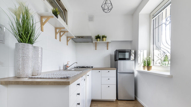
White cabinets are a top choice for giving the illusion of space in a kitchen
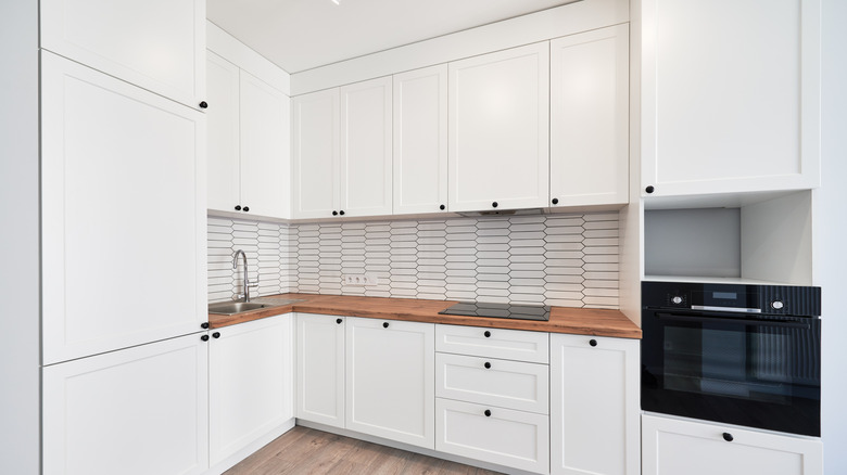
As you're comparing cabinet color options, don't overlook the potential benefit that white can deliver. "While some may argue that white kitchens are on the decline, I've always believed in their enduring appeal," Collier notes. "When thoughtfully selected, white can be timeless, elegant, and quietly powerful." Beyond its timeless qualities, white is one of the best colors for making a room feel larger than it really is. Not only does it reflect light to give the illusion of additional space, but it can also help a kitchen feel less cluttered, making it feel larger.
Before you commit to white cabinets for your home, there are a few downsides to consider. Because of their color, they are going to easily show splatters, so you'll have to stay on top of cleaning. The color can also make a room appear very sterile. However, with the right shade, you can prevent this. For instance, Collier recommends Linen White from Benjamin Moore for a crisp but warm shade. She says, "This is the classic white from the 'Something's Gotta Give' movie set — still gorgeous and iconic over 20 years later." Collier explains how this creamier, warmer white can deliver a subtle glow, avoiding that stark look that is possible with some shades. Collier also highlights Benjamin Moore's Simply White as another option to consider. She describes it as "a clean, luminous white with a hint of warmth." This could be the right pick if you want the focus to be more on your backsplash and hardware choices.
For DIY renovations, you'll also need to take steps to prevent bleeding when painting your cabinets. The tannins in the wood are more likely to bleed through and be noticeable when you use lighter paints such as white, which could leave your new doors looking dingy. Consider using a shellac-based primer such as Zinsser B-I-N Shellac Primer, which will close off the wood's pores, preventing the tannins from being released to discolor your new paint job.
Light walnut cabinets can make a tight kitchen appear more spacious than it really is
Those who are looking for a wood look but realize that dark finishes like cherry or walnut will make their small kitchen feel even more cramped may want to consider light walnut. Collier explains that light walnut "adds organic richness and texture without visually weighing down the space." The lighter wood color also won't absorb all of the light that comes into the room. Instead, it will reflect it to give the illusion of a more expansive area. Walnut cabinets are known for their durability, so you'll be investing in your home with this pick as well.
As you're planning the rest of the design elements, you'll find that several colors and materials can nicely complement the gorgeous light walnut wood. For a more modern look, you might consider mostly white countertops, stainless steel appliances, and matte black hardware. If you desire a warmer look, consider a creamier beige or taupe countertop material and brushed gold or nickel hardware.
In addition to the benefits the material can deliver, there are a few cons of light walnut cabinets that you'll want to weigh before committing to them. First, walnut is not the most budget-friendly material to begin with, and light walnut can be even more expensive. Proper care will also be important to maintain your investment. As noted earlier, the wood is durable, but you'll still want to take measures to avoid getting it too wet when cleaning. Harsh chemical cleaners should also be avoided, as they can cause damage to the wood.
Consider sage green cabinets when you want your small kitchen to feel larger
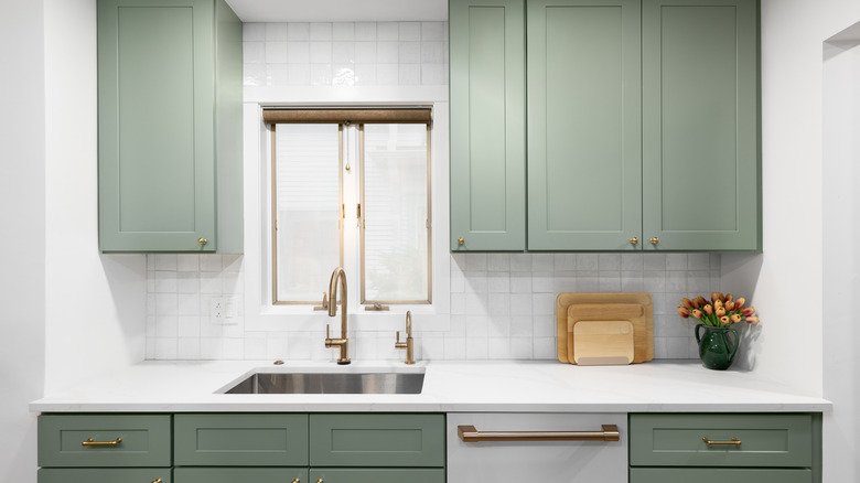
Sage is one trending paint color for green kitchen cabinets that can help you achieve a larger-feeling space. Kocur says, "If you're more of a green fan, soft sage green is also a popular choice for kitchens." As with the other expert recommendations, this neutral green is a lighter color. So it will reflect natural light, allowing the space to feel larger than it really is.
Kocur offers some advice to keep in mind as you decide on the rest of the design elements for your kitchen remodeling project. He says, "Sage green looks especially good with natural accents like bamboo or wood and accessories that are more natural, like terracotta, handmade pottery." One specific paint color that he recommends is Sage by Sherwin Williams. You could also consider an even lighter shade of sage, such as Silver Sage by Benjamin Moore, if you want to enjoy even more light reflective properties for a really airy and expansive feel.