12 Stunning Trim Color Ideas To Use In Your Home That Aren't A Tired White
We may receive a commission on purchases made from links.
Today, color is king. Over the past few years, bright, bold colors have been replacing the whites, grays, creams, and beiges of the previous decade. Monochromatic rooms no longer refer to all-white rooms, but to color-drenched spaces with the same daring color on the walls, trim, and even ceiling. Even kitchen appliances are trading their uniform stainless steel for colorful vintage pieces and painted-panel fronts.
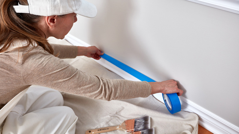
Another new color trend is to paint oft-neglected trim a color other than white. Trim refers to any type of molding or wall paneling, including crown molding, base boards, chair rails, fireplace mantels, door frames, window frames, wainscoting, and board and batten. It can simply edge around the top and bottom of the room like a picture frame, or cover half of the walls. Although trim can take up a large amount of a room's space, it never occurs to most people to paint it to match the decor. Sure, you may have spent hours deciding on dentil detailing over egg and dart for your crown molding, but probably didn't give the color a second thought.
Designers are trading outdated white trim for deep greens, bright blues, and romantic pinks that match the room's decor, while the new neutrals for all-white spaces are black, gray, and tan. All that's left to do now is find the perfect color for your trim!
Black
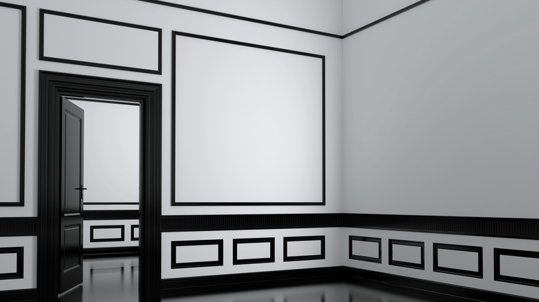
All-white rooms may be going out of style, but not when they are punctuated with black. If you aren't ready to go crazy with color, black trim in your all-white room is a great first step. Black is high-drama, but also a neutral that won't force you too far out of your comfort zone. Black and white are a classic combo for both the interior and exterior of your home, and the look is sophisticated and stylish. Try Benjamin Moore's Black Satin or Valspar's Tuxedo to achieve the look.
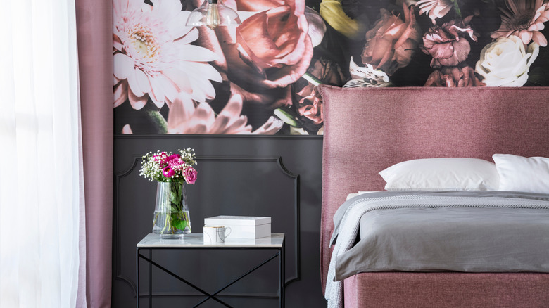
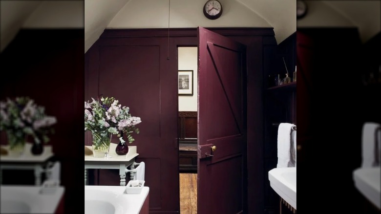
Mauve
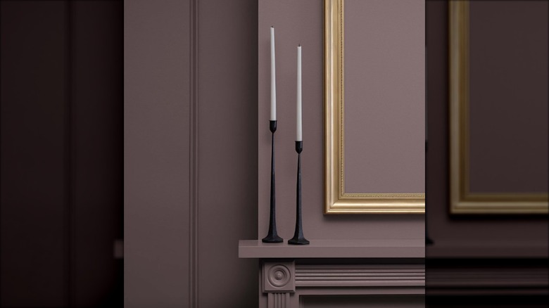
Mauve hasn't been a popular color choice since the '80s — until now. Mauve Finery was one of Sherwin Williams' chosen colors for 2025, and Cinnamon Slate was Benjamin Moore's Color of the Year. A mix of pink and purple, the color sounds destined for a little girl's room, but the brown undertones give it a decidedly grown-up feel. As a trim, it adds gravitas to rooms painted in creams, tans, grays, pinks, or purples, and looks sophisticated when drenched on both the trim and wall.
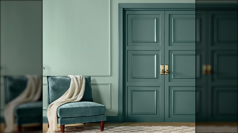
Emerald green
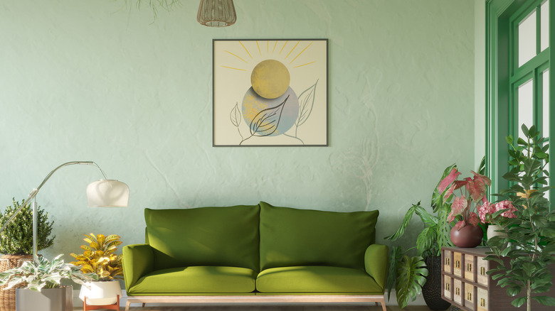
Jewel tones are incredibly popular right now, and so are colors derived from nature. Emerald green checks both boxes, and works in a variety of modern styles from maximalist to bohemian. Indulge in the popular color drench trend by using the color on the walls, ceiling, and trim, or pair it with a lighter green and let your trim work pop. Emerald paint colors to try are Emerald Isle or Once Upon a Time from Benjamin Moore, and Lucky Green from Sherwin Williams.
Cornflower blue
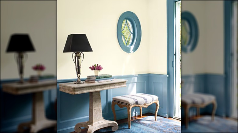
If you have a pale blue, light gray, beige, or white wall, try using a versatile cornflower blue instead of white for a modern, high-contrast look. It will draw the eye to ornately carved moldings, and highlight the color when used elsewhere in your room's decor. This subtle blue has hints of gray that make it almost a neutral and won't shock against a light wall like a brighter or darker blue might. Benjamin Moore's Whipple Blue is a good choice, but you can also try the look with Valspar's aptly named Cornflower Blue.
Greige
Typically, homeowners with open floor plans want to use a neutral color throughout the whole house. For years, designers were asked to use shades of white or cool gray, but now the requests are shifting toward greige — a mix of gray and beige that is the best of both worlds. Greige, such as Drift of Mist by Sherwin Williams, will work to accentuate any neutral wall colors, or act as a neutral when paired with bolder color choices. It offers the same classic feel as white trim, but with an added softness.
Dark Gray
Like black trim, a dark gray will highlight architectural details and hide a multitude of sins on high-traffic areas like doors and windows. While such a dark trim feels like a bold move, it can also act as a neutral that won't fight with colorful walls or decor. It works with walls painted white, black, light gray, beige, most blues, olive green, yellow, pink — almost any color on the wheel. It's also a popular trim color for home exteriors. Behr's Midnight in NY or Graphic Charcoal are a great place to start.
Olive green
Olive green was a top interior paint color for 2024 and remains popular thanks to the current biophilic design trend that brings the look of the outdoors into interiors. The color is incredibly versatile and works as a wall color, trim color, or both. It pairs well with other earth tones like deep yellows, browns, oranges, terra cotta, and burnt reds, as well as neutrals like white, gray, cream, and beige. Valspar's Mossy Aura leans on the gray side for neutral pairings, while Benjamin Moore's Georgian Green has yellow undertones for earthy colors.
Blue-green
A deep blue-green is a bold trim color that pairs nicely with lighter colors in shades of — you guessed it — blue or green. The color covers a wide range of light and dark shades, some leaning more blue, others more green. To highlight your trim work, choose a lighter color on the walls and darker color on the trim, and opt for colors with the same undertones. One potential pairing is Sherwin Williams' 2025 Color of the Year, Quietude, on the walls, and Rocky River, from the same color collection, for the trim.
Pink
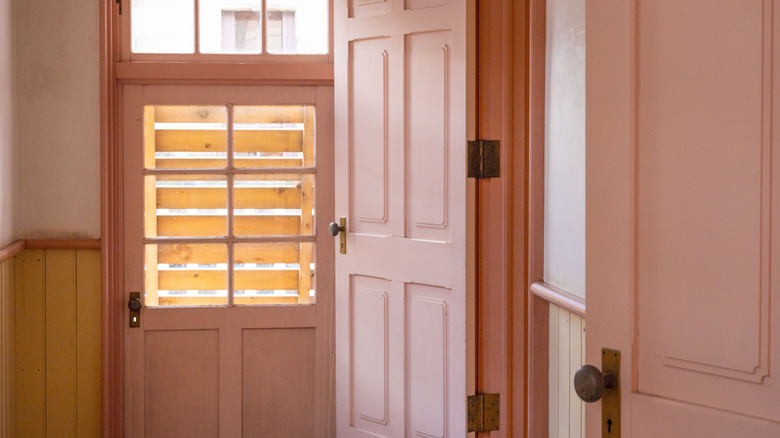
Pink is a lot more versatile than you might think. It pairs well with white, black, brown, beige, gray, terra cotta, green, yellow, blue, and other shades of pink. It's also a striking trim color when paired with wallpaper that has pink as an accent color. Many people make the mistake of sticking with white trim in a room with wallpaper as a way to tone down the bold look, but leaning into a wallpaper's color scheme will actually blend in more than an abrupt white.
Deep blue
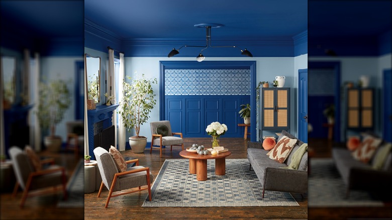
An ultramarine blue, such as Valspar's 2025 Color of the Year, Encore, can anchor a room, whether it is used on the walls, the trim, or both. It looks classic next to white or light blue walls, and for the more adventurous, Valspar recommends pairing it with a lavender or sage. It's a color that works well as indoor or outdoor trim, and a lovely color for doors, shutters, and even decks (Rust-Oleum's Gloss Royal Blue is a great exterior option).
Brown
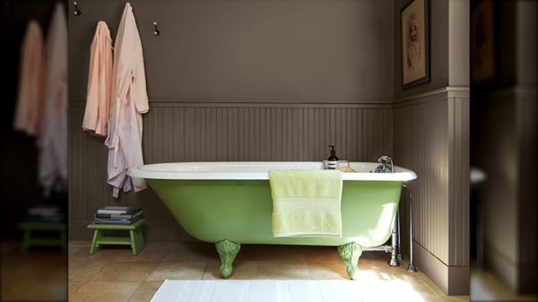
Brown paint can trick the eye into thinking the trim is natural wood. If you love the look of a Craftsman-style home, a dark brown on beams, fireplace mantels, and crown molding will give you a similar feel, especially when paired with white walls. Lighter browns act as a neutral and go with pretty much any color under the sun — especially the warm earth tones that are currently on-trend.
Aubergine
Warm purples such as Brinjal from Farrow & Ball can be at once bold and calming. Shades of aubergine, amethyst, and plum add drama to any space, and as a trim, are best paired with neutrals such as white, cream, or beige. You can also up the drama to another level by color-drenching every surface, or go gothic with a damask wallpaper accented in black or eggplant.