How To Create A Single Color Garden That's Interesting And Beautiful
Sometimes, limitations are the key to unlocking creativity. This creative philosophy also applies to monochromatic gardening. By focusing on a single color, gardeners open the door to a deeper, more nuanced design language that plays with texture, form, and shade. Instead of feeling restrictive, the one-color approach fosters cohesion and calm, letting details shine without the distraction of competing hues.
A monochromatic garden uses one dominant hue to create harmony, but it's not necessarily flat or repetitive. Through varied bloom shapes, layered foliage, and strategic color gradients, these gardens can feel both sophisticated and serene. They're especially well-suited for smaller or urban spaces where too many colors might overwhelm. The approach also echoes a broader movement in garden design that favors emotional clarity and aesthetic restraint — particularly the "green drenching" trend, which relies on layered shades of green to create tranquil, immersive environments. This minimalist palette aligns with wellness goals and biophilic design principles.
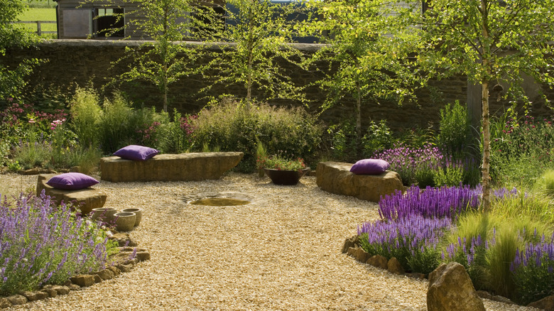
Color choice also has a powerful psychological impact. Cool tones like blue, lavender, and green expand a space visually and offer a calming effect, while warm colors such as red or orange bring vibrancy and intimacy. White gardens, sometimes called "moon gardens," take on a luminous quality at dusk — perfect for quiet evening enjoyment. Understanding why color selection plays such a pivotal role in garden design can help guide intentional and satisfying choices.
Choose your color, then build around it
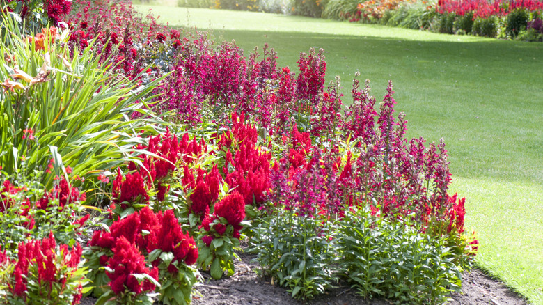
Selecting the right color is the first and most crucial decision in a monochromatic garden. Start by considering your outdoor space's purpose and the mood you'd like to cultivate. Cool colors like lavender or blue can make a garden feel more expansive and restful, while bold hues like red or orange are energizing and make a strong visual statement. If you're looking to stay on trend, Garden Media's 2025 garden color of the year, a vivid teal, offers a dramatic, modern choice for your outdoor design.
Once you've picked your dominant hue, build depth by incorporating a range of tints and shades. A garden centered around purple, for instance, can include everything from pale lilac blooms to near-black plum foliage. This technique keeps the eye engaged without breaking from the overall theme. Expert designers recommend playing with saturation to guide visual flow and establish focal points — lighter tones for highlights, deeper shades to anchor and define garden zones.
Foliage color is also essential to reinforcing your palette. Some leaves naturally echo flower tones, while others introduce subtle contrast. For example, chartreuse or silver-variegated foliage can beautifully balance a predominantly white garden. For added inspiration on ways to incorporate trending colors, use Pantone's beautiful 2025 color of the year in your garden as a rich starting point for seasonal and personal expression.
Designing for texture, form, and flow
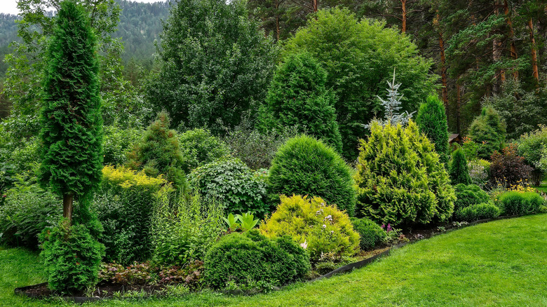
Color alone might not hold a garden's visual interest. That's where the significance of texture and plant form comes in. Thoughtfully combining plants with different leaf shapes, sizes, and finishes adds dimension and complexity to your single-color scheme. For example, pairing the bold, waxy leaves of colocasia with fine, feathery grasses creates contrast even within a limited color palette. Foliage can be just as impactful as flowers, especially when blooms fade or during off-peak seasons.
Plant shape also drives the eye through the landscape. The are very concrete reasons we prefer walks along gentle sloping parkways versus, say, flat parking lots. Use upright, mounding, and trailing plants to create rhythm and depth. A monochromatic garden benefits greatly from this kind of structural layering. For instance, tall spires of salvia can rise behind dome-shaped peonies, while trailing sweet potato vine spills over borders, all within the same hue range. These forms help build natural scenes that feel alive and deliberate rather than static and parking-lot-like.
Mass plantings are another key to amplifying color impact and avoiding a patchwork look. Repetition of the same plant or different plants in the same shade gives your garden cohesion and makes it easier to appreciate from a distance. For tips on strategies for achieving visual unity in outdoor spaces and creating a cohesive front garden, look to guides that emphasize flow and repetition in landscape design.
How to keep your single-color garden interesting year-round
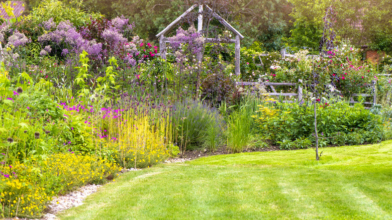
One of the biggest challenges in monochromatic gardening is keeping the display compelling throughout the seasons. This can be done by layering annuals and perennials. To maintain visual interest year-round, layer plants that bloom at different times, from early spring bulbs to midsummer perennials and fall-blooming favorites. Annuals are also useful for bridging color gaps and can be swapped out easily depending on the season or your evolving design.
When flowers aren't blooming, foliage can carry the color theme forward. Ornamental grasses, shrubs with colored leaves, and plants with colorful stems or seed heads all contribute to off-season structure and tone. Perfectly designed cottage gardens offer inspiration here as they often blend annuals and perennials with overlapping bloom times to create continuous color and texture throughout the growing season. You can explore how to layer bloom times for continuous interest by borrowing tactics from that style.
For gardeners who want to experiment before committing to a large-scale monochromatic plan, container gardening offers a flexible solution. Try grouping pots in varying heights and textures but sticking to a single color family — a great way to test combinations and build confidence. If you're interested in low-commitment planning techniques, try some creative ways to plan garden color palettes, like using paint chips or office supplies, to visualize your scheme before planting.