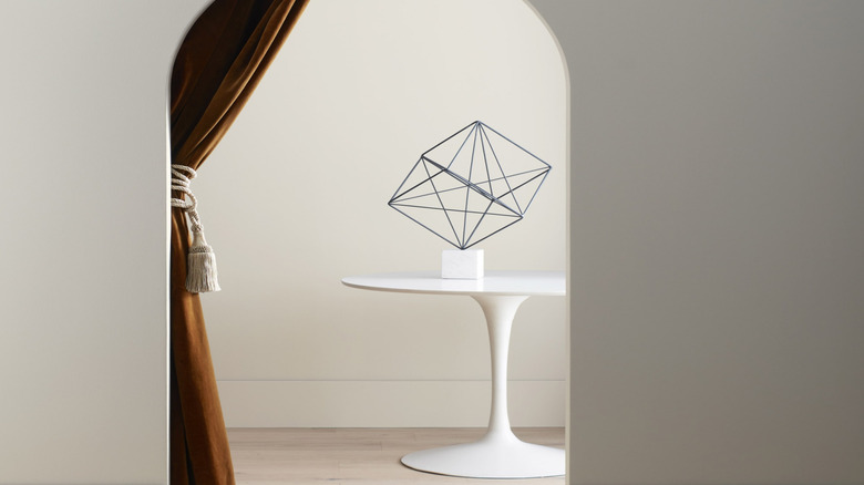
Benjamin Moore's Trendiest Paint Colors (& Which Ones To Avoid)
We may receive a commission on purchases made from links.
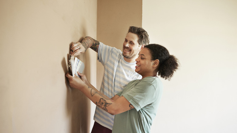
Benjamin Moore has been a longstanding resource for interior and exterior paint since its introduction to the market in 1883. Designers and homeowners favor this iconic brand for its extremely nuanced color range and high-quality paints. Each year, the company brings a whole new host of color trends to the forefront of interior design, and this one is no exception. Paint is an easy way to elevate your home and bring it up-to-date. And whether you prefer subdued hues or statement-making shades, there are several trendy tints to choose from.
House Digest exclusively consulted two key professionals to highlight the top Benjamin Moore paint colors to consider for your home. Kimberley Pontbriand of Blanc Marine Intérieurs gives us dedicated insight into which shades she recommends and which you should stay away from. Beril Yilmaz, designer at By Design and Viz, also provides unique advice on the current best and worst hues. So, discover the top trending Benjamin Moore paint colors and learn how to incorporate them with intention.
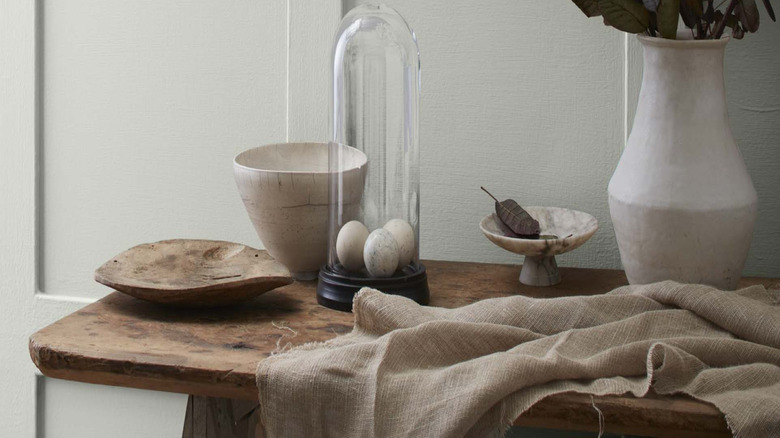
Maritime White is a sophisticated neutral with subtle warmth
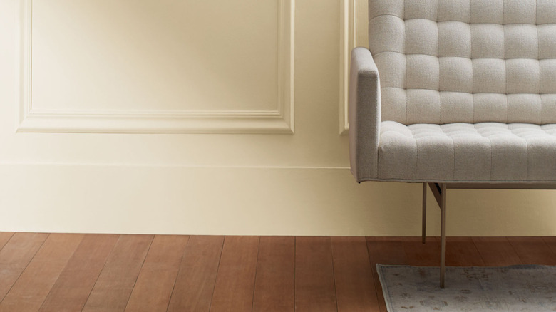
This iconic paint color is a classic for a reason. Pontbriand describes Maritime White as "a creamy, muted neutral that adds warmth without overpowering a space, ideal for creating a cozy yet sophisticated atmosphere." She explains why it is an ideal neutral for any living space, saying that off-white shades remain best-sellers because they complement "natural materials, soft textures, and moody, layered palettes, adapting beautifully to various lighting conditions. They serve as the foundation for spaces that feel curated, inviting, and effortlessly refined — just the way we love them."
Benjamin Moore defines Maritime White as a "sophisticated off-white with muted beige tones." Because of its neutrality, it is a safe introduction to non-white walls. Benjamin Moore's suggested matching color section includes both warm and cool options, highlighting the versatility of this shade. Broken Arrow is a trendy light brown that can bring out the warmth of Maritime White even more. For another trend-forward idea, consider painting your upper cabinets and walls in Maritime White and covering your lower cabinets in an earthy accent shade. This look was executed beautifully by paint color expert Kylie M. on her Instagram. The pairing of a soft neutral and a bolder earthy tone is a pattern you will see echoed throughout these expert tips.
Revere Pewter bridges both warm and cool neutral tones
The preference for warm versus cool neutrals seems to change every other year. To create a space that never goes out of style, consider an "in-between" shade that bridges the gap between warm and cool. Pontbriand explains the power of Revere Pewter, saying it is "a balanced greige with subtle warmth, offering a timeless and understated elegance." Relaxing greige paint colors can create a soothing home while simultaneously sparking a welcoming effect. One major benefit of greige is that it can work in both contemporary and classic interiors, making it an ideal choice for transitional spaces.
It's not uncommon to have both warm and cool tones within the same space. You may have stainless steel appliances and natural wood cabinets, or gray laminate with a warm-toned backsplash. Revere Pewter can help make these visual juxtapositions feel more deliberate. Pontbriand isn't the only design pro who recommends Revere Pewter. Michelle from The Color Concierge is another vocal fan, describing it as a crisper alternative to the also-popular Agreeable Gray from Sherwin Williams. If you're trying to decide between the two, Revere Pewter has green undertones that create an earthier, deeper effect.
Raccoon Fur is a daring yet accessible shade of soft black
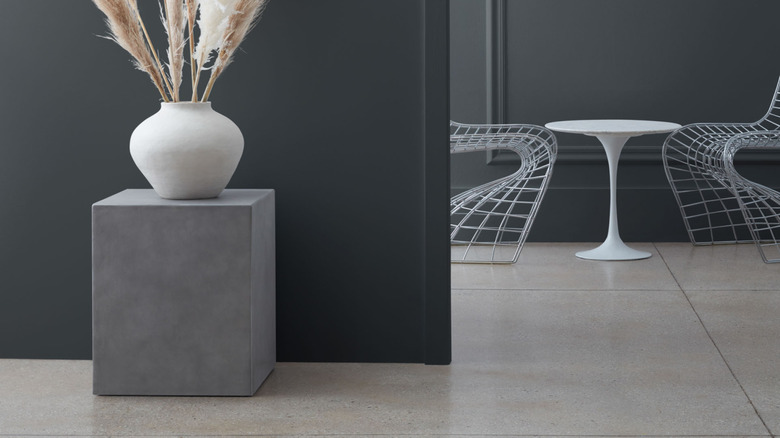
Over the past few years, the trend of black as a go-to paint color has divided the masses. Some design aficionados suggest utilizing black walls to create a cozy space and make pale and colorful decor pop. Others warn against replacing neutrals with black, and recommend that it be used exclusively as an accent color. Whichever side of the debate you fall on, Raccoon Fur is an excellent option to consider as it is softer than pure black yet without sacrificing an inch of audaciousness. Pontbriand describes this shade as "a bold near-black that exudes elegance and drama."
Dark brown has been predicted to replace the black wall trend. However, Raccoon Fur doesn't lean warm. It utilizes a touch of inky blue in order to soften pure black. This creates a highly contemporary appearance, ideal for modern interiors. Benjamin Moore suggests using light neutrals like White Dove and the pale green Silken Pine for optimal contrast. Raccoon Fur can also be used on the exterior of your home if you're bold enough to commit to the dark façade look. Deep blue is slated to become one of the top exterior home colors in 2025, and the blue tint of Raccoon Fur is right on trend. If you do commit to the black house trend, avoid the common mistake of not testing shades in natural light.
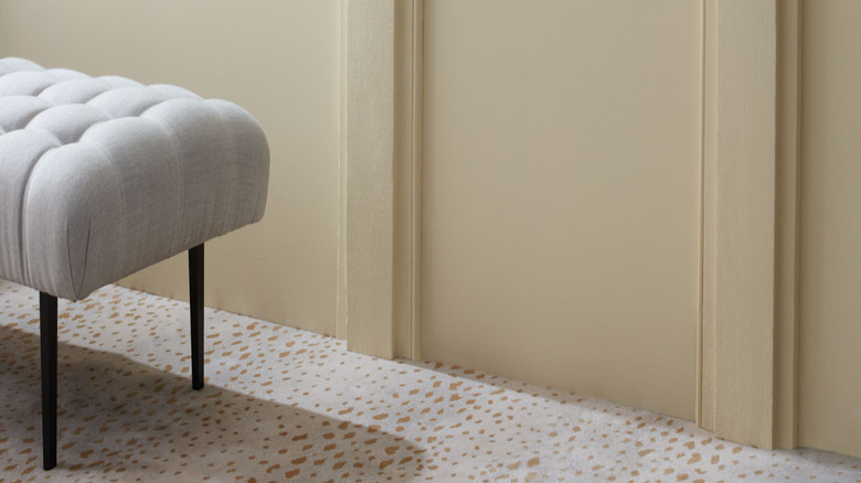
Gettysburgh Gold is a rich and opulent golden brown
The 1970s are a huge influence on design in 2025, particularly with brown-toned paint colors taking over the industry. However, brown isn't the only warm shade that dominated this freedom-focused decade. Yellow was also a huge player in the '70s decor game, and Gettysburgh Gold represents the best of both of these joyful, earthy colors. A mix of a gilded mustard and a rich brown, designer Pontbriand describes the shade as, "A muted golden hue, perfect for balance and contrast."
Although this tone is undoubtedly on-trend, Benjamin Moore labels Gettysburgh Gold as "ancestral and opulent." This hints at its classic-leaning tendencies and highlights an evident vintage quality. Because of its traditional appearance, it is another color that works well if you have an older home that you still want to elevate with a trendy touch that won't feel out of keeping. It can be a difficult balance to make a vintage space feel up-to-date while still respecting its history, but Gettysburgh Gold is up for the challenge. Instead of pairing this shade with stark white, go with other warm neutrals to create a natural and cohesive look.
White Dove is a warm white that won't go out of style
One color backed by Yilmaz is White Dove. This shade is proof that something can be simultaneously trendy and timeless. She exclusively tells House Digest, "White Dove is a favorite because it's a warm white that works well with any space." This mirrors Pontbriand's support for warm white hues. Benjamin Moore describes the shade as clean and classic, making it ideal if you want to create a neutral backdrop for your bolder decor.
Although you can pair it with most colors, Benjamin Moore recommends two daring shades: Kendall Charcoal and Country Redwood. The charcoal shade has a similar effect to Raccoon Fur but with a more approachable appearance. It also has varied undertones, making it easier to blend with existing decor. If you prefer organic over modern styles, using Country Redwood as an accent color will appear natural without looking like another neutral. After all, terra-cotta (both the color and the material) is another current trend.
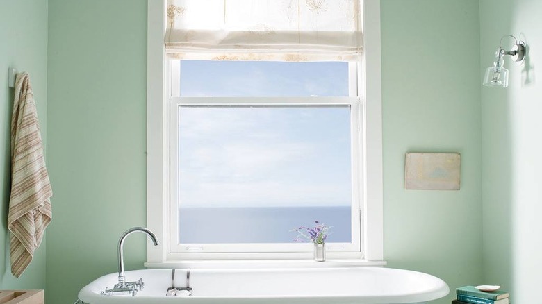
Chantilly Lace is a crisp and contemporary ivory color
For another light neutral that will bridge the gap between pristine and cozy, consider Chantilly Lace. Yilmaz elaborates, "Chantilly Lace is a crisp, clean neutral that's fresh and modern." Inspired by natural textiles like cotton and silk, this shade is elegant, gentle, and foolproof as an interior base shade. Although it has a touch of blue, it still looks delicate and welcoming. The coolness makes it modern while the linen shade creates a soft atmosphere. It is a great option for a bathroom, as it will make the space appear clean but not sterile.
When it comes to the aesthetics that pair well with Chantilly Lace, modern farmhouse is an obvious choice. The muted quality adds a touch of rusticity, but the brightness keeps it contemporary. There's a reason why Benjamin Moore describes it as evocative of simpler times. It has an effortless quality that lets the rest of your interior shine. For example, paint your walls in Chantilly Lace but leave the trim around your windows and doors in their natural wood tone. This will create a stunning sense of contrast. It also plays a beautiful supporting role against natural brick.
Cinnamon Slate is a velvety brown and the Color of the Year
Cinnamon Slate, Benjamin Moore's 2025 Color of the Year, is an ode to warmth, comfort, and ease. So, a roundup of color trends wouldn't be complete without mentioning the hue. Yilmaz details the reasons behind its popularity: "Cinnamon Slate is Benjamin Moore's Color of The Year for 2025, so it's getting a lot of attention. People are gravitating towards Cinnamon Slate this year because of a shift from cool, minimalist interiors to more warm and inviting spaces. After years of white and gray dominating home design, homeowners are looking for rich, deep, and warm tones." Cinnamon Slate is a blend of muted plum and soft brown, falling in line with the other top trending brown tones, yet offering a slightly cooler variation. The gentle purple undertones give this brown color a modern twist.
While it's true that the light neutrals mentioned above are timeless and easy to incorporate, modern design is all about making bold choices. Cinnamon Slate is the perfect opportunity to incorporate a rich, eye-catching color in your space. Recommended by Benjamin Moore and echoed by paint color experts, a soothing cream (such as the brand's Linen White, Dove Wing, or the aforementioned Maritime White) is the perfect shade to pair with Cinnamon Slate.
Balboa Mist is a taupe tone that creates a cozy space
Gray can be used correctly — if you select the right tone. Although it sits in the gray family, Balboa Mist is hardly a true gray. Yilmaz explains how it differs from the neutrals of years past: "It's a warm rich taupe that complements [the] organic modern style that's trending. Balboa Mist is trending because it's the perfect blend of warm and cool tones. In organic modern design Balboa Mist acts like the perfect backdrop since it's so versatile. It enhances the warmth of wood, natural feel of stone, and the coziness of woven linen textures."
Balboa Mist is one of Benjamin Moore's best-selling colors for a reason. It's another shade that appears clean without looking cold. The color can be used in cottage-style homes or contemporary interiors. If you want to really make the wood details pop against the wall color, try staining them in a rich mahogany hue. In addition to bringing out natural wood tones, the gray tint can also complement blues and greens in your space. In essence, it will elevate anything earthy. Try pairing it with Hunter Green accents and tons of visible texture. Natural textiles like linen and jute are also ideal. Gauzy pieces, like the Emme Cotton Throw Blanket, pair perfectly with the vibe of Balboa Mist.
Stay away from gray shades with blue undertones
Although soft black with blue undertones makes the "do" list for current color trends, gray is getting pushed aside. While soft black is bold, gray doesn't offer the same level of drama. Pontbriand advises avoiding gray paint colors with cool, blue undertones moving forward, explaining, "Once a go-to for modern interiors, cooler grays can sometimes feel stark or dated, especially in spaces that lack warmth and texture." This echoes the concept of millennial gray, which is not a complimentary phrase. It's a term used to refer to first-time homebuyers (millennials) who are flipping dated homes with a hefty coat of gray through paint, laminate, furniture, and beyond.
The label most likely originated on TikTok, as Generation Z — the new interior trendsetters — expressed their distaste for the dreaded "landlord special." Just because something is gray, doesn't mean it looks cool and modern. The movement towards warmer neutrals and accent colors is a revolution that was sparked by the overdose of drab, cool tones. If you find yourself with a predominantly gray interior, you can go one of two ways. You can commit to the cool-toned space and add richer, deeper hues like Stained Glass, a trending Benjamin Moore color for 2025, or offset it with warmer, adaptable neutrals like Sea Salt or Light Breeze.
Avoid overly bright whites that appear sterile
While white is a timeless interior color, there are countless variations to choose from. Pontbriand cautions against pure white colors with no warm undertones. She explains, "Overly bright whites — crisp whites can be beautiful, but stark, ultra-bright whites can sometimes feel harsh and sterile. Instead, we lean toward softer whites with a touch of warmth for a more inviting feel." Benjamin Moore lists Glacier White as one of the top white-based colors. This echoes Pontbriand's penchant for warmer variants. It is described as "a versatile off-white with hushed cream undertones." This subtly cozy shade will complement almost any existing interior decor.
Selecting a warm-toned white is particularly important if your home lacks natural light. It will help create a sunnier space, whereas a cool-toned white can appear shadowed. When it comes to tips to help you pick the right white paint for your space, existing architectural details like flooring are also important to take into account. Sterile walls can clash with warm wood, whereas ivory and beige will bring out the variations in the natural material. Although it is important to select a white with specific undertones rather than a completely colorless shade, you want to make sure that it still looks white. A white shade with too much green, yellow, or pink can start to look like that color on your wall. So, always test a generously sized sample on your walls before committing to a color, even if it looks white on the swatch. One of the most common mistakes when painting the interior of homes white is not accounting for reflected colors from things like flooring and exterior elements (such as trees and buildings). With a larger sample on the wall, you can evaluate how the paint tone works in your space specifically.
Don't date your home with yellow-toned beige
While warmth is generally a good move, you don't want to get dangerously close to a dated shade. Pontbriand explains the blunder of going with yellowy beige, saying, "While neutrals are always in style, beige tones that lean too yellow can feel outdated compared to today's more balanced and nuanced warm neutrals." The key word in her advice is balance. Some examples of paint colors that might lean too outdated include Antique Yellow and Antiquity — hence the names. For a timeless home, it is better to opt for a light or medium taupe like Smoky Taupe.
It might seem contradictory to promote warm neutrals while condemning yellow-beige, but paint color is all about nuance. Shades and undertones tend to look doubly bright once they are on your wall, and what you thought was a subtle tint can turn into a surprisingly dominating cast. So, a good rule of thumb is to select a color two shades lighter and less saturated than your intended look. Then, add decor that also has that undertone to create cohesion within your space.
Sidestep overused shades like Gray Owl and Stonington Gray
Just like Pontbriand, Yilmaz cautions against saturating your space in gray. She expands, "A few Benjamin Moore colors have been overused and are starting to feel outdated. Gray Owl and Stonington Gray were once go-to grays, but the all-gray trend has lost its charm. Instead of these I recommend a warmer gray like Classic Gray, to prevent your space from looking cold and flat." Benjamin Moore describes Classic Gray as almost an off-white. This is a testament to its brightness, which sets it apart from dull and drab gray tones.
The light reflective value of Classic Gray is 74, inching it closer to white than a true gray. If you don't like the look of beige but you're searching for a neutral other than white, this is an alternative to consider. It is another Benjamin Moore best-seller, and its popularity is likely due to its true neutral quality. If you want to explore the contrast trim trend in a subtler way, try painting your space in Simply White and use Classic Gray as the baseboard and trim color.
Don't fall into the unnatural trap of Palladian Blue
If you want to curate an up-to-date interior, it's important to be aware of colors that are over-saturating the market (pun intended). Yilmaz points out one overdone hue to avoid moving forward: "Palladian Blue was hugely popular for a while, but softer, earthier blues and greens are now taking its place. October Mist is one of these earthy greens that's taking over social media." Although Palladian Blue is still described as calming, it has a radiance that might overwhelm some interiors. If you want your walls to elevate your space without stealing the attention away from your decor, a warmer, more muted color might be preferable.
Another option is to choose a lighter variation of Palladian Blue, like the shade In Your Eyes. This is ideal if you like the crisp appearance of Palladian Blue but want to curate a more timeless look. And if you already have a space that is saturated in a similar shade to Palladian Blue, there are ways you can make it work with the current trends. Designer Claire Jefford recommends pairing it with Tweed Coat, a shade that echoes the recurring theme of taupe. She also mentions Yilmaz's initial pick, White Dove. While it's possible to make Palladian Blue work in an up-to-date interior, you can find several serene alternatives to this overused shade by exploring Benjamin Moore's most soothing paint colors for a comforting home.