10 Lesser-Known Neutral Paint Shades From Sherwin Williams You Shouldn't Overlook
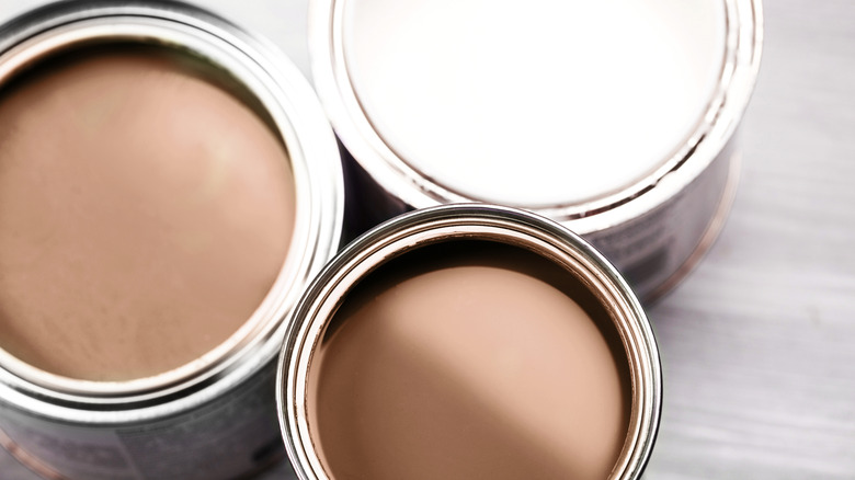
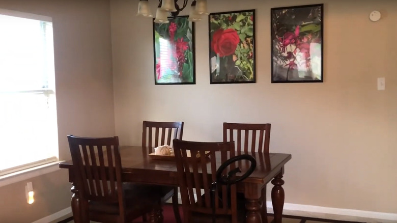
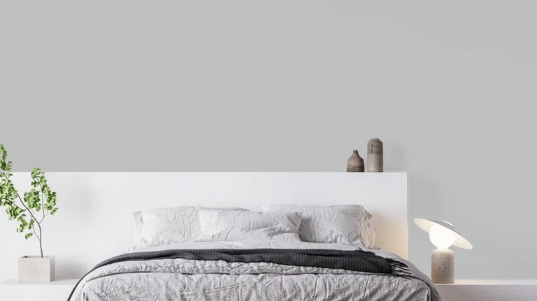
Neutrals colors definitely have their place in a home. Though brands are moving away from neutrals for their 2025 colors of the year, there's no reason you have to abandon them in favor of trends. If you like simple colors that easily fall into the background but aren't just basic shades of white, or you want something simple to use on your trim, doors, or cabinets; neutrals are a safe and comforting option. They also have the benefit of working with many different color schemes, which means you can build up and decorate your space pretty much however you want without worrying about your wall colors clashing.
If you've been trying to find the perfect neutral shade and spent days scrolling through dozens of the most popular choices without any luck, it may be time to look at some of the lesser-known neutral paint shades from Sherwin Williams. Though these colors are underrated, they aren't ones you should ignore. Some are just a little more unique or offer a bolder color that makes people hesitant to match, but they can be absolutely beautiful if done right. For example, Palisade, Mountain Road, and Requisite Gray are just a small sample of colors in the neutral range from Sherwin Williams that you may not have heard about before. With these colors, you can still make your home uniquely yours without having to go bold and bright.
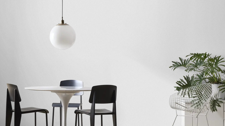
Evening Shadow adds just a pinch of color to a room
Not ready to dive into colored walls but want something a little more unique than white? Evening Shadow (SW 7662) is a cool neutral that has a hint of blue for a light and clean wall color. During the day, and in bright rooms, it can easily pass for an off-white, but at night, the blue comes out. It works well as a primary wall color or on cabinets and shelves. Evening Shadow fits with most whites and blues, such as Ice Cube, Shell White, and Daphne.
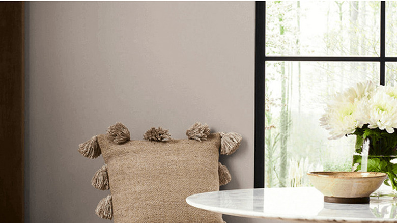
Polished Concrete is a warm and welcoming color shade
Polished Concrete (SW9167) is a gray color with purple and red notes that works well with colors like Rhinestone, Snowfall, and Plum Dandy and fits perfectly alongside several different color schemes. It can be the star of the show when paired with neutral or light colors, or it can create a stunning contrast that makes the violet undertones pop when combined with bright or rich tones. If you're nervous about picking the perfect shade of paint, this is a safe — somewhat bold -– color to choose.
Go bold and sophisticated with Black Fox
Black Fox (SW 7020) is a shade of black with beige undertones. It's a bold color that looks perfect alongside dark metal, wood, and natural stone. It's often found in cozy cabins and industrial homes, providing a firm palette without looking too dark. When next to lighter colors or shades with hints of yellow, such as Eider White, Greek Villa, and Cool Avocado, the beige undertone really pops and gives it a more natural look. Use it as an accent wall, for exterior paint, or in bright rooms for added depth.
Knitting Needles is a subtle and calm color
Knitting Needles (SW 7672) is gray with subtle violet undertones that make for an almost perfect true gray shade. The color comes off as an excellent background color. Pair it with neutrals or tan for an amazingly cozy but clean-feeling space or add a few touches of your favorite color to make an impression. Match it with other colors like Extra White, Shell White, and Attitude Gray for the perfect neutral space. Or you can combine it with other purple-blue colors to highlight those undertones.
Palisade creates a warm, cozy, and bright environment
Palisade (SW 7635) is a warm gray with a reddish undertone. It's a darker color that adds some depth to a room but isn't too dark to make a space feel cramped or dreary. It works well in bathrooms and living rooms or as a cabinet color. For a complementary palette, it pairs best with grays and other colors that have orange and red undertones, like Roycroft Brass, Pediment, and Snowbound. It also works with highlights of blues if you want a coastal-style space.
Mountain Road adds a hint of nature and earthiness to any room
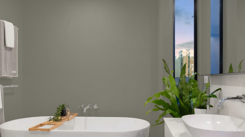
It's not always easy to find the perfect shade of green for your walls, but Mountain Road (SW 7743) manages to pull off a gray-green with style. It works well with various shades, including bold greens, blues, and other grays. Sherwin Williams also recommends tan and yellow colors like Shoji White, Softer Tan, and Woven Wicker. If you're feeling a little lost on how to use Mountain Road, these are the best places in your home to use neutral green paint colors.
Laurel Woods will make you feel like you're part of the forest even in the middle of a city
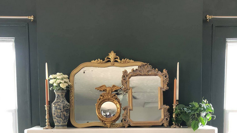
Want to get back to nature? Laurel Woods (SW 7749) brings to life feelings of pine forests and rich earth. There are many dark paint colors HGTV stars love using in homes, but doing it yourself can be intimidating. This is a dark neutral that can be a bit difficult to work with. Unlike some other bold, rich colors, Laurel Woods is a neutral and pairs well with Reserved White, Intellectual Gray, and Worldy Gray.
Requisite Gray is a beachy color when in the right light

Requisite Gray (SW 7023) is a warm neutral that offers a bright coastal appearance. Pair it with other shades of gray and white, as well as blue, to tie the look together. Sherwin Williams recommends colors such as Dried Lavender, Simple White, and Eider White. To get the most out of this color, you want spaces with a fair amount of warm light. Bright LED lights and darker rooms fit this color, but some of the warm undertones tend to wash out.
Dhurrie Beige is a sophisticated color that pairs well with dark colors
Dhurrie Beige (SW 7524) can create either a sense of sophistication or tranquility. It works well with both light and dark colors, like Aesthetic White, Dry Dock, and Deep Forest Brown. If you're hesitant about how to use Dhurrie Beige or other colors on this list, these are the best ways to use neutrals in home décor. They work with a lot of different color schemes, designs, and textures, but sometimes, it's nice to have an idea of how to start.
Monorail Silver offers a magical shade to highlight any room
If you're looking for a neutral color that makes it feel like moonlight is permanently shining into your room, consider Monorail Silver (SW 7663). It's a cool gray color with just a hint of cyan blue underneath to give it a magical feeling. Depending on what other colors you use with it, it can feel whimsical, industrial, or full of modern elegance. Sherwin Williams recommends pairing it with colors like Ice Cube, Shell White, and Wall Street. It also does well alongside shades of pink and violet.